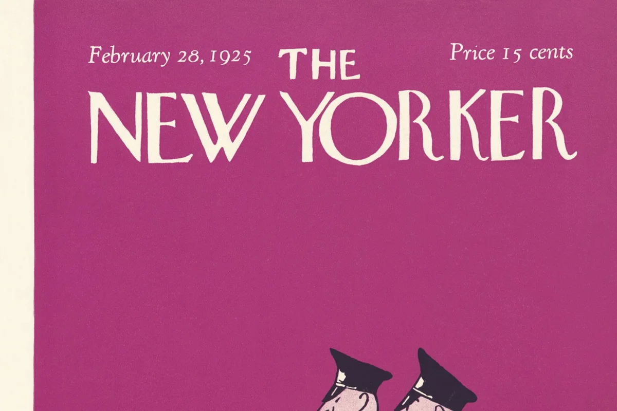
The New Yorker Uses Caslon
The New Yorker has been set in Caslon since Harold Ross published the first issue in 1925. A century later, the body text is still Caslon. No other major American publication has maintained a single text typeface for this long.
The specific cut has evolved — from foundry metal Caslon to phototype to Adobe Caslon Pro in the digital era — but the fundamental character has remained constant. Caslon's proportions define what a New Yorker page looks like: moderate x-height, slightly irregular letterforms, old-style figures that sit within the text rather than towering above it.
For readers, this consistency is invisible. The type disappears into the prose, and a century of art directors have left it alone.
Why Caslon Works for The New Yorker
The printer's adage
"When in doubt, use Caslon" has been a typographic maxim since the 18th century. William Caslon's original types were designed for sustained reading — long-form text consumed column after column. The New Yorker publishes some of the longest journalism in American media. The match is structural.
Warmth without informality
Caslon's letterforms carry subtle irregularities inherited from their punchcutting origins:
- Slightly bracketed serifs that ease the eye along the baseline
- Open counters that prevent text from darkening at small sizes
- Old-style figures (3, 5, 7 descend below baseline) that blend into prose
These irregularities produce warmth — the text feels authored, not typeset by machine. For a magazine built on voice and literary ambition, this matters.
A century of reader trust
Caslon is no longer a typeface choice — it is an institutional signal. Readers associate its texture with a specific standard of editing, fact-checking, and prose quality. Changing it would disrupt a visual contract a century old.
Free Alternative: Libre Caslon Text
Libre Caslon Text in Regular (400) is optimized for body text at small sizes, matching the role Caslon plays in The New Yorker's columns. Pablo Impallari's design preserves the bracketed serifs, open counters, and old-style figures of the Caslon tradition. For long-form editorial layouts demanding quiet readability, it is the strongest open-source option.


