Vogue Uses Bodoni
Five letters in Bodoni have appeared on more newsstands, coffee tables, and waiting room side tables than perhaps any other typographic arrangement in publishing history.
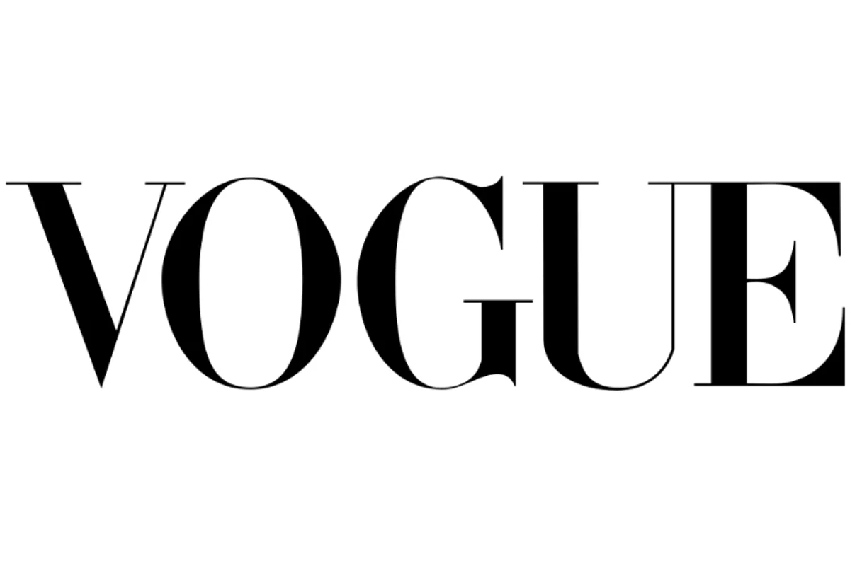
Vogue's masthead is set in a customized Bodoni — high contrast, razor-thin serifs, vertical stress — and it has remained essentially unchanged since the mid-1950s. Art directors, photographers, and cover subjects rotate constantly. The typeface stays.
Before Bodoni, Vogue's masthead cycled through several identities. The adoption of Bodoni coincided with the magazine's consolidation as the dominant voice in fashion media. The typeface didn't just label the brand — it became the brand's visual shorthand for authority and taste.
Why Bodoni Works for Vogue
Extreme contrast as editorial statement
Bodoni's defining feature — the dramatic difference between thick strokes and hairline serifs — mirrors fashion's own obsession with contrast. Light and shadow in photography, structure and drape in garments. The typeface speaks the same visual language as its content.
Verticality and posture
Bodoni's letterforms stand upright with rigid vertical stress. No bracketed curves softening the serifs, no diagonal emphasis suggesting motion. The effect is composed, poised — the typographic equivalent of good posture:
- Vertical stress conveys formality and control
- Unbracketed serifs project sharpness and precision
- Consistent baseline creates an even, commanding rhythm
Recognition at any scale
The masthead must read instantly on a crowded newsstand at arm's length and hold up as a thumbnail on a phone screen. Bodoni's high contrast makes "VOGUE" identifiable even when blurred — the thick-thin pattern alone is enough to trigger recognition.
Free Alternative: Libre Bodoni
Libre Bodoni in Bold (700) captures the dramatic thick-thin contrast that makes Vogue's masthead iconic. Its high-contrast strokes and sharp, unbracketed serifs faithfully reproduce the Didone proportions of the original. For editorial headlines and masthead-style treatments, it delivers the same commanding presence that has defined fashion typography for decades.


