Best Fonts for Presentations
Typography for slide decks, keynotes, and presentation materials. Presentation fonts must remain readable from the back of the room while supporting visual hierarchy on projected screens.
Free Fonts for Presentations
Open-source fonts perfect for presentations projects.
Premium Presentations Fonts You Can Replace
Popular premium fonts for presentations with free open-source alternatives.

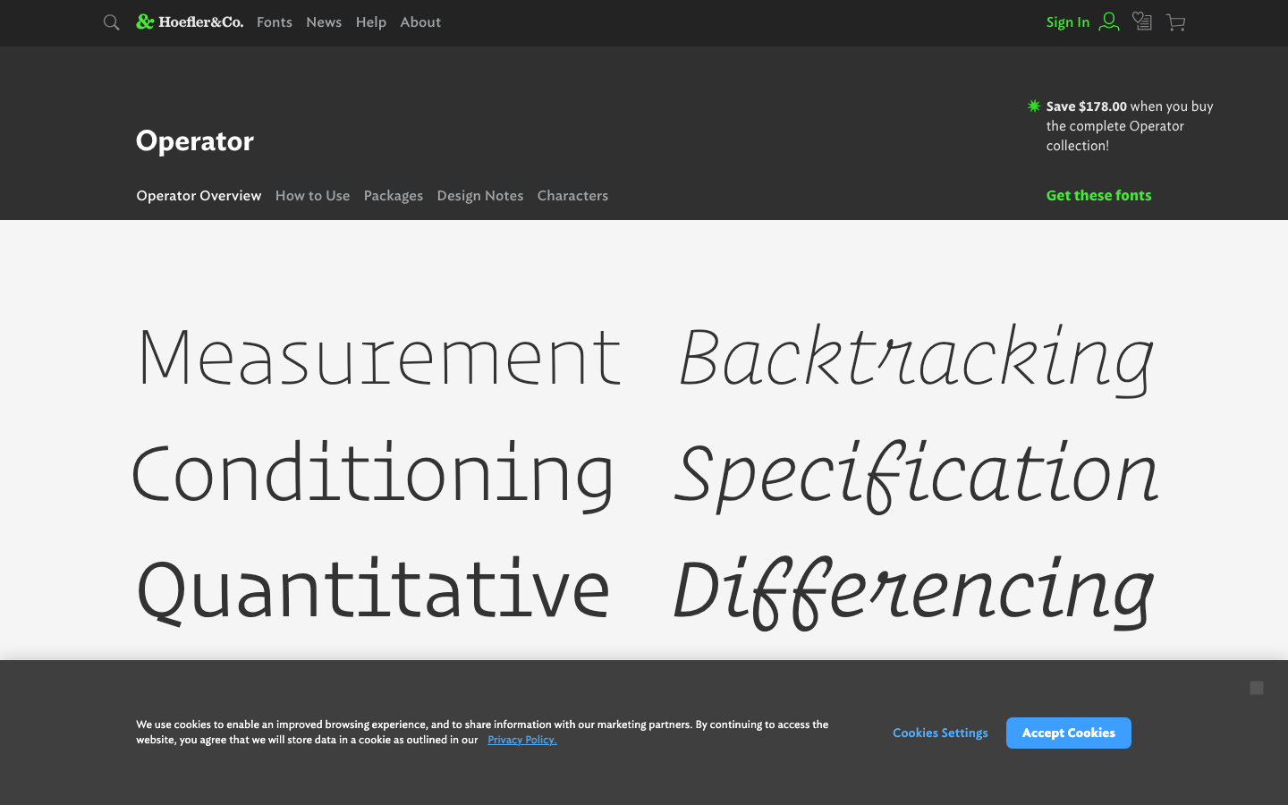
Operator Mono
Frequently Asked Questions
What fonts work best for presentations?
Presentation fonts need to read clearly from distance on projected screens. Choose sans-serifs with open letterforms—avoid thin weights that wash out on projectors. Minimum 24pt for body text, 36pt+ for headlines. Test your font on the actual projector when possible, as rendering varies significantly.
Should I use fancy fonts in my presentations?
Generally no. Presentation typography should support your message, not compete with it. Clean, readable fonts keep focus on content. Save decorative fonts for title slides only. Consistency builds professionalism—stick to one font family with varied weights. Your audience should remember your ideas, not your font choices.
What free fonts work well for presentations?
Inter provides excellent screen rendering and professional appearance. Nunito offers friendly warmth for less formal presentations. Montserrat delivers modern, clean headlines. Poppins works well for contemporary slide decks. All render well on projectors and include multiple weights for hierarchy.
Presentations Alternatives by Font
Browse presentations alternatives for specific premium fonts.
