Free Alternatives to Operator Mono

About Operator Mono
- Foundry
- Hoefler&Co
- Classification
- mono
- Style
- monospace
Brands Using Operator Mono
Chosen by engineers who care about editor typography, especially the cursive comment italics
Widely adopted premium coding font known for italic cursive
Popular choice for live coding demonstrations at tech talks
A favorite editor/IDE font for its calligraphic comment italics
 See Operator Mono live on these sites with FontSwap →
Operator Mono is a premium monospaced typeface from Hoefler&Co, the New York foundry behind Gotham and Mercury. It was drawn for one audience above all others: developers who spend their days inside a code editor and want that code to feel a little more human. The upright weights are handsome but conventional. What people fall in love with is the italic — a genuine cursive, script-like italic that looks handwritten, the kind of thing almost no other monospaced font even attempts.
That single decision is why Operator Mono has a reputation far out of proportion to its size. It reframed what a coding font was allowed to be.
Why Operator Mono Matters
For decades the unspoken rule was that monospaced fonts should be plain. They exist to line up columns of code, keep indentation honest, and otherwise disappear. Personality was for headlines and logotypes, not for the font you stared at eight hours a day.
Operator Mono broke that rule on purpose. Released in 2016 as part of the larger Operator family, it treated the coding font as a design object worth caring about, and it made one bold move that nobody could ignore: it gave the italic a real cursive.
In most monospaced fonts, the "italic" is just the roman leaned over a few degrees. Operator Mono's italic is drawn from scratch as a flowing, connected script, closer to a fountain-pen hand than to a slanted terminal. Set your editor to render comments in italics and something quietly delightful happens — your prose comments look handwritten, sitting beside the mechanical precision of the code they describe. Developers noticed immediately, and screenshots of that effect spread across social media faster than any specimen sheet ever could.
The font became a small status symbol. It is sold as a paid license from a foundry known for craft, so choosing it signaled that you cared about your tools the way some people care about mechanical keyboards or good coffee. But the appeal was never only about prestige. The cursive comments genuinely help: they carve a clear visual channel between what the machine runs and what a human wrote to explain it.
Operator Mono matters because it proved a market existed. Once developers saw that a coding font could have warmth and a point of view, a wave of expressive monospaced fonts followed — some free, some paid, several of them explicitly chasing the same handwritten-italic idea.
Design Characteristics
Operator is a family, not a single font. The proportional cuts (simply called Operator) are spaced like normal text, while Operator Mono is the fixed-width member built for code. They share a design language, so a team can use the mono in the editor and the proportional version in a slide deck and still feel of a piece.
The uprights are where the font behaves itself. Letterforms are open and even-toned, with a generous x-height and clean, unfussy terminals. Nothing shouts. It is a comfortable, professional monospace that would be perfectly respectable even if the italic did not exist.
Then the italic changes everything. Here are the traits that define the face:
- A true cursive italic. The italic is a drawn script with entry and exit strokes that suggest handwriting, not a mechanically sloped roman. This is the signature — the reason people buy the font.
- Fixed width under a flowing hand. Making cursive letters obey a monospaced grid is genuinely hard, because a script "f" wants to sprawl while an "i" wants to shrink. Operator Mono resolves that tension so every glyph still occupies one identical cell, which is what keeps code aligned.
- Warm, humanist uprights. Even the roman weights lean warm rather than clinical, so the jump to the cursive italic feels like a natural extension rather than a costume change.
- Five named weights. The family runs Extra Light, Light, Book, Medium, and Bold, which is plenty for syntax highlighting but a narrower range than the nine-weight families that came later.
- No native programming ligatures. Operator Mono does not fuse
=>or!==into custom glyphs. Some developers patch ligatures in from other fonts, but out of the box it renders operators as their plain characters.
That last point matters when you compare it to the free field, where ligatures are common and, in one case, a cursive italic is on offer too.
Where Operator Mono Excels
Operator Mono is at its best anywhere code is meant to be looked at, not just executed.
- Syntax-highlighted editors. With a theme that italicizes comments and keywords, the cursive forms turn ordinary highlighting into something that reads like annotated prose. This is the font's home turf.
- Live coding and streaming. On a screen share or a Twitch stream, the handwritten italic is instantly recognizable and gives a stream its own visual signature.
- Conference talks and screenshots. Code samples in slides look considered and polished, which is exactly the impression a speaker wants when their code is projected three meters wide.
- Developer branding. For a studio or a developer-tools company, editor screenshots set in Operator Mono carry a consistent, crafted look across a marketing site or documentation.
- Personal setups. Plenty of people simply enjoy their editor more with it, and enjoying your tools is a legitimate reason to choose them.
The common thread is display. Whenever code is a thing to be shown, Operator Mono earns its price.
Where Operator Mono Struggles
No font is free of tradeoffs, and Operator Mono's are worth stating plainly.
- Price and licensing. It is a commercial font from a premium foundry. For a team of any size, licenses add up, and the budget question is the single most common reason people go looking for an alternative.
- No built-in ligatures. Developers who have grown attached to ligature rendering will find Operator Mono missing that feature natively, and the community patches that add ligatures can be fiddly to maintain across updates.
- A narrow weight range. Five weights cover most needs, but designers who want ultra-thin or extra-heavy cuts for display work will feel the ceiling.
- Not a variable font. Operator Mono ships as static instances. There is no continuous weight axis, so you cannot dial in an intermediate weight or ship a single small variable file.
- The italic is polarizing. The cursive is the whole point, and some developers find it distracting in dense code rather than delightful. It is a taste, not a universal improvement.
Recognizing these limits helps clarify what you are actually paying for — the italic and the craft — and what you might comfortably give up in a free substitute.
How to Choose a Free Substitute
The honest starting point is this: among the free alternatives here, only Victor Mono reproduces Operator Mono's defining trick. Everything else is a compromise on the italic in exchange for other strengths.
- You want the cursive italic → Victor Mono. This is the closest match by a wide margin, and it is the standout — the only one among the free alternatives here with a genuine cursive, script-style italic. It is the go-to free stand-in for people who want the Operator Mono experience without the license, and it throws in variable weights and programming ligatures on top. If the handwritten comments are why you wanted Operator Mono, start and probably finish here.
- You want polish and reliability → JetBrains Mono. Made by JetBrains and shipped with their IDEs, it is professionally maintained, ligature-rich, and pleasant. Its italic is a tasteful slanted form rather than a cursive, so you lose the signature look but gain rock-solid, cross-editor dependability.
- You want ligatures above all → Fira Code. Fira Code has the deepest, most familiar ligature set in the free world, which is exactly the feature Operator Mono lacks. The italics are plain obliques, so this is the choice when operator glyphs matter more than italic personality.
- You want a neutral, corporate-grade default → Source Code Pro. Adobe's coding font is clean, widely supported, and available as a 200–900 variable family. Its italics are genuine drawn italics but stay conventional, making it a safe, calm pick for enterprise codebases and documentation rather than a personality match.
- You want character over imitation → Space Mono. Space Mono does not try to be Operator Mono at all. It is a retro, geometric, slightly futuristic face that gives terminals and tech branding a strong identity. Two weights only, and no cursive, but genuinely distinctive.
- You want something raw and experimental → Not Courier Sans. This is the outlier: a lo-fi, sans-serifed Courier derivative with deliberately unpolished cuts. It shares none of Operator Mono's warmth, but for creative-coding and zine-style projects that want a rough monospace, it has its own charm.
A simple way to decide: if you are chasing the italic, it is Victor Mono. If you are chasing everyday coding quality on a budget, it is JetBrains Mono or Source Code Pro. And if you are chasing a look rather than a substitute, Fira Code, Space Mono, and Not Courier Sans each offer a different one.
Premium Font Neighbors
If Operator Mono appeals to you, a handful of other premium monospaced fonts live in the same neighborhood and are worth knowing.
Dank Mono is the most direct rival. It is a paid coding font built around its own cursive italic, positioned squarely as an alternative for people who love the Operator Mono idea but want a different hand.
Consolas and SF Mono come from the platform makers. Consolas is Microsoft's ClearType-era monospace, bundled with Windows and Office, while SF Mono is Apple's system coding font seen throughout Terminal and Xcode. Neither has a cursive italic, but both are meticulously engineered for on-screen legibility and cost nothing if you are already on the platform.
Monaco is the older Apple classic — the fixed-width face many developers first learned to code in, dependable and unpretentious.
Archer sits a little apart. It is Hoefler&Co's own slab serif, and it pairs beautifully with Operator Mono when you want body text and code to feel like one system; that shared foundry lineage is why it shows up as a natural companion.
Further out, GT Pressura from Grilli Type brings an industrial, rubber-stamp character with a monospaced cut, while Pitch Sans (Klim Type Foundry) and Nitti Grotesk (Bold Monday) are the proportional companions to well-loved monospace designs — useful references when you want a text face that harmonizes with a mono in the same family tree.
Exploring these helps clarify what you actually want: the cursive italic specifically (Dank Mono, or free Victor Mono), the platform-native reliability (Consolas, SF Mono, Monaco), or a coordinated type system around your code (Archer and the proportional companions above).
FAQ
What is the best free alternative to Operator Mono?
Victor Mono is the best free alternative, and it is not close. Among the free alternatives here, it is the standout for reproducing Operator Mono's signature cursive italic, with semi-connected cursive letterforms that create a similar effect in italicized comments and keywords. It also adds variable weights and programming ligatures, and it is available under an open-source license for both personal and commercial use.
Does any free coding font have a cursive italic like Operator Mono?
Yes. Among the free alternatives here, Victor Mono is the one to reach for. The others on this list — JetBrains Mono, Fira Code, Source Code Pro, Space Mono — offer either a plain slanted oblique or a conventional drawn italic, not a connected script. Victor Mono is the exception, the go-to free stand-in that delivers a semi-connected cursive italic without a license fee, which is why it tops nearly every Operator Mono alternatives list.
Why is Operator Mono a paid font?
Operator Mono is a commercial release from Hoefler&Co, a foundry known for high craft, so it is licensed rather than free. A large part of what you are paying for is the italic: drawing a genuine cursive that still obeys a fixed-width grid is difficult and time-consuming, since script letters naturally vary in width while a monospace demands they do not. The price also reflects the family's polish and the foundry's reputation.
Does Operator Mono support programming ligatures?
Not natively. Out of the box, Operator Mono renders operators like => and !== as their individual characters rather than fusing them into custom glyphs. Some developers apply community patches that graft ligatures from fonts like Fira Code onto Operator Mono, but that is unofficial and can break with updates. If native ligatures matter to you, Victor Mono offers both a cursive italic and ligatures in one package, and Fira Code has the most extensive ligature set among free options.
Is Operator Mono a variable font?
No. Operator Mono ships as static instances across five weights — Extra Light, Light, Book, Medium, and Bold — with no continuous weight axis. If a variable font is important for your workflow, Victor Mono, JetBrains Mono, Fira Code, and Source Code Pro all provide variable families for free, letting you fine-tune weight and ship a single adjustable file.
How do I get the handwritten comment look in my editor?
The effect comes from two things working together: the font and your theme. First, set Operator Mono (or free Victor Mono) as your editor font. Then choose or edit a syntax theme that renders comments — and often keywords — in italics, which most modern themes in VS Code and similar editors already do. Once italics are enabled for those tokens, the cursive letterforms turn your comments into what looks like margin notes written by hand.
What's the difference between Operator and Operator Mono?
They are two members of the same Hoefler&Co family. Operator is the proportionally spaced version, suited to running text and interfaces, while Operator Mono is the fixed-width member built for code, where every glyph occupies an identical cell. They share the same design language, including the cursive italic, so you can use the mono in your editor and the proportional cut in documentation or slides and keep a consistent look.
Is Operator Mono on Google Fonts?
No, Operator Mono is a premium font from Hoefler&Co and is not available on Google Fonts.
The closest Google Fonts alternative is Victor Mono with 90% similarity. Get it free on Google Fonts ↗
Free Alternatives (6)
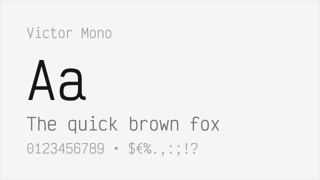
Free alternative with similar cursive italic style
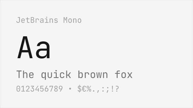
Excellent free coding font with good italics, though less distinctive
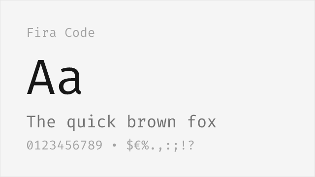
Popular free option with extensive ligatures
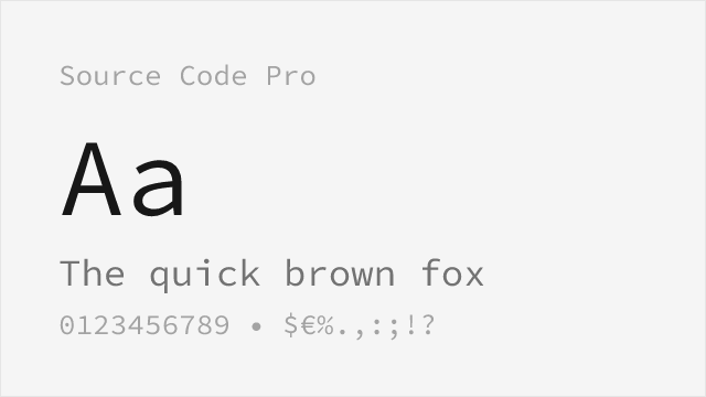
Adobe's clean open-source coding mono with genuine italics but no cursive
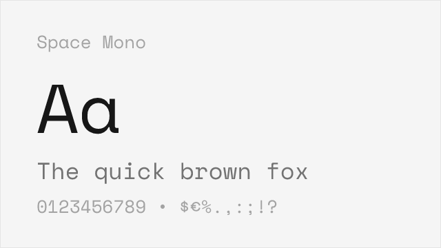
Distinctive retro-flavored mono; static two-weight family
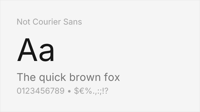
Experimental monospace with raw, lo-fi aesthetic from stripped Nimbus Mono
Compare the alternatives
See how Operator Mono compares to its top alternatives — and how those alternatives compare to each other — side by side.
See where Operator Mono is used in the wild and swap to free alternatives live.
Install FontSwap →Replacement Summary
Source: FontAlternatives.com
Premium font: Operator Mono
Best free alternative: Victor Mono
FontAlternatives similarity score: 90%
Replacement difficulty: Low
Best for: syntax-highlighted code, live streaming, personal development setups, budget-conscious developers
Notable users: Craft-focused developer teams, Developer Community, Conference Presentations
Not recommended when: Brand consistency with Craft-focused developer teams requires exact letterforms
What is the best free alternative to Operator Mono?
Victor Mono is the best free alternative to Operator Mono with a FontAlternatives similarity score of 90%.
Victor Mono shares similar proportions, stroke characteristics, and intended use with Operator Mono. It is available under the OFL-1.1 license, which permits both personal and commercial use at no cost.
This alternative works particularly well for: syntax-highlighted code, live streaming, personal development setups, budget-conscious developers.
Can I safely replace Operator Mono with Victor Mono?
Yes, Victor Mono is a high-confidence replacement for Operator Mono. The FontAlternatives similarity score of 90% indicates strong structural compatibility.
Licensing: Victor Mono is licensed under OFL-1.1, which allows commercial use without licensing fees or royalties.
Weight coverage: Most weights have close or exact matches available.
When should I NOT replace Operator Mono?
While Victor Mono is a strong alternative, there are situations where replacing Operator Mono may not be appropriate:
- Strict compliance: Verify that OFL-1.1 terms meet your specific legal and compliance requirements.
Weight-Matching Guide
Map Operator Mono weights to their closest free alternatives for accurate font substitution.
Victor Mono
| Operator Mono | Victor Mono | Match |
|---|---|---|
| Light | Light (300) | close |
| Book | Regular (400) | close |
| Medium | Medium (500) | exact |
| Bold | Bold (700) | exact |
JetBrains Mono
| Operator Mono | JetBrains Mono | Match |
|---|---|---|
| Light | Light (300) | close |
| Book | Regular (400) | close |
| Medium | Medium (500) | exact |
| Bold | Bold (700) | exact |
Fira Code
| Operator Mono | Fira Code | Match |
|---|---|---|
| Light | Light (300) | close |
| Book | Regular (400) | close |
| Medium | Medium (500) | exact |
| Bold | Bold (700) | exact |
Source Code Pro
| Operator Mono | Source Code Pro | Match |
|---|---|---|
| Light | Light (300) | close |
| Book | Regular (400) | exact |
| Medium | Medium (500) | exact |
| Bold | Bold (700) | exact |
Space Mono
| Operator Mono | Space Mono | Match |
|---|---|---|
| Book | Regular (400) | substitute |
| Bold | Bold (700) | substitute |
Not Courier Sans
| Operator Mono | Not Courier Sans | Match |
|---|---|---|
| Book | Regular (400) | substitute |
| Bold | Bold (700) | substitute |
Performance Guide
Production performance metrics for each alternative.
How to Use Victor Mono
Copy these code snippets to quickly add Victor Mono to your project.
CSS code for Victor Mono
@import url('https://fonts.googleapis.com/css2?family=Victor+Mono:wght@100..900&display=swap');HTML code for Victor Mono
<link rel="preconnect" href="https://fonts.googleapis.com">
<link rel="preconnect" href="https://fonts.gstatic.com" crossorigin>
<link href="https://fonts.googleapis.com/css2?family=Victor+Mono:wght@100..900&display=swap" rel="stylesheet">
Tailwind code for Victor Mono
// tailwind.config.js
module.exports = {
  theme: {
    extend: {
      fontFamily: {
        'victor-mono': ['"Victor Mono"', 'sans-serif'],
      },
    },
  },
}

// Usage in HTML:
// <p class="font-victor-mono">Your text here</p>
Next.js code for Victor Mono
// Using next/font (Next.js 13+)
import { Victor_Mono } from 'next/font/google';

const victor_mono = Victor_Mono({
  subsets: ['latin'],
  weight: ['100', '200', '300', '400', '500', '600', '700', '800', '900'],
});

export default function Component() {
  return (
    <p className={victor_mono.className}>
      Your text here
    </p>
  );
}

// Or using inline styles with Google Fonts link:
// <p style={{ fontFamily: '"Victor Mono"' }}>Your text</p>
Expo and React Native code for Victor Mono
// Install: npx expo install @expo-google-fonts/victor-mono expo-font
import { useFonts, Victor_Mono_400Regular } from '@expo-google-fonts/victor-mono';

export default function App() {
  const [fontsLoaded] = useFonts({
    Victor_Mono_400Regular,
  });

  if (!fontsLoaded) return null;

  return (
    <Text style={{ fontFamily: 'Victor_Mono_400Regular' }}>
      Your text here
    </Text>
  );
}
Browse Alternatives by Context
Find Operator Mono alternatives filtered by specific use case, style, or language support.
By Use Case
By Script
Frequently Asked Questions
What is the best free alternative to Operator Mono?
Victor Mono is the best free alternative to Operator Mono with a FontAlternatives similarity score of 90%. It shares similar proportions and characteristics while being available under the OFL-1.1 license for both personal and commercial use at no cost.
Is there a free version of Operator Mono?
There is no official free version of Operator Mono. However, Victor Mono is available under the OFL-1.1 open-source license and achieves a FontAlternatives similarity score of 90%. It includes variable weights and supports latin, latin-extended.
What Google Font looks like Operator Mono?
The Google Fonts most similar to Operator Mono are Victor Mono, JetBrains Mono, Fira Code. Among these alternatives, Victor Mono offers the closest match with a FontAlternatives similarity score of 90% and includes variable weights for flexible typography options.
Can I use Victor Mono commercially?
Yes, Victor Mono can be used commercially. It is licensed under OFL-1.1, which allows free use in websites, applications, print materials, and commercial projects without purchasing a license or paying royalties.
Is Victor Mono similar enough to Operator Mono?
Victor Mono achieves a FontAlternatives similarity score of 90% compared to Operator Mono. While not identical, it offers comparable letterforms, proportions, and visual style. Most designers find it works excellently as a substitute in web and print projects.
What are the main differences between Operator Mono and its free alternatives?
Free alternatives to Operator Mono may differ in subtle details like letter spacing, curve refinements, and available weights. Premium fonts typically include more OpenType features, extended language support, and optimized screen rendering. However, for most projects, these differences are negligible.
Where can I download free alternatives to Operator Mono?
Download Victor Mono directly from Google Fonts. Click the "Get Font" button on any alternative listed above to visit the official download page. Google Fonts also provides convenient embed codes for seamless web integration.