Free Alternatives to Dank Mono

About Dank Mono
- Foundry
- Phil Plückthun
- Classification
- mono
- Style
- monospace
Brands Using Dank Mono
A popular paid coding font among frontend and JavaScript developers
Frequently screenshotted alongside dark themes like Dracula and Night Owl
Recurring pick in "my editor setup" showcases and dotfiles repos
A distinctive on-camera coding font in Twitch and YouTube dev streams
 See Dank Mono live on these sites with FontSwap →
Dank Mono is a premium monospace typeface created by Phil Plückthun, the developer known for his work on styled-components and urql in the JavaScript ecosystem. Released in 2018, it combines playful cursive italics with comprehensive programming ligatures, targeting developers who want personality in their code editor without sacrificing functionality. At around £25 (roughly $30) for a personal license, it sits in a middle tier: pricier than the free coding fonts, far cheaper than Operator Mono.
Why Dank Mono Matters
Dank Mono arrived at a specific cultural moment: the point where a developer's editor stopped being a private tool and became something people shared. Screenshots of beautifully configured terminals, "my setup" threads, and IDE walkthrough videos turned the coding environment into a small canvas for self-expression, and the monospace font became the single most visible choice on it.
Into that moment, Dank Mono offered something most coding fonts did not — a point of view. Its cursive italics and integrated ligatures made a screen of code look intentional and a little bit fun, and it spread the way developer tools spread: word of mouth, a recommendation in a thread, a font someone spotted on a stream and had to identify. That it came from a working open-source developer rather than a traditional foundry only reinforced its credibility with the audience that adopted it.
Who is it for? Frontend and JavaScript developers who spend all day in the editor and want it to feel like theirs; streamers and screencasters who need code that reads well on camera and signals taste; and anyone for whom a coding font is part of a personal aesthetic, not just a utility. It is emphatically not aimed at the developer who wants their tools invisible — for them, the free workhorses below are a better fit.
That a paid coding font could build a following at all says something about the moment. For decades the monospace was pure infrastructure — Courier, then Consolas, chosen once and never thought about again. Dank Mono, Operator Mono, MonoLisa, and Berkeley Mono turned it into a small luxury category, one where developers who spend forty hours a week staring at the same glyphs decided that a few dollars for letterforms they genuinely enjoy was an easy trade. Dank Mono was one of the fonts that proved that market existed, and it did so from a standing start, without a foundry's marketing behind it.
Design Characteristics
Dank Mono's design is built around one big idea — that a code font can have handwriting in it — supported by a set of pragmatic engineering decisions:
- Cursive italics: The signature feature. Italic forms are flowing and semi-connected, drawn to read like margin notes, so comments and italicized keywords feel visually separate from the upright body of the code.
- Integrated programming ligatures: Common multi-character operators (
=>,===,!==,->,<=) render as single, clean glyphs, reducing visual noise. Crucially, they ship built in — no patched font required. - Even monospace rhythm: Despite the calligraphic italics, the roman is a disciplined fixed-width design with consistent spacing, so columns of code stay aligned.
- Warm, contemporary letterforms: The upright characters are friendly rather than mechanical, with a slightly humanist touch that keeps long sessions comfortable.
- Glyph disambiguation: The usual code-font hazards —
l/1/I,0/O— are drawn to stay distinct at small sizes. - Two weights plus a cursive italic: Dank Mono ships three styles — Regular, a cursive Italic, and Bold — enough to cover the roman/bold/comment hierarchy most syntax themes rely on.
History and Design
Phil Plückthun designed Dank Mono because he couldn't find a coding font that matched his aesthetic preferences. As a prominent open-source developer, he understood the environment where code is read and written — VS Code, terminal windows, documentation previews — and designed specifically for those contexts. The name "Dank" reflects internet culture's influence on its creation, embracing the meme-inflected humor that permeates modern developer communities.
Unlike fonts from traditional type foundries, Dank Mono emerged from within the developer community itself. Plückthun applied the same attention to detail that characterizes his code libraries to his font design. The result is a typeface that feels native to the environment where it is used — not a font adapted for coding, but one born from coding culture.
The cursive italics themselves draw on handwriting. Rendered in a syntax theme, an italicized comment reads like a margin annotation set in a different hand from the code around it, and an italic keyword gains emphasis without breaking the line's rhythm. It is a small idea with an outsized effect on how a screen of code feels: less like a wall of uniform glyphs, more like a document with a voice. That single decision is most of what people are responding to when they say a Dank Mono setup looks "nice" — it is the humanity, not the ligatures, that does the work.
Plückthun's decision to include ligatures from the start distinguished Dank Mono from Operator Mono, which requires separate community patches for ligature support. The integrated approach means Dank Mono works consistently across editors without configuration hassles — a small thing that mattered a lot to the developers who adopted it.
Where Dank Mono Excels
The unifying thread is visibility. Dank Mono was built for the moments when code leaves the privacy of your own machine and goes in front of other people — a stream, a conference slide, a marketing screenshot, a shared dotfiles repo — and needs to look like a considered choice rather than the editor default. In those settings its personality is an asset, not a distraction, which is why it shows up so consistently in "developer aesthetic" content. It is at its best wherever code is meant to be seen, not just written:
- Modern JavaScript development: Its aesthetics align with the React, TypeScript, and frontend tooling communities where it first caught on.
- Live streaming and content creation: Personality that looks good on camera and gives a stream a recognizable visual signature.
- Personal setups: When you want your development environment to feel uniquely yours rather than default.
- Terminal customization: Complements modern shell configurations and Powerline themes.
- Documentation and marketing screenshots: Code samples that look more engaging than standard monospace.
Where Dank Mono Struggles
The same choices that give Dank Mono its charm also bound where it fits:
- Ligature-averse toolchains: Some editors, diff viewers, and terminals render ligatures inconsistently or make certain operators harder to scan. If your workflow fights ligatures, much of Dank Mono's appeal is muted.
- Teams that want neutrality: In a shared codebase or a large org, an expressive, opinionated font can be a distraction; a neutral workhorse is often the safer standard.
- Only two weights: Regular and Bold cover the basics, but setups that lean on a light or medium weight for UI chrome will find the range thin next to variable fonts that span 100–900.
- Cursive italics are polarizing: The flowing italic that some developers love, others find harder to read in dense code — it is a genuine taste split, not a universal win.
- Latin only: Coverage is Latin and Latin Extended; multilingual or non-Latin code comments need a fallback.
- A paid font in a free-font category: Coding fonts are a space with exceptional free options, so Dank Mono's licence has to justify itself against Victor Mono, JetBrains Mono, and Fira Code — all excellent and free.
How to Choose a Free Substitute
The good news for anyone unwilling to pay is that monospace is the single best-served category in free type, so a strong substitute is genuinely easy to find. Match on the feature you actually care about:
If what you love is the cursive italic, there is exactly one free font built to deliver it: Victor Mono. Rune Bjørnerås drew it specifically to be the free answer to Dank Mono, with flowing semi-connected italics and ligatures, plus a variable weight axis Dank Mono does not have. Start here.
If you mainly want ligatures and professional polish, reach for JetBrains Mono (refined, enterprise-backed, pleasant slanted italics) or Fira Code, which has the deepest ligature set of any free coding font. Neither gives you cursive italics, but both are superb daily drivers.
If your priority is readability over a long workday, Source Code Pro is the disciplined, Adobe-engineered choice, and Geist Mono brings a clean, contemporary look that fits a modern product brand. And if what you actually wanted was personality — a code font that does not look like everyone else's — Space Mono is the free wildcard, quirky and geometric, best in display and branding contexts rather than a dense editor.
Whichever you pick, test it where you live: load it in your real editor, at your real font size, with your real color theme, and spend an hour actually coding in it. Check the operators, the l/1/I and 0/O clusters, and the italic comments, because a monospace that dazzles in a specimen can still wear on you by the end of a workday — and the only reliable way to find out is to use it for one.
Premium Font Neighbors
If you are willing to pay and Dank Mono is not quite right, the premium coding-font shelf is deep. Operator Mono (Hoefler&Co) is the prestigious original of the cursive-italic idea — more refined, more expensive, and without built-in ligatures. MonoLisa and Berkeley Mono are two darlings of the current paid-coding-font wave, each with a strong, distinctive character and extensive weights. PragmataPro is the ultra-condensed, glyph-rich option beloved for fitting more code on screen. And the workhorses — Consolas, Monaco, SF Mono, and Input Mono — round out the field for anyone who wants a proven, neutral monospace rather than an expressive one.
FAQ
What is the best free alternative to Dank Mono?
Victor Mono is the best free alternative. It was designed by Rune Bjørnerås specifically as the free answer to Dank Mono, with flowing, semi-connected cursive italics and programming ligatures. It even adds variable font support that Dank Mono lacks, so it matches the aesthetic and exceeds it on flexibility.
How much does Dank Mono cost?
Dank Mono is priced at around £25 (roughly $30) for a personal license, with a commercial license around £60 — more accessible than Operator Mono (which runs $200+) but still a real investment for a coding font. If you want to try the cursive-italic aesthetic first, Victor Mono is a free way to experience the concept before deciding.
Does Dank Mono include programming ligatures?
Yes. Dank Mono ships a comprehensive set of programming ligatures for operators like ===, !==, =>, ->, and <=, built in rather than patched. Unlike Operator Mono, which needs a separate community patch for ligatures, Dank Mono works out of the box. Victor Mono and Fira Code offer comparable ligature support for free.
How does Dank Mono compare to Operator Mono?
Both feature cursive italics, but they differ in approach and price. Dank Mono includes integrated ligatures and has a more playful character at around £25 (roughly $30). Operator Mono from Hoefler&Co offers more refined typographic craftsmanship and prestige but costs $200+ and requires community patches for ligature support.
Are cursive italics good for coding?
It depends on taste. Flowing cursive italics make comments and italicized keywords stand out clearly, which many developers find helps them parse code faster. Others find the connected letterforms harder to read at small sizes in dense code. Because it is a genuine preference split, the best test is to try a font like Victor Mono in your own editor before committing.
Which free coding font has the most weights?
Among the alternatives here, Source Code Pro (200–900), Geist Mono (100–900), and JetBrains Mono (100–800) all offer far wider variable weight ranges than Dank Mono's two static weights, which makes them better suited to setups that use multiple weights across editor chrome and code.
Where can I download a free font similar to Dank Mono?
Victor Mono, JetBrains Mono, Fira Code, Source Code Pro, and Space Mono are all on Google Fonts; Geist Mono is available from Vercel. All are released under open licenses (OFL or similar) that permit free use in any personal or commercial project, so you can trial several in your editor at no cost.
Is Dank Mono on Google Fonts?
No, Dank Mono is a premium font from Phil Plückthun and is not available on Google Fonts.
The closest Google Fonts alternative is Victor Mono with 90% similarity. Get it free on Google Fonts ↗
Free Alternatives (6)
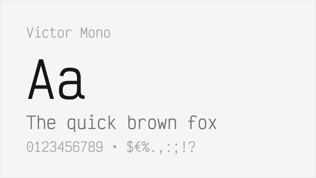
Excellent free alternative with similar cursive italics and ligatures
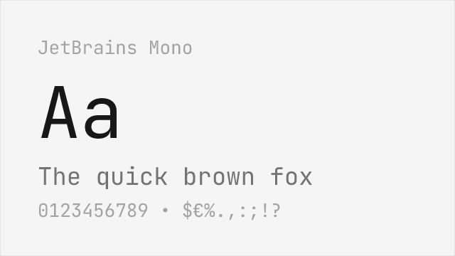
High-quality free font with good ligatures and italics
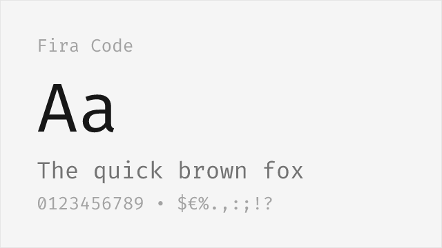
Popular free option with extensive programming ligatures
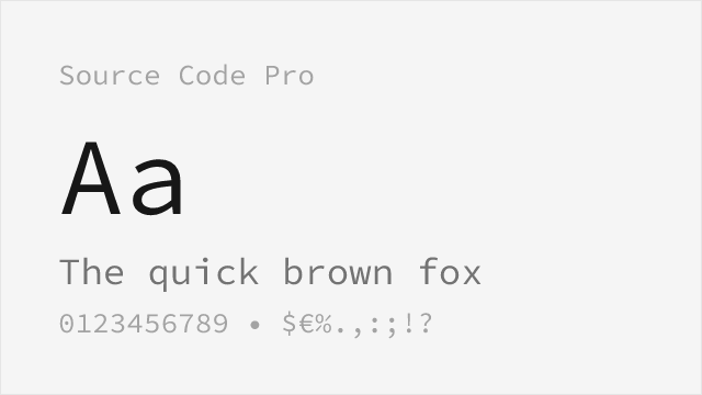
Adobe's rock-solid open-source coding font with a wide weight range
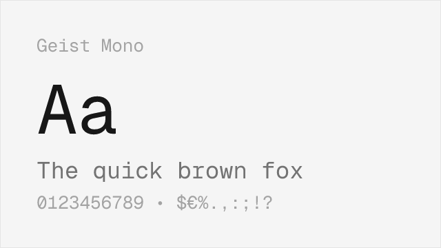
Vercel's modern monospace, clean and contemporary
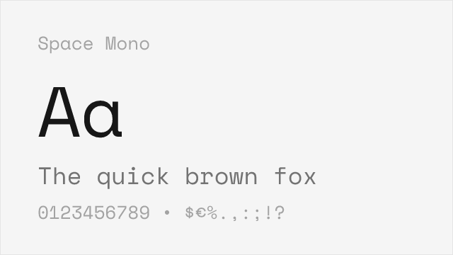
Distinctive geometric monospace with real personality
Compare the alternatives
See how Dank Mono compares to its top alternatives — and how those alternatives compare to each other — side by side.
See where Dank Mono is used in the wild and swap to free alternatives live.
Install FontSwap →Replacement Summary
Source: FontAlternatives.com
Premium font: Dank Mono
Best free alternative: Victor Mono
FontAlternatives similarity score: 90%
Replacement difficulty: Low
Best for: syntax-highlighted code, live streaming, personal projects, demonstrations
Notable users: Independent developer community, VS Code theme showcases, Dev.to setup posts
Not recommended when: Brand consistency with Independent developer community requires exact letterforms
What is the best free alternative to Dank Mono?
Victor Mono is the best free alternative to Dank Mono with a FontAlternatives similarity score of 90%.
Victor Mono shares similar proportions, stroke characteristics, and intended use with Dank Mono. It is available under the OFL-1.1 license, which permits both personal and commercial use at no cost.
This alternative works particularly well for: syntax-highlighted code, live streaming, personal projects, demonstrations.
Can I safely replace Dank Mono with Victor Mono?
Yes, Victor Mono is a high-confidence replacement for Dank Mono. The FontAlternatives similarity score of 90% indicates strong structural compatibility.
Licensing: Victor Mono is licensed under OFL-1.1, which allows commercial use without licensing fees or royalties.
Weight coverage: All 2 weights have exact matches available.
When should I NOT replace Dank Mono?
While Victor Mono is a strong alternative, there are situations where replacing Dank Mono may not be appropriate:
- Strict compliance: Verify that OFL-1.1 terms meet your specific legal and compliance requirements.
Weight-Matching Guide
Map Dank Mono weights to their closest free alternatives for accurate font substitution.
Victor Mono
| Dank Mono | Victor Mono | Match |
|---|---|---|
| Regular | Regular (400) | exact |
| Bold | Bold (700) | exact |
JetBrains Mono
| Dank Mono | JetBrains Mono | Match |
|---|---|---|
| Regular | Regular (400) | exact |
| Bold | Bold (700) | exact |
Fira Code
| Dank Mono | Fira Code | Match |
|---|---|---|
| Regular | Regular (400) | exact |
| Bold | Bold (700) | exact |
Source Code Pro
| Dank Mono | Source Code Pro | Match |
|---|---|---|
| Regular | Regular (400) | exact |
| Bold | Bold (700) | exact |
Geist Mono
| Dank Mono | Geist Mono | Match |
|---|---|---|
| Regular | Regular (400) | exact |
| Bold | Bold (700) | exact |
Space Mono
| Dank Mono | Space Mono | Match |
|---|---|---|
| Regular | Regular (400) | exact |
| Bold | Bold (700) | exact |
Performance Guide
Production performance metrics for each alternative.
How to Use Victor Mono
Copy these code snippets to quickly add Victor Mono to your project.
CSS code for Victor Mono
@import url('https://fonts.googleapis.com/css2?family=Victor+Mono:wght@100..900&display=swap');HTML code for Victor Mono
<link rel="preconnect" href="https://fonts.googleapis.com">
<link rel="preconnect" href="https://fonts.gstatic.com" crossorigin>
<link href="https://fonts.googleapis.com/css2?family=Victor+Mono:wght@100..900&display=swap" rel="stylesheet">
Tailwind code for Victor Mono
// tailwind.config.js
module.exports = {
  theme: {
    extend: {
      fontFamily: {
        'victor-mono': ['"Victor Mono"', 'sans-serif'],
      },
    },
  },
}

// Usage in HTML:
// <p class="font-victor-mono">Your text here</p>
Next.js code for Victor Mono
// Using next/font (Next.js 13+)
import { Victor_Mono } from 'next/font/google';

const victor_mono = Victor_Mono({
  subsets: ['latin'],
  weight: ['100', '200', '300', '400', '500', '600', '700', '800', '900'],
});

export default function Component() {
  return (
    <p className={victor_mono.className}>
      Your text here
    </p>
  );
}

// Or using inline styles with Google Fonts link:
// <p style={{ fontFamily: '"Victor Mono"' }}>Your text</p>
Expo and React Native code for Victor Mono
// Install: npx expo install @expo-google-fonts/victor-mono expo-font
import { useFonts, Victor_Mono_400Regular } from '@expo-google-fonts/victor-mono';

export default function App() {
  const [fontsLoaded] = useFonts({
    Victor_Mono_400Regular,
  });

  if (!fontsLoaded) return null;

  return (
    <Text style={{ fontFamily: 'Victor_Mono_400Regular' }}>
      Your text here
    </Text>
  );
}
Recommended Font Pairings
These free fonts pair well with Victor Mono Dank Mono for headlines, body text, or accent use.
Inter's clean modern design complements Dank Mono's playful personality without competing for attention in developer tool interfaces
Roboto's geometric neutrality balances Dank Mono's expressive character for developer dashboards and documentation sites
Browse Alternatives by Context
Find Dank Mono alternatives filtered by specific use case, style, or language support.
By Use Case
By Style
By Script
Frequently Asked Questions
What is the best free alternative to Dank Mono?
Victor Mono is the best free alternative to Dank Mono with a FontAlternatives similarity score of 90%. It shares similar proportions and characteristics while being available under the OFL-1.1 license for both personal and commercial use at no cost.
Is there a free version of Dank Mono?
There is no official free version of Dank Mono. However, Victor Mono is available under the OFL-1.1 open-source license and achieves a FontAlternatives similarity score of 90%. It includes variable weights and supports latin, latin-extended.
What Google Font looks like Dank Mono?
The Google Fonts most similar to Dank Mono are Victor Mono, JetBrains Mono, Fira Code. Among these alternatives, Victor Mono offers the closest match with a FontAlternatives similarity score of 90% and includes variable weights for flexible typography options.
Can I use Victor Mono commercially?
Yes, Victor Mono can be used commercially. It is licensed under OFL-1.1, which allows free use in websites, applications, print materials, and commercial projects without purchasing a license or paying royalties.
Is Victor Mono similar enough to Dank Mono?
Victor Mono achieves a FontAlternatives similarity score of 90% compared to Dank Mono. While not identical, it offers comparable letterforms, proportions, and visual style. Most designers find it works excellently as a substitute in web and print projects.
What are the main differences between Dank Mono and its free alternatives?
Free alternatives to Dank Mono may differ in subtle details like letter spacing, curve refinements, and available weights. Premium fonts typically include more OpenType features, extended language support, and optimized screen rendering. However, for most projects, these differences are negligible.
Where can I download free alternatives to Dank Mono?
Download Victor Mono directly from Google Fonts. Click the "Get Font" button on any alternative listed above to visit the official download page. Google Fonts also provides convenient embed codes for seamless web integration.