Free Alternatives to Dank Mono for Terminal

6 alternatives | 1 highly relevant | mono | Best match: Fira Code (78%)

Looking for a free mono font for terminal projects? Dank Mono by Phil Plückthun is a popular choice, but its licensing cost can be prohibitive. We've curated 6 free alternatives that work well in terminal contexts. We've identified 1 that are especially well-suited for this context. Each alternative is scored by visual similarity and contextual relevance, and ships under an open-source license for both personal and commercial use.

Top Picks

Comparison Table

Font Relevance Similarity Weights Variable License Source
Fira Code 36 78% Variable Yes OFL-1.1 Google Fonts ↗
JetBrains Mono 16 82% Variable Yes OFL-1.1 Google Fonts ↗
Source Code Pro 16 75% Variable Yes OFL-1.1 Google Fonts ↗
Geist Mono 15 72% Variable Yes OFL-1.1 Google Fonts ↗
Victor Mono 9 90% Variable Yes OFL-1.1 Google Fonts ↗
Space Mono 7 68% 2 No OFL-1.1 Google Fonts ↗

Most Relevant (1)

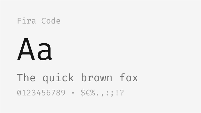
#1 Fira Code 78% Relevant
[Google Fonts] · OFL-1.1 · Variable

Popular free option with extensive programming ligatures

Why it matches: Fira Code provides the most extensive ligature set available among free fonts, matching Dank Mono's programming ligature functionality. While lacking cursive italics entirely, Fira Code offers superior ligature coverage and broader community adoption. For developers who prioritize ligatures over italic personality, Fira Code delivers.
web developmentterminal customizationany code editordocumentation
Get Font ↗

Other Alternatives (5)

[Google Fonts] · OFL-1.1 · Variable

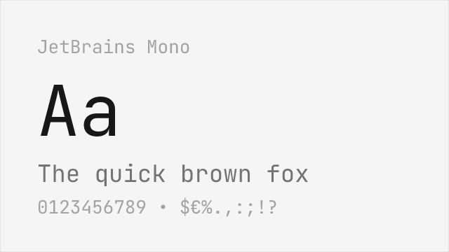
High-quality free font with good ligatures and italics
Why it matches: JetBrains Mono offers comparable programming ligatures and pleasant italics in a more professionally refined package. While lacking Dank Mono's distinctive cursive character, JetBrains Mono provides similar functionality with enterprise-grade polish. The comprehensive weight range and variable font support exceed what Dank Mono offers.
IDE environmentscross-platform developmenttechnical documentationprofessional settings
Get Font ↗
[Google Fonts] · OFL-1.1 · Variable

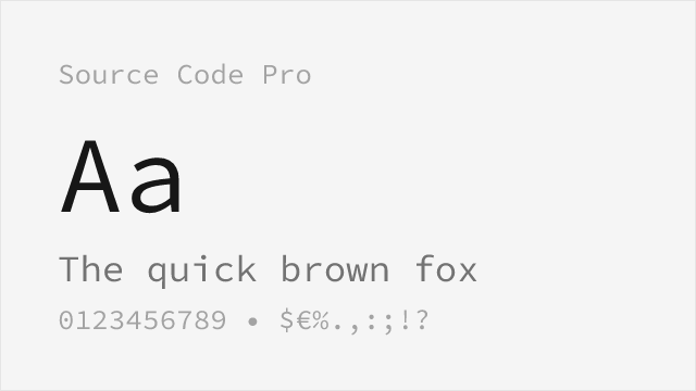
Adobe's rock-solid open-source coding font with a wide weight range
Why it matches: Source Code Pro is the safe, professional pick: Adobe engineered it specifically for reading code, with clearly disambiguated glyphs and a full 200-900 weight axis. It has no cursive italic and no ligatures, so it forgoes Dank Mono's personality, but for sheer legibility and cross-platform reliability at small sizes it is one of the strongest free monospaces available.
production IDE worktechnical documentationlong coding sessionsaccessibility-sensitive setups
Get Font ↗
#4 Geist Mono 72%
[Google Fonts] · OFL-1.1 · Variable

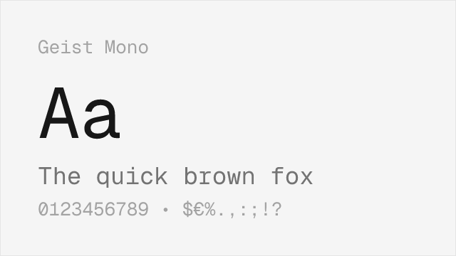
Vercel's modern monospace, clean and contemporary
Why it matches: Geist Mono comes from Vercel and shares Dank Mono's contemporary, design-forward developer aesthetic — the kind of type that looks at home in a modern dark-theme editor or a polished product screenshot. It is more restrained than Dank Mono (no cursive italic), but its crisp, even texture and full variable weight axis make it a natural fit for teams that want a current, minimal look without paying a licence.
product and marketing code blocksmodern editor themesdesign-system documentationbrand-consistent developer tooling
Get Font ↗
#5 Victor Mono 90%
[Google Fonts] · OFL-1.1 · Variable

Excellent free alternative with similar cursive italics and ligatures
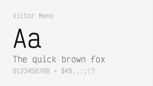
Why it matches: Victor Mono was designed specifically to fill the gap for a free coding font with distinctive cursive italics. Both share flowing, semi-connected italic letterforms that make comments and keywords visually distinct. Victor Mono matches Dank Mono's playful personality while adding variable font support for even more flexibility.
syntax-highlighted codelive streamingpersonal projectsdemonstrations
Get Font ↗
#6 Space Mono 68%
[Google Fonts] · OFL-1.1 · 2 weights

Distinctive geometric monospace with real personality

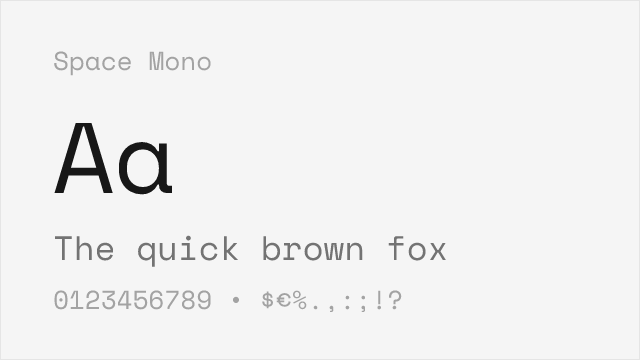
Why it matches: Space Mono is the free monospace to reach for when what you actually liked about Dank Mono was its personality. Drawn by Colophon for Google, it is quirky and geometric with unmistakable character — a different flavour of distinctive rather than a copy of Dank Mono's cursive, but it scratches the same itch for a code font that does not look like everyone else's.
display code and hero snippetseditorial and branding contextspersonality-forward personal setupsposters and titling
Get Font ↗

Related Pages