 Install FontSwap
Free Alternatives to Operator Mono with Expressive Style
Operator Mono is known for its expressive aesthetic. If you're looking for a free mono font with a similar expressive feel, these 6 alternatives offer comparable characteristics. We've identified 6 that are especially well-suited for this context. All are available under open-source licenses for unrestricted commercial use.
Top Picks
Comparison Table
| Font | Relevance ⓘ
How well this alternative fits the specific context (use-case or trait) of this page. Score 0–100 based on matching keywords, industries, and font characteristics. Alternatives scoring 25+ are highlighted.
| Similarity ⓘ
How visually similar this free font is to the premium original. Score 0–100 based on x-height, width, stroke contrast, use-case overlap, and language coverage.
Learn more → | Weights | Variable | License | Source |
|---|---|---|---|---|---|---|
| Victor Mono | 58 | 90% | Variable | Yes | OFL-1.1 | Google Fonts ↗ |
| JetBrains Mono | 31 | 82% | Variable | Yes | OFL-1.1 | Google Fonts ↗ |
| Fira Code | 31 | 78% | Variable | Yes | OFL-1.1 | Google Fonts ↗ |
| Source Code Pro | 30 | 74% | Variable | Yes | OFL-1.1 | Google Fonts ↗ |
| Space Mono | 29 | 68% | 2 | No | OFL-1.1 | Google Fonts ↗ |
| Not Courier Sans | 25 | 50% | 2 | No | GPL-2.0-with-font-exception | fontsquirrel ↗ |
All Alternatives (6)
[Google Fonts] · OFL-1.1 · Variable
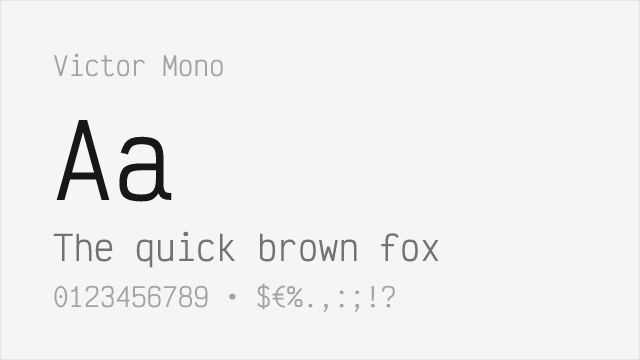
Free alternative with similar cursive italic style
Why it matches: Victor Mono is the go-to free stand-in for Operator Mono, sharing its distinctive cursive-italic concept. Victor Mono's semi-connected cursive script echoes the handwritten feel of Operator Mono's fully cursive italic, transforming syntax-highlighted code into something more personal. Victor Mono adds variable font support and programming ligatures that Operator Mono lacks.
syntax-highlighted codelive streamingpersonal development setupsbudget-conscious developers
[Google Fonts] · OFL-1.1 · Variable
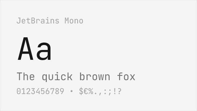
Excellent free coding font with good italics, though less distinctive
Why it matches: JetBrains Mono offers a professionally polished alternative with pleasant italics and comprehensive ligature support. While the italics are less dramatically cursive than Operator Mono's signature style, they provide sufficient visual distinction in syntax highlighting. The enterprise backing ensures long-term reliability and broad editor compatibility.
IDE environmentsprofessional settingscross-platform developmenttechnical documentation
[Google Fonts] · OFL-1.1 · Variable
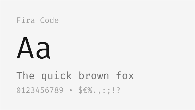
Popular free option with extensive ligatures
Why it matches: Fira Code provides the most comprehensive ligature set among free coding fonts, addressing Operator Mono's primary limitation—lack of native ligatures. While Fira Code's italics are simple obliques rather than cursive forms, the extensive operator ligatures create visually pleasing code. For developers who prioritize ligatures over italic personality, Fira Code excels.
web developmentligature-heavy codingterminal customizationany code editor
[Google Fonts] · OFL-1.1 · Variable
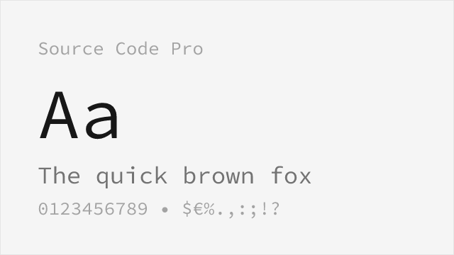
Adobe's clean open-source coding mono with genuine italics but no cursive
Why it matches: Source Code Pro is Adobe's take on a neutral, workhorse coding font, and it answers the part of Operator Mono that is about clarity rather than flourish. It ships true drawn italics rather than slanted romans, so comments and emphasized tokens still read as a distinct style, even though those italics stay upright-derived instead of turning into a flowing script. The wide 200–900 variable range and deep language coverage make it an easy, license-free default for teams that want polish without the calligraphic personality.
enterprise codebasesdocumentation systemsmultilingual projectsneutral editor themes
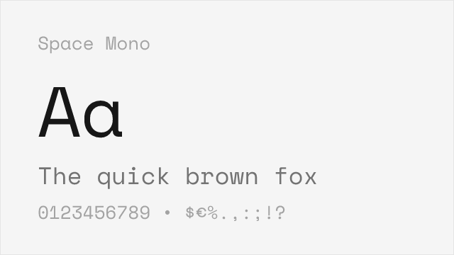
[Google Fonts] · OFL-1.1 · 2 weights
Distinctive retro-flavored mono; static two-weight family
Why it matches: Space Mono goes after the same instinct behind Operator Mono—that a coding font is allowed to have a face—just from a very different direction. Where Operator Mono is warm and handwritten, Space Mono is mechanical and retro-futuristic, full of blunt terminals and quirky details that give a terminal or a title block real character. It will not reproduce the cursive italic, and it stops at two weights, but for projects that want personality over neutrality it is a striking, license-free choice.
tech brandingterminal themesheadings and code snippetscreative coding
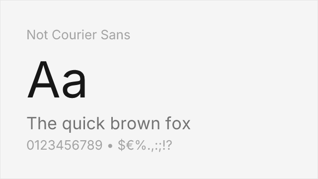
[fontsquirrel] · GPL-2.0-with-font-exception · 2 weights
Experimental monospace with raw, lo-fi aesthetic from stripped Nimbus Mono