 Install FontSwap
Free Alternatives to Avenir Supporting Cyrillic
Need a free alternative to Avenir with Cyrillic script support? These 4 options include Cyrillic characters and share visual similarities with Avenir. Each is licensed for free personal and commercial use.
Top Picks
Comparison Table
| Font | Relevance ⓘ
How well this alternative fits the specific context (use-case or trait) of this page. Score 0–100 based on matching keywords, industries, and font characteristics. Alternatives scoring 25+ are highlighted.
| Similarity ⓘ
How visually similar this free font is to the premium original. Score 0–100 based on x-height, width, stroke contrast, use-case overlap, and language coverage.
Learn more → | Weights | Variable | License | Source |
|---|---|---|---|---|---|---|
| Nunito | 0 | 88% | Variable | Yes | OFL-1.1 | Google Fonts ↗ |
| Nunito Sans | 0 | 86% | Variable | Yes | OFL-1.1 | Google Fonts ↗ |
| Mulish | 0 | 72% | Variable | Yes | OFL-1.1 | Google Fonts ↗ |
| Manrope | 0 | 68% | Variable | Yes | OFL-1.1 | Google Fonts ↗ |
All Alternatives (4)
[Google Fonts] · OFL-1.1 · Variable
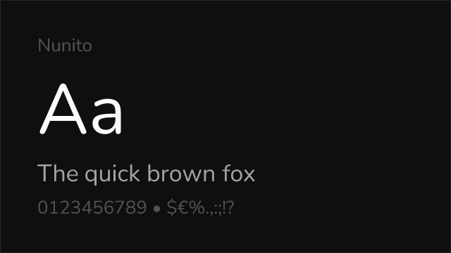
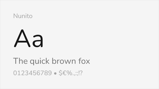
Excellent match with similar rounded terminals and geometric structure
Why it matches: Nunito captures Avenir's distinctive blend of geometric structure and rounded terminals. Both typefaces share the same philosophy of softening geometric forms for warmth without sacrificing modern clarity. The x-height, letter spacing, and overall friendly character closely parallel Avenir's humanist-geometric hybrid design.
friendly brandinghealthcareeducational contentmobile apps
[Google Fonts] · OFL-1.1 · Variable
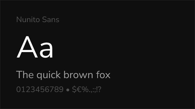
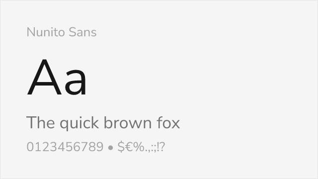
The flat-terminal Nunito — arguably the closest free read on Avenir's forms
Why it matches: Nunito Sans is the flat-terminal companion to Nunito, and that makes it an even closer read on Avenir than its rounded sibling. It keeps the humanist-geometric balance — open apertures, a generous but controlled x-height, subtle stroke modulation — that defines Avenir, without the soft rounded corners, landing very near the original's calm, professional tone.
corporate brandinglong-form body textinterfaces
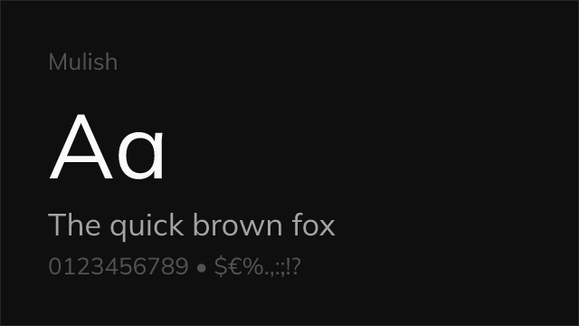
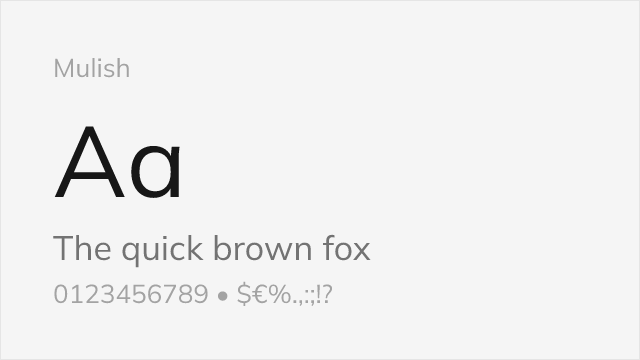
[Google Fonts] · OFL-1.1 · Variable
Minimalist sans with clean, low-contrast humanist-geometric forms
Why it matches: Mulish (formerly Muli) is a quiet, minimalist sans built on the same humanist-geometric logic as Avenir. Its even color, open counters, and restrained detailing give it Avenir's unfussy, trustworthy feel, though it is a touch more neutral and less warm than the original.
product UIdashboardsminimal branding
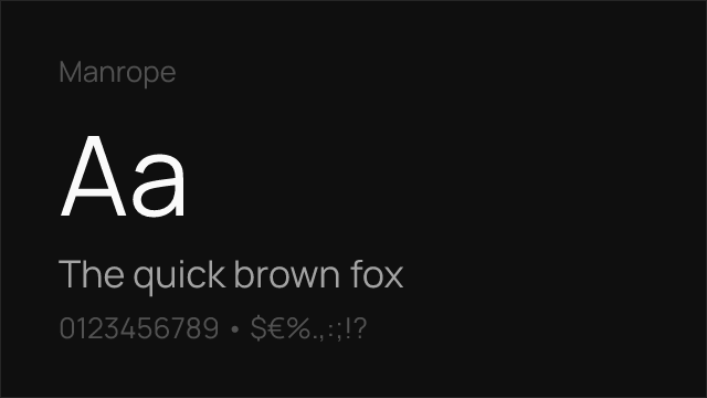
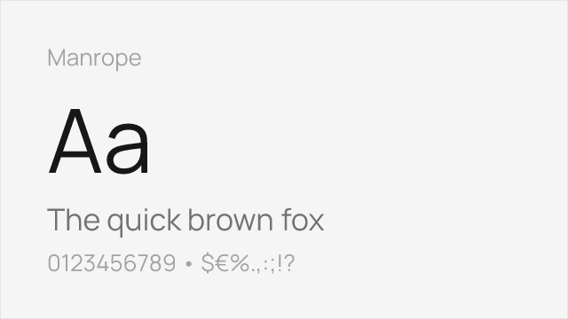
[Google Fonts] · OFL-1.1 · Variable
Modern semi-geometric sans tuned for screens and interfaces
Why it matches: Manrope is a contemporary semi-geometric sans that shares Avenir's balance of geometric structure and humanist openness, redrawn for the screen. It reads as a more current, UI-first cousin — cleaner at small sizes, with a slightly tighter, more technical feel than Avenir's softer warmth.
web and app UIstartup brandingdashboards