 Install FontSwap
Free Alternatives to Cambria Supporting Greek
Need a free alternative to Cambria with Greek script support? These 3 options include Greek characters and share visual similarities with Cambria. Each is licensed for free personal and commercial use.
Top Picks
Comparison Table
| Font | Relevance ⓘ
How well this alternative fits the specific context (use-case or trait) of this page. Score 0–100 based on matching keywords, industries, and font characteristics. Alternatives scoring 25+ are highlighted.
| Similarity ⓘ
How visually similar this free font is to the premium original. Score 0–100 based on x-height, width, stroke contrast, use-case overlap, and language coverage.
Learn more → | Weights | Variable | License | Source |
|---|---|---|---|---|---|---|
| Literata | 0 | 86% | Variable | Yes | OFL-1.1 | Google Fonts ↗ |
| Source Serif Pro | 0 | 76% | Variable | Yes | OFL-1.1 | Google Fonts ↗ |
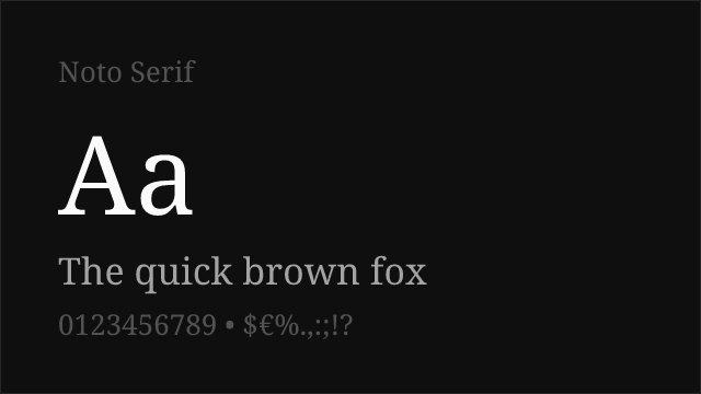
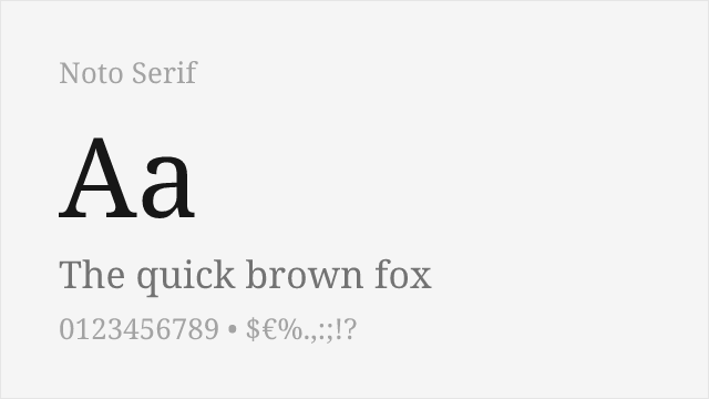
| Noto Serif | 0 | 72% | Variable | Yes | OFL-1.1 | Google Fonts ↗ |
All Alternatives (3)
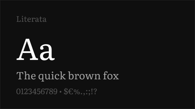
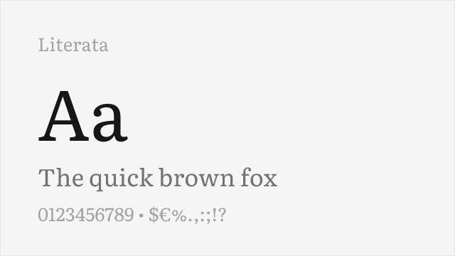
[Google Fonts] · OFL-1.1 · Variable
Screen-first reading serif with a variable 200-900 axis; the closest match in brief and build.
Why it matches: Literata was commissioned for Google Play Books and drawn under the same constraint Cambria was: hold up as body text on a screen, at small sizes, for hours. Both answer it the same way — sturdy slab-influenced serifs, low stroke contrast, a generous x-height and open counters that resist filling in. Literata is the more modern execution, with a genuine variable axis spanning 200-900 where Cambria offers two weights, and it reads slightly warmer on the page. If you are replacing Cambria in anything meant to be read at length, start here.
documentsacademicpublishingweb
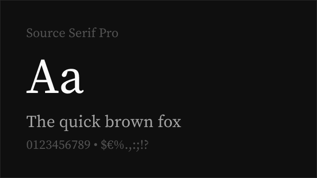
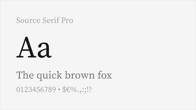
[Google Fonts] · OFL-1.1 · Variable
Adobe's open-source text serif, variable across 200-900.
Why it matches: Source Serif sits between Cambria's screen pragmatism and a more traditional book serif. Its contrast is a step higher and its serifs are finer, so it looks more literary on the page and slightly less robust at very small sizes. Where it wins decisively is range: a variable axis from 200 to 900 with matching italics, against Cambria's Regular and Bold. For reports and papers that need real typographic hierarchy, that difference matters more than the marginal legibility gap.
academicpublishingdocumentsprint
[Google Fonts] · OFL-1.1 · Variable
Google's workhorse serif with a variable 100-900 axis and enormous script coverage.
Why it matches: Noto Serif is the safe institutional choice — sturdy, unremarkable, and drawn to the same broad-coverage standard across every script Google supports. Structurally it is close to Cambria: low contrast, large x-height, serifs with enough weight to hold. Its real argument is multilingual work. If your documents run through Cyrillic, Greek or considerably further afield, Noto Serif keeps a consistent texture where most alternatives fall back to a mismatched face.
documentsacademiccorporateweb