Free Alternatives to Cambria with Low Contrast Style

7 alternatives | serif | Best match: Literata (86%)

Cambria is known for its low contrast aesthetic. If you're looking for a free serif font with a similar low contrast feel, these 7 alternatives offer comparable characteristics. All are available under open-source licenses for unrestricted commercial use.

Top Picks

Comparison Table

Font Relevance Similarity Weights Variable License Source
Literata 17 86% Variable Yes OFL-1.1 Google Fonts ↗
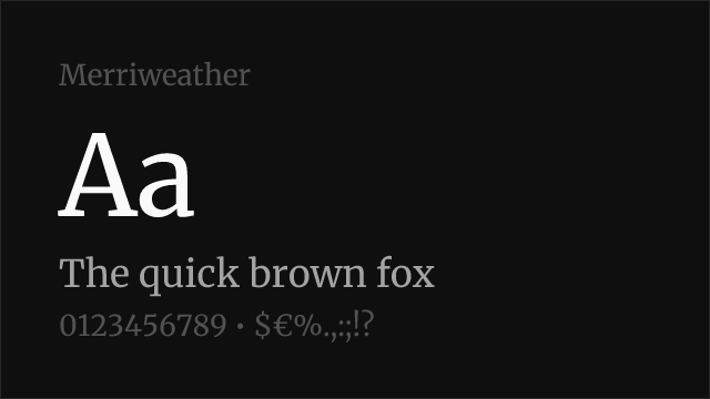
Merriweather 17 84% 4 No OFL-1.1 Google Fonts ↗
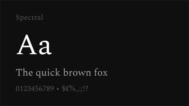
Spectral 16 80% 7 No OFL-1.1 Google Fonts ↗
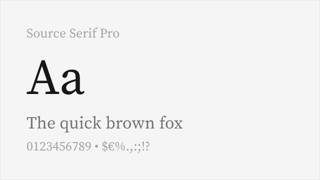
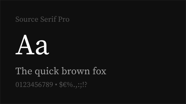
Source Serif Pro 15 76% Variable Yes OFL-1.1 Google Fonts ↗
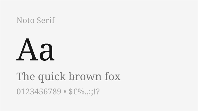
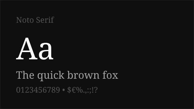
Noto Serif 14 72% Variable Yes OFL-1.1 Google Fonts ↗
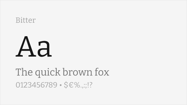
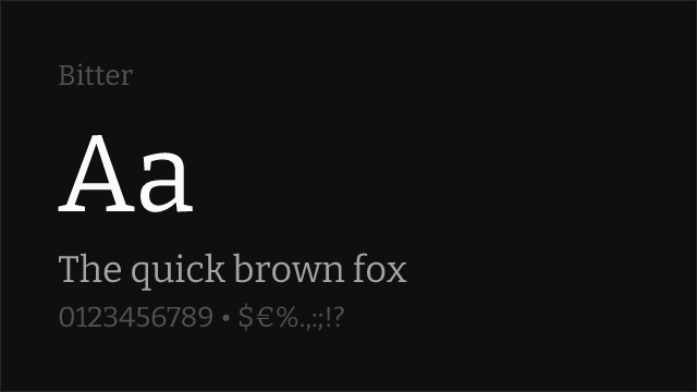
Bitter 14 68% Variable Yes OFL-1.1 Google Fonts ↗
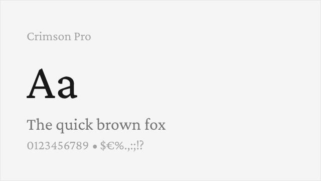
Crimson Pro 13 64% Variable Yes OFL-1.1 Google Fonts ↗

All Alternatives (7)

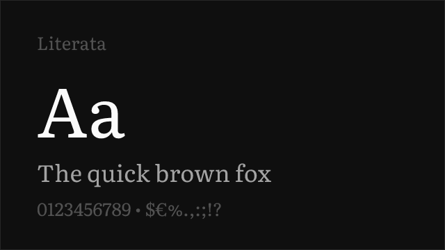
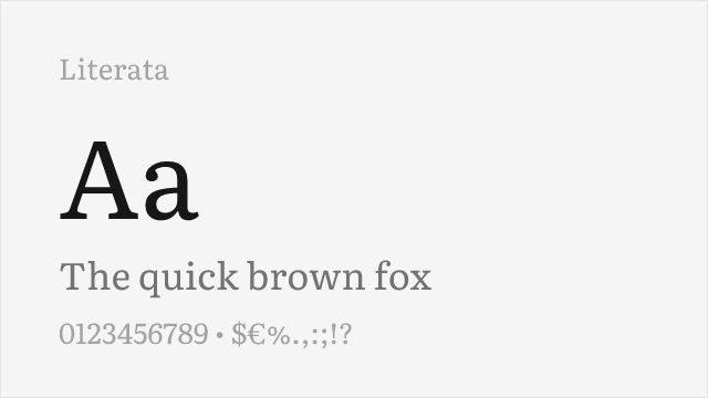
#1 Literata 86%
[Google Fonts] · OFL-1.1 · Variable

Screen-first reading serif with a variable 200-900 axis; the closest match in brief and build.
Why it matches: Literata was commissioned for Google Play Books and drawn under the same constraint Cambria was: hold up as body text on a screen, at small sizes, for hours. Both answer it the same way — sturdy slab-influenced serifs, low stroke contrast, a generous x-height and open counters that resist filling in. Literata is the more modern execution, with a genuine variable axis spanning 200-900 where Cambria offers two weights, and it reads slightly warmer on the page. If you are replacing Cambria in anything meant to be read at length, start here.
documentsacademicpublishingweb
Get Font ↗
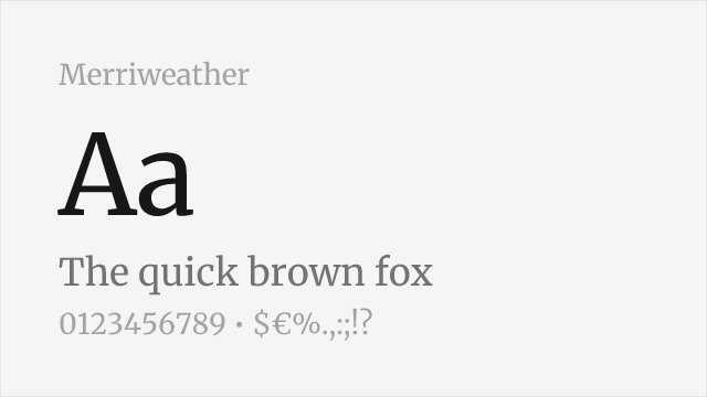
#2 Merriweather 84%
[Google Fonts] · OFL-1.1 · 4 weights

Large x-height and sturdy serifs; drawn explicitly for screen legibility.
Why it matches: Merriweather shares Cambria's core structural decisions: a very large x-height, low contrast, and serifs heavy enough to survive rasterisation without hinting heroics. It runs wider than Cambria, so expect text to take more horizontal room — a paragraph will occupy more lines at the same measure. In exchange you get letterforms that hold together at smaller sizes than almost any other free serif, which is exactly the property that made Cambria worth using in the first place.
documentswebacademicpublishing
Get Font ↗
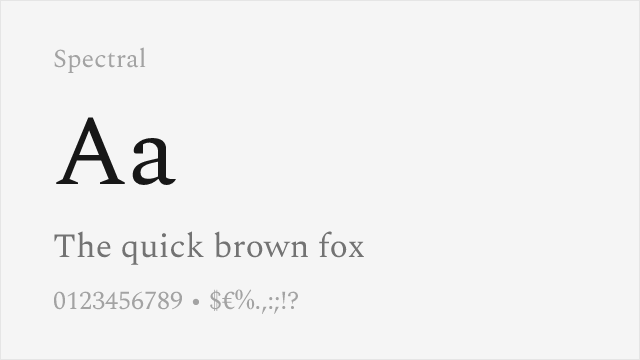
#3 Spectral 80%
[Google Fonts] · OFL-1.1 · 7 weights

Production Type's screen-reading serif; seven weights each with a true cursive italic.
Why it matches: Spectral was drawn for the browser and for Google Docs, which puts it in the same lineage of commissioned screen serifs as Cambria. It is the more refined drawing of the two — the serifs are cleanly bracketed rather than wedge-like, and the italic is a genuine cursive rather than a steepened roman. Seven weights give it far more hierarchy than Cambria's two. Choose it when the document is going on the web and you want it to look considered rather than merely functional.
publishingeditorialacademicdocuments
Get Font ↗
[Google Fonts] · OFL-1.1 · Variable

Adobe's open-source text serif, variable across 200-900.
Why it matches: Source Serif sits between Cambria's screen pragmatism and a more traditional book serif. Its contrast is a step higher and its serifs are finer, so it looks more literary on the page and slightly less robust at very small sizes. Where it wins decisively is range: a variable axis from 200 to 900 with matching italics, against Cambria's Regular and Bold. For reports and papers that need real typographic hierarchy, that difference matters more than the marginal legibility gap.
academicpublishingdocumentsprint
Get Font ↗
#5 Noto Serif 72%
[Google Fonts] · OFL-1.1 · Variable

Google's workhorse serif with a variable 100-900 axis and enormous script coverage.
Why it matches: Noto Serif is the safe institutional choice — sturdy, unremarkable, and drawn to the same broad-coverage standard across every script Google supports. Structurally it is close to Cambria: low contrast, large x-height, serifs with enough weight to hold. Its real argument is multilingual work. If your documents run through Cyrillic, Greek or considerably further afield, Noto Serif keeps a consistent texture where most alternatives fall back to a mismatched face.
documentsacademiccorporateweb
Get Font ↗
#6 Bitter 68%
[Google Fonts] · OFL-1.1 · Variable

Contemporary slab with a variable 100-900 axis, drawn for screens.

Why it matches: Bitter pushes Cambria's slab-influenced serifs further toward an actual slab. The serifs are squarer and more emphatic, and the overall colour on the page is darker, which suits interfaces and short-form text better than long reading. It is the right pick when you liked Cambria's solidity and want more of it — dashboards, data tables, documentation — rather than when you are reproducing a document.
documentationuiwebdocuments
Get Font ↗
#7 Crimson Pro 64%
[Google Fonts] · OFL-1.1 · Variable

Old-style book serif; warmer and more traditional than Cambria.

Why it matches: Crimson Pro is the option for when the Cambria in your template was a default rather than a decision. It is an old-style book face in the Garamond tradition — higher contrast, smaller x-height, more delicate serifs — and it will make a document look considerably more literary. It also gives up Cambria's headline strength: at small sizes on ordinary screens it is noticeably more fragile. Use it for print and long-form reading, not for interfaces.
printpublishingbooksacademic
Get Font ↗

Related Pages