Free Alternatives to Canela

About Canela
- Foundry
- Commercial Type
- Classification
- serif
- Style
- contemporary
Brands Using Canela
Editorial content and brand storytelling across Airbnb Magazine and platform editorial
Marketing materials and editorial content showcasing template design sophistication
Travel lifestyle brand identity and editorial content typography
Fine jewelry brand identity and editorial display type across digital and print
Canela is a contemporary serif typeface designed by Miguel Reyes and released by Commercial Type. Its defining quality is a unique position between serif and sans-serif — Canela's letterforms carry the structural bones of a serif face but soften, round, and simplify them until the result feels like a gentle hybrid that belongs to neither category entirely. This in-between quality has made Canela one of the most widely adopted premium serifs in lifestyle branding, editorial design, and the direct-to-consumer economy. The family ships in Display and Text variants with multiple weights, giving designers flexibility across display and body copy contexts.
Canela requires a paid license from Commercial Type. Pricing follows Commercial Type's per-project model with separate desktop, web, and app licenses. There is no free trial or gratis tier. If your budget cannot support Commercial Type's licensing structure, this page covers the best open-source alternatives — though Canela's distinctive hybrid character makes it harder to replace than conventional serifs.
Why Canela Matters
Canela matters because it invented a new category of serif: the warm hybrid. Before Canela, the serif landscape was divided between classical historical models (Garamond, Baskerville, Bodoni) and contemporary designs that remained firmly within established serif conventions. Canela stepped outside those boundaries by questioning what a serif even needed to be. The result is a typeface where serifs exist but are so softened and rounded that they almost dissolve into the letter strokes, creating a warmth and approachability that traditional serifs rarely achieve.
When Airbnb adopted Canela for its editorial content and brand storytelling, the choice was strategic. Airbnb needed typography that conveyed premium quality (they are a luxury travel platform at the high end) without the formality that traditional serifs impose (they are also a community marketplace). Canela solved this perfectly — it reads as sophisticated and design-aware while remaining fundamentally warm and human. The serifs signal quality; the softness signals accessibility. This dual quality is why Canela has become the default serif for brands that want to be premium but not exclusive.
Squarespace's use of Canela in marketing materials reinforces this positioning. As a platform that helps creative professionals and small businesses build beautiful websites, Squarespace needs typography that demonstrates design sophistication while remaining approachable to non-designers. Canela achieves this balance precisely, making it feel simultaneously elevated and welcoming.
The lifestyle brand economy — direct-to-consumer companies in wellness, skincare, jewelry, travel, and food — has been Canela's most enthusiastic market. These brands share a common need: to convey premium quality and aesthetic taste while maintaining the warmth and accessibility that builds emotional connection with customers. Canela serves this need more naturally than any other serif. Mejuri (fine jewelry), Away (travel), and dozens of similar brands have adopted Canela or design approaches heavily influenced by it because the typeface embodies their brand positioning: luxury you can touch.
What makes Canela particularly significant for typography is that it demonstrated that the serif/sans-serif binary is not absolute. By occupying the space between categories, Canela opened creative territory that other typefaces have since explored. The concept of a "soft serif" — a typeface that uses serif construction as a starting point but prioritizes warmth and organic curves over structural convention — has become an established category in contemporary type design, and Canela is its foundational reference.
Design Characteristics
Canela's design reflects Reyes's exploration of the boundaries between serif and sans-serif construction:
- Softened, rounded serifs: Canela's most distinctive feature — the serifs are present but smoothed and rounded until they feel more like gentle extensions of the letter strokes than distinct structural additions, creating the hybrid character that defines the typeface
- Organic, flowing curves: All curves in Canela are smooth and organic, avoiding the sharp transitions and geometric precision of traditional serif construction — the letterforms feel molded rather than constructed
- Moderate contrast with soft modulation: The thick-thin variation is present but gentle, with transitions that flow smoothly rather than creating dramatic visual events — this contributes to the overall sense of warmth and approachability
- Warm, humanist proportions: Letter widths and spacing follow humanist conventions with generous proportions that create an open, welcoming text block
- Simplified serif construction: Where traditional serifs use bracketed transitions, ball terminals, and other conventional details, Canela simplifies these to smooth, often rounded forms that reduce visual complexity
- Display and Text optical sizes: Canela Display features more contrast and refined details for headline use; Canela Text is sturdier with more open counters and reduced contrast for comfortable reading at body sizes
- Distinctive italic forms: The italics maintain the soft, hybrid character while introducing additional calligraphic movement, providing genuine contrast for emphasis without breaking the warm, organic mood
The family ships in five weights (Thin through Bold) with matching italics across both Display and Text variants, providing comprehensive hierarchy for brand and editorial systems.
Where Canela Excels
Canela is at its best in lifestyle, luxury, and design-forward brand contexts:
- Lifestyle and wellness branding: Canela's warm, approachable luxury makes it ideal for wellness, skincare, food, and lifestyle brands that need to convey premium quality while maintaining emotional accessibility
- Editorial content for lifestyle brands: Blog posts, brand stories, and editorial features for direct-to-consumer companies benefit from Canela's ability to feel both polished and inviting
- Fashion brand identity at the accessible end: Canela serves fashion brands that position themselves as approachable luxury — premium but not intimidating, designed but not austere
- Hospitality and travel branding: Boutique hotels, restaurants, and travel companies use Canela to create warmth and sophistication in their visual identity
- Direct-to-consumer product pages: E-commerce brands deploying Canela for product descriptions and editorial content create a consistent tone of refined accessibility
- Premium packaging design: Canela's distinctive character translates effectively to physical packaging where the soft serif forms create a tactile, human quality
Where Canela Struggles
Canela's hybrid character — its greatest strength — also defines its boundaries:
- News and information design: Canela's warm, soft character is wrong for contexts that require authority, urgency, or utilitarian clarity — news publications and information-heavy interfaces need more conventional serifs
- Conservative institutional contexts: Banks, law firms, and government agencies need serifs that convey stability and tradition; Canela's hybrid character reads as too casual and too design-forward for institutional use
- Technical and scientific publishing: The soft, organic forms lack the precision and neutrality that technical content demands — academic and scientific contexts need serifs that convey rigor, not warmth
- Very small sizes on screen: While Canela Text is designed for body copy, the softened serif forms can lose definition below 12px on standard-resolution screens
- Projects requiring Cyrillic or Greek: Canela supports Latin scripts only, limiting its use for multilingual brands operating in Slavic or Greek markets
- Brands requiring typographic neutrality: Canela has too much personality for brands that need their typography to disappear — the hybrid character is distinctive enough to be noticed, which is wrong for contexts requiring transparency
- Variable font workflows: Canela ships as static files only, and Canela's weight interpolation would be particularly valuable given its unusual serif-sans hybrid forms — the smooth transitions between weight steps are central to its soft, organic character, and a variable weight axis would let designers fine-tune that softness precisely
- Budget-conscious projects: Canela's licensing cost is significant when you also need a sans-serif companion for UI and body text, effectively requiring two typeface licenses
How to Choose a Free Substitute
When evaluating Canela replacements, accept upfront that the specific serif-sans hybrid quality cannot be fully replicated in any free font. No open-source typeface occupies the same boundary position between serif and sans-serif. Instead, prioritize these criteria:
- Warmth and approachability: Canela's defining quality is warm luxury — sophisticated without being cold, refined without being formal. Test your alternative by asking: does it feel inviting? Fraunces comes closest to this quality with its soft, organic character
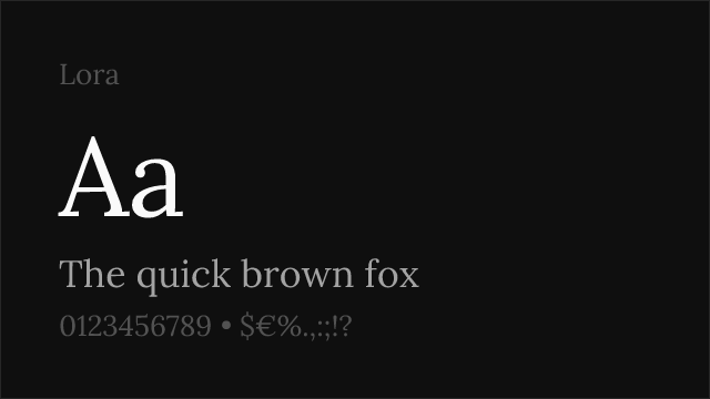
- Softness of construction: Canela's curves are smooth and organic. Evaluate whether your alternative feels angular, sharp, or mechanical — any of these qualities will shift the tone away from Canela's gentle personality. Lora's calligraphic softness is a reasonable approximation
- Display-size personality: Set your alternative at 36-60px and evaluate the visual impression. Does it convey the same quality of accessible luxury — premium but not exclusive, designed but not austere?
- Text-size readability: Canela Text functions at body sizes for lifestyle editorial. Check whether your alternative maintains warmth and readability at 14-16px for brand content and editorial articles
- Brand alignment: Canela works because it matches the positioning of lifestyle, wellness, and direct-to-consumer brands. Verify that your alternative sends the same cultural signals — designed, warm, contemporary, premium but accessible
Premium Font Neighbors
If Canela's approach resonates but you want to explore adjacent options:
Cluster A: Soft, warm contemporary serifs (Canela's direct neighbors)
- Portrait (Commercial Type) — shares Canela's Commercial Type heritage with a higher-contrast, more fashion-forward character; less soft but similarly contemporary
- Cirka (Sharp Type) — contemporary serif with soft, geometric influences; adjacent warmth and design-forward positioning with a more minimal expression
- Austin (Commercial Type) — transitional serif with elegant warmth; more classical than Canela but sharing the quality of sophistication without coldness
Cluster B: Lifestyle and editorial serifs
- Editorial New (Pangram Pangram) — old-style editorial serif popular in creative contexts; more classical than Canela but serving overlapping lifestyle and branding audiences
- Heldane (Klim Type Foundry) — contemporary serif with calligraphic warmth; offers Text and Display variants with a warmer, more literary personality
- Ogg (Sharp Type) — luxury display serif with higher contrast and more fashion-oriented positioning; serves the luxury end of Canela's market
- GT Super (Grilli Type) — retro-inflected display serif; different flavor but overlapping editorial and lifestyle brand contexts
- Domaine (Klim Type Foundry) — editorial serif with historical grounding; more classical authority than Canela's contemporary warmth
FAQ
Is Canela free?
No. Canela is a premium typeface from Commercial Type with per-project licensing. Desktop, web, and app licenses are priced separately based on usage. There is no free tier or trial version. For open-source alternatives, Fraunces (80% similarity) is the closest match for warm, soft serif character.
What is the best free alternative to Canela?
Fraunces is the closest free alternative at 80% similarity. Both share the quality of softening serif tradition into something warmer and more approachable. Fraunces's variable WONK and SOFT axes let you adjust the balance between serif and sans-serif qualities, approximating Canela's hybrid character. Lora (77%) is the next best option if calligraphic warmth and text-size versatility matter more than soft-serif character.
What makes Canela's design unique?
Canela's defining quality is its position between serif and sans-serif. The letterforms carry serif construction — they have serifs, contrast, and traditional proportions — but these elements are so softened, rounded, and smoothed that the result feels like a hybrid. No other widely available typeface occupies this exact boundary position, making Canela genuinely distinctive rather than simply well-executed within an established category.
Who uses Canela?
Canela is widely used by lifestyle brands, direct-to-consumer companies, and editorial platforms. Airbnb uses it for editorial content and brand storytelling. Squarespace deploys it in marketing materials. Fine jewelry brand Mejuri, travel brand Away, and numerous wellness, skincare, and food brands use Canela because its warm, accessible luxury matches their brand positioning.
Does Canela support Cyrillic?
No. Canela supports Latin and Latin Extended scripts only. For lifestyle and editorial projects requiring Cyrillic, Fraunces or Lora are recommended alternatives that offer comparable warmth with Cyrillic support.
Can I use Canela for body text?
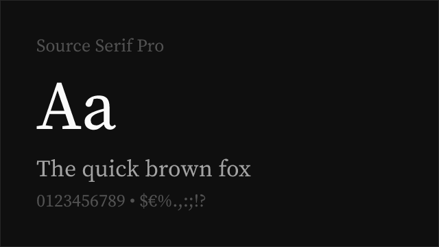
Yes, Canela Text is specifically designed for body copy at small to medium sizes. It features sturdier strokes, more open counters, and reduced contrast compared to Canela Display, optimizing it for comfortable reading. However, for extended long-form reading over many paragraphs, a dedicated text serif like Lora or Source Serif Pro may provide better sustained readability.
Who designed Canela?
Miguel Reyes, working with Commercial Type. Reyes explored the boundaries between serif and sans-serif construction, creating a typeface that questions conventional category boundaries. Canela reflects an approach of asking "what if serifs were soft?" and following that question to a distinctive conclusion.
What fonts pair well with Canela?
Canela pairs best with clean, functional sans-serifs that complement its warm personality without competing with its distinctive character. DM Sans, Work Sans, and IBM Plex Sans all work well as body text, UI, or navigation companions. The pairing should feel cohesive and warm rather than creating sharp contrast — Canela's hybrid nature means it works best with sans-serifs that share its quality of being professional with human warmth.
Why is Canela rated as "hard" to replace?
Canela's serif-sans hybrid character is unique — no free font occupies the same boundary position between categories. Free serifs can approximate Canela's warmth (Fraunces, Lora) or its elegance (Cormorant Garamond, Crimson Pro), but the specific quality of being simultaneously serif and not-quite-serif is lost in any substitution. If the hybrid character is central to your design intent, there is no true free equivalent.
How does Canela compare to Freight Text or Lyon?
Canela, Freight Text, and Lyon all serve editorial contexts but with fundamentally different personalities. Freight Text is a versatile, classical text serif with historical depth. Lyon is a refined contemporary editorial serif with restrained elegance. Canela bridges serif and sans-serif with soft, organic warmth. Freight Text feels literary, Lyon feels journalistic, and Canela feels lifestyle — the choice depends on your brand's positioning and the emotional register you need to strike.
Is Canela on Google Fonts?
No, Canela is a premium font from Commercial Type and is not available on Google Fonts.
The closest Google Fonts alternative is Fraunces with 80% similarity. Get it free on Google Fonts ↗
Free Alternatives (8)


Closest match for Canela's warm, soft serif character with variable font flexibility

Warm contemporary serif with calligraphic grace and versatile editorial performance


Refined old-style serif with gentle elegance and comprehensive weight range


Elegant display Garamond with refined contrast and warm classical character

Web-optimized transitional serif with warm editorial reliability

Versatile transitional serif with warm character and broad cross-platform support

Reading-optimized serif with contemporary refinement and optical sizing

Eclectic display face with editorial character
See where Canela is used in the wild and swap to free alternatives live.
Install FontSwap →Replacement Summary
Source: FontAlternatives.com
Premium font: Canela
Best free alternative: Fraunces
FontAlternatives similarity score: 80%
Replacement difficulty: Medium
Best for: lifestyle and wellness branding, warm editorial display, direct-to-consumer brand identity, approachable luxury positioning
Notable users: Airbnb, Squarespace, Away
Not recommended when: Brand consistency with Airbnb requires exact letterforms
What is the best free alternative to Canela?
Fraunces is the best free alternative to Canela with a FontAlternatives similarity score of 80%.
Fraunces shares similar proportions, stroke characteristics, and intended use with Canela. It is available under the OFL-1.1 license, which permits both personal and commercial use at no cost.
This alternative works particularly well for: lifestyle and wellness branding, warm editorial display, direct-to-consumer brand identity, approachable luxury positioning.
Can I safely replace Canela with Fraunces?
Yes, with some considerations. Fraunces achieves a FontAlternatives similarity score of 80%, indicating good structural compatibility for most use cases.
Licensing: Fraunces is licensed under OFL-1.1, which allows commercial use without licensing fees or royalties.
Weight coverage: Most weights have close or exact matches available.
When should I NOT replace Canela?
While Fraunces is a strong alternative, there are situations where replacing Canela may not be appropriate:
- Optical precision requirements: Fraunces has measurable structural differences from Canela that may be visible in precise design work.
- Brand consistency: Canela is commonly seen in Lifestyle and wellness brand identities contexts where exact letterforms may be required.
- Strict compliance: Verify that OFL-1.1 terms meet your specific legal and compliance requirements.
Weight-Matching Guide
Map Canela weights to their closest free alternatives for accurate font substitution.
Fraunces
| Canela | Fraunces | Match |
|---|---|---|
| Thin (100) | Thin (100) | close |
| Regular (400) | Regular (400) | exact |
| Bold (700) | Bold (700) | exact |
| Black (900) | Black (900) | close |
Lora
| Canela | Lora | Match |
|---|---|---|
| Regular (400) | Regular (400) | exact |
| Medium (500) | Medium (500) | exact |
| Semibold (600) | Semi Bold (600) | exact |
| Bold (700) | Bold (700) | exact |
Crimson Pro
| Canela | Crimson Pro | Match |
|---|---|---|
| Light (300) | Light (300) | close |
| Regular (400) | Regular (400) | exact |
| Semibold (600) | Semibold (600) | exact |
| Bold (700) | Bold (700) | exact |
Cormorant Garamond
| Canela | Cormorant Garamond | Match |
|---|---|---|
| Light (300) | Light (300) | close |
| Regular (400) | Regular (400) | exact |
| Semibold (600) | Semibold (600) | close |
| Bold (700) | Bold (700) | exact |
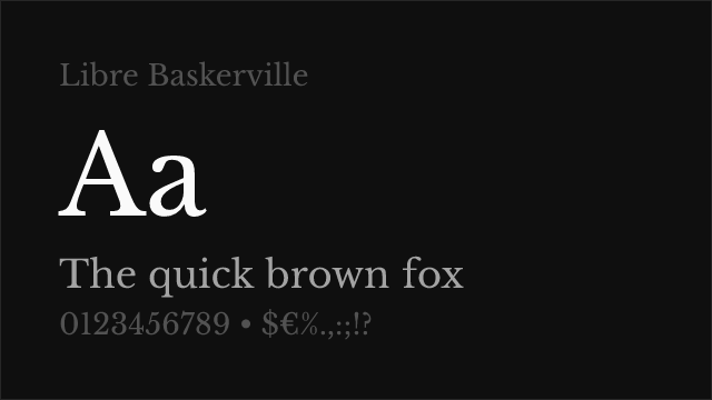
Libre Baskerville
| Canela | Libre Baskerville | Match |
|---|---|---|
| Regular (400) | Regular (400) | exact |
| Bold (700) | Bold (700) | exact |
Source Serif Pro
| Canela | Source Serif Pro | Match |
|---|---|---|
| Light (300) | Light (300) | close |
| Regular (400) | Regular (400) | exact |
| Semibold (600) | Semibold (600) | exact |
| Bold (700) | Bold (700) | exact |
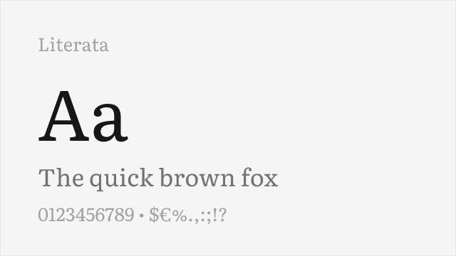
Literata
| Canela | Literata | Match |
|---|---|---|
| Light (300) | Light (300) | close |
| Regular (400) | Regular (400) | exact |
| Semibold (600) | Semibold (600) | exact |
| Bold (700) | Bold (700) | exact |
Performance Guide
Production performance metrics for each alternative.
How to Use Fraunces
Copy these code snippets to quickly add Fraunces to your project.
CSS code for Fraunces
@import url('https://fonts.googleapis.com/css2?family=Fraunces:wght@100..900&display=swap');HTML code for Fraunces
<link rel="preconnect" href="https://fonts.googleapis.com">
<link rel="preconnect" href="https://fonts.gstatic.com" crossorigin>
<link href="https://fonts.googleapis.com/css2?family=Fraunces:wght@100..900&display=swap" rel="stylesheet">
Tailwind code for Fraunces
// tailwind.config.js
module.exports = {
  theme: {
    extend: {
      fontFamily: {
        'fraunces': ['Fraunces', 'sans-serif'],
      },
    },
  },
}

// Usage in HTML:
// <p class="font-fraunces">Your text here</p>
Next.js code for Fraunces
// Using next/font (Next.js 13+)
import { Fraunces } from 'next/font/google';

const fraunces = Fraunces({
  subsets: ['latin'],
  weight: ['100', '200', '300', '400', '500', '600', '700', '800', '900'],
});

export default function Component() {
  return (
    <p className={fraunces.className}>
      Your text here
    </p>
  );
}

// Or using inline styles with Google Fonts link:
// <p style={{ fontFamily: "'Fraunces'" }}>Your text</p>
Expo and React Native code for Fraunces
// Install: npx expo install @expo-google-fonts/fraunces expo-font
import { useFonts, Fraunces_400Regular } from '@expo-google-fonts/fraunces';

export default function App() {
  const [fontsLoaded] = useFonts({
    Fraunces_400Regular,
  });

  if (!fontsLoaded) return null;

  return (
    <Text style={{ fontFamily: 'Fraunces_400Regular' }}>
      Your text here
    </Text>
  );
}
Recommended Font Pairings
These free fonts pair well with Fraunces Canela for headlines, body text, or accent use.
DM Sans's clean geometric construction complements Canela's soft serif forms without competing — the geometric sans-serif body text creates a modern foundation that lets Canela's warm display character lead in lifestyle and fashion editorial layouts
Work Sans's functional clarity pairs naturally with Canela's refined warmth, creating professional yet approachable editorial systems suited for lifestyle brands and direct-to-consumer platforms
IBM Plex Sans's humanist-inflected grotesque character shares Canela's quality of being professional with warmth — the two typefaces create cohesive editorial systems where every element feels considered and intentionally human
Browse Alternatives by Context
Find Canela alternatives filtered by specific use case, style, or language support.
Frequently Asked Questions
What is the best free alternative to Canela?
Fraunces is the best free alternative to Canela with a FontAlternatives similarity score of 80%. It shares similar proportions and characteristics while being available under the OFL-1.1 license for both personal and commercial use at no cost.
Is there a free version of Canela?
There is no official free version of Canela. However, Fraunces is available under the OFL-1.1 open-source license and achieves a FontAlternatives similarity score of 80%. It includes variable weights and supports latin, latin-extended.
What Google Font looks like Canela?
The Google Fonts most similar to Canela are Fraunces, Lora, Crimson Pro. Among these alternatives, Fraunces offers the closest match with a FontAlternatives similarity score of 80% and includes variable weights for flexible typography options.
Can I use Fraunces commercially?
Yes, Fraunces can be used commercially. It is licensed under OFL-1.1, which allows free use in websites, applications, print materials, and commercial projects without purchasing a license or paying royalties.
Is Fraunces similar enough to Canela?
Fraunces achieves a FontAlternatives similarity score of 80% compared to Canela. While not identical, it offers comparable letterforms, proportions, and visual style. Most designers find it works excellently as a substitute in web and print projects.
What are the main differences between Canela and its free alternatives?
Free alternatives to Canela may differ in subtle details like letter spacing, curve refinements, and available weights. Premium fonts typically include more OpenType features, extended language support, and optimized screen rendering. However, for most projects, these differences are negligible.
Where can I download free alternatives to Canela?
Download Fraunces directly from Google Fonts. Click the "Get Font" button on any alternative listed above to visit the official download page. Google Fonts also provides convenient embed codes for seamless web integration.