Free Alternatives to Consolas

About Consolas
- Foundry
- Microsoft
- Classification
- mono
- Style
- monospace
Brands Using Consolas
Default code editor font for Microsoft's IDE
Default monospaced system font since Windows Vista
Earlier default code rendering font
Consolas is a monospace typeface designed by Lucas de Groot for Microsoft, released in 2004 with Windows Vista. It was specifically designed to take advantage of Microsoft's ClearType font rendering technology, making it one of the first fonts optimized for subpixel rendering on LCD displays. For Windows developers, Consolas has been the default coding experience for nearly two decades.
History and Design
Lucas de Groot created Consolas as part of Microsoft's ClearType Font Collection, alongside Calibri, Cambria, and other fonts designed to showcase subpixel rendering. The name comes from the word "console," reflecting its intended use in programming environments and command-line interfaces.
Consolas broke from traditional monospace design by using curved strokes instead of straight lines, creating a warmer, more humanist appearance while maintaining the fixed-width constraint essential for code alignment. Where older monospace fonts like Courier New featured rigid, typewriter-derived letterforms, Consolas brought the kind of refinement usually reserved for proportional fonts to the monospace world.
The ClearType optimization was groundbreaking for its time. De Groot designed each glyph to render optimally using subpixel antialiasing, which distributes color across the RGB subpixels of LCD displays to create the illusion of higher resolution. This made Consolas significantly clearer than previous system monospace fonts, especially at the small sizes common in code editors.
Microsoft bundled Consolas with Windows Vista and Visual Studio, ensuring widespread availability among developers. It quickly became the standard, replacing Courier New as the default monospace font across Microsoft's development tools.
Why Consolas is Popular
Consolas became the default programming font in Visual Studio and has been a favorite among Windows developers for nearly two decades. Key features include:
- ClearType optimization: Exceptional rendering on LCD displays at small sizes
- Humanist touches: Curved strokes add warmth to the monospace grid
- Excellent differentiation: Clear distinction between similar characters (0/O, 1/l/I)
- Italic variant: True italic design, not sloped roman—important for syntax highlighting
- Multiple weights: Regular and Bold provide sufficient hierarchy for most code contexts
The humanist design philosophy makes Consolas more comfortable for extended coding sessions than mechanical-looking alternatives. Developers often report less eye fatigue compared to rigid typewriter-style fonts.
Use Cases
Consolas excels in:
- Visual Studio: Default font for Microsoft's IDE
- Windows Terminal: Clear rendering for command-line work
- Code documentation: Technical writing and examples
- Cross-platform development: Familiar to Windows developers working on other platforms
Finding Free Alternatives
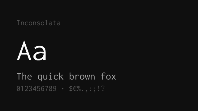
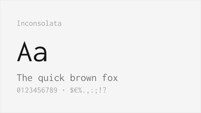
Inconsolata was created by Raph Levien specifically as a free alternative to Consolas, sharing its humanist approach to monospace design. Released in 2006, it was one of the first high-quality free coding fonts available and remains a popular choice. The variable font version offers weight flexibility from ExtraLight to Black that Consolas's limited Regular/Bold cannot match.
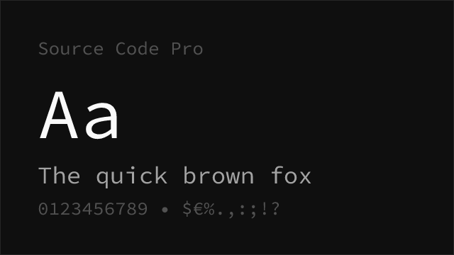
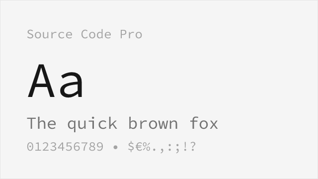
Source Code Pro from Adobe offers another excellent option with similar proportions and readability. Its true italics and integration with the Source family make it ideal for enterprise environments requiring consistent typography across prose and code. The extensive weight range and professional quality assurance justify its popularity in corporate settings.
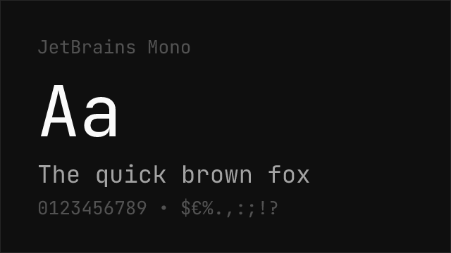
JetBrains Mono provides a modern alternative with programming ligatures that Consolas lacks. While the aesthetic differs slightly, it offers similar readability with enhanced functionality for developers who appreciate ligature-transformed operators. For those seeking the best of both worlds—Consolas-like clarity with modern features—JetBrains Mono is compelling.
FAQ
What is the best free alternative to Consolas?
Inconsolata is the best free alternative to Consolas, designed explicitly to provide a similar aesthetic and reading experience. Created by Raph Levien, it shares Consolas's humanist approach with curved strokes while being available under an open-source license for use in any project.
Can I use Consolas on Mac or Linux?
Consolas is bundled with Microsoft Office and Windows, so if you have Office installed, you may have access to it. However, the license restricts redistribution, so for cross-platform projects, Inconsolata or Source Code Pro are better choices as they're freely available everywhere.
Does Consolas support programming ligatures?
Consolas does not include programming ligatures in its standard version. For ligature support, consider Fira Code or JetBrains Mono, which provide extensive ligatures while maintaining similar readability. These fonts can be used as drop-in replacements with added functionality.
How does Consolas compare to Courier New?
Consolas is significantly more readable than Courier New, especially on modern displays. Its ClearType optimization, curved strokes, and better proportions make code easier to read for extended periods. Courier New's typewriter-based design feels dated by comparison.
Where can I download a free font similar to Consolas?
Inconsolata is available on Google Fonts at fonts.google.com/specimen/Inconsolata. Source Code Pro is also on Google Fonts at fonts.google.com/specimen/Source+Code+Pro. Both are licensed under OFL-1.1, making them free for personal and commercial use.
Is Consolas on Google Fonts?
No, Consolas is a premium font from Microsoft and is not available on Google Fonts.
The closest Google Fonts alternative is Inconsolata with 90% similarity. Get it free on Google Fonts ↗
Free Alternatives (5)
Designed specifically as a free Consolas alternative with similar proportions
Adobe's excellent monospace with comparable readability

Modern coding font with excellent legibility and programming ligatures
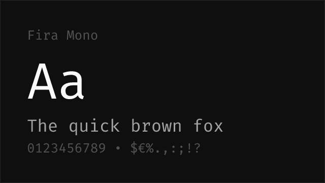

Mozilla's clean monospace with similar neutral character

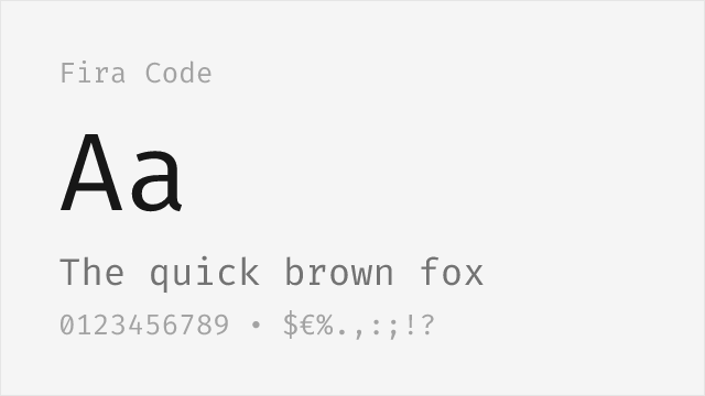
Fira Mono with programming ligatures for enhanced code readability
Replacement Summary
Source: FontAlternatives.com
Premium font: Consolas
Best free alternative: Inconsolata
FontAlternatives similarity score: 90%
Replacement difficulty: Low
Best for: code editors, web applications, documentation, cross-platform projects
Notable users: Visual Studio, Microsoft Windows, GitHub
Not recommended when: Brand consistency with Visual Studio requires exact letterforms
What is the best free alternative to Consolas?
Inconsolata is the best free alternative to Consolas with a FontAlternatives similarity score of 90%.
Inconsolata shares similar proportions, stroke characteristics, and intended use with Consolas. It is available under the OFL-1.1 license, which permits both personal and commercial use at no cost.
This alternative works particularly well for: code editors, web applications, documentation, cross-platform projects.
Can I safely replace Consolas with Inconsolata?
Yes, Inconsolata is a high-confidence replacement for Consolas. The FontAlternatives similarity score of 90% indicates strong structural compatibility.
Licensing: Inconsolata is licensed under OFL-1.1, which allows commercial use without licensing fees or royalties.
Weight coverage: All 2 weights have exact matches available.
When should I NOT replace Consolas?
While Inconsolata is a strong alternative, there are situations where replacing Consolas may not be appropriate:
- Extended language support: Inconsolata has limited cyrillic support compared to Consolas.
- Brand consistency: Consolas is commonly seen in Visual Studio contexts where exact letterforms may be required.
- Strict compliance: Verify that OFL-1.1 terms meet your specific legal and compliance requirements.
Weight-Matching Guide
Map Consolas weights to their closest free alternatives for accurate font substitution.
Inconsolata
| Consolas | Inconsolata | Match |
|---|---|---|
| Regular | Regular (400) | exact |
| Bold | Bold (700) | exact |
Performance Guide
Production performance metrics for each alternative.
How to Use Inconsolata
Copy these code snippets to quickly add Inconsolata to your project.
CSS code for Inconsolata
@import url('https://fonts.googleapis.com/css2?family=Inconsolata:wght@100..900&display=swap');HTML code for Inconsolata
<link rel="preconnect" href="https://fonts.googleapis.com">
<link rel="preconnect" href="https://fonts.gstatic.com" crossorigin>
<link href="https://fonts.googleapis.com/css2?family=Inconsolata:wght@100..900&display=swap" rel="stylesheet">
Tailwind code for Inconsolata
// tailwind.config.js
module.exports = {
  theme: {
    extend: {
      fontFamily: {
        'inconsolata': ['Inconsolata', 'sans-serif'],
      },
    },
  },
}

// Usage in HTML:
// <p class="font-inconsolata">Your text here</p>
Next.js code for Inconsolata
// Using next/font (Next.js 13+)
import { Inconsolata } from 'next/font/google';

const inconsolata = Inconsolata({
  subsets: ['latin'],
  weight: ['100', '200', '300', '400', '500', '600', '700', '800', '900'],
});

export default function Component() {
  return (
    <p className={inconsolata.className}>
      Your text here
    </p>
  );
}

// Or using inline styles with Google Fonts link:
// <p style={{ fontFamily: "'Inconsolata'" }}>Your text</p>
Expo and React Native code for Inconsolata
// Install: npx expo install @expo-google-fonts/inconsolata expo-font
import { useFonts, Inconsolata_400Regular } from '@expo-google-fonts/inconsolata';

export default function App() {
  const [fontsLoaded] = useFonts({
    Inconsolata_400Regular,
  });

  if (!fontsLoaded) return null;

  return (
    <Text style={{ fontFamily: 'Inconsolata_400Regular' }}>
      Your text here
    </Text>
  );
}
Browse Alternatives by Context
Find Consolas alternatives filtered by specific use case, style, or language support.
By Use Case
By Style
Frequently Asked Questions
What is the best free alternative to Consolas?
Inconsolata is the best free alternative to Consolas with a FontAlternatives similarity score of 90%. It shares similar proportions and characteristics while being available under the OFL-1.1 license for both personal and commercial use at no cost.
Is there a free version of Consolas?
There is no official free version of Consolas. However, Inconsolata is available under the OFL-1.1 open-source license and achieves a FontAlternatives similarity score of 90%. It includes variable weights and supports latin, latin-extended.
What Google Font looks like Consolas?
The Google Fonts most similar to Consolas are Inconsolata, Source Code Pro, JetBrains Mono. Among these alternatives, Inconsolata offers the closest match with a FontAlternatives similarity score of 90% and includes variable weights for flexible typography options.
Can I use Inconsolata commercially?
Yes, Inconsolata can be used commercially. It is licensed under OFL-1.1, which allows free use in websites, applications, print materials, and commercial projects without purchasing a license or paying royalties.
Is Inconsolata similar enough to Consolas?
Inconsolata achieves a FontAlternatives similarity score of 90% compared to Consolas. While not identical, it offers comparable letterforms, proportions, and visual style. Most designers find it works excellently as a substitute in web and print projects.
What are the main differences between Consolas and its free alternatives?
Free alternatives to Consolas may differ in subtle details like letter spacing, curve refinements, and available weights. Premium fonts typically include more OpenType features, extended language support, and optimized screen rendering. However, for most projects, these differences are negligible.
Where can I download free alternatives to Consolas?
Download Inconsolata directly from Google Fonts. Click the "Get Font" button on any alternative listed above to visit the official download page. Google Fonts also provides convenient embed codes for seamless web integration.