 Install FontSwap
Free Alternatives to Cooper Black with Retro Style
Cooper Black is known for its retro aesthetic. If you're looking for a free display font with a similar retro feel, these 6 alternatives offer comparable characteristics. We've identified 6 that are especially well-suited for this context. All are available under open-source licenses for unrestricted commercial use.
Top Picks
Comparison Table
| Font | Relevance ⓘ
How well this alternative fits the specific context (use-case or trait) of this page. Score 0–100 based on matching keywords, industries, and font characteristics. Alternatives scoring 25+ are highlighted.
| Similarity ⓘ
How visually similar this free font is to the premium original. Score 0–100 based on x-height, width, stroke contrast, use-case overlap, and language coverage.
Learn more → | Weights | Variable | License | Source |
|---|---|---|---|---|---|---|
| Aladin | 46 | 55% | 1 | No | OFL-1.1 | Google Fonts ↗ |
| Fraunces | 36 | 78% | Variable | Yes | OFL-1.1 | Google Fonts ↗ |
| Arvo | 34 | 68% | 2 | No | OFL-1.1 | Google Fonts ↗ |
| Roboto Slab | 33 | 64% | Variable | Yes | Apache-2.0 | Google Fonts ↗ |
| Bitter | 32 | 60% | Variable | Yes | OFL-1.1 | Google Fonts ↗ |
| Frijole | 30 | 50% | 1 | No | OFL-1.1 | Google Fonts ↗ |
All Alternatives (6)
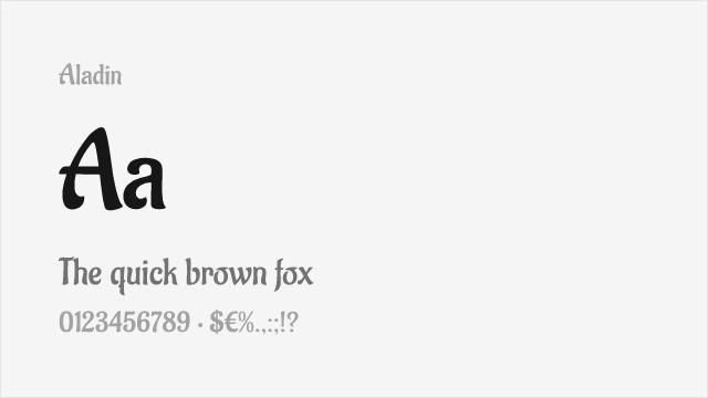
[Google Fonts] · OFL-1.1 · 1 weights
Calligraphic display with warm, approachable character for packaging and posters
Why it matches: Aladin is a rounded, brush-influenced display face that shares Cooper Black's warm, friendly personality even though it is far lighter. It is not a weight match, but for playful packaging and poster work that wants Cooper Black's approachable charm at a more delicate scale, it captures the spirit.
packagingposterscasual brandinginvitations
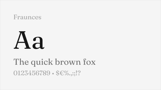
[Google Fonts] · OFL-1.1 · Variable
Modern variable display serif with optical sizes and soft, friendly character
Why it matches: Fraunces captures Cooper Black's soft, friendly display character through deliberate quirkiness and warm letterforms. Both feature rounded, approachable aesthetics that stand apart from typical display serifs. Fraunces' variable font axes (weight and "WONK") provide control over personality that fixed Cooper Black cannot offer.
brand identityeditorial headlinespackaging designweb display
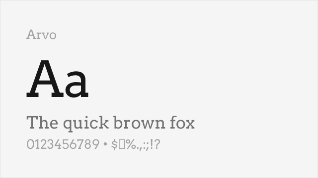
[Google Fonts] · OFL-1.1 · 2 weights
Friendly slab serif with warm character, good for softer display needs
Why it matches: Arvo shares Cooper Black's friendly warmth through ball terminals and rounded details, though at lighter weights. Both typefaces convey approachability unusual for their serif categories. For projects needing Cooper Black's personality at smaller sizes or lighter weights, Arvo provides a more versatile solution.
lifestyle brandingfood packaginghospitalityeditorial headlines
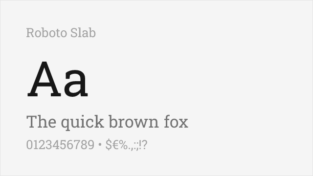
[Google Fonts] · Apache-2.0 · Variable
Variable slab serif whose heaviest weights approach Cooper Black's heft
Why it matches: Roboto Slab is a clean, modern slab serif, and in its Black weight it gets close to Cooper Black's density while staying far more legible at text sizes. It trades Cooper Black's rounded, vintage warmth for squared, contemporary slabs, so it is a match of weight and presence rather than personality — but for a heavy, friendly serif with a full variable range, it is one of the most useful free options.
editorial headlinespackagingbrandingweb display
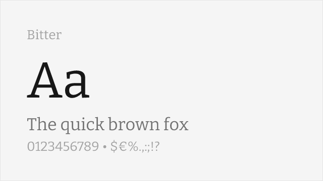
[Google Fonts] · OFL-1.1 · Variable
Contemporary slab serif with a warm feel and heavy weights available
Why it matches: Bitter is a slab serif drawn for comfortable screen reading, with a touch of warmth in its curves that echoes Cooper Black's friendliness. Its heavier weights bring real presence to headlines, and its full variable range makes it usable for body text too, so it can carry a whole layout where Cooper Black could only ever shout the title.
editorial and webheadlines with body textbrandinglong-form display
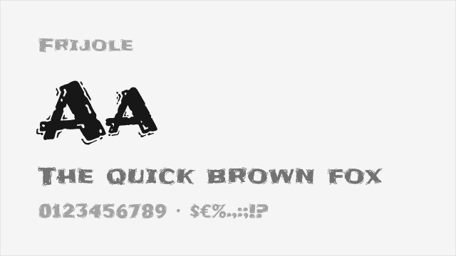
[Google Fonts] · OFL-1.1 · 1 weights
Bold textured display with playful energy for casual branding
Why it matches: Frijole is a chunky, textured display face with a retro, casual energy in the same family of warm, characterful display type Cooper Black belongs to. It is a novelty rather than a workhorse, but for vintage-flavored, playful branding it offers a distinctive free alternative with real personality.
casual brandingretro packagingpostersnovelty headlines