Free Alternatives to Druk for Sports
Looking for a free display font for sports projects? Druk by Commercial Type is a popular choice, but its licensing cost can be prohibitive. We've curated 8 free alternatives that work well in sports contexts. We've identified 4 that are especially well-suited for this context. Each alternative is scored by visual similarity and contextual relevance, and ships under an open-source license for both personal and commercial use.
Top Picks
Comparison Table
| Font | Relevance ⓘ
How well this alternative fits the specific context (use-case or trait) of this page. Score 0–100 based on matching keywords, industries, and font characteristics. Alternatives scoring 25+ are highlighted.
| Similarity ⓘ
How visually similar this free font is to the premium original. Score 0–100 based on x-height, width, stroke contrast, use-case overlap, and language coverage.
Learn more → | Weights | Variable | License | Source |
|---|---|---|---|---|---|---|
| Bebas Neue | 33 | 85% | 1 | No | OFL-1.1 | Google Fonts ↗ |
| Oswald | 32 | 82% | Variable | Yes | OFL-1.1 | Google Fonts ↗ |
| Fjalla One | 32 | 78% | 1 | No | OFL-1.1 | Google Fonts ↗ |
| Anton | 32 | 75% | 1 | No | OFL-1.1 | Google Fonts ↗ |
| Barlow | 15 | 70% | 9 | No | OFL-1.1 | Google Fonts ↗ |
| Montserrat | 15 | 65% | Variable | Yes | OFL-1.1 | Google Fonts ↗ |
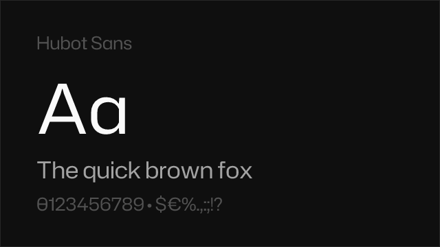
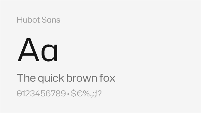
| Hubot Sans | 14 | 60% | Variable | Yes | OFL-1.1 | github ↗ |
| Raleway | 7 | 68% | Variable | Yes | OFL-1.1 | Google Fonts ↗ |
Most Relevant (4)
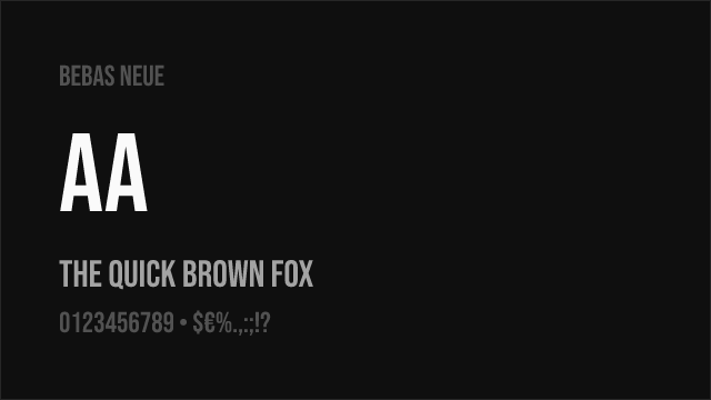

Closest condensed display match with clean geometric construction
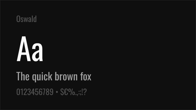

Versatile condensed gothic with variable font support and multiple weights
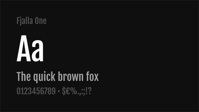

Bold condensed display with strong vertical presence
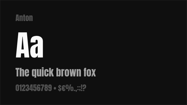
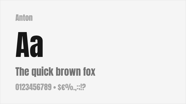
Ultra-condensed heavy display with maximum visual impact
Other Alternatives (4)


Industrial grotesque with condensed variants — different DNA but practical overlap


Geometric sans with strong display capabilities — a general-purpose alternative

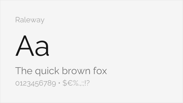
Elegant geometric sans with distinctive character — different personality but usable for display