Free Alternatives to Fette Fraktur

About Fette Fraktur
- Foundry
- Linotype
- Classification
- display
- Style
- blackletter
Fette Fraktur is among the most recognizable blackletter typefaces in the world. Originally designed by Johann Christian Bauer in 1850 for the Bauer Type Foundry in Frankfurt, it later became part of the Linotype library. The name translates to "Bold Fraktur," accurately describing its heavy, commanding weight that has made it a staple of display typography for over 170 years.
History and Design
Fette Fraktur emerged during a period when German printing was dominated by blackletter styles. Bauer designed it as a bold display companion to lighter Fraktur text faces, intended for headlines, title pages, and posters where maximum visual impact was required. The design features the characteristic angular, fractured strokes of the Fraktur tradition — broken curves that create the distinctive jagged rhythm unique to this script category.
The letterforms combine thick, heavy main strokes with fine hairlines, producing dramatic contrast that commands attention at large sizes. The uppercase letters feature elaborate swashed terminals and decorative elements typical of 19th-century German display typography. The lowercase retains the essential Fraktur construction: angular arches, diamond-shaped terminals, and the distinctive long-s form that defines the script's visual identity.
Cultural Impact
Fette Fraktur transcends its origins as a German display face. In contemporary design, it appears in contexts ranging from newspaper mastheads to hip-hop album covers, craft beer labels to tattoo lettering. The typeface's bold weight and instantly recognizable silhouette make it effective whenever heritage, authority, or cultural identity needs typographic expression. Its adoption by diverse subcultures — from metal music to Chicano lettering traditions — demonstrates blackletter's capacity to carry meaning across cultural boundaries.
Technical Characteristics
- Heavy stroke weight: Maximum visual impact at display sizes
- Dramatic thick-thin contrast: Traditional Fraktur stroke modulation
- Elaborate uppercase: Decorative capitals with swashed terminals
- Angular construction: Broken curves characteristic of Fraktur tradition
- Display-only design: Optimized for large sizes, not intended for body text
Use Cases
Fette Fraktur works effectively for:
- Heritage branding: Craft breweries, artisanal products, traditional businesses
- Editorial display: Newspaper mastheads, magazine feature headlines
- Event promotion: Concert posters, festival branding, cultural events
- Packaging design: Premium spirits, specialty foods, luxury goods
- Decorative accents: Drop caps, monograms, logotype elements
Finding Free Alternatives
UnifrakturMaguntia provides the closest free match, reproducing authentic Fraktur construction with traditional German blackletter forms. Metal Mania captures the heavy weight and display impact of Fette Fraktur, making it suitable for bold headline applications. For a lighter interpretation of the Fraktur tradition, UnifrakturCook offers a more restrained alternative while maintaining the essential angular letterforms.
Is Fette Fraktur on Google Fonts?
No, Fette Fraktur is a premium font from Linotype and is not available on Google Fonts.
The closest Google Fonts alternative is UnifrakturMaguntia with 82% similarity. Get it free on Google Fonts ↗
Free Alternatives (10)
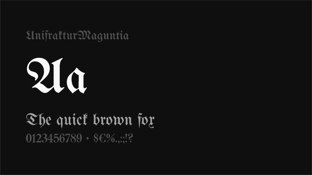
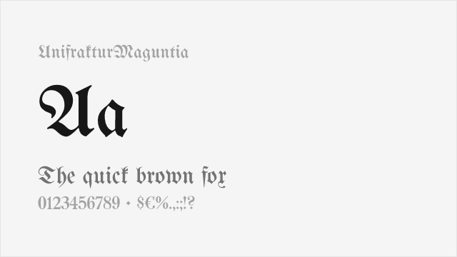
Closest free Fraktur with authentic traditional letterforms
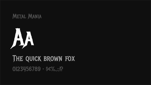
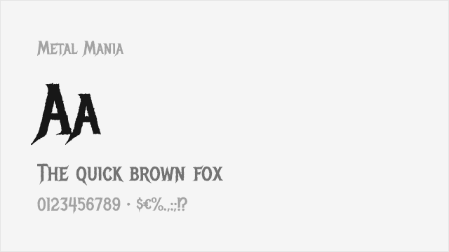
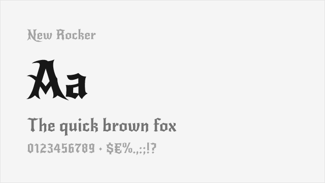
Heavy blackletter capturing Fette Fraktur's bold weight
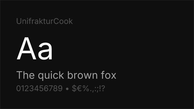
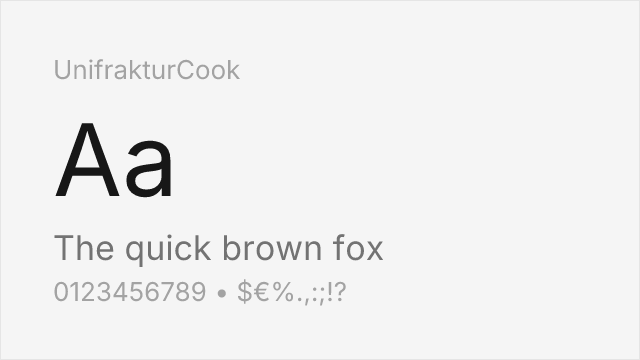
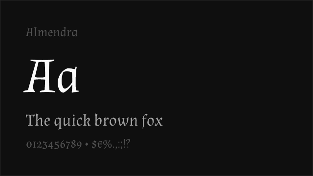
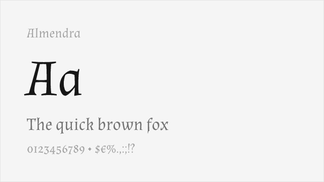
Lighter Fraktur variant with related construction
Decorative blackletter with similar display impact

Modern blackletter interpretation with bold presence


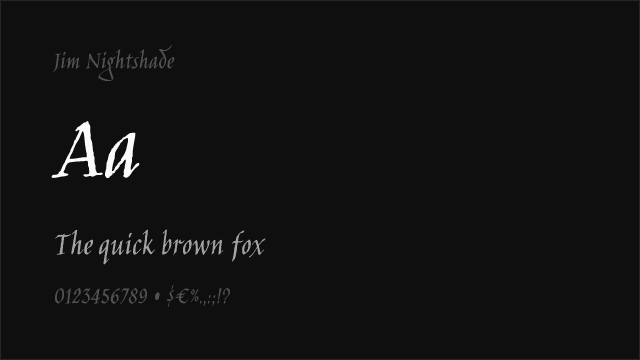
Calligraphic gothic influence with display character
Gothic brush style with expressive weight
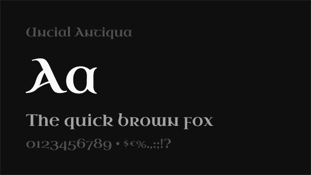
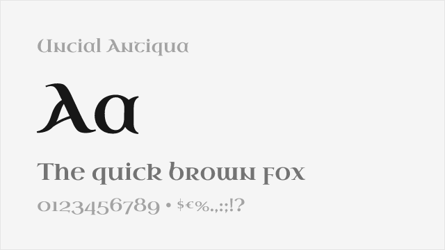
Historical uncial style related to blackletter tradition
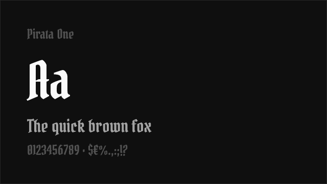
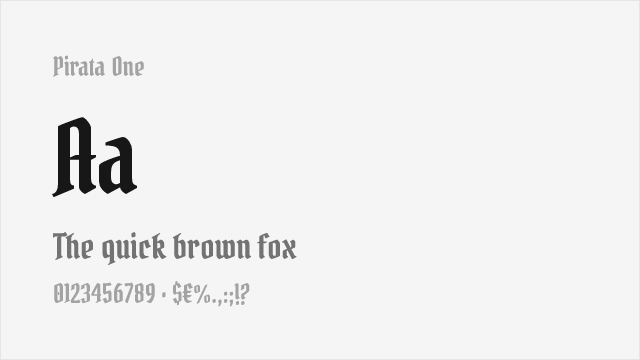
Ornamental display with gothic decorative elements
See where Fette Fraktur is used in the wild and swap to free alternatives live.
Install FontSwap →Performance Guide
Production performance metrics for each alternative.
How to Use UnifrakturMaguntia
Copy these code snippets to quickly add UnifrakturMaguntia to your project.
CSS code for UnifrakturMaguntia
@import url('https://fonts.googleapis.com/css2?family=UnifrakturMaguntia:wght@400&display=swap');HTML code for UnifrakturMaguntia
<link rel="preconnect" href="https://fonts.googleapis.com">
<link rel="preconnect" href="https://fonts.gstatic.com" crossorigin>
<link href="https://fonts.googleapis.com/css2?family=UnifrakturMaguntia:wght@400&display=swap" rel="stylesheet">
Tailwind code for UnifrakturMaguntia
// tailwind.config.js
module.exports = {
  theme: {
    extend: {
      fontFamily: {
        'unifrakturmaguntia': ['UnifrakturMaguntia', 'sans-serif'],
      },
    },
  },
}

// Usage in HTML:
// <p class="font-unifrakturmaguntia">Your text here</p>
Next.js code for UnifrakturMaguntia
// Using next/font (Next.js 13+)
import { UnifrakturMaguntia } from 'next/font/google';

const unifraktur_maguntia = UnifrakturMaguntia({
  subsets: ['latin'],
  weight: ['400'],
});

export default function Component() {
  return (
    <p className={unifraktur_maguntia.className}>
      Your text here
    </p>
  );
}

// Or using inline styles with Google Fonts link:
// <p style={{ fontFamily: "'UnifrakturMaguntia'" }}>Your text</p>
Expo and React Native code for UnifrakturMaguntia
// Install: npx expo install @expo-google-fonts/unifraktur-maguntia expo-font
import { useFonts, UnifrakturMaguntia_400Regular } from '@expo-google-fonts/unifraktur-maguntia';

export default function App() {
  const [fontsLoaded] = useFonts({
    UnifrakturMaguntia_400Regular,
  });

  if (!fontsLoaded) return null;

  return (
    <Text style={{ fontFamily: 'UnifrakturMaguntia_400Regular' }}>
      Your text here
    </Text>
  );
}
Recommended Font Pairings
These free fonts pair well with UnifrakturMaguntia Fette Fraktur for headlines, body text, or accent use.
Browse Alternatives by Context
Find Fette Fraktur alternatives filtered by specific use case, style, or language support.
By Style
By Script
Frequently Asked Questions
What is the best free alternative to Fette Fraktur?
UnifrakturMaguntia is the best free alternative to Fette Fraktur with a FontAlternatives similarity score of 82%. It shares similar proportions and characteristics while being available under the GPL-2.0 license for both personal and commercial use at no cost.
Is there a free version of Fette Fraktur?
There is no official free version of Fette Fraktur. However, UnifrakturMaguntia is available under the GPL-2.0 open-source license and achieves a FontAlternatives similarity score of 82%. It includes 1 weights and supports latin, latin-extended.
What Google Font looks like Fette Fraktur?
The Google Fonts most similar to Fette Fraktur are UnifrakturMaguntia, Metal Mania, UnifrakturCook. Among these alternatives, UnifrakturMaguntia offers the closest match with a FontAlternatives similarity score of 82% and includes 1 weights for design flexibility.
Can I use UnifrakturMaguntia commercially?
Yes, UnifrakturMaguntia can be used commercially. It is licensed under GPL-2.0, which allows free use in websites, applications, print materials, and commercial projects without purchasing a license or paying royalties.
Is UnifrakturMaguntia similar enough to Fette Fraktur?
UnifrakturMaguntia achieves a FontAlternatives similarity score of 82% compared to Fette Fraktur. While not identical, it offers comparable letterforms, proportions, and visual style. Most designers find it works excellently as a substitute in web and print projects.
What are the main differences between Fette Fraktur and its free alternatives?
Free alternatives to Fette Fraktur may differ in subtle details like letter spacing, curve refinements, and available weights. Premium fonts typically include more OpenType features, extended language support, and optimized screen rendering. However, for most projects, these differences are negligible.
Where can I download free alternatives to Fette Fraktur?
Download UnifrakturMaguntia directly from Google Fonts. Click the "Get Font" button on any alternative listed above to visit the official download page. Google Fonts also provides convenient embed codes for seamless web integration.