Free Alternatives to Bank Gothic

About Bank Gothic
- Foundry
- Bitstream
- Classification
- display
- Style
- geometric
Brands Using Bank Gothic
Franchise title and UI typography (documented from Call of Duty 4 onward)
Interface and branding type in the series
Game interface typography
Film title and promotional typography
An early, defining Bank Gothic use in cinema (1997)
 See Bank Gothic live on these sites with FontSwap →
Bank Gothic is one of those typefaces you have seen a thousand times without knowing its name. Its square, all-capital letters are the visual shorthand for "future," "military," and "serious technology" — the font on the game box, the movie poster, the tactical gear. Designed by Morris Fuller Benton in the 1930s, it has spent the last few decades as the default sound of science fiction.
History and Design
Morris Fuller Benton was the most prolific American type designer of his era — the man behind Franklin Gothic, News Gothic, and dozens of other staples — and he drew Bank Gothic for American Type Founders around 1930, during the Art Deco vogue for geometric precision. The name points to its origin: a sober, authoritative face suitable for banking documents, certificates, and official stationery, where its even, engineered capitals conveyed permanence and trust.
The defining feature is the square. Where most typefaces build round letters from circles, Bank Gothic builds them from rectangles with gently rounded corners, so the O, C, G, and Q read as squares rather than ovals. Combined with an even, monotone stroke and wide, upright proportions, this gives the face its unmistakable machined, industrial look.
There is a quiet elegance to how that square is drawn. A true rectangle would look crude, so Benton softened the corners just enough to feel intentional rather than blunt, and kept the horizontal and vertical strokes in careful balance so the letters sit evenly on a line. It is a restrained, engineered kind of beauty — the same sensibility that made his Franklin Gothic a workhorse, applied here to a face with an entirely different job.
Crucially, Bank Gothic was designed as capitals only. The classic ATF metal release had no lowercase at all — the design is purely capitals. That single decision shapes everything about how the typeface can be used — it is a display face by construction, built for short, uppercase lines and utterly unsuited to running text. The original family offered a few weights in regular and condensed widths; the wide, square regular is the cut most people picture. Modern digital versions are distributed by several vendors (the common one bears Bitstream's name) and some add a lowercase, but the square, caps-first DNA is constant.
Why Bank Gothic Matters
Bank Gothic matters less for what it was than for what it became. Somewhere in the late twentieth century, its cool, engineered capitals were adopted so thoroughly by science fiction, gaming, and military-themed design that the typeface stopped being neutral and became a genre signal. Set a word in Bank Gothic and audiences instantly read "high-tech," "tactical," or "near future," with no other cue required.
That is a rare thing for a typeface to achieve: it carries meaning on its own. Video game franchises, action-film marketing, and tech-product branding reach for it precisely because it does so much narrative work in a single glance. It says technological authority the way Didot says fashion.
How a 1930s banking face became the voice of science fiction is a small lesson in how meaning attaches to type. Nothing about the design is inherently futuristic; its square, machined regularity simply happened to match what mid-century and later audiences imagined "advanced technology" should look like. Enough films, games, and products used it in that spirit that the association became self-reinforcing — each new sci-fi title that set its name in Bank Gothic taught the next generation of designers that this is what the future looks like. The typeface did not predict the aesthetic; it was drafted into it, and then it defined it.
Who is it for? Designers working in games, sci-fi, action, and military or tactical branding — anyone who wants a headline to feel engineered and slightly ominous. It is a mood typeface, chosen for genre and atmosphere rather than for reading, and it belongs on titles, logos, HUDs, and short lines set large.
Design Characteristics
The traits that make Bank Gothic instantly recognizable:
- Square letterforms — round shapes are built from rounded rectangles, giving the O and C their signature squared silhouette.
- Capitals only — the classic design has no true lowercase, which is why Bank Gothic settings are always uppercase (some modern digitizations add one).
- Monotone strokes — near-uniform weight throughout, with no thick-thin contrast, reinforcing the machined feel.
- Wide, even proportions — the capitals are broad and regularly spaced, closer to a monospaced rhythm than to a condensed display face.
- Geometric, industrial tone — precise, cool, and impersonal, with an Art Deco lineage that reads today as futuristic.
The square proportions and caps-only structure are the two traits any substitute has to reckon with. Condensed faces like Bebas Neue borrow the impact but not the width; a genuinely square face like Orbitron matches the shape far more closely.
Where Bank Gothic Excels
Bank Gothic is a specialist, and within its specialty it is unbeatable:
- Games and sci-fi — titles, box art, and interface type that need to feel like advanced technology.
- Action and military branding — tactical gear, defense contractors, and anything that wants to look rugged and precise.
- Tech and corporate logos — especially the 1990s–2000s "future business" aesthetic, where its cool authority signaled innovation.
- HUDs and interface graphics — short labels and readouts in a futuristic UI.
- Sport and esports — team names and event branding that want a hard, competitive edge.
Gaming is the clearest home. A shooter or sci-fi title has seconds to establish that its world is hard, advanced, and dangerous, and a Bank Gothic logo does that before a single screenshot loads. The same is true of tactical and defense branding, where the square, monotone capitals read as precision-engineered and no-nonsense — the visual promise of equipment that works. In these arenas the typeface is not decoration; it is part of the product's argument about itself.
The common thread is genre and atmosphere at display size. Bank Gothic is not chosen for how it reads but for what it signals, and in the right context that signal is instant and unmistakable.
Where Bank Gothic Struggles
The caps-only structure is the first and biggest limit. With no true lowercase, Bank Gothic cannot set body text, sentences, or anything that needs mixed case — it is a display face and nothing else, and forcing paragraphs into all-caps Bank Gothic is both illegible and exhausting to read.
Its second problem is overexposure. Bank Gothic has been used for sci-fi and military design so relentlessly that it has become a cliché — the typographic equivalent of a lens flare. What once felt futuristic can now read as dated or generic, a shortcut that signals "we wanted it to look high-tech" rather than a considered choice. Designers seeking a genuinely fresh technological look often deliberately avoid it.
There is also the usual practical friction. The various digital "Bank Gothic" cuts differ in weight and spacing, so matching an existing design means identifying the specific version in use, and a good licensed cut is a commercial purchase with no operating-system freebie. Combined with its narrow range of uses, that is why so much "Bank Gothic" work is done with a free square or industrial display face instead.
How to Choose a Free Substitute
The right free stand-in depends on whether you want Bank Gothic's shape or just its impact:
- The futuristic square look → Orbitron. A genuinely square, geometric, techno face — the closest free match to Bank Gothic's proportions, ideal for sci-fi and gaming.
- Maximum headline impact → Bebas Neue. The most popular free display caps face; condensed rather than square, but hugely effective for titles and posters.
- A flexible family with lowercase → Saira. Semi-square with a full range of weights and widths and true lowercase, so it can carry a whole project, not just headlines.
- Weight range and hierarchy → Oswald. Condensed, variable, and versatile when you need several weights of an industrial gothic.
- Sheer heaviness → Anton. A single ultra-bold weight for the loudest possible headline.
- Sturdy, simple titles → Fjalla One. A solid display sans for bold headings when you do not need the square character.
A simple rule: if you want the square, sci-fi Bank Gothic feel, start with Orbitron; if you just need a strong display headline, Bebas Neue is the safe, ubiquitous choice; and if your design needs real body text, pair any of them with a readable sans rather than trying to stretch Bank Gothic to do a job it was never built for. And because these are display faces, always test them at your actual headline size — the squared counters and wide spacing that look sharp at 60 point can clog or wander at smaller sizes, so the specimen that sells you the font is not always the setting you will ship.
Premium Font Neighbors
Bank Gothic belongs to a small family of square and industrial display faces, and its neighbors are worth knowing:
- Eurostile (and its ancestor Microgramma) is the definitive square sans — the other great "space age" face, more refined and with a full lowercase, and often the better choice for a squared, technical look that also needs to read.
- DIN is the German engineering standard: technical, functional, and industrial, though narrower and more neutral than Bank Gothic.
- Trade Gothic and Franklin Gothic-family grotesques share the utilitarian, no-nonsense heritage in a more conventional shape.
- Futura and ITC Avant Garde anchor the geometric side — the same Art Deco-era love of the circle and the square, applied to a full text-capable typeface.
Comparing them clarifies what you actually want: the square, space-age look with real usability (Eurostile), technical neutrality (DIN), or simply an industrial display voice (Trade Gothic) — with Orbitron and Bebas Neue covering the display end for free. Eurostile in particular is worth a serious look, because it delivers much of Bank Gothic's squared, futuristic character while including a full lowercase and a wider range of styles — often making it the more practical premium choice when a project needs more than a row of capitals.
FAQ
What is the best free alternative to Bank Gothic?
For Bank Gothic's square, futuristic character, Orbitron is the closest free match — it shares the wide, geometric, techno capitals. For pure display impact in headlines, Bebas Neue is the most popular free choice, though it is condensed rather than square. Both are on Google Fonts under the SIL Open Font License for unlimited commercial use.
Can I use Bebas Neue commercially?
Yes. Bebas Neue is licensed under the SIL Open Font License (OFL-1.1), which permits unlimited commercial use at no cost — websites, apps, print, film, gaming, and products. The license allows modification and redistribution, requiring attribution only when you redistribute the font files themselves.
Does Bank Gothic have lowercase letters?
Not in its classic form. Bank Gothic was designed as a capitals-only display face; the lowercase positions hold small capitals rather than a true lowercase. This is why it is always set in uppercase and why it cannot be used for body text — if you need mixed-case text, a face like Saira or Oswald (which include real lowercase) is the better substitute.
How similar is Bebas Neue to Bank Gothic?
Bebas Neue captures roughly 88% of Bank Gothic's display impact — the all-caps, industrial, geometric feel — but differs in proportion, being condensed where Bank Gothic is square. For the squared shape specifically, Orbitron is a closer match; for headline effect, Bebas Neue is very close and far more widely used.
Why is Bank Gothic used for sci-fi and military designs?
Its square, monotone, engineered capitals read as precise and technological, and decades of use in games, films, and tech branding have cemented that association. Bank Gothic now works as a genre signal: audiences instantly read "future," "tactical," or "high-tech" from the letterforms alone, which is exactly why it is reached for so often in those contexts — and why it can feel like a cliché.
Where can I download Bebas Neue for free?
Bebas Neue is free from Google Fonts at fonts.google.com/specimen/Bebas+Neue. The Google Fonts release is a single display weight; expanded weights and true lowercase are available in the commercial Bebas Neue Pro. You can embed the free version via CSS or download it for desktop use, including film and video editing.
Is Bank Gothic on Google Fonts?
No, Bank Gothic is a premium font from Bitstream and is not available on Google Fonts.
The closest Google Fonts alternative is Bebas Neue with 88% similarity. Get it free on Google Fonts ↗
Free Alternatives (6)
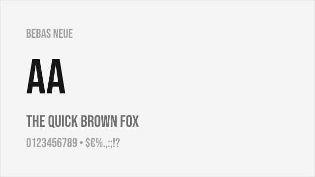
Free condensed all-caps display font with similar industrial geometric character
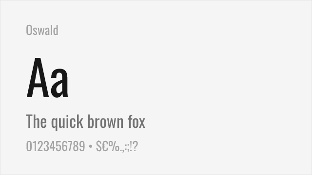
Versatile condensed sans-serif with multiple weights and variable font support
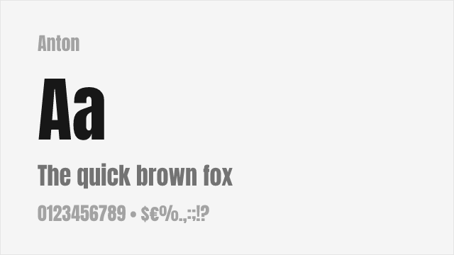
Ultra-heavy display sans perfect for impactful headlines
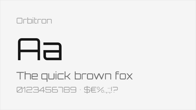
Square geometric sci-fi display face — matches Bank Gothic's proportions
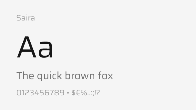
Versatile semi-square grotesque with a full variable range and widths
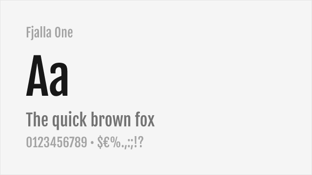
Stocky display sans with a sturdy, industrial presence
Compare the alternatives
See how Bank Gothic compares to its top alternatives — and how those alternatives compare to each other — side by side.
See where Bank Gothic is used in the wild and swap to free alternatives live.
Install FontSwap →Replacement Summary
Source: FontAlternatives.com
Premium font: Bank Gothic
Best free alternative: Bebas Neue
FontAlternatives similarity score: 88%
Replacement difficulty: Low
Best for: film and video, headlines, branding, web headers
Notable users: Call of Duty, Grand Theft Auto, SimCity 2000
Not recommended when: Brand consistency with Call of Duty requires exact letterforms
What is the best free alternative to Bank Gothic?
Bebas Neue is the best free alternative to Bank Gothic with a FontAlternatives similarity score of 88%.
Bebas Neue shares similar proportions, stroke characteristics, and intended use with Bank Gothic. It is available under the OFL-1.1 license, which permits both personal and commercial use at no cost.
This alternative works particularly well for: film and video, headlines, branding, web headers.
Can I safely replace Bank Gothic with Bebas Neue?
Yes, Bebas Neue is a high-confidence replacement for Bank Gothic. The FontAlternatives similarity score of 88% indicates strong structural compatibility.
Licensing: Bebas Neue is licensed under OFL-1.1, which allows commercial use without licensing fees or royalties.
Weight coverage: Most weights have close or exact matches available.
When should I NOT replace Bank Gothic?
While Bebas Neue is a strong alternative, there are situations where replacing Bank Gothic may not be appropriate:
- Strict compliance: Verify that OFL-1.1 terms meet your specific legal and compliance requirements.
Weight-Matching Guide
Map Bank Gothic weights to their closest free alternatives for accurate font substitution.
Bebas Neue
| Bank Gothic | Bebas Neue | Match |
|---|---|---|
| Medium | Regular (400) | close |
Oswald
| Bank Gothic | Oswald | Match |
|---|---|---|
| Regular | Regular (400) | close |
| Bold | Bold (700) | close |
Anton
| Bank Gothic | Anton | Match |
|---|---|---|
| Bold | Regular (400) | substitute |
Orbitron
| Bank Gothic | Orbitron | Match |
|---|---|---|
| Medium | Medium (500) | close |
| Bold | Bold (700) | close |
Saira
| Bank Gothic | Saira | Match |
|---|---|---|
| Medium | Medium (500) | close |
| Bold | Bold (700) | close |
Fjalla One
| Bank Gothic | Fjalla One | Match |
|---|---|---|
| Bold | Regular (400) | substitute |
Performance Guide
Production performance metrics for each alternative.
How to Use Bebas Neue
Copy these code snippets to quickly add Bebas Neue to your project.
CSS code for Bebas Neue
@import url('https://fonts.googleapis.com/css2?family=Bebas+Neue:wght@400&display=swap');HTML code for Bebas Neue
<link rel="preconnect" href="https://fonts.googleapis.com">
<link rel="preconnect" href="https://fonts.gstatic.com" crossorigin>
<link href="https://fonts.googleapis.com/css2?family=Bebas+Neue:wght@400&display=swap" rel="stylesheet">
Tailwind code for Bebas Neue
// tailwind.config.js
module.exports = {
  theme: {
    extend: {
      fontFamily: {
        'bebas-neue': ['"Bebas Neue"', 'sans-serif'],
      },
    },
  },
}

// Usage in HTML:
// <p class="font-bebas-neue">Your text here</p>
Next.js code for Bebas Neue
// Using next/font (Next.js 13+)
import { Bebas_Neue } from 'next/font/google';

const bebas_neue = Bebas_Neue({
  subsets: ['latin'],
  weight: ['400'],
});

export default function Component() {
  return (
    <p className={bebas_neue.className}>
      Your text here
    </p>
  );
}

// Or using inline styles with Google Fonts link:
// <p style={{ fontFamily: '"Bebas Neue"' }}>Your text</p>
Expo and React Native code for Bebas Neue
// Install: npx expo install @expo-google-fonts/bebas-neue expo-font
import { useFonts, Bebas_Neue_400Regular } from '@expo-google-fonts/bebas-neue';

export default function App() {
  const [fontsLoaded] = useFonts({
    Bebas_Neue_400Regular,
  });

  if (!fontsLoaded) return null;

  return (
    <Text style={{ fontFamily: 'Bebas_Neue_400Regular' }}>
      Your text here
    </Text>
  );
}
Recommended Font Pairings
These free fonts pair well with Bebas Neue Bank Gothic for headlines, body text, or accent use.
Roboto's geometric structure echoes Bank Gothic's industrial precision while providing versatile body text for tech and gaming interfaces
Open Sans's neutral humanist forms create accessible body text beneath Bank Gothic's authoritative display headings
Source Sans Pro's clean professionalism complements Bank Gothic's tactical aesthetic for military, gaming, and sci-fi themed layouts
Browse Alternatives by Context
Find Bank Gothic alternatives filtered by specific use case, style, or language support.
By Use Case
By Style
By Script
Frequently Asked Questions
What is the best free alternative to Bank Gothic?
Bebas Neue is the best free alternative to Bank Gothic with a FontAlternatives similarity score of 88%. It shares similar proportions and characteristics while being available under the OFL-1.1 license for both personal and commercial use at no cost.
Is there a free version of Bank Gothic?
There is no official free version of Bank Gothic. However, Bebas Neue is available under the OFL-1.1 open-source license and achieves a FontAlternatives similarity score of 88%. It includes 1 weights and supports latin, latin-extended.
What Google Font looks like Bank Gothic?
The Google Fonts most similar to Bank Gothic are Bebas Neue, Oswald, Anton. Among these alternatives, Bebas Neue offers the closest match with a FontAlternatives similarity score of 88% and includes 1 weights for design flexibility.
Can I use Bebas Neue commercially?
Yes, Bebas Neue can be used commercially. It is licensed under OFL-1.1, which allows free use in websites, applications, print materials, and commercial projects without purchasing a license or paying royalties.
Is Bebas Neue similar enough to Bank Gothic?
Bebas Neue achieves a FontAlternatives similarity score of 88% compared to Bank Gothic. While not identical, it offers comparable letterforms, proportions, and visual style. Most designers find it works excellently as a substitute in web and print projects.
What are the main differences between Bank Gothic and its free alternatives?
Free alternatives to Bank Gothic may differ in subtle details like letter spacing, curve refinements, and available weights. Premium fonts typically include more OpenType features, extended language support, and optimized screen rendering. However, for most projects, these differences are negligible.
Where can I download free alternatives to Bank Gothic?
Download Bebas Neue directly from Google Fonts. Click the "Get Font" button on any alternative listed above to visit the official download page. Google Fonts also provides convenient embed codes for seamless web integration.