Free Alternatives to ITC Avant Garde

About ITC Avant Garde
- Classification
- display
- Style
- geometric
Brands Using ITC Avant Garde
Namesake masthead logo that became the typeface (1970)
The definitive display face of the era's advertising and editorial design
A staple of 1970s–80s music packaging and title lettering
Widely set for logotypes and headlines across period publishing
 See ITC Avant Garde live on these sites with FontSwap →
ITC Avant Garde Gothic is a geometric sans-serif typeface designed by Herb Lubalin and Tom Carnase, based on the logo designed for Avant Garde magazine in 1968. The typeface expanded the magazine's distinctive wordmark into a complete alphabet, becoming one of the most influential — and most recognizable — geometric sans-serifs of the 20th century, and a defining voice of 1970s advertising, editorial, and album design.
History and Design
The story of ITC Avant Garde begins with Avant Garde magazine, a controversial arts publication founded by Ralph Ginzburg in 1968. Herb Lubalin, the magazine's art director, created a custom logotype featuring interconnecting letters with distinctive geometric forms. The logo's striking appearance generated enormous interest, leading to the development of a full typeface.
Tom Carnase joined Lubalin to expand the logo into a complete font family. Released through ITC in 1970, ITC Avant Garde Gothic featured not only the standard alphabet but an extensive set of ligatures that captured the interlocking aesthetic of the original logo. These alternate ligatures became as famous as the typeface itself.
Herb Lubalin was one of the towering figures of American graphic design, celebrated for a body of expressive, letter-driven work in which typography was not the vehicle for an idea but the idea itself. His masthead for Avant Garde — a magazine as notorious for its provocative content as its design — condensed that philosophy into a single wordmark, and the demand to turn it into a usable typeface came directly from designers who wanted to borrow its confidence. That the face grew from a logo rather than a text brief is the key to understanding everything about it: it was born to make statements, not to disappear into paragraphs, and it has been doing exactly that ever since.
The Ligature Legacy
ITC Avant Garde's ligatures represent some of typography's most distinctive connected letters — the family originally shipped with a set of 33 alternate characters and ligatures. Combinations of diagonal and rounded capitals feature overlapping or interlocking forms that create visual puzzles within words. While these ligatures require careful use, they enable typographers to create memorable wordmarks and headlines.
They also gave the typeface its double reputation. In skilled hands — Lubalin's own, or a careful art director's — the interlocks produce logotypes of real elegance, letters nesting into one another so the whole word reads as a single designed object. In careless hands they become a cautionary tale: crammed together indiscriminately, they turn a word into an illegible tangle, and Avant Garde is often cited as the most-abused typeface of its era precisely because the tempting alternates invite overuse. The lesson every designer eventually learns with it is restraint — the ligatures are a scalpel, not a default, and the difference between a beautiful Avant Garde wordmark and an embarrassing one is knowing when not to reach for them.
Why ITC Avant Garde Matters
ITC Avant Garde demonstrated that typefaces could be both strictly geometric and expressively playful. The design influenced countless geometric sans-serifs that followed, while its ligatures inspired a generation of display typography. Its association with 1970s design has given it nostalgic value, while its fundamental geometry keeps it perpetually modern.
It also occupies a specific place in type history as a product of the ITC era. International Typeface Corporation, co-founded by Lubalin's collaborator Aaron Burns, pioneered a new licensing model in the 1970s that let a typeface be sold across many manufacturers' systems at once — and Avant Garde, born from Lubalin's magazine work, became one of its flagship releases and one of the most-used (and, its critics say, most-abused) faces of the decade. To study Avant Garde is to study the moment when expressive, designer-driven display type went mainstream.
Who is it for? Designers composing a distinctive, art-directed logotype or headline — fashion, music, editorial, and retro-flavored branding — who will use its ligatures and wide geometry deliberately. It is emphatically not for body text, dense layouts, or neutral corporate work, where its width and stylishness get in the way; for those, the plainer geometric alternatives below serve far better.
Design Characteristics
ITC Avant Garde is geometry pushed to a stylish extreme — the most self-consciously "designed" of the geometric sans-serifs, and every feature reflects its origin as a magazine logo rather than a workhorse text face:
- Perfect circles and clean geometry: The bowls of
O,o,e, and related letters are built on near-perfect circles, the defining move of the geometric style, executed here with unusual purity. - Wide, spacious proportions: The letters are notably wide and the default spacing generous, giving it an airy, elegant footprint that reads as high-style and slightly retro.
- Distinctive decorative ligatures: Its signature feature — interlocking and overlapping capital combinations that turn a wordmark into a small piece of design.
- A large family of alternates: Beyond the ligatures, it ships many alternate characters, inviting typographers to compose bespoke logotypes rather than just set text.
- Even, near-monoline strokes: Minimal contrast keeps the geometry pristine, though the thin strokes at fine sizes need care.
- A distinctly 1970s aesthetic: Its ubiquity in that decade's advertising and album art gives it a strong period flavor that can read as nostalgic or dated depending on context — a quality that has made it fashionable again in recent waves of retro-modern branding, where designers reach for it precisely to evoke that confident, optimistic era.
Where ITC Avant Garde Excels
ITC Avant Garde is a display face through and through, at its best where a designer is composing something to be looked at rather than read at length:
- Logo and wordmark design: Its whole reason for being — the ligatures and alternates let you build a distinctive, art-directed logotype.
- Fashion and high-style editorial: The elegant, wide geometry suits fashion, beauty, and luxury advertising.
- Display headlines and posters: Large, art-directed title treatments where the geometry and spacing can breathe.
- Album art and music branding: A staple of 1970s record design, and still a shortcut to that confident, retro-modern mood.
- Retro and nostalgic branding: Anything reaching deliberately for a 1970s or Art-Deco-adjacent feel.
Where ITC Avant Garde Struggles
The qualities that make ITC Avant Garde a brilliant logo face make it a poor general-purpose one, and it is genuinely easy to misuse:
- Body text and small sizes: The wide proportions, large apertures, and even strokes are tiring and inefficient in running text; it was never a reading face.
- Ligature overuse: Its famous ligatures are a trap — used carelessly they make words hard to read, and the design has a reputation for being abused precisely because the alternates are so tempting.
- Tight or space-constrained layouts: Its generous width is the opposite of economical; where space is scarce, it is the wrong tool.
- Dating a design: The strong 1970s association means it can pin a brand to a specific era unless handled with care.
- Neutral or corporate-serious work: Its stylishness is a statement; for understated, neutral typography a plainer geometric or grotesque is better, since Avant Garde will always draw attention to itself rather than let the message speak quietly.
How to Choose a Free Substitute
No free font reproduces ITC Avant Garde's decorative ligatures — those are unique to it — so decide whether you need the ligatures, the wide elegant geometry, or just a clean geometric sans, because the answer changes the pick.
For the closest geometric-elegance match, Josefin Sans captures the refined, art-deco-adjacent character with a comparable circular construction. If you want a contemporary, flexible geometric for branding, Poppins and Jost are the clean, variable options, and Montserrat offers the deepest weight range. For ITC Avant Garde's distinctive width, Questrial gets closest to the wide, spacious footprint, and Raleway brings elegant thin weights for display. What none of them supply is the interlocking ligatures — if those are the whole point of your wordmark, you will need to license the original or draw custom letters.
The main thing to test is width and spacing. ITC Avant Garde is unusually wide, so several alternatives will feel narrower and tighter; if the airy, spacious feel is central, favor Questrial and open up your tracking. And whatever you choose, resist the temptation ITC Avant Garde itself invites — restraint with alternates and spacing is what separates an elegant geometric wordmark from a cluttered one.
Premium Font Neighbors
ITC Avant Garde lives in the geometric-sans family, so its neighbors are the other pillars of that style. Futura is the archetype the whole genre descends from, and Century Gothic is the wide, circular geometric closest to ITC Avant Garde's proportions (Monotype drew it partly to match Avant Garde's widths). Avenir is Adrian Frutiger's warmer, humanist take on geometric forms, while Gotham and Circular are the modern American and startup-era geometrics that dominate current branding. For more character, Brandon Grotesque and Sofia Pro offer contemporary geometrics with warmth, and Kabel brings a quirkier, period Art-Deco geometry adjacent to Avant Garde's own era.
FAQ
What is the best free alternative to ITC Avant Garde?
Josefin Sans is the best free alternative to ITC Avant Garde, offering elegant geometric letterforms with art deco influences. Designed by Santiago Orozco for Google Fonts, it features a high x-height and geometric construction reminiscent of ITC Avant Garde. Its seven weights from Thin to Bold provide excellent versatility for both display and text use.
Can I use Josefin Sans commercially?
Yes, Josefin Sans is licensed under the SIL Open Font License (OFL-1.1), permitting unlimited commercial use without fees. You can use it for websites, applications, print materials, branding, fashion, and products. The license allows modification and redistribution, only requiring attribution when redistributing the font files themselves.
How similar is Josefin Sans to ITC Avant Garde?
Josefin Sans achieves approximately 80% similarity to ITC Avant Garde in capturing the elegant geometric aesthetic. Both share high x-heights, circular letter construction, and sophisticated proportions. Josefin Sans lacks ITC Avant Garde's distinctive ligatures but compensates with a more complete weight range and modern optimization.
What are the main differences between ITC Avant Garde and Josefin Sans?
ITC Avant Garde features extensive decorative ligatures and alternate characters that define its character and require OpenType support. Josefin Sans takes a more straightforward approach without ligatures but offers a complete weight range. ITC Avant Garde has a distinctly 1970s aesthetic; Josefin Sans reads as timeless geometric elegance.
Where can I download Josefin Sans for free?
Josefin Sans is available for free download from Google Fonts at fonts.google.com/specimen/Josefin+Sans. The font includes seven weights from Thin (100) to Bold (700) plus matching italics. Google Fonts provides easy embedding for web projects and desktop installation for design applications. Poppins, Raleway, Jost, Montserrat, and Questrial are all on Google Fonts too.
Can I get ITC Avant Garde's ligatures in a free font?
No. The interlocking, overlapping capital ligatures are unique to ITC Avant Garde and are not reproduced in any free alternative. If those specific ligatures are essential to your wordmark, you will need to license the original ITC Avant Garde or have a lettering artist draw custom interlocks; the free geometric alternatives give you the circular, wide character but not the connected forms.
Is ITC Avant Garde good for body text?
No. It is a display typeface designed from a magazine logo, with wide proportions, large apertures, and even, thin strokes that make it inefficient and tiring in running text. Use it for logos, headlines, and short display lines, and pair it with a neutral, readable sans or serif — or a plainer geometric like Poppins — for any body copy in the same layout.
What fonts pair well with ITC Avant Garde?
Because ITC Avant Garde is so stylized, its best partners are calm and neutral. A plain grotesque or humanist sans (Helvetica, Inter, or a workhorse like Source Sans) handles body text without competing, and a classic serif can provide warm contrast beneath its geometric headlines. Keep the palette restrained so the Avant Garde display work stays the star and the reader is not overwhelmed.
Is ITC Avant Garde on Google Fonts?
No, ITC Avant Garde is a premium font from ITC (International Typeface Corporation) and is not available on Google Fonts.
The closest Google Fonts alternative is Josefin Sans with 80% similarity. Get it free on Google Fonts ↗
Free Alternatives (6)
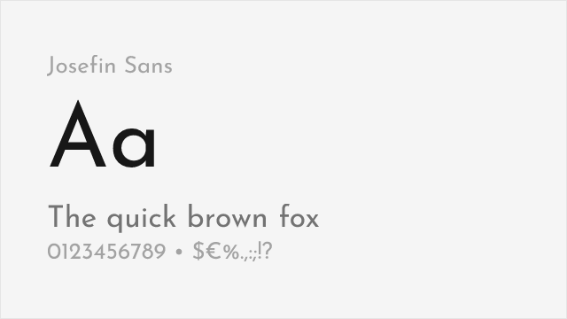
Elegant geometric sans with art deco influences and wide range of weights
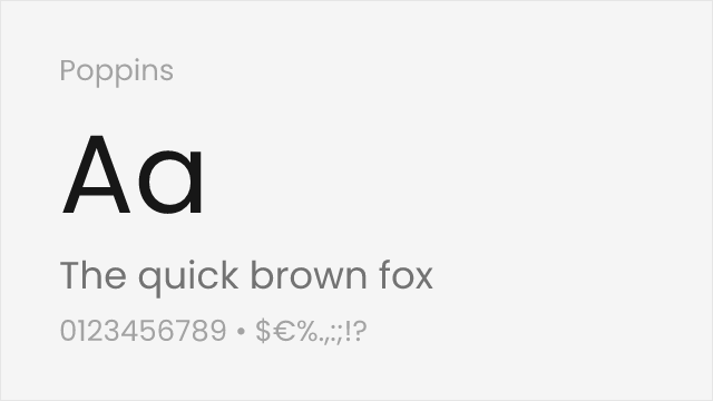
Clean geometric sans with similar circular letter construction
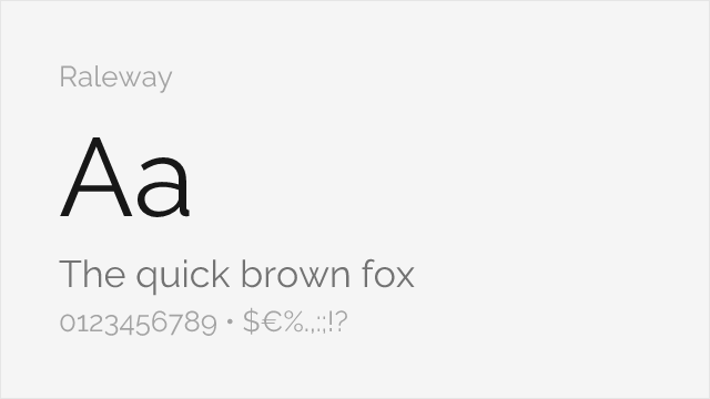
Elegant geometric sans with similar sophisticated proportions
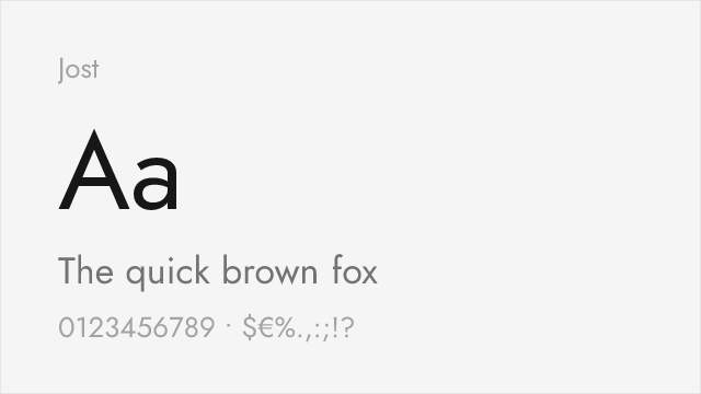
Futura-lineage geometric with a full variable weight axis
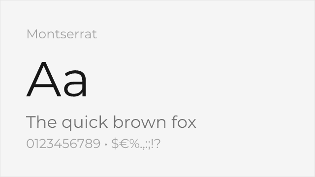
Ubiquitous geometric sans with a deep weight range for branding
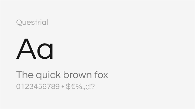
Wide single-weight geometric echoing Avant Garde's spacious circular forms
Compare the alternatives
See how ITC Avant Garde compares to its top alternatives — and how those alternatives compare to each other — side by side.
See where ITC Avant Garde is used in the wild and swap to free alternatives live.
Install FontSwap →Replacement Summary
Source: FontAlternatives.com
Premium font: ITC Avant Garde
Best free alternative: Josefin Sans
FontAlternatives similarity score: 80%
Replacement difficulty: Medium
Best for: fashion and lifestyle, high-end retail, wedding materials, display headlines
Notable users: Avant Garde magazine, 1970s advertising campaigns, Album & record-sleeve design
Not recommended when: Brand consistency with Avant Garde magazine requires exact letterforms
What is the best free alternative to ITC Avant Garde?
Josefin Sans is the best free alternative to ITC Avant Garde with a FontAlternatives similarity score of 80%.
Josefin Sans shares similar proportions, stroke characteristics, and intended use with ITC Avant Garde. It is available under the OFL-1.1 license, which permits both personal and commercial use at no cost.
This alternative works particularly well for: fashion and lifestyle, high-end retail, wedding materials, display headlines.
Can I safely replace ITC Avant Garde with Josefin Sans?
Yes, with some considerations. Josefin Sans achieves a FontAlternatives similarity score of 80%, indicating good structural compatibility for most use cases.
Licensing: Josefin Sans is licensed under OFL-1.1, which allows commercial use without licensing fees or royalties.
Weight coverage: Most weights have close or exact matches available.
When should I NOT replace ITC Avant Garde?
While Josefin Sans is a strong alternative, there are situations where replacing ITC Avant Garde may not be appropriate:
- Optical precision requirements: Josefin Sans has measurable structural differences from ITC Avant Garde that may be visible in precise design work.
- Strict compliance: Verify that OFL-1.1 terms meet your specific legal and compliance requirements.
Weight-Matching Guide
Map ITC Avant Garde weights to their closest free alternatives for accurate font substitution.
Josefin Sans
| ITC Avant Garde | Josefin Sans | Match |
|---|---|---|
| ExtraLight | Thin (100) | close |
| Book | Regular (400) | close |
| Medium | Medium (500) | exact |
| Bold | Bold (700) | exact |
Poppins
| ITC Avant Garde | Poppins | Match |
|---|---|---|
| Book | Regular (400) | close |
| Medium | Medium (500) | exact |
| Demi | SemiBold (600) | close |
| Bold | Bold (700) | close |
Raleway
| ITC Avant Garde | Raleway | Match |
|---|---|---|
| Book | Regular (400) | close |
| Medium | Medium (500) | exact |
| Demi | SemiBold (600) | close |
| Bold | Bold (700) | close |
Jost
| ITC Avant Garde | Jost | Match |
|---|---|---|
| Book | Regular (400) | close |
| Medium | Medium (500) | exact |
| Demi | SemiBold (600) | close |
| Bold | Bold (700) | close |
Montserrat
| ITC Avant Garde | Montserrat | Match |
|---|---|---|
| Book | Regular (400) | close |
| Medium | Medium (500) | exact |
| Demi | SemiBold (600) | close |
| Bold | Bold (700) | close |
Questrial
| ITC Avant Garde | Questrial | Match |
|---|---|---|
| Book | Regular (400) | close |
Performance Guide
Production performance metrics for each alternative.
How to Use Josefin Sans
Copy these code snippets to quickly add Josefin Sans to your project.
CSS code for Josefin Sans
@import url('https://fonts.googleapis.com/css2?family=Josefin+Sans:wght@100..900&display=swap');HTML code for Josefin Sans
<link rel="preconnect" href="https://fonts.googleapis.com">
<link rel="preconnect" href="https://fonts.gstatic.com" crossorigin>
<link href="https://fonts.googleapis.com/css2?family=Josefin+Sans:wght@100..900&display=swap" rel="stylesheet">
Tailwind code for Josefin Sans
// tailwind.config.js
module.exports = {
  theme: {
    extend: {
      fontFamily: {
        'josefin-sans': ['"Josefin Sans"', 'sans-serif'],
      },
    },
  },
}

// Usage in HTML:
// <p class="font-josefin-sans">Your text here</p>
Next.js code for Josefin Sans
// Using next/font (Next.js 13+)
import { Josefin_Sans } from 'next/font/google';

const josefin_sans = Josefin_Sans({
  subsets: ['latin'],
  weight: ['100', '200', '300', '400', '500', '600', '700', '800', '900'],
});

export default function Component() {
  return (
    <p className={josefin_sans.className}>
      Your text here
    </p>
  );
}

// Or using inline styles with Google Fonts link:
// <p style={{ fontFamily: '"Josefin Sans"' }}>Your text</p>
Expo and React Native code for Josefin Sans
// Install: npx expo install @expo-google-fonts/josefin-sans expo-font
import { useFonts, Josefin_Sans_400Regular } from '@expo-google-fonts/josefin-sans';

export default function App() {
  const [fontsLoaded] = useFonts({
    Josefin_Sans_400Regular,
  });

  if (!fontsLoaded) return null;

  return (
    <Text style={{ fontFamily: 'Josefin_Sans_400Regular' }}>
      Your text here
    </Text>
  );
}
Recommended Font Pairings
These free fonts pair well with Josefin Sans ITC Avant Garde for headlines, body text, or accent use.
Libre Bodoni's high-contrast Didone forms create dramatic contrast with ITC Avant Garde's geometric precision for fashion and art editorial
Playfair Display's elegant serifs provide sophisticated body text that complements ITC Avant Garde's bold geometric display headlines
EB Garamond's classical old-style serifs offer refined body text that balances ITC Avant Garde's modern geometric display character
Browse Alternatives by Context
Find ITC Avant Garde alternatives filtered by specific use case, style, or language support.
By Use Case
By Style
By Script
Frequently Asked Questions
What is the best free alternative to ITC Avant Garde?
Josefin Sans is the best free alternative to ITC Avant Garde with a FontAlternatives similarity score of 80%. It shares similar proportions and characteristics while being available under the OFL-1.1 license for both personal and commercial use at no cost.
Is there a free version of ITC Avant Garde?
There is no official free version of ITC Avant Garde. However, Josefin Sans is available under the OFL-1.1 open-source license and achieves a FontAlternatives similarity score of 80%. It includes variable weights and supports latin, latin-extended.
What Google Font looks like ITC Avant Garde?
The Google Fonts most similar to ITC Avant Garde are Josefin Sans, Poppins, Raleway. Among these alternatives, Josefin Sans offers the closest match with a FontAlternatives similarity score of 80% and includes variable weights for flexible typography options.
Can I use Josefin Sans commercially?
Yes, Josefin Sans can be used commercially. It is licensed under OFL-1.1, which allows free use in websites, applications, print materials, and commercial projects without purchasing a license or paying royalties.
Is Josefin Sans similar enough to ITC Avant Garde?
Josefin Sans achieves a FontAlternatives similarity score of 80% compared to ITC Avant Garde. While not identical, it offers comparable letterforms, proportions, and visual style. Most designers find it works excellently as a substitute in web and print projects.
What are the main differences between ITC Avant Garde and its free alternatives?
Free alternatives to ITC Avant Garde may differ in subtle details like letter spacing, curve refinements, and available weights. Premium fonts typically include more OpenType features, extended language support, and optimized screen rendering. However, for most projects, these differences are negligible.
Where can I download free alternatives to ITC Avant Garde?
Download Josefin Sans directly from Google Fonts. Click the "Get Font" button on any alternative listed above to visit the official download page. Google Fonts also provides convenient embed codes for seamless web integration.