 Install FontSwap
Free Alternatives to ITC Avant Garde with Display Style
ITC Avant Garde is known for its display aesthetic. If you're looking for a free display font with a similar display feel, these 6 alternatives offer comparable characteristics. We've identified 6 that are especially well-suited for this context. All are available under open-source licenses for unrestricted commercial use.
Top Picks
Comparison Table
| Font | Relevance ⓘ
How well this alternative fits the specific context (use-case or trait) of this page. Score 0–100 based on matching keywords, industries, and font characteristics. Alternatives scoring 25+ are highlighted.
| Similarity ⓘ
How visually similar this free font is to the premium original. Score 0–100 based on x-height, width, stroke contrast, use-case overlap, and language coverage.
Learn more → | Weights | Variable | License | Source |
|---|---|---|---|---|---|---|
| Josefin Sans | 36 | 80% | Variable | Yes | OFL-1.1 | Google Fonts ↗ |
| Poppins | 34 | 72% | 9 | No | OFL-1.1 | Google Fonts ↗ |
| Raleway | 34 | 70% | Variable | Yes | OFL-1.1 | Google Fonts ↗ |
| Jost | 34 | 68% | Variable | Yes | OFL-1.1 | Google Fonts ↗ |
| Montserrat | 33 | 66% | Variable | Yes | OFL-1.1 | Google Fonts ↗ |
| Questrial | 33 | 64% | 1 | No | OFL-1.1 | Google Fonts ↗ |
All Alternatives (6)
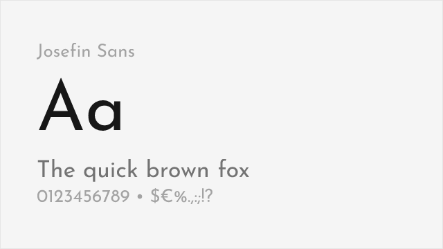
[Google Fonts] · OFL-1.1 · Variable
Elegant geometric sans with art deco influences and wide range of weights
Why it matches: Josefin Sans captures ITC Avant Garde's elegant geometric proportions and art deco influences. Both feature high x-heights, circular letter construction, and sophisticated character suitable for fashion and editorial use. Josefin Sans lacks ITC Avant Garde's decorative ligatures but provides more practical weight range.
fashion and lifestylehigh-end retailwedding materialsdisplay headlines
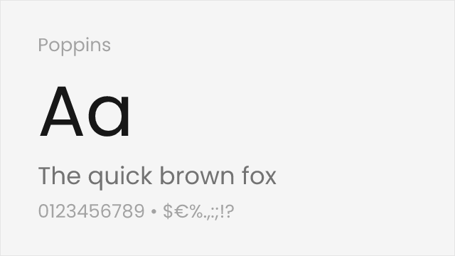
[Google Fonts] · OFL-1.1 · 9 weights
Clean geometric sans with similar circular letter construction
Why it matches: Poppins shares ITC Avant Garde's geometric foundations with circular letter forms and modern proportions. While less art-deco influenced, Poppins provides similar contemporary geometric character suitable for branding and display. The comprehensive weight range and Google Fonts optimization ensure excellent web performance.
tech brandingweb applicationscontemporary designuser interfaces
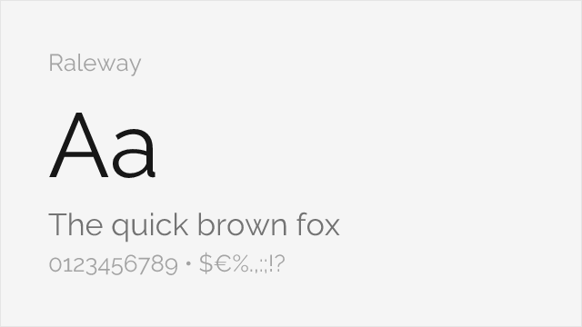
[Google Fonts] · OFL-1.1 · Variable
Elegant geometric sans with similar sophisticated proportions
Why it matches: Raleway offers elegant geometric forms with sophisticated proportions approaching ITC Avant Garde's refinement. The design features similar display-oriented character suitable for fashion and editorial contexts. Raleway's variable font version enables precise weight control for nuanced typography.
fashion brandingeditorial designelegant displayweb headers
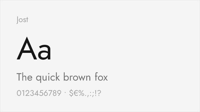
[Google Fonts] · OFL-1.1 · Variable
Futura-lineage geometric with a full variable weight axis
Why it matches: Jost is a contemporary reworking of the Futura idea, so it shares ITC Avant Garde's strict geometric construction — circular bowls, clean single-storey forms, and an even, mechanical rhythm. It lacks the decorative ligatures and the extreme width, but for a clean geometric wordmark or headline with a full variable weight range, it is a flexible free choice.
geometric brandingheadlines and postersmodern editorialdesign systems
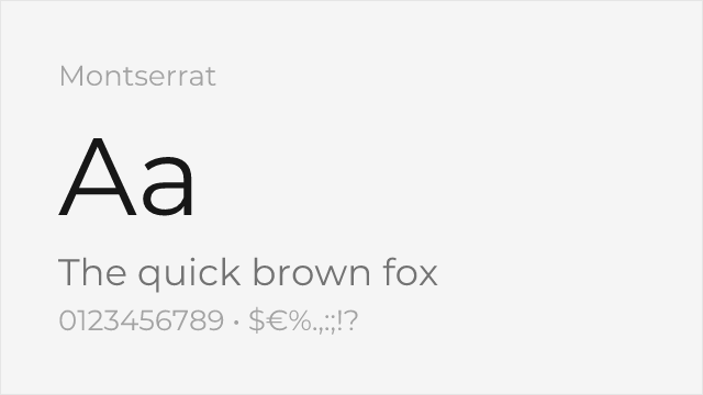
[Google Fonts] · OFL-1.1 · Variable
Ubiquitous geometric sans with a deep weight range for branding
Why it matches: Montserrat is the web's default geometric sans, with clean circular forms and a complete weight range. It is more neutral and less distinctly period-1970s than ITC Avant Garde, but for versatile geometric branding and display work it delivers the same modern circular feel with far more flexibility.
branding and logosheadlinesmarketing sitessocial media graphics
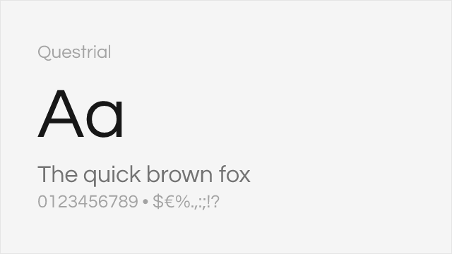
[Google Fonts] · OFL-1.1 · 1 weights
Wide single-weight geometric echoing Avant Garde's spacious circular forms
Why it matches: Questrial is a wide, clean geometric sans whose spacious, circular proportions get closer than most free fonts to ITC Avant Garde's generous width. It is a single weight and lacks the ligatures, so it is a display pick rather than a full system, but for a wide geometric headline it captures the airy, elegant footprint well.
wide geometric headlineslogosdisplay and titlingeditorial