 Install FontSwap
Free Alternatives to Bank Gothic with Signage Style
Bank Gothic is known for its signage aesthetic. If you're looking for a free display font with a similar signage feel, these 6 alternatives offer comparable characteristics. We've identified 1 that are especially well-suited for this context. All are available under open-source licenses for unrestricted commercial use.
Top Picks
Comparison Table
| Font | Relevance ⓘ
How well this alternative fits the specific context (use-case or trait) of this page. Score 0–100 based on matching keywords, industries, and font characteristics. Alternatives scoring 25+ are highlighted.
| Similarity ⓘ
How visually similar this free font is to the premium original. Score 0–100 based on x-height, width, stroke contrast, use-case overlap, and language coverage.
Learn more → | Weights | Variable | License | Source |
|---|---|---|---|---|---|---|
| Saira | 33 | 66% | Variable | Yes | OFL-1.1 | Google Fonts ↗ |
| Bebas Neue | 18 | 88% | 1 | No | OFL-1.1 | Google Fonts ↗ |
| Oswald | 15 | 75% | Variable | Yes | OFL-1.1 | Google Fonts ↗ |
| Anton | 14 | 72% | 1 | No | OFL-1.1 | Google Fonts ↗ |
| Orbitron | 14 | 70% | Variable | Yes | OFL-1.1 | Google Fonts ↗ |
| Fjalla One | 12 | 62% | 1 | No | OFL-1.1 | Google Fonts ↗ |
Most Relevant (1)
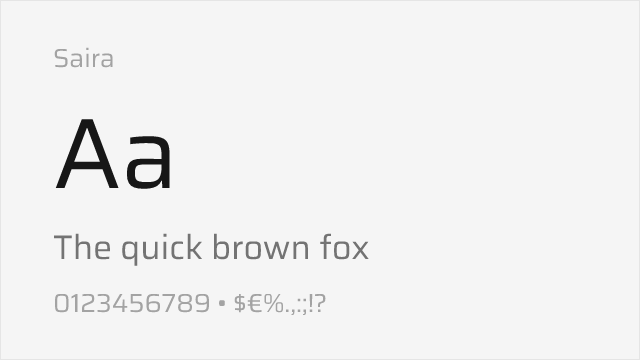
[Google Fonts] · OFL-1.1 · Variable
Versatile semi-square grotesque with a full variable range and widths
Why it matches: Saira is a semi-square grotesque with even, upright capitals and a large family of weights and widths. It is more neutral and readable than Bank Gothic, but its squared-off forms and technical feel make it a flexible, modern free substitute — especially where you need more than display caps.
tech UI and headlinesdashboardsmodern industrial branding
Other Alternatives (5)
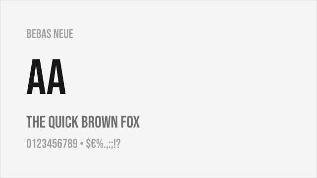
[Google Fonts] · OFL-1.1 · 1 weights
Free condensed all-caps display font with similar industrial geometric character
Why it matches: Bebas Neue shares Bank Gothic's all-caps, industrial display aesthetic and geometric construction optimized for headlines and titles. The key difference is proportion: Bebas Neue is condensed where Bank Gothic is square, so it captures the authoritative impact more than the exact width, but for headline work the effect is comparable and hugely popular.
film and videoheadlinesbrandingweb headers
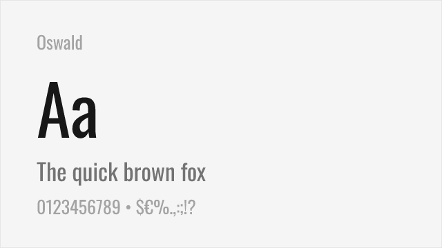
[Google Fonts] · OFL-1.1 · Variable
Versatile condensed sans-serif with multiple weights and variable font support
Why it matches: Oswald provides condensed sans-serif typography with a comprehensive weight range that Bank Gothic's limited options cannot match. Both share an industrial gothic heritage and work well for space-efficient headlines. Oswald's variable font enables nuanced hierarchy impossible with Bank Gothic's fixed weights, and it includes true lowercase.
website headerseditorial designdata visualizationvideo production
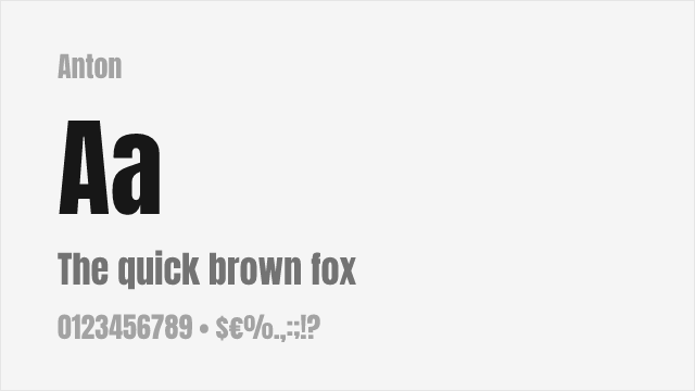
[Google Fonts] · OFL-1.1 · 1 weights
Ultra-heavy display sans perfect for impactful headlines
Why it matches: Anton delivers maximum impact in a single heavy weight, similar to Bank Gothic's boldest display applications. Both prioritize attention-grabbing presence over typographic nuance, and Anton's one heavy weight matches Bank Gothic's typical use case — bold headlines where subtlety isn't required.
headlinesposter designsocial media graphicsbanner text
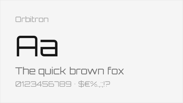
[Google Fonts] · OFL-1.1 · Variable
Square geometric sci-fi display face — matches Bank Gothic's proportions
Why it matches: Orbitron is a square, geometric, techno display face that captures Bank Gothic's actual proportions better than the condensed options — wide, even, monospaced-feeling capitals with a futuristic, tactical air. For the sci-fi and gaming looks Bank Gothic is famous for, Orbitron is the closest free match in shape as well as mood.
sci-fi and gamingtech brandingfuturistic headlines
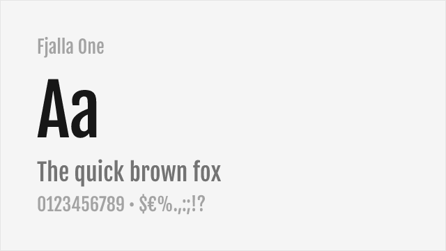
[Google Fonts] · OFL-1.1 · 1 weights
Stocky display sans with a sturdy, industrial presence
Why it matches: Fjalla One is a sturdy, medium-contrast display sans with a solid, industrial feel that echoes Bank Gothic's authoritative weight. It is more conventional in shape, but for bold headlines and titles that need presence it is a dependable single-weight free choice.
headlinesposterstitles