 Install FontSwap
Free Alternatives to Frutiger Supporting Cyrillic
Need a free alternative to Frutiger with Cyrillic script support? These 3 options include Cyrillic characters and share visual similarities with Frutiger. Each is licensed for free personal and commercial use.
Top Picks
Comparison Table
| Font | Relevance ⓘ
How well this alternative fits the specific context (use-case or trait) of this page. Score 0–100 based on matching keywords, industries, and font characteristics. Alternatives scoring 25+ are highlighted.
| Similarity ⓘ
How visually similar this free font is to the premium original. Score 0–100 based on x-height, width, stroke contrast, use-case overlap, and language coverage.
Learn more → | Weights | Variable | License | Source |
|---|---|---|---|---|---|---|
| Open Sans | 0 | 80% | Variable | Yes | Apache-2.0 | Google Fonts ↗ |
| Source Sans 3 | 0 | 78% | Variable | Yes | OFL-1.1 | Google Fonts ↗ |
| Fira Sans | 0 | 74% | 9 | No | OFL-1.1 | Google Fonts ↗ |
All Alternatives (3)
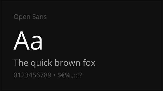
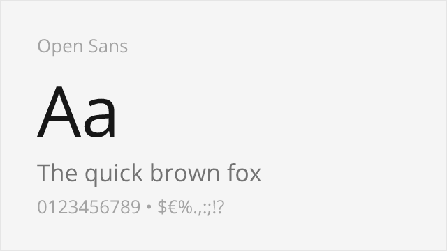
[Google Fonts] · Apache-2.0 · Variable
Comparable humanist proportions designed for digital clarity
Why it matches: Open Sans captures Frutiger's humanist proportions with similar emphasis on digital legibility. Both feature generous x-heights, open apertures, and neutral-yet-friendly character suitable for corporate and government applications. Open Sans's widespread adoption and extensive testing make it reliable for the professional contexts where Frutiger excels.
web applicationscorporate communicationsmultilingual projectsprint materials
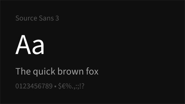

[Google Fonts] · OFL-1.1 · Variable
Shares emphasis on legibility with similar stroke contrast
Why it matches: Source Sans Pro shares Frutiger's emphasis on legibility with similar humanist warmth and professional utility. Both feature open apertures and clear letterforms suitable for government and healthcare contexts. Source Sans Pro's coordination with Source Serif and Source Code provides system-building flexibility that Frutiger lacks.
government websitestechnical documentationuser interfacescorporate identity
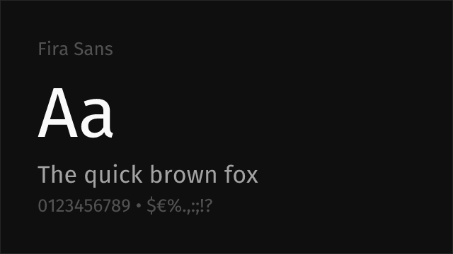
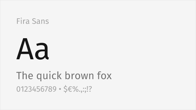
[Google Fonts] · OFL-1.1 · 9 weights
Humanist sans from Spiekermann's studio with warmth and broad weights
Why it matches: Fira Sans, drawn by Erik Spiekermann's studio for Mozilla, is a humanist sans with genuine warmth and open, legible forms that sit close to Frutiger's temperament. It shares the friendly-but-professional character and clear apertures that make Frutiger so readable, with a very broad weight range and true italics for building complete systems.
corporate and editorialinterfacesmultilingual textlong-form reading