Free Alternatives to Myriad Pro with Minimal Style
Myriad Pro is known for its minimal aesthetic. If you're looking for a free sans serif font with a similar minimal feel, these 3 alternatives offer comparable characteristics. We've identified 3 that are especially well-suited for this context. All are available under open-source licenses for unrestricted commercial use.
Top Picks
Comparison Table
| Font | Relevance ⓘ
How well this alternative fits the specific context (use-case or trait) of this page. Score 0–100 based on matching keywords, industries, and font characteristics. Alternatives scoring 25+ are highlighted.
| Similarity ⓘ
How visually similar this free font is to the premium original. Score 0–100 based on x-height, width, stroke contrast, use-case overlap, and language coverage.
Learn more → | Weights | Variable | License | Source |
|---|---|---|---|---|---|---|
| Source Sans Pro | 88 | 88% | Variable | Yes | OFL-1.1 | Google Fonts ↗ |
| Open Sans | 86 | 82% | Variable | Yes | Apache-2.0 | Google Fonts ↗ |
| Lato | 66 | 78% | 5 | No | OFL-1.1 | Google Fonts ↗ |
All Alternatives (3)


[Google Fonts] · OFL-1.1 · Variable
Adobe's open-source counterpart with similar design philosophy
Why it matches: Source Sans Pro is essentially Adobe's open-source sibling to Myriad Pro, sharing the same humanist philosophy, generous x-height, and professional utility. Both feature open apertures, excellent screen legibility, and the warm-but-neutral character that made Myriad ubiquitous in corporate communications. Source Sans Pro's variable font version offers even more flexibility than Myriad Pro.
user interfacesgovernment websitestechnical documentationcorporate communications
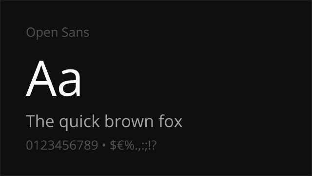
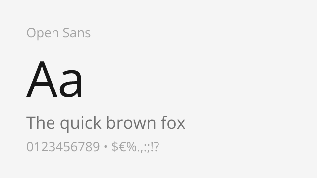
[Google Fonts] · Apache-2.0 · Variable
Shares humanist warmth and excellent screen legibility
Why it matches: Open Sans shares Myriad Pro's humanist warmth and screen optimization with similar generous x-height and open letterforms. Both prioritize clarity and neutrality while maintaining an approachable, friendly character. Open Sans's widespread adoption and excellent cross-platform rendering make it functionally interchangeable with Myriad for most web and UI applications.
web applicationsmobile appsmultilingual projectsprint materials
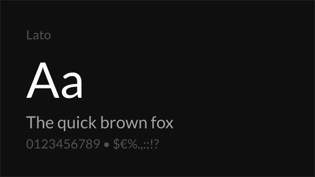
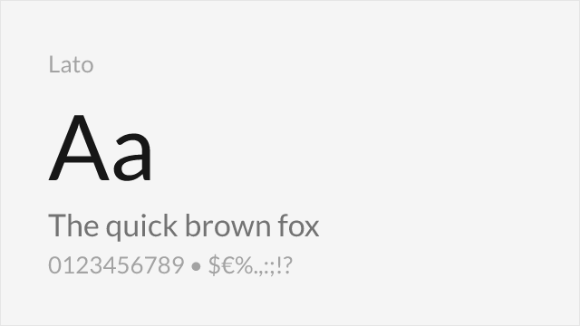
[Google Fonts] · OFL-1.1 · 5 weights
Similar professional character with humanist proportions
Why it matches: Lato shares Myriad Pro's balance of warmth and professionalism with similar humanist proportions. Both feature the clean, modern character appropriate for corporate and tech contexts. Lato's slightly more geometric construction gives it a subtly different feel while maintaining comparable utility.
brandingbody textcorporate identityprint materials