 Install FontSwap
Free Alternatives to PP Altera Supporting Latin Extended
Need a free alternative to PP Altera with Latin Extended script support? These 7 options include Latin Extended characters and are open-licence alternatives to PP Altera in the same style. Each is licensed for free personal and commercial use.
Top Picks
Comparison Table
| Font | Relevance ⓘ
How well this alternative fits the specific context (use-case or trait) of this page. Score 0–100 based on matching keywords, industries, and font characteristics. Alternatives scoring 25+ are highlighted.
| Weights | Variable | License | Source |
|---|---|---|---|---|---|
| Literata | 0 | Variable | Yes | OFL-1.1 | Google Fonts ↗ |
| Hanken Grotesk | 0 | Variable | Yes | OFL-1.1 | Google Fonts ↗ |
| Playfair Display | 0 | Variable | Yes | OFL-1.1 | Google Fonts ↗ |
| Schibsted Grotesk | 0 | Variable | Yes | OFL-1.1 | Google Fonts ↗ |
| Bodoni Moda | 0 | Variable | Yes | OFL-1.1 | Google Fonts ↗ |
| Alegreya | 0 | Variable | Yes | OFL-1.1 | Google Fonts ↗ |
| Fraunces | 0 | Variable | Yes | OFL-1.1 | Google Fonts ↗ |
All Alternatives (7)
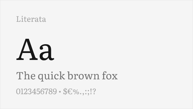
#1 Literata
[Google Fonts] · OFL-1.1 · Variable
Text serif for the Text and Serif sides; also covers Cyrillic and Greek
Why it matches: Literata is a bracketed text serif built for long reading, with an optical-size axis (7-72) and a weight axis (200-900); its x-height is 0.507 em and its cap height 0.700 em. In the vendor's published specimens, Altera's Text and Serif sub-families read as sturdy, readable serifs, so Literata is the natural stand-in for those sides. It will not slide toward a sans the way Altera can, and it adds Cyrillic and Greek, which Pangram Pangram does not list for Altera.
editorialbody textlong readingbook design
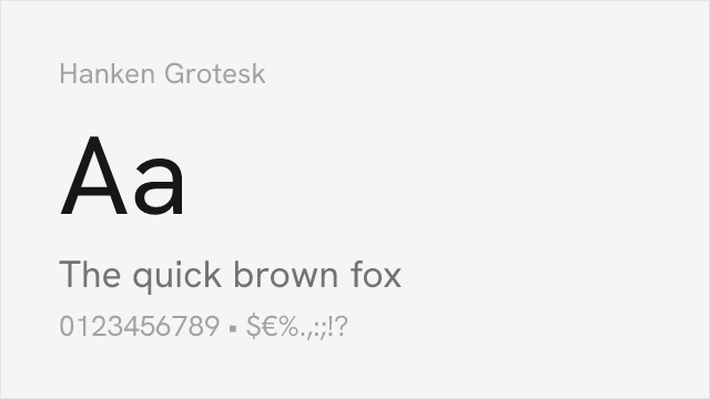
[Google Fonts] · OFL-1.1 · Variable
Clean grotesque for the Sans and Sleek sides
Why it matches: Hanken Grotesk is a clean, neutral grotesque on a single weight axis (100-900), with an x-height of 0.493 em and a cap height of 0.697 em. In the vendor's published specimens, it suits Altera's Sans and Sleek sub-families, where the letters are plain and even. It does not reach the hairline Elegant side or any of the serif sides, so use it for interface text and plain headlines and pair it with a serif from this list when you need contrast.
uiheadlinesbody textbranding
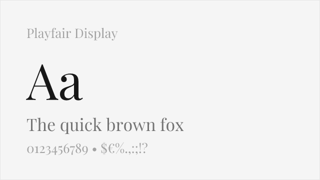
[Google Fonts] · OFL-1.1 · Variable
Sharp, high-contrast serif for the Sharpe side; has Cyrillic
Why it matches: Playfair Display is a high-contrast serif with thin hairlines and a large x-height (0.515 em, cap height 0.708 em). In the vendor's published specimens, it resembles the high-contrast end of Altera's Contrast axis, so it suits headlines in the Sharpe style. It is a fixed serif design with a weight axis of 400-900 and cannot move toward sans, and the hairlines get fragile at small sizes, so keep it for display and large text.
headlinesdisplayeditorialbranding
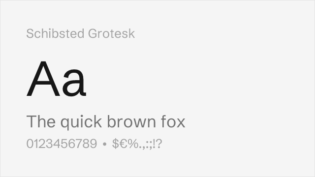
[Google Fonts] · OFL-1.1 · Variable
Sturdy editorial grotesque, a second sans option
Why it matches: Schibsted Grotesk is a sturdy editorial grotesque (x-height 0.527 em, cap height 0.703 em) with a weight axis of 400-900. It is a second sans option beside Hanken Grotesk, a little firmer and more newsy in tone. In the vendor's published specimens, it goes with Altera's Sans sub-family, not its serif sides, so choose it when you want a sans with more presence than Hanken Grotesk for headlines and editorial layouts.
uieditorialheadlinesbody text
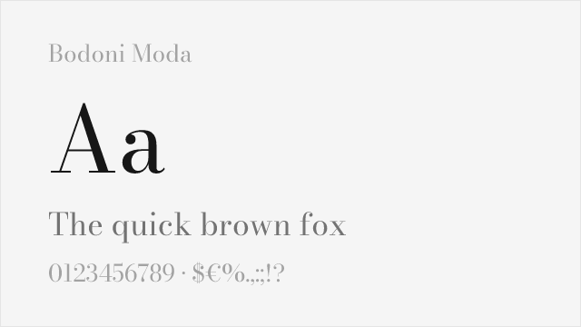
#5 Bodoni Moda
[Google Fonts] · OFL-1.1 · Variable
Hairline Didone for the Sharpe side; a classic Didone, not Altera's shapes
Why it matches: Bodoni Moda has the hairlines of the most contrasty Altera specimens, and an optical-size axis (6-96) that thins them at large sizes. Its x-height is low (0.460 em at the default optical size of 11), which makes it look smaller than a typical text face, and its shapes are a classic Didone, not Altera's. Use it for large display lines where the extreme contrast is the point, not for body text or small interface labels.
displayheadlinesfashioneditorial
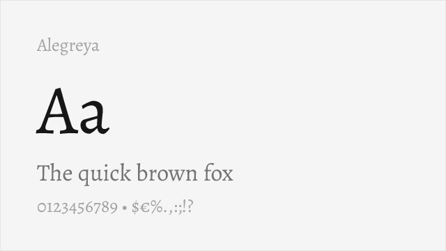
#6 Alegreya
[Google Fonts] · OFL-1.1 · Variable
Calligraphic text serif with a livelier rhythm; Cyrillic, Greek and Vietnamese
Why it matches: Alegreya is a calligraphic serif for long reading, with a weight axis of 400-900. It is a small-looking face (x-height 0.456 em, cap height 0.646 em) with a livelier, more handwritten rhythm than Altera's Text side in the vendor's published specimens, so it is a looser match. It is worth trying when you want warmth in running text, and it covers Cyrillic, Greek and Vietnamese, which Pangram Pangram does not list for Altera.
editorialbody textlong readingbook design
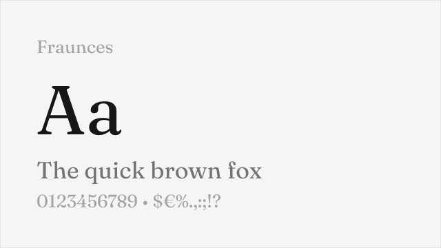
#7 Fraunces
[Google Fonts] · OFL-1.1 · Variable
Variable serif whose axes change softness and contrast of the letters
Why it matches: Fraunces has four axes: weight (100-900), optical size (9-144), SOFT and WONK. Like Altera, it offers several voices from one variable design, which is why it is on this list. Its axes move within one serif design and never reach a sans, so it is not a match for Altera's shapes. Try it when you want one font that can look sharp and formal at large sizes and soft and friendly with SOFT turned up.
displaybrandingheadlineseditorial