 Install FontSwap
Free Alternatives to PP Altera

About PP Altera
- Foundry
- Pangram Pangram
- Classification
- sans-serif
- Variable
- Yes
- Style
- modern
PP Altera is a variable typeface from Pangram Pangram, first listed by the vendor in October 2026 (version 1.00). It is designed by Caio Kondo, Francesca Bolognini and Mat Desjardins. Its pitch is one structure with nine voices: nine sub-families (Sans, Sleek, Elegant, Wedge, Text, Ancient, Serif, Carve and Sharpe), each with 8 styles, which makes 72 styles in all. The vendor describes three variable axes, named Serif, Contrast and Weight, and its specimens show letters moving from a plain sans toward a sharp, high-contrast serif. The vendor sells a variable cut inside each sub-family; its page text does not say whether the Serif axis spans every sub-family.
Altera works as a toolkit, not as a single look. No free font in our catalogue changes between sans and serif on an axis, and none has a serif or contrast axis. The practical approach is to choose the sub-family you actually use and match that.
What the vendor says
Pangram Pangram sells Altera by collection and by sub-family, and its page says licences start at $40. It lists the variable cut with each sub-family and the formats OTF, TTF, WOFF and WOFF2. Each cut has 510 glyphs. The language list names Latin-script languages such as Turkish, Polish, Czech, Hungarian, Romanian and Icelandic, followed by "and more".
A free trial exists. The vendor describes it as key weights with a complete glyph set for personal projects, portfolio and pitches, and it is sent by email. It is not a commercial licence.
Free alternatives by sub-family
| Altera side | Free fonts to try |
|---|---|
| Sans, Sleek | Hanken Grotesk, Schibsted Grotesk |
| Wedge, Text | Literata, Alegreya |
| Serif, Carve | Literata, Fraunces |
| Sharpe, Ancient (high contrast; Ancient is a judgement call) | Playfair Display, Bodoni Moda |
| Elegant (hairline sans) | no close free match |
The pairings follow how each sub-family looks in the vendor's specimen. The pairings are editorial judgement from the vendor's published specimens and the free fonts' own shapes; none comes from a side-by-side render at the same setting. We have not measured PP Altera, so this page shows no scores for these fonts; the order of the list is editorial.
Why People Replace PP Altera
- Licence cost: PP Altera requires a paid licence from Pangram Pangram; the vendor's page says licences start at $40
- Language coverage: Pangram Pangram does not list Cyrillic or Greek among its supported languages, while Literata and Playfair Display both cover Cyrillic
- Web licensing: the EULA requires a separate Web License for each domain or subdomain, limited to a number of page views per month
Best Free Alternative
Literata is our first pick for the serif side, with Hanken Grotesk for the sans side. Both are variable and OFL-licensed. Neither moves along a serif axis, so choose one for text-sized serif work and the other for interface sans, and set them as a pair instead of expecting one font to do both.
FAQ
Is PP Altera free?
No. PP Altera is a paid font from Pangram Pangram, with licences starting at $40. The vendor's trial page says: "Get key weights of Altera with a complete glyph set for free for your personal projects, portfolio, pitches, etc..." Its FAQ adds that its fonts are "free to try for personal use as long as it is not used in a commercial project."
Is PP Altera a variable font?
Yes. The vendor describes three variable axes (Serif, Contrast and Weight) and a variable cut in each of the nine sub-families.
Does PP Altera support Cyrillic?
Pangram Pangram does not list Cyrillic or Greek among its supported languages on the product page. The list ends with "and more", so check with the vendor or its trial before relying on any Cyrillic.
What is the best free alternative to PP Altera?
Literata for serif text and Hanken Grotesk for sans are free alternatives in the same style. The order is editorial, because we have not measured PP Altera. For a sharper, high-contrast headline, try Playfair Display or Bodoni Moda.
How many styles does PP Altera have?
72: nine sub-families with 8 styles each, according to the vendor.
Is PP Altera on Google Fonts?
No, PP Altera is a premium font from Pangram Pangram and it is not available on Google Fonts.
A Google Fonts alternative in the same style is Literata. Get it free on Google Fonts ↗
Free Alternatives (7)
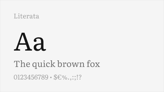
Text serif for the Text and Serif sides; also covers Cyrillic and Greek
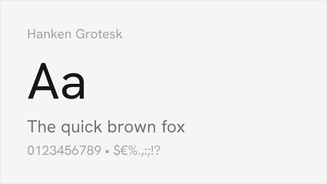
Clean grotesque for the Sans and Sleek sides
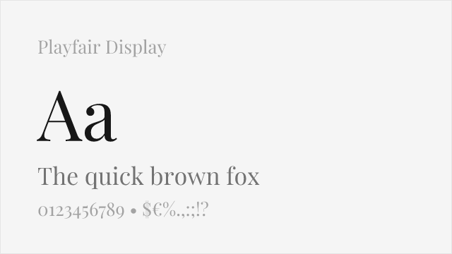
Sharp, high-contrast serif for the Sharpe side; has Cyrillic
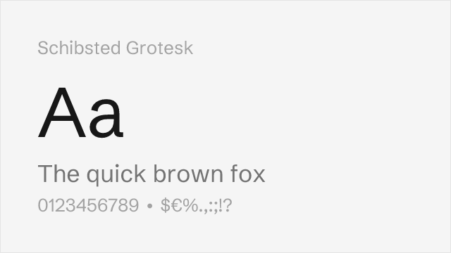
Sturdy editorial grotesque, a second sans option
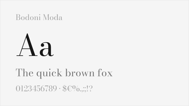
Hairline Didone for the Sharpe side; a classic Didone, not Altera's shapes
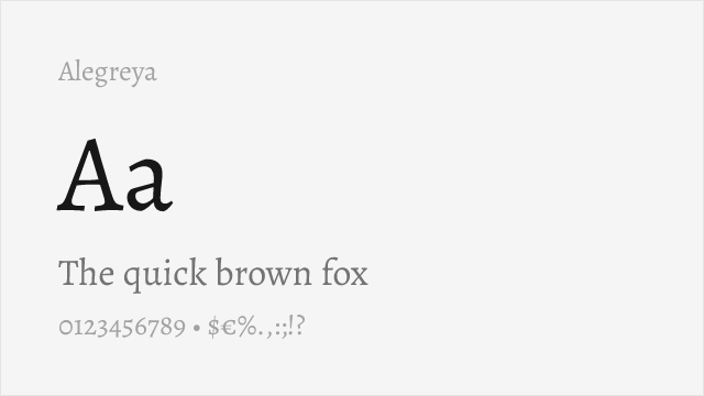
Calligraphic text serif with a livelier rhythm; Cyrillic, Greek and Vietnamese
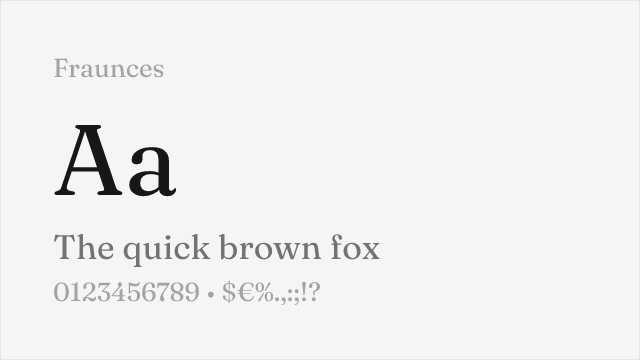
Variable serif whose axes change softness and contrast of the letters
Test the swap on your text
Type your own headline and see every free alternative to PP Altera side by side, or overlay one on the PP Altera reference.
We don't render PP Altera from a lookalike. If you have it installed, this tester uses your copy and scores each alternative on your text.
Compare the alternatives
See how PP Altera compares to its top alternatives — and how those alternatives compare to each other — side by side.
See where PP Altera is used in the wild and swap to free alternatives live.
Install FontSwap → Enjoying FontSwap? Rate it →Performance Guide
Production performance metrics for each alternative.
How to Use Literata
Copy these code snippets to quickly add Literata to your project.
CSS code for Literata
@import url('https://fonts.googleapis.com/css2?family=Literata:wght@200..900&display=swap');HTML code for Literata
<link rel="preconnect" href="https://fonts.googleapis.com">
<link rel="preconnect" href="https://fonts.gstatic.com" crossorigin>
<link href="https://fonts.googleapis.com/css2?family=Literata:wght@200..900&display=swap" rel="stylesheet">
Tailwind code for Literata
// tailwind.config.js
module.exports = {
  theme: {
    extend: {
      fontFamily: {
        'literata': ['Literata', 'sans-serif'],
      },
    },
  },
}

// Usage in HTML:
// <p class="font-literata">Your text here</p>
Next.js code for Literata
// Using next/font (Next.js 13+)
import { Literata } from 'next/font/google';

const literata = Literata({
  subsets: ['latin'],
  weight: ['200', '300', '400', '500', '600', '700', '800', '900'],
});

export default function Component() {
  return (
    <p className={literata.className}>
      Your text here
    </p>
  );
}

// Or using inline styles with Google Fonts link:
// <p style={{ fontFamily: "'Literata'" }}>Your text</p>
Expo and React Native code for Literata
// Install: npx expo install @expo-google-fonts/literata expo-font
import { useFonts, Literata_400Regular } from '@expo-google-fonts/literata';

export default function App() {
  const [fontsLoaded] = useFonts({
    Literata_400Regular,
  });

  if (!fontsLoaded) return null;

  return (
    <Text style={{ fontFamily: 'Literata_400Regular' }}>
      Your text here
    </Text>
  );
}
Browse Alternatives by Context
Find PP Altera alternatives filtered by specific use case, style, or language support.
By Script
Frequently Asked Questions
What is the best free alternative to PP Altera?
Literata is an open-licence alternative to PP Altera in the same style, available under the OFL-1.1 license for personal and commercial use at no cost.
Is there a free version of PP Altera?
There is no official free version of PP Altera. Literata is an open-licence alternative in the same style. It includes variable weights and support for latin, latin-extended.
What Google Font looks like PP Altera?
Open-licence Google Fonts in the same style as PP Altera include Literata, Hanken Grotesk, Playfair Display. Literata includes variable weights for flexible typography options.
Can I use Literata commercially?
Yes, Literata can be used commercially. It is licensed under OFL-1.1, which allows free use in websites, applications, print materials, and commercial projects without purchasing a license or paying royalties.
Is Literata similar enough to PP Altera?
Literata is an open-licence alternative to PP Altera in the same style. We have not measured PP Altera, so we do not publish a score for it. Compare the two on the page and test them with your own text before you switch.
What are the main differences between PP Altera and its free alternatives?
PP Altera is a commercial font and Literata is a different design. Compare weights, features and licensing on the pages above, and test with your own text before you switch.
Where can I download free alternatives to PP Altera?
Download Literata directly from Google Fonts. Click the "Get Font" button on any alternative listed above to visit the official download page. Google Fonts also provides convenient embed codes for seamless web integration.
Free Twins: one premium font and its best free lookalikes, every Thursday.
Get the free font substitution kit now
Confirm by email and the kit is yours.
We'll email you a link to confirm. Unsubscribe in one click. No spam, no selling your address. Privacy