Free Alternatives to Suisse Int'l with Editorial Style

9 alternatives | 2 highly relevant | sans serif | Best match: Inter (90%)

Suisse Int'l is known for its editorial aesthetic. If you're looking for a free sans serif font with a similar editorial feel, these 9 alternatives offer comparable characteristics. We've identified 2 that are especially well-suited for this context. All are available under open-source licenses for unrestricted commercial use.

Top Picks

Comparison Table

Font Relevance Similarity Weights Variable License Source
Inter 28 90% Variable Yes OFL-1.1 Google Fonts ↗
Source Sans 3 26 78% Variable Yes OFL-1.1 Google Fonts ↗
Work Sans 16 82% Variable Yes OFL-1.1 Google Fonts ↗
DM Sans 16 80% Variable Yes OFL-1.1 Google Fonts ↗
Switzer 16 78% Variable Yes ITF Free Font License fontshare ↗
Public Sans 15 76% Variable Yes OFL-1.1 Google Fonts ↗
Libre Franklin 15 74% Variable Yes OFL-1.1 Google Fonts ↗
Familjen Grotesk 14 72% Variable Yes OFL-1.1 Google Fonts ↗
Nacelle 13 65% Variable Yes ITF Free Font License fontshare ↗

Most Relevant (2)

#1 Inter 90% Relevant
[Google Fonts] · OFL-1.1 · Variable

Closest overall match with exceptional screen rendering and full variable font support

Why it matches: Inter mirrors Suisse Int'l's tall x-height, open apertures, and disciplined neo-grotesque skeleton. Both typefaces prioritize functional clarity for digital interfaces, sharing similarly tight but readable letter-spacing. Inter's optical sizing axis automatically adjusts details for different sizes, compensating for the manual optical grading Suisse achieves across its superfamily variants. The lowercase a, e, and s shapes are structurally very close, and both fonts share a restrained, personality-free approach to sans-serif design.
editorial web layoutsdesign system foundationscontent-heavy interfacesSwiss-style digital design
Get Font ↗
#2 Source Sans 3 78% Relevant
[Google Fonts] · OFL-1.1 · Variable

Adobe's workhorse sans with broad language support and strong hinting

Why it matches: Source Sans 3 matches Suisse Int'l's commitment to screen legibility through generous apertures and careful hinting. While Suisse is more distinctly neo-grotesque, Source Sans 3 adds subtle humanist touches that improve readability in long-form content. Its extensive language support and Adobe's optimization make it reliable across diverse rendering environments — a practical advantage over Suisse's Latin-only coverage.
enterprise applicationsgovernment and institutional sitesdocumentation systemsmultilingual interfaces
Get Font ↗

Other Alternatives (7)

#3 Work Sans 82%
[Google Fonts] · OFL-1.1 · Variable

Mature editorial sans with comparable weight distribution and restrained character

Why it matches: Work Sans shares Suisse Int'l's preference for functional clarity over decorative personality. Both typefaces feature a moderate x-height and restrained letter-spacing suitable for dense editorial layouts. Work Sans leans slightly more humanist in its stroke terminals, which adds warmth at body sizes where Suisse can feel austere. The American gothic heritage in Work Sans complements the Swiss rationalism of Suisse without clashing.
editorial layoutscontent-heavy web appsresponsive marketing sitescross-platform design systems
Get Font ↗
#4 DM Sans 80%
[Google Fonts] · OFL-1.1 · Variable

Geometric-leaning grotesque with clean, modern proportions

Why it matches: DM Sans blends geometric construction with grotesque openness in a way that approximates Suisse Int'l's balanced personality. Both avoid the extreme geometry of Futura or the raw grotesque feel of Helvetica, landing in a middle ground that reads as modern without being trendy. DM Sans is slightly rounder in its bowls and counters, giving it a marginally softer feel than Suisse's crisper letterforms.
startup product interfacesmobile app typographypresentation deckslightweight branding
Get Font ↗
#5 Switzer 78%
[fontshare] · ITF Free Font License · Variable

Swiss-style grotesque from Fontshare with similar heritage

Get Font ↗
#6 Public Sans 76%
[Google Fonts] · OFL-1.1 · Variable

Government-grade neutrality with accessibility-first design

Why it matches: Public Sans shares Suisse Int'l's goal of invisible, functional typography. Both were designed to let content take priority over typeface personality. Public Sans is slightly more austere and wider-set than Suisse, optimized for the accessibility requirements of government digital services. The neutral character of both typefaces makes them interchangeable in contexts where clarity trumps brand distinctiveness.
accessible web applicationsinstitutional portalsform-heavy enterprise toolscompliance-focused interfaces
Get Font ↗
[Google Fonts] · OFL-1.1 · Variable

Faithful Franklin Gothic revival with strong editorial pedigree

Why it matches: Libre Franklin shares Suisse Int'l's editorial utility through its American gothic heritage — sturdy construction, moderate contrast, and workmanlike clarity. While Suisse draws from the Swiss tradition and Libre Franklin from the American one, both arrive at a similar place: reliable, neutral typography that stays out of the content's way. Libre Franklin's slightly more condensed proportions make it efficient in tight editorial layouts.
news and publishing siteseditorial designcorporate communicationsprint-to-digital projects
Get Font ↗
[Google Fonts] · OFL-1.1 · Variable

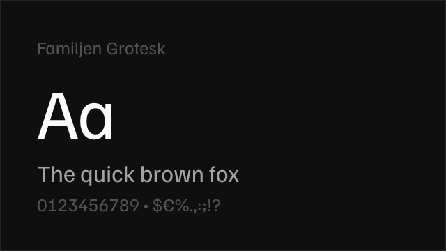
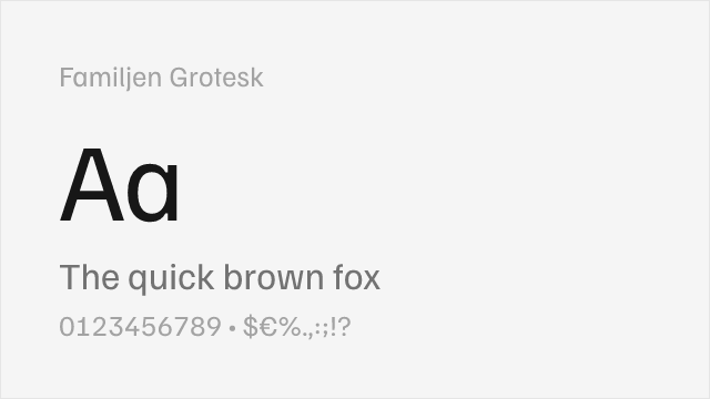
Swedish neo-grotesque with contemporary refinements for digital use

Why it matches: Familjen Grotesk shares Suisse Int'l's Scandinavian/Swiss design sensibility — both are contemporary neo-grotesques that value restraint, open apertures, and clean proportions over personality. Familjen is lighter and more contemporary in its touch, with a narrower weight range (400-700) that limits its versatility compared to Suisse's full family. The Swedish design heritage gives it a closely related aesthetic DNA.
minimal brand identitiescontemporary editorial designScandinavian-style interfacescultural institution websites
Get Font ↗
#9 Nacelle 65%
[fontshare] · ITF Free Font License · Variable

Clean neo-grotesque from Fontshare

Get Font ↗

Related Pages