 Install FontSwap
Free Alternatives to WTF Forma Supporting Latin Extended
Need a free alternative to WTF Forma with Latin Extended script support? These 7 options include Latin Extended characters and share visual similarities with WTF Forma. Each is licensed for free personal and commercial use.
Top Picks
Comparison Table
| Font | Relevance ⓘ
How well this alternative fits the specific context (use-case or trait) of this page. Score 0–100 based on matching keywords, industries, and font characteristics. Alternatives scoring 25+ are highlighted.
| Similarity ⓘ
How visually similar this free font is to the premium original. Score 0–100 based on x-height, width, stroke contrast, use-case overlap, and language coverage.
Learn more → | Weights | Variable | License | Source |
|---|---|---|---|---|---|---|
| Barlow | 0 | 80% | 9 | No | OFL-1.1 | Google Fonts ↗ |
| Source Sans 3 | 0 | 78% | Variable | Yes | OFL-1.1 | Google Fonts ↗ |
| IBM Plex Sans | 0 | 77% | Variable | Yes | OFL-1.1 | Google Fonts ↗ |
| Inter | 0 | 76% | Variable | Yes | OFL-1.1 | Google Fonts ↗ |
| Public Sans | 0 | 75% | Variable | Yes | OFL-1.1 | Google Fonts ↗ |
| Noto Sans | 0 | 74% | Variable | Yes | OFL-1.1 | Google Fonts ↗ |
| Work Sans | 0 | 73% | Variable | Yes | OFL-1.1 | Google Fonts ↗ |
All Alternatives (7)
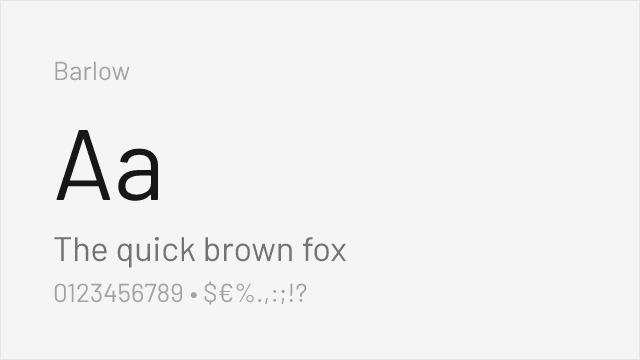
[Google Fonts] · OFL-1.1 · 9 weights
DIN-adjacent signage aesthetic with California public-signage DNA
Why it matches: Barlow captures WTF Forma's DIN-influenced proportions through its own transportation and signage lineage. Both typefaces share slightly condensed proportions, squared curves, and industrial precision suited for corporate identity systems. Barlow's semi-condensed and condensed variants provide similar space efficiency to Forma's compressed and condensed widths. The overall tone is comparable: professional, functional, and authoritative without being severe.
corporate identity systemssignage and wayfindingdata-dense dashboardsspace-constrained layouts

[Google Fonts] · OFL-1.1 · Variable
Adobe's workhorse sans with excellent cross-platform rendering and variable support
Why it matches: Source Sans 3 matches WTF Forma's commitment to functional corporate typography that works across contexts. Both feature open apertures, consistent stroke weight, and neutral personality suited for enterprise applications. Source Sans 3's extensive hinting ensures reliable rendering on the varied display hardware common in corporate environments, from office monitors to conference room projectors.
enterprise applicationscross-platform deploymentsdocumentation and help systemsgovernment and institutional sites
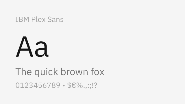
[Google Fonts] · OFL-1.1 · Variable
Engineered for UI clarity with strong corporate identity and glyph differentiation
Why it matches: IBM Plex Sans mirrors WTF Forma's corporate engineering approach to typography. Both typefaces were designed to serve large organizations across diverse touchpoints, prioritizing glyph disambiguation and professional tone. Plex's rational grid structure echoes Forma's systematic width variants, and both achieve corporate authority without sacrificing approachability.
enterprise dashboardscorporate identity systemstechnical documentationdata-heavy interfaces
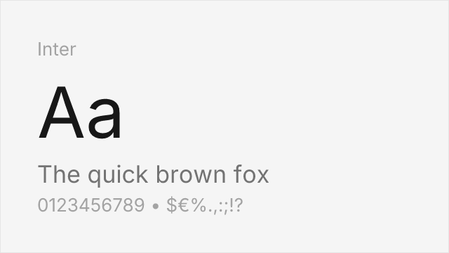
[Google Fonts] · OFL-1.1 · Variable
Screen-optimized variable sans with optical sizing and comprehensive language support
Why it matches: Inter provides WTF Forma's functional clarity in a screen-first package. Both typefaces prioritize reading efficiency and clean corporate tone. Inter's taller x-height and more open proportions give it slightly better screen legibility at small sizes, while Forma's DIN-influenced metrics provide better space efficiency. Inter's optical sizing axis compensates for the lack of dedicated width variants.
web and app interfacesdesign system prototypingdata-dense dashboardscross-platform applications
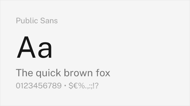
[Google Fonts] · OFL-1.1 · Variable
Government-grade neutrality with accessibility-first design principles
Why it matches: Public Sans shares WTF Forma's institutional authority and functional neutrality. Both were designed for contexts where typography must communicate trust and clarity above all else. Public Sans's U.S. government heritage gives it a similar institutional weight to Forma's corporate design DNA. Both feature open apertures and careful glyph differentiation.
institutional communicationsaccessible interface designgovernment and civic techform-heavy enterprise tools
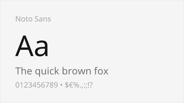
[Google Fonts] · OFL-1.1 · Variable
Unmatched multilingual coverage with neutral corporate character
Why it matches: Noto Sans provides the global deployment capability that WTF Forma users often need. Both share a neutral neo-grotesk foundation suited for corporate contexts, but Noto Sans extends this to hundreds of scripts. For organizations operating across language boundaries, Noto Sans's consistent cross-script design echoes Forma's systematic approach to width and weight variants.
multilingual corporate deploymentsglobal brand systemscross-script consistencyfallback font strategy

[Google Fonts] · OFL-1.1 · Variable
Industrial-functional variable sans with American gothic lineage
Why it matches: Work Sans channels the same industrial-functional tradition that influences WTF Forma, but through an American gothic lens. Both typefaces prioritize efficient space use and clear letterforms for professional contexts. Work Sans's slightly wider proportions give text a more relaxed rhythm compared to Forma's DIN-derived metrics, making it better suited for editorial and content-heavy applications.
editorial web contenttech company brandingcontent management systemsresponsive web applications