Free Alternatives to WTF Forma

About WTF Forma
- Foundry
- W Type Foundry
- Classification
- sans-serif
- Style
- neo-grotesque
Brands Using WTF Forma
Primary brand typeface for enterprise companies seeking DIN-like authority with contemporary warmth
Corporate communications and client-facing materials requiring trustworthy, functional typography
Patient-facing communications and signage requiring clarity and professionalism
A clean neo-grotesque for wayfinding and information design
 See WTF Forma live on these sites with FontSwap →
WTF Forma is a contemporary sans-serif typeface by W Type Foundry, a type design collective based in Santiago, Chile. Formerly known as Without Foundry, the studio took shape as W Type Foundry around 2016 and has built a reputation for systematic corporate typeface systems designed for B2B contexts. Forma spans 50 styles across five widths (Compressed, Condensed, Regular, Expanded, Wide) with a complete set of italics, making it one of the most systematically designed DIN-influenced sans-serif families available.
WTF Forma requires a commercial license. It is available through MyFonts and directly from W Type Foundry. There is no free tier, no open-source license, and no Google Fonts availability. If you need a similar DIN-influenced corporate sans-serif without the licensing cost, this page covers the best free alternatives.
Why WTF Forma Matters
DIN is one of the most referenced typefaces in corporate design. Originally developed as a German industrial standard for engineering and signage, its proportions and personality have become shorthand for "trustworthy, functional, modern." But licensing DIN and its derivatives (DIN Next, DIN 2014, FF DIN) for comprehensive brand systems is expensive, and the available versions vary widely in quality and completeness.
WTF Forma approaches the DIN aesthetic from a different angle. Rather than directly reviving or digitizing DIN, it takes the underlying principles — rational construction, slightly condensed proportions, functional clarity — and builds a contemporary family designed with three explicit goals: serving large corporations, exuding friendliness, and providing a practical solution for multi-context brand systems.
The result is a typeface that reads as corporate-trustworthy without the coldness often associated with pure DIN. Forma adds subtle warmth through slightly softened curves and marginally more generous proportions than strict DIN derivatives, making it more comfortable for extended reading while maintaining the institutional authority that DIN provides.
What separates Forma from a single-weight DIN clone is the breadth of the system. A brand rarely needs one typeface; it needs a family that can hold a densely packed data table, a paragraph of running copy, and a large environmental headline without ever changing its voice. Forma's answer is width. By shipping Compressed, Condensed, Regular, Expanded, and Wide as independently drawn designs, it lets a design team stay inside a single family while adjusting the fit of the text to the space it occupies. That is the practical reason large organizations pay for typefaces like this: consistency across every touchpoint is worth more than the appeal of any one style.
The friendliness goal is easy to underrate. Pure DIN can feel cold and administrative, closer to a road sign than a brand. Forma's softened curves pull it a few degrees warmer without giving up the rational, engineered structure that signals competence. For sectors that need to feel both authoritative and human — healthcare, finance, enterprise software — that middle position is exactly the point.
Design Characteristics
WTF Forma sits in the corporate neo-grotesk family with DIN-influenced proportions:
- Five widths: Compressed, Condensed, Regular, Expanded, and Wide. Each width is independently designed, not mathematically scaled, allowing proper optical adjustment across the width spectrum.
- Complete italic set: Every weight in every width has a matching italic, providing 50 total styles for comprehensive typographic control.
- DIN-influenced proportions: Slightly condensed default width with rational, grid-aligned construction. The proportions are space-efficient without feeling cramped.
- Softened curves: Where DIN is strictly geometric, Forma introduces subtle curves that add warmth and approachability. This is most visible in characters like the lowercase a, g, and e.
- Consistent stroke weight: Even weight distribution ensures legibility across sizes and output contexts, from screen rendering to large-format print.
- Corporate-neutral character: The overall personality is professional and trustworthy without being sterile. Forma aims for the "friendly corporate" zone that many organizations want but few typefaces successfully deliver.
Read together, these characteristics describe a typeface engineered for range rather than for a signature look. The width system is the defining feature. Most sans-serif families offer a handful of weights and, if you are lucky, a single condensed cut; Forma treats width as a first-class axis, giving a designer five distinct horizontal proportions to work with. Compressed and Condensed buy space in tight layouts and long headlines. Regular carries body copy. Expanded and Wide open the letterforms up for display and environmental use, where generous spacing reads as confidence.
Because each width is drawn on its own rather than mechanically stretched, the letterforms stay optically correct across the range: stroke weights hold, counters stay balanced, and the family reads as one coherent voice at every setting. The complete italic coverage matters for the same reason. In corporate and editorial work, italics do real semantic labor — emphasis, citations, captions, foreign terms — and a family that carries a true italic for every weight and width removes the compromise of a faked slant, which is one of the quiet tells of an under-resourced type system.
Where WTF Forma Excels
- Corporate identity systems: The five-width range covers everything from tight data tables (Compressed) to relaxed editorial layouts (Wide)
- Financial and legal communications: The trustworthy, rational aesthetic suits sectors where typography must convey reliability
- Healthcare and institutional branding: The warmth-within-structure approach works for organizations that need to be both professional and approachable
- Signage and environmental graphics: The condensed variants are space-efficient for wayfinding while remaining legible
- Multi-context brand deployments: A single family covering narrow data layouts, standard body text, and expanded display use
The common thread across these uses is range within a single system. An annual report might set dense financial tables in a Condensed weight, run its narrative body in Regular, and headline its section openers in Wide, all without leaving the family or breaking the brand's typographic voice. That is the scenario Forma is built for, and it is where a five-width family earns its license cost over a one-width grotesque.
Where It Struggles
- Projects wanting personality: Forma is deliberately corporate-neutral. If your brand needs to be immediately recognizable through typography, a more distinctive typeface is a better choice.
- Display-only use: For headline-only projects, Forma's systematic width coverage is unnecessary. A single-width grotesque (free or premium) produces comparable results.
- Screen-first digital products: Forma lacks the screen-specific optimizations (hinting, optical sizing) that Inter and Source Sans 3 provide. For web-only projects, these free alternatives may actually perform better on screen.
None of these limits are flaws so much as consequences of the brief. Forma optimizes for a broad, neutral, multi-context system, and that optimization costs it distinctiveness and screen-specific tuning. Recognizing this is useful when choosing a substitute: if a project only ever needs one width at one size on screen, you are paying for range you will not use, and a focused free grotesque will serve you just as well.
How to Choose a Free Substitute
When evaluating alternatives to WTF Forma, prioritize:
- Width variants: Forma's key value is its five-width system. Barlow (with Semi Condensed and Condensed) is the closest free match for width coverage.
- Corporate tone: The substitute should read as professional and trustworthy. Avoid fonts with too much personality (Space Grotesk) or too little presence (system sans-serifs).
- Weight range: Ensure at least Light through Bold for hierarchy. Forma carries five weights per width (Thin, Light, Regular, Bold, Heavy), so most free families can cover its core hierarchy — the harder part is matching that range across all five widths.
- DIN adjacency: If the DIN aesthetic is what drew you to Forma, test Barlow specifically. For a more neutral corporate tone, try Source Sans 3 or IBM Plex Sans.
- Italic quality: Forma's complete italic coverage is unusual. Verify your substitute offers true italics, not mechanically slanted romans.
Beyond those criteria, the right alternative usually falls out of where the type will actually live:
- Closest to the DIN look → Barlow. Its transportation-and-signage lineage and available Semi Condensed and Condensed cuts make it the nearest free stand-in for Forma's condensed proportions and industrial tone. Reach for it first when the DIN aesthetic is what drew you to Forma.
- Broadest cross-platform reliability → Source Sans 3. When a design has to render predictably across office monitors, projectors, and mixed operating systems, its extensive hinting and neutral corporate voice make it the safe default for enterprise deployment.
- Engineered, technical corporate tone → IBM Plex Sans. Built to serve a large organization across many touchpoints, Plex brings careful glyph disambiguation and a rational grid. It leans cooler and more technical than Forma, which suits documentation and data-heavy interfaces.
- Screen-first products → Inter. Its taller x-height, open apertures, and optical-sizing axis give it the small-size legibility Forma's print-tuned metrics lack. For web and app interfaces, it is often the more comfortable choice.
- Institutional and accessibility-driven work → Public Sans. Government-grade neutrality and careful glyph differentiation make it the pick for civic tech, forms, and any context where clarity and trust outweigh personality.
- Multilingual and global systems → Noto Sans. When a brand crosses scripts, Noto's consistent cross-language design extends Forma's systematic approach to a global footprint, and it doubles as a dependable fallback face.
- Content-heavy and editorial → Work Sans. Its slightly wider proportions give running text a more relaxed rhythm than Forma's compressed metrics, which reads more comfortably across long stretches of copy.
A useful way to frame the decision: match Forma by width system when the value you want is range, and Barlow gets closest there; match it by medium when a single context dominates — Inter for screens, Source Sans 3 for cross-platform documents, Noto Sans when language coverage is the deciding factor. No free family reproduces all fifty of Forma's styles, so the honest goal is not to clone the system but to cover the widths and weights a project genuinely uses.
Premium Font Neighbors
If WTF Forma's approach appeals to you, these premium typefaces occupy adjacent territory:
Cluster A: DIN-influenced corporate sans-serifs
- DIN Next (Monotype) — the official modernization of the DIN standard
- FF DIN (FontFont) — Albert-Jan Pool's influential DIN revival
- Frutiger (Linotype) — legibility-first sans with institutional authority, a philosophical cousin
- Univers (Linotype) — Adrian Frutiger's systematic neo-grotesk with comprehensive weight/width coverage
Cluster B: Contemporary corporate grotesques
- Aktiv Grotesk (Dalton Maag) — workhorse neo-grotesk with extensive language support
- GT America (Grilli Type) — bridges American gothic and European grotesk for corporate use
- Graphik (Commercial Type) — popular in tech and media for its clean, corporate tone
- Neue Haas Grotesk (Linotype/Monotype) — Christian Schwartz's 2010 revival of the original pre-Helvetica design, recut for contemporary corporate use
All fonts listed above are premium/commercial typefaces requiring paid licenses.
Comparing these neighbors helps clarify what you actually want from Forma. If it is the DIN character specifically, the Cluster A revivals hold that line more strictly. If it is a clean contemporary corporate grotesque, the Cluster B families cover similar ground with their own personalities. And if what you want is simply the neutral, systematic, friendly-corporate feeling, the free alternatives above deliver most of it without the licensing cost, the trade-off being fewer widths and, in the closest matches, a narrower weight range.
FAQ
What is the best free alternative to WTF Forma?
Barlow is the closest free alternative at 80% similarity. It shares WTF Forma's DIN-influenced proportions, condensed variants, and industrial-corporate character. For a warmer corporate sans-serif, Source Sans 3 (78% similarity) or IBM Plex Sans (77%) are excellent alternatives.
How does WTF Forma compare to DIN Next?
Both draw on the DIN tradition, but WTF Forma adds intentional warmth through softened curves and more generous proportions. DIN Next is a closer revival of the original DIN standard; Forma is a contemporary reinterpretation. Forma offers more widths (5 vs. DIN Next's 3) and a warmer corporate tone. In practice, that difference shows up most in large brand systems: the extra widths give Forma more room to handle both compressed data settings and expanded display type inside one family, while the softened curves make it a little more comfortable when the same brand needs to run longer passages of body copy.
Is WTF Forma a variable font?
No. WTF Forma is currently available only as static instances. The 50 styles (5 widths × 5 weights × 2 for roman and italic) are individual font files. For projects requiring variable font technology, Source Sans 3 and Inter offer variable alternatives with a comparable clean corporate tone.
Why is it called "WTF" Forma?
WTF stands for "W Type Foundry," the foundry's abbreviated name. The foundry was originally called Without Foundry before being renamed W Type Foundry in 2016. All their typefaces use the WTF prefix as a foundry identifier.
Can WTF Forma be used for web projects?
Yes, through licensed web font files. The 50-style family allows web designers to load only the specific widths and weights needed. Because Forma ships as static instances rather than a variable font, each width and weight you load is a separate file, so it pays to subset deliberately and serve only the styles a given page actually uses. Teams that would rather ship a single small variable file than juggle many static ones will find Inter or Source Sans 3 easier to deploy on the web. For projects that cannot justify the license cost, Barlow provides comparable width coverage with free web font access through Google Fonts.
What industries use WTF Forma?
WTF Forma's DIN-influenced corporate aesthetic makes it popular in financial services, healthcare, legal, and enterprise technology — sectors where typography must convey trust, clarity, and professionalism. Its five-width system is particularly valued in organizations that need a single family for everything from data tables to marketing materials.
Is WTF Forma on Google Fonts?
No, WTF Forma is a premium font from W Type Foundry and is not available on Google Fonts.
The closest Google Fonts alternative is Barlow with 80% similarity. Get it free on Google Fonts ↗
Free Alternatives (7)
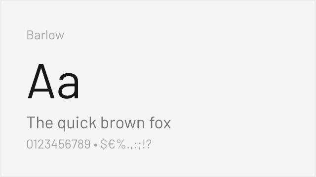
DIN-adjacent signage aesthetic with California public-signage DNA

Adobe's workhorse sans with excellent cross-platform rendering and variable support
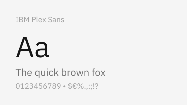
Engineered for UI clarity with strong corporate identity and glyph differentiation
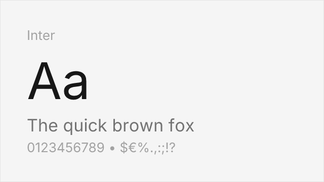
Screen-optimized variable sans with optical sizing and comprehensive language support
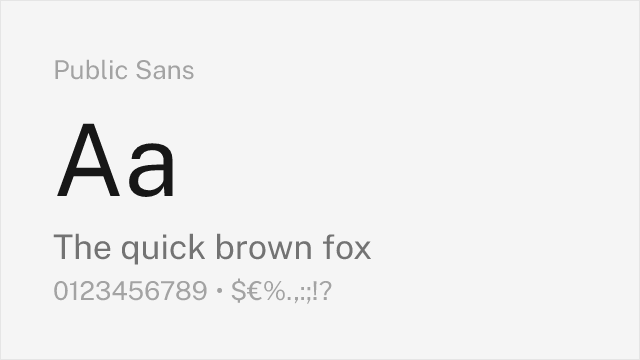
Government-grade neutrality with accessibility-first design principles
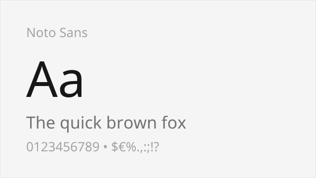
Unmatched multilingual coverage with neutral corporate character

Industrial-functional variable sans with American gothic lineage
Compare the alternatives
See how WTF Forma compares to its top alternatives — and how those alternatives compare to each other — side by side.
See where WTF Forma is used in the wild and swap to free alternatives live.
Install FontSwap →Replacement Summary
Source: FontAlternatives.com
Premium font: WTF Forma
Best free alternative: Barlow
FontAlternatives similarity score: 80%
Replacement difficulty: Medium
Best for: corporate identity systems, signage and wayfinding, data-dense dashboards, space-constrained layouts
Notable users: Corporate Identity Systems, Financial Institutions, Healthcare Organizations
Not recommended when: Brand consistency with Corporate Identity Systems requires exact letterforms
What is the best free alternative to WTF Forma?
Barlow is the best free alternative to WTF Forma with a FontAlternatives similarity score of 80%.
Barlow shares similar proportions, stroke characteristics, and intended use with WTF Forma. It is available under the OFL-1.1 license, which permits both personal and commercial use at no cost.
This alternative works particularly well for: corporate identity systems, signage and wayfinding, data-dense dashboards, space-constrained layouts.
Can I safely replace WTF Forma with Barlow?
Yes, with some considerations. Barlow achieves a FontAlternatives similarity score of 80%, indicating good structural compatibility for most use cases.
Licensing: Barlow is licensed under OFL-1.1, which allows commercial use without licensing fees or royalties.
Weight coverage: Most weights have close or exact matches available.
When should I NOT replace WTF Forma?
While Barlow is a strong alternative, there are situations where replacing WTF Forma may not be appropriate:
- Optical precision requirements: Barlow has measurable structural differences from WTF Forma that may be visible in precise design work.
- Strict compliance: Verify that OFL-1.1 terms meet your specific legal and compliance requirements.
Weight-Matching Guide
Map WTF Forma weights to their closest free alternatives for accurate font substitution.
Barlow
| WTF Forma | Barlow | Match |
|---|---|---|
| Light | Light (300) | close |
| Regular | Regular (400) | close |
| Bold | Bold (700) | close |
| Heavy | Black (900) | close |
Source Sans 3
| WTF Forma | Source Sans 3 | Match |
|---|---|---|
| Light | Light (300) | close |
| Regular | Regular (400) | close |
| Bold | Bold (700) | close |
| Heavy | Black (900) | close |
IBM Plex Sans
| WTF Forma | IBM Plex Sans | Match |
|---|---|---|
| Thin | Thin (100) | exact |
| Light | Light (300) | close |
| Regular | Regular (400) | close |
| Bold | Bold (700) | close |
Inter
| WTF Forma | Inter | Match |
|---|---|---|
| Light | Light (300) | close |
| Regular | Regular (400) | close |
| Bold | Bold (700) | close |
| Heavy | Black (900) | close |
Public Sans
| WTF Forma | Public Sans | Match |
|---|---|---|
| Light | Light (300) | close |
| Regular | Regular (400) | close |
| Bold | Bold (700) | close |
| Heavy | Black (900) | close |
Noto Sans
| WTF Forma | Noto Sans | Match |
|---|---|---|
| Light | Light (300) | close |
| Regular | Regular (400) | close |
| Bold | Bold (700) | close |
| Heavy | Black (900) | close |
Work Sans
| WTF Forma | Work Sans | Match |
|---|---|---|
| Light | Light (300) | close |
| Regular | Regular (400) | close |
| Bold | Bold (700) | close |
| Heavy | Black (900) | close |
Performance Guide
Production performance metrics for each alternative.
How to Use Barlow
Copy these code snippets to quickly add Barlow to your project.
CSS code for Barlow
@import url('https://fonts.googleapis.com/css2?family=Barlow:wght@100;200;300;400;500;600;700;800;900&display=swap');HTML code for Barlow
<link rel="preconnect" href="https://fonts.googleapis.com">
<link rel="preconnect" href="https://fonts.gstatic.com" crossorigin>
<link href="https://fonts.googleapis.com/css2?family=Barlow:wght@100;200;300;400;500;600;700;800;900&display=swap" rel="stylesheet">
Tailwind code for Barlow
// tailwind.config.js
module.exports = {
  theme: {
    extend: {
      fontFamily: {
        'barlow': ['Barlow', 'sans-serif'],
      },
    },
  },
}

// Usage in HTML:
// <p class="font-barlow">Your text here</p>
Next.js code for Barlow
// Using next/font (Next.js 13+)
import { Barlow } from 'next/font/google';

const barlow = Barlow({
  subsets: ['latin'],
  weight: ['100', '200', '300', '400', '500', '600', '700', '800', '900'],
});

export default function Component() {
  return (
    <p className={barlow.className}>
      Your text here
    </p>
  );
}

// Or using inline styles with Google Fonts link:
// <p style={{ fontFamily: "'Barlow'" }}>Your text</p>
Expo and React Native code for Barlow
// Install: npx expo install @expo-google-fonts/barlow expo-font
import { useFonts, Barlow_400Regular } from '@expo-google-fonts/barlow';

export default function App() {
  const [fontsLoaded] = useFonts({
    Barlow_400Regular,
  });

  if (!fontsLoaded) return null;

  return (
    <Text style={{ fontFamily: 'Barlow_400Regular' }}>
      Your text here
    </Text>
  );
}
Recommended Font Pairings
These free fonts pair well with Barlow WTF Forma for headlines, body text, or accent use.
Source Serif Pro's transitional serif forms provide excellent contrast with WTF Forma's clean corporate sans-serif, creating a trustworthy pairing for financial, legal, and institutional communications
Fira Code's monospace clarity and programming ligatures complement WTF Forma's functional aesthetic for technical documentation and developer-facing enterprise interfaces
Crimson Pro's refined serif character creates editorial contrast with WTF Forma's corporate clarity, suitable for annual reports, whitepapers, and thought leadership content
Browse Alternatives by Context
Find WTF Forma alternatives filtered by specific use case, style, or language support.
By Use Case
By Script
Frequently Asked Questions
What is the best free alternative to WTF Forma?
Barlow is the best free alternative to WTF Forma with a FontAlternatives similarity score of 80%. It shares similar proportions and characteristics while being available under the OFL-1.1 license for both personal and commercial use at no cost.
Is there a free version of WTF Forma?
There is no official free version of WTF Forma. However, Barlow is available under the OFL-1.1 open-source license and achieves a FontAlternatives similarity score of 80%. It includes 9 weights and supports latin, latin-extended.
What Google Font looks like WTF Forma?
The Google Fonts most similar to WTF Forma are Barlow, Source Sans 3, IBM Plex Sans. Among these alternatives, Barlow offers the closest match with a FontAlternatives similarity score of 80% and includes 9 weights for design flexibility.
Can I use Barlow commercially?
Yes, Barlow can be used commercially. It is licensed under OFL-1.1, which allows free use in websites, applications, print materials, and commercial projects without purchasing a license or paying royalties.
Is Barlow similar enough to WTF Forma?
Barlow achieves a FontAlternatives similarity score of 80% compared to WTF Forma. While not identical, it offers comparable letterforms, proportions, and visual style. Most designers find it works excellently as a substitute in web and print projects.
What are the main differences between WTF Forma and its free alternatives?
Free alternatives to WTF Forma may differ in subtle details like letter spacing, curve refinements, and available weights. Premium fonts typically include more OpenType features, extended language support, and optimized screen rendering. However, for most projects, these differences are negligible.
Where can I download free alternatives to WTF Forma?
Download Barlow directly from Google Fonts. Click the "Get Font" button on any alternative listed above to visit the official download page. Google Fonts also provides convenient embed codes for seamless web integration.