 Install FontSwap
Satoshi

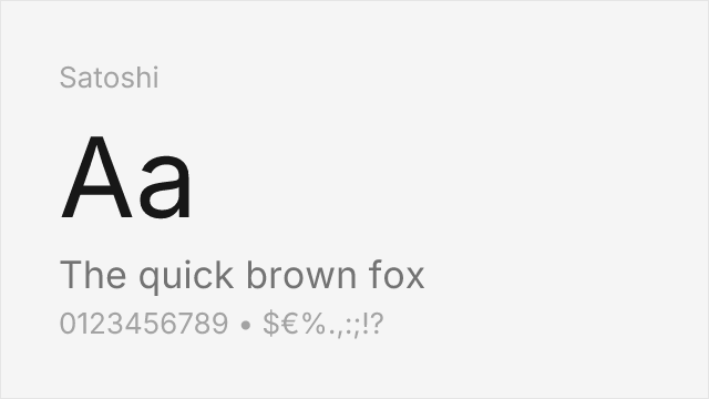
About Satoshi
- Source
- Fontshare ↗
- Classification
- sans-serif
- Weights
- Variable (100-900)
- Features
- Variable, Italics
Free for personal and commercial use, in any medium, with no attribution required. You may not modify or redistribute the font files, and self-hosting as a webfont needs ITF's written consent — use the Fontshare API instead.
What's allowed?
- ✓ Client work
- ✓ SaaS / Web apps
- ✓ YouTube / Video
- ✓ Sell products
- ✓ Print materials
Satoshi is a free modernist sans-serif from the Indian Type Foundry, released through Fontshare in March 2021. It ships five weights with matching obliques, two variable files, and a Latin-only character set of 431 encoded codepoints. It is the most-viewed family in Fontshare's own catalogue, and it is not open source — which is the detail most people miss before they build a product on it.
What Satoshi is, and where it came from
Satoshi was designed by Deni Anggara for the Indian Type Foundry. That credit needs stating carefully, because the Fontshare byline reads "Indian Type Foundry": the API sets display_publisher_as_designer: true, so the individual credit never appears in the designer field — it survives only in the last line of the description. It is corroborated by the binary itself (name ID 9 reads Deni Anggara), by the @license header of the bundled CSS, and by ITF's own description, which closes: "Satoshi was designed by Deni Anggara for the Indian Type Foundry." ITF describes Anggara as a graphic and typeface designer based in Jakarta. Both credits are legitimate — the foundry published it, Anggara drew it.
ITF was started in 2009 by Satya Rajpurohit and Peter Biľak. Fontshare is not a third-party mirror; it is ITF's own free-font platform, described in the shipped EULA as "a dedicated platform called www.fontshare.com".
On design intent, ITF makes exactly one published statement, worth quoting rather than paraphrasing: Satoshi is "a modernist sans serif typeface. Its design combines typically grotesk-style letterforms, with some characters that are quite geometrically-designed. In terms of its appearance, Satoshi was inspired by Modernism and Industrial-Era graphic and typographic design." Its foundry tags are Branding, Logos, Magazines. That is the whole record — and there is no published account of where the name came from, so this page does not offer one.
One caveat about vintage: today's files report Version 2.000. Satoshi was released in March 2021, but what you download now is a later revision and ITF publishes no changelog, so treat 2021 as the family's birthday rather than a description of the current binaries.
There is one sourceable popularity claim. Fontshare's API reports 108,818 views for Satoshi, first among the catalogue's 100 families, ahead of Clash Display (69,460) and General Sans (59,299). Cabinet Grotesk (47,907), Ranade (41,494), Chillax (37,835) and Clash Grotesk (30,859) fill out the next four places, with Switzer eighth at 30,217. That is an August 2026 snapshot of an undocumented metric — not downloads, not installs.
Design characteristics
Measured from the shipped Satoshi-Regular.otf on a 1000-unit em: cap height 716, x-height 484, descender -223. The x-height-to-cap ratio is 0.68 — tall, but not the extreme x-height of a screen-first grotesque. The interesting number is the ascender: b, d and l reach 729, above the cap height. All-caps settings therefore look slightly compact against mixed case, and lowercase-heavy headlines get a visible vertical lift. Lining figures top out at 716–730, aligning with the capitals rather than sitting short. Widths run moderately narrow — H 705, n 562, o 568, word space 277 — so Satoshi sets tighter than a true geometric sans at the same size without being condensed.
The letterforms are where the "grotesque with geometric moments" framing earns itself. The default a is double-storey with no bottom spur; the default g is single-storey, with an open descending tail. That contradicts ITF's own copy, which says both are double-storeyed — the sentence does not describe the shipped v2.000 files. A double-storey g does exist, but it lives in a stylistic set.
Twenty OpenType features sit in GSUB, four of them stylistic sets that materially change the voice of the face: ss01 swaps in an alternate G with the descending spur removed — the default G carries one below the crossbar — plus a single-storey a and an alternate registered sign; ss02 gives the double-storey g, ear rising above the x-height, lower loop closed; ss03 a t with a curved hooked foot instead of the flat default; ss04 a Q whose long straight tail drops below the baseline rather than crossing the bowl. Ten ligatures ship, matching ITF's own count: fi, fl, f_f, f_f_i, f_f_l and f_t in liga, then f_y, t_i, t_t and t_y in dlig. Figures default to proportional lining, with tabular, numerator, denominator, superscript, subscript, inferior and fraction features all present — a better numeric toolkit than most free sans-serifs offer.
The italics are obliques
This is the most under-reported fact about the family, and it is verifiable rather than a matter of taste. post.italicAngle is -9.0, and Satoshi-Italic.otf has the same glyph count (504), the same encoded set (431), and identical contour and point counts to the roman for a, g and l. Only 20 glyphs in the whole font differ from the roman in contour or point count, and most of them are rounds — the e family, ae, oe and Ccedilla account for fourteen of the twenty. The italic f gains no descender, the a stays double-storey, and k and y keep their upright skeletons. Shear the roman by 9 degrees and the straight-sided glyphs — l, I, H, E, L, x, T — land within a few units of the shipped italic; only the rounds carry real optical correction — o and O deviate 23–38 units from the sheared roman while keeping the same point structure. There is light optical correction too (in Satoshi-Italic.otf the e carries 33 points against the roman's 30), so it is not a raw slant either. Call it a well-handled 9-degree oblique, and do not expect cursive shapes.
The variable file defaults to Black
Both variable files carry a wght axis running 300 to 900 with a default of 900, not 400. The file's name table calls it "Satoshi Variable Bold" and sets usWeightClass to 900, and ITF's bundled README tells you to set font-variation-settings: 'wght' 900. Five named instances exist (Light 300, Regular 400, Medium 500, Bold 700, Black 900), but 400 being named is not the same as 400 being the default.
The consequence is concrete: load the raw variable TTF without declaring a weight and you get Black. Fontshare's variable embed (?f[]=satoshi@1) declares font-weight: 300 900 on its @font-face, so that CDN path behaves as expected — the default embed (?f[]=satoshi) ships twelve rules — the ten statics plus two variable faces — with the variable declarations emitted last, so they win the match. Only an explicit static request (?f[]=satoshi@300,400,500,700,900) drops the variable path. Self-hosters must set font-weight or font-variation-settings explicitly. (Fontshare's API randomises the range_default it reports for the wght axis — values from 420 to 900 across repeated calls — so nothing there reflects the binary's actual default either.)
There is one axis and one only. No width, no optical size, no slant, no italic axis — italics are a separate file.
Where Satoshi works
ITF built it for branding, logos and magazines, and that is genuinely where it is strongest. The tall ascenders and cap-height figures give headlines and wordmarks a clean, engineered top line, and the geometric touches read as contemporary without tipping into the circular sameness of a full geometric sans.
It also holds up in product and marketing UI at medium-to-large sizes — navigation, feature headings, pricing tables, section labels — where its moderate width sets about 4% tighter than a geometric sans like Futura and runs on a par with Helvetica. The tabular figures make it viable for dashboards, which is unusual for a display-leaning sans, and a single variable file covers the whole weight hierarchy.
Where Satoshi struggles
- There is no 600. The weights are 300, 400, 500, 700, 900. Design systems that assume a SemiBold step must interpolate on the variable axis or accept a wide jump from Medium straight to Bold. With static files only, that jump is unavoidable.
- Emphasis in long copy. Obliques are fine for a UI label or a caption, but a slanted roman does not carry a page of emphasised editorial text the way a drawn italic does.
- Latin only. 431 codepoints, of which the extended-Latin blocks contribute Latin-1 Supplement (92), Latin Extended-A (115) and Latin Extended-B (12). Turkish, Polish, Czech, Romanian, Croatian, Serbian Latin, Icelandic, Welsh and Maltese all check out with zero missing characters. But there is no Cyrillic and no Greek — the only Greek-block codepoints are Omega and pi, present as maths symbols. And despite Fontshare listing Vietnamese, the Latin Extended Additional block (U+1EA0–U+1EF9), where the tone-marked Vietnamese vowels live, contributes just 2 of the 431 codepoints —
ơ,ư,Ơ,Ưand very nearly every tone-marked vowel are simply absent. - The licence forbids modification. No subsetting, no adapting, no handing the files to an agency or printer — which rules out several standard optimisation and hand-off workflows.
- No family siblings. There is no Satoshi Mono, Serif or Display, so a full design system has to pair across foundries.
- Not on Google Fonts.
fonts.googleapis.com/css2?family=Satoshireturns HTTP 400, so any workflow, plugin or CMS that assumes a Google Fonts URL needs a manual detour. - The glyph set is smaller than the marketing suggests. ITF's description mentions a smiling face and circled numerals; neither appears in the v2.000 files. The arrows, geometric shapes, peace sign and check mark from the same sentence are present.
Which premium fonts Satoshi substitutes for
- Söhne (Klim Type Foundry) is the loosest match. Söhne is a neo-grotesque; Satoshi is a grotesque with geometric interventions, and those show up exactly where you look first — the
G, theQ, the single-storeyg. Satoshi carries the register of a Söhne layout at zero licence cost, but anyone who knows Söhne will spot the swap. Satoshi's real win here is the variable axis, which Söhne does not offer. - Moderat (Tightype) is the closest fit conceptually — both sit in the same geometric-leaning, tech-adjacent territory. If Moderat was chosen for its temperature rather than a specific letterform, Satoshi substitutes cleanly.
- Pitch Sans (Klim) is the harder swap, and the gap is structural rather than stylistic: Pitch Sans is monospaced — Klim's sans cut of the monospaced slab Pitch — while Satoshi is proportional. Where those fixed widths are doing the work, aligning code, tabular data or a deliberately mechanical layout, Satoshi is not a substitute at all; reach for a free monospace such as JetBrains Mono or Geist Mono instead. Satoshi stands in only for the engineered, technical impression, and if the fixed widths or the specific quirks are why Pitch Sans was picked, it does not substitute convincingly.
- Instrument Sans deserves a straight answer: it is itself free, on Google Fonts under the SIL Open Font License, with weight and width axes. Choosing between them is about fit, not cost. Instrument Sans is the more permissively licensed (you may modify and subset it; Satoshi's licence forbids that) and has a width axis; Satoshi answers with the wider weight range and the larger stylistic-set toolkit.
Across all four, Satoshi is a good tonal substitute and never a metric one. Set a paragraph of each side by side before committing.
Pairing Satoshi
Pair Satoshi for contrast in construction, not in mood. It is a low-contrast, moderately narrow sans with a 0.68 x-height ratio and ascenders that overshoot the caps; pair it with something that differs on at least two of those, or the setting reads as an accident.
For editorial, a higher-contrast serif does the separating work: Instrument Serif at display sizes, Source Serif Pro or Literata when the serif carries running text. Because there is no Satoshi Mono, code and data need an outside partner — JetBrains Mono and Geist Mono both hold up, since the shared low stroke contrast keeps the page consistent while the fixed widths differentiate.
Satoshi pairs with itself too, but the missing 600 shapes how: use a wide jump — 300 or 400 for body against 700 or 900 for headings — rather than a subtle three-step ramp out of 400/500/700. Avoid other geometric-leaning grotesques with a similar x-height, which is most of the free sans catalogue. Two faces that are 85% alike look like a mistake, not a system.
Licensing and self-hosting in plain terms
Satoshi ships under the ITF Free Font License (itf_ffl in Fontshare's API), not the SIL Open Font License. Of Fontshare's 100 families, 64 are ITF FFL and 36 are OFL; Satoshi is in the first group. It is free, but it is not open source, and that distinction has teeth.
You may: use it for personal or commercial work, free of charge, for an unlimited period, in any medium — print, web, mobile, digital, apps, ePub, broadcast, OEM — at any scale, anywhere in the world, including for logos and other graphic elements. There is no device or printer cap, and you may embed it in read-only PDFs. Attribution is optional: you "may but are not required to" credit ITF.
You may not: modify, edit, adapt, reverse engineer or otherwise alter the font software; distribute, duplicate, lend, resell or sub-license the files — the EULA explicitly names "passing on to external designers or service providers (design agencies, repro studios, printers, etc.)" — or upload them to a public server or P2P network. The agreement is governed by Indian law, exclusive jurisdiction Ahmedabad.
One clause deserves flagging rather than resolving. The EULA prohibits transmitting the font software over the internet "in font serving or for font replacement" without written consent — read at its widest, that covers any web server delivering a woff2. But the download ships a WEB/ folder of woff2, woff and ttf files, a ready-made satoshi.css and a README of step-by-step self-hosting instructions, so self-hosting is plainly the intended use and the sensible reading is that the clause targets third-party font-delivery services. That is a tension in the document, not a settled question; if it matters to your legal team, ask ITF. If you would rather not self-host, Fontshare serves the family from api.fontshare.com/v2/css with font-display: swap.
Frequently asked questions
Is Satoshi free for commercial use? Yes — free personal and commercial use, any medium, any scale, worldwide, no time limit, no attribution required. Free is not the same as open source; the restrictions above still bind.
Is Satoshi on Google Fonts?
No. fonts.googleapis.com/css2?family=Satoshi returns HTTP 400. It comes only from Fontshare, as a zip or via ITF's hosted CSS API. There is no GitHub repository either.
How many weights does Satoshi have?
Five: Light 300, Regular 400, Medium 500, Bold 700, Black 900, each with a matching oblique — ten styles. You will see "ten weights" repeated widely, including in ITF's own description; the style list is authoritative. The download holds twelve desktop font files — ten static OTFs plus two variable TTFs — alongside a WEB/ folder carrying woff2, woff, ttf and eot for each of the twelve styles. No ExtraLight, SemiBold or ExtraBold.
Does Satoshi have real italics?
Not in the drawn sense. They are a 9-degree oblique with light optical correction — the same 504 glyphs as the roman, only 20 of which differ in contour or point count, no descending f, double-storey a retained.
Does Satoshi support Cyrillic, Greek or Vietnamese? Latin only. Zero Cyrillic codepoints; the only Greek-block characters are Omega and pi, both maths symbols. Fontshare lists Vietnamese, but the cmap lacks the precomposed characters needed to set it.
Why does my self-hosted Satoshi render bold?
The variable file's wght axis defaults to 900, so loading the raw TTF without a declared weight gives you Black. Declare font-weight: 300 900 in your @font-face, or set font-variation-settings: 'wght' 400.
Can I subset Satoshi, or send the files to my agency? No to both, on a plain reading of the licence: it forbids modifying and adapting the font software — subsetting is a modification — and forbids passing files to external designers or service providers, naming agencies, repro studios and printers. Point collaborators at the Fontshare download instead.
Is Satoshi named after Satoshi Nakamoto? There is no published explanation of the name. ITF states an inspiration and says nothing about naming; every crypto-adjacent origin story is speculation.
Is there a Satoshi Mono or a Satoshi Serif? No. Fontshare lists no related families — it is a standalone sans, which is why a full design system has to pair it outside the family.
Which brands use Satoshi? There is no verifiable list. Fonts In Use documents a handful of projects, all independent studio, agency and cultural work rather than household names. If you see a claim that a major tech brand uses Satoshi, ask for a source before repeating it.
Is Satoshi on Google Fonts?
No, Satoshi is not on Google Fonts. It is available from Fontshare ↗
Alternative For (4)
Satoshi is a free alternative to the following fonts:
Neo-grotesque from Fontshare with similar tech character
Popular neo-grotesque from Fontshare with clean character
Compare Satoshi
See how Satoshi compares to other fonts side by side.
Variable Font Axes
Satoshi is a variable font with 1 axis you can fine-tune.
| Axis | Min | Default | Max |
|---|---|---|---|
| wght | 300 | 900 | 900 |
How to Use Satoshi
Copy these code snippets to quickly add Satoshi to your project.
CSS code for Satoshi
/* Download from: https://www.fontshare.com/fonts/satoshi */
@font-face {
  font-family: Satoshi;
  src: url('/fonts/satoshi.woff2') format('woff2');
  font-display: swap;
}
HTML code for Satoshi
<!-- Download from: https://www.fontshare.com/fonts/satoshi -->
<link href="/fonts/satoshi.css" rel="stylesheet">
Tailwind code for Satoshi
// tailwind.config.js
module.exports = {
  theme: {
    extend: {
      fontFamily: {
        'satoshi': ['Satoshi', 'sans-serif'],
      },
    },
  },
}

// Usage in HTML:
// <p class="font-satoshi">Your text here</p>
Next.js code for Satoshi
// Import the font CSS in your _app.js or layout
import '/fonts/satoshi.css';

export default function Component() {
  return (
    <p style={{ fontFamily: "'Satoshi'" }}>
      Your text here
    </p>
  );
}
Expo and React Native code for Satoshi
// Install: npx expo install expo-font
import { useFonts } from 'expo-font';

export default function App() {
  const [fontsLoaded] = useFonts({
    'Satoshi': require('./assets/fonts/satoshi.ttf'),
  });

  if (!fontsLoaded) return null;

  return (
    <Text style={{ fontFamily: 'Satoshi' }}>
      Your text here
    </Text>
  );
}

// Download font from: https://www.fontshare.com/fonts/satoshi