Fonts for Education & Academia
Typography for textbooks, e-learning platforms, academic papers, and educational materials. Readability and accessibility are critical, especially for learners with dyslexia.
Typography Requirements
Source-backed compliance information for education & academia applications.
Dyslexia-Friendly Typography Guidelines
- • Sans-serif fonts generally preferred for dyslexic readers
- • Monospace fonts show slightly better results in research
- • Avoid italics for extended text passages
- • Use clear letter spacing and line height
Source: Good Fonts for Dyslexia Research (retrieved 2026-01-14)
Dyslexia Scotland Formatting Guide
- • Use font size 12-14 point for print materials
- • Left-align text (avoid full justification)
- • Maintain consistent spacing between words
- • Use matte paper to reduce glare
Source: Dyslexia Scotland Formats Guide (retrieved 2026-01-14)
Note: Requirements may vary by jurisdiction. Consult relevant authorities for your specific context.
Font Selection Checklist
Key questions to consider when choosing fonts for education & academia applications.
What age group is the primary audience?
Younger learners may benefit from larger fonts and more spacing. Consider developmental reading stages.
Are there students with dyslexia or reading difficulties?
Dyslexia-friendly fonts have clear letter differentiation (b/d/p/q), open spacing, and avoid mirrored letterforms.
Is this for screen or print reading?
Screen reading may require larger baseline sizes. Consider fonts optimized for the target medium.
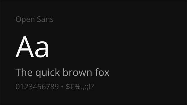
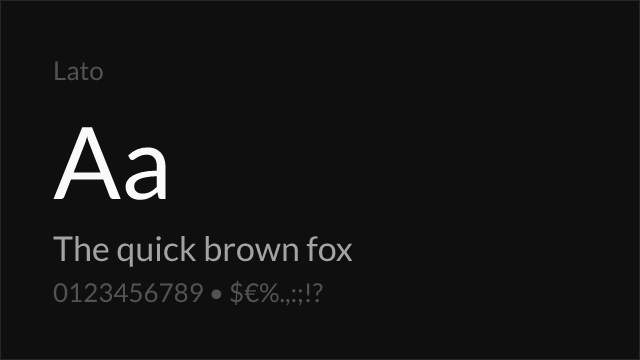
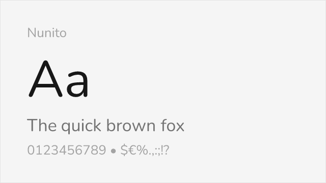
Recommended Fonts
Curated free fonts well-suited for education & academia applications.


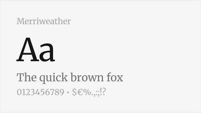
More Options
Additional fonts tagged for education & academia applications.
Migrating from Premium Fonts?
Common premium fonts used in education & academia and their free alternatives.
| Premium Font | Free Alternative | Match |
|---|---|---|
| Verdana | DejaVu Sans | 85% |
| Calibri | Lato | 88% |
| Gill Sans | Lato | 85% |
| Frutiger | Hind | 82% |
| Myriad Pro | Source Sans Pro | 88% |
Frequently Asked Questions
What fonts are best for dyslexic readers?
Research suggests sans-serif and monospace fonts perform best for dyslexic readers. Fonts like Lexend, Atkinson Hyperlegible, and Open Sans have good letter differentiation. Key factors include distinct letterforms (especially b/d/p/q), consistent spacing, and avoiding italics for extended text.
What font size should educational materials use?
For print educational materials, 12-14 point is generally recommended. For younger readers or those with reading difficulties, larger sizes (14-16pt) improve comprehension. On screens, 16px or larger baseline is recommended, with the ability to scale up to 200%.
Related Industries
Sources
- Good Fonts for Dyslexia Research — Retrieved 2026-01-14
- Dyslexia Scotland Formats Guide — Retrieved 2026-01-14