Abercrombie & Fitch Uses Garamond
When Mike Jeffries repositioned Abercrombie & Fitch in 1992, the rebrand included a typographic decision that would define the company's visual identity for decades: Garamond.
The choice was counterintuitive. A & F was selling casual clothing to teenagers and college students — a demographic that most brands addressed with bold sans-serifs and aggressive display type. Jeffries went the opposite direction. Garamond, a 16th-century French old-style serif, communicated heritage, taste, and the Ivy League. The gap between the typeface's associations and the product's price point was the point — it made $40 t-shirts feel like they belonged to a world of prep schools and old money.
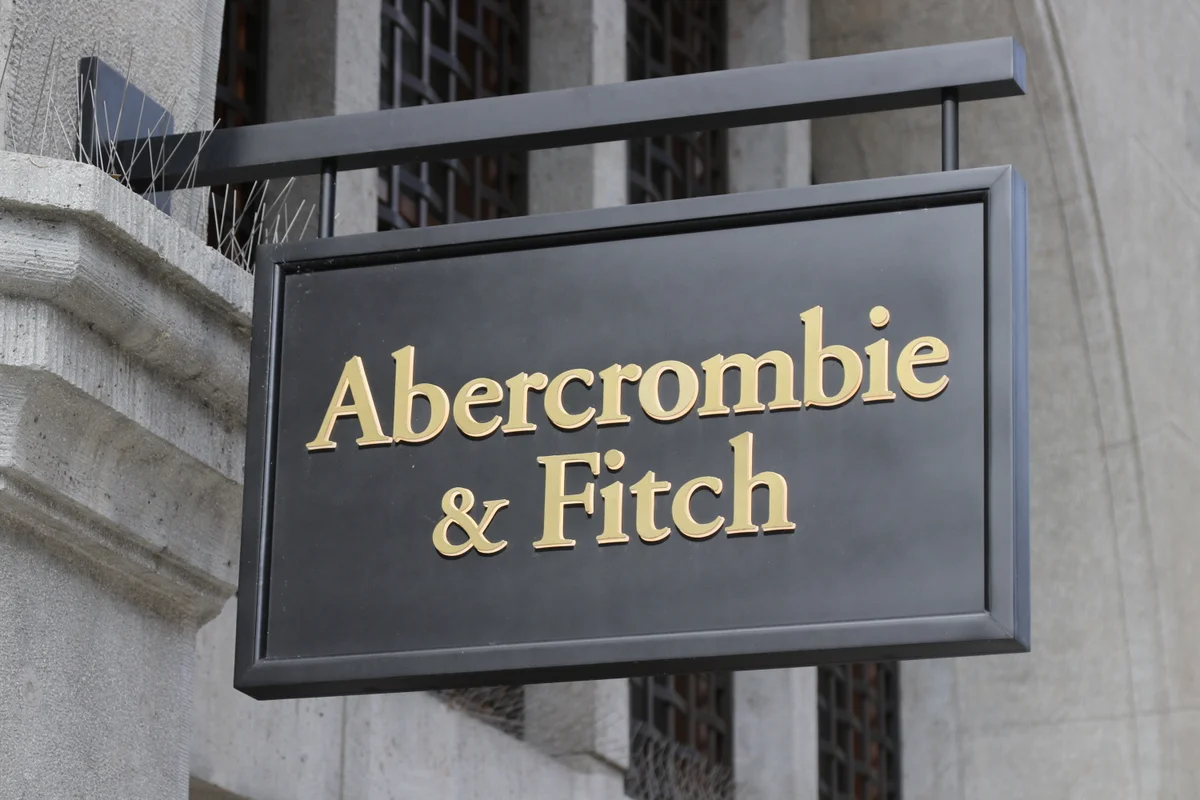
The wordmark appeared on shopping bags, store facades, and the brand's famously provocative catalog. Garamond's elegant proportions lent a veneer of sophistication to everything they touched.
Why Garamond Works for Abercrombie & Fitch
Aspirational heritage
Garamond carries centuries of association with scholarly and literary publishing. For a brand selling aspiration to young consumers, this association performed specific work:
- Suggested establishment credentials the brand didn't historically possess
- Evoked East Coast collegiate culture — the brand's core mythology
- Differentiated from competitors like Gap and American Eagle, who used sans-serif type
Restraint as luxury signal
Garamond is a quiet typeface. Its moderate x-height, gentle bracketed serifs, and old-style proportions don't demand attention. In retail, where visual noise is the default, this restraint read as confidence:
- Lowercase letterforms with modest contrast
- No condensing, no extended tracking
- Classic roman proportions that suggest permanence
The ampersand
"Abercrombie & Fitch" is a long brand name. Garamond's ampersand — calligraphic, distinctive, visually interesting — turns a functional connector into a design element. It became one of the most recognizable ampersands in retail branding.
Free Alternative: EB Garamond
EB Garamond in Regular (400) reproduces the old-style elegance that underpinned Abercrombie's brand identity. Its calligraphic details — including a beautifully drawn ampersand — match the collegiate, heritage-forward tone. For retail branding or editorial work that needs Garamond's aspirational warmth without the licensing cost, EB Garamond is the definitive open-source choice.


