Charles de Gaulle Airport Uses Frutiger
Most typefaces are designed first and find their context later. Frutiger went the other way. In 1968, Aeroports de Paris commissioned Adrian Frutiger to create a signage system for the new Charles de Gaulle Airport terminal. He developed a typeface from scratch, initially called Roissy after the airport's commune.
The brief was unforgiving: signs had to be legible at extreme angles, from moving walkways, in peripheral vision, and across the cavernous spaces of a modernist terminal. Frutiger tested letterforms by blurring printed samples to simulate reading at distance, discarding any character that lost its identity.
The airport opened in 1974 with the signage system in place. Linotype released the typeface commercially as Frutiger in 1976, and it became the most influential wayfinding typeface of the twentieth century. Airports, hospitals, and transit systems worldwide adopted it or its derivatives.
Why Frutiger Works for CDG
Key Facts:
- Typeface: Frutiger (originally "Roissy")
- Designer: Adrian Frutiger, 1968--1975
- Commissioned by: Aeroports de Paris for CDG Terminal 1
- Commercial release: 1976 (Linotype)
The typeface was engineered for its environment. Frutiger did not adapt an existing face -- he solved specific problems:
- Open apertures prevent letters from collapsing at distance (compare Frutiger's lowercase e to Helvetica's)
- Large x-height maximises the area that carries distinguishing information
- Consistent stroke width ensures even colour on backlit sign panels
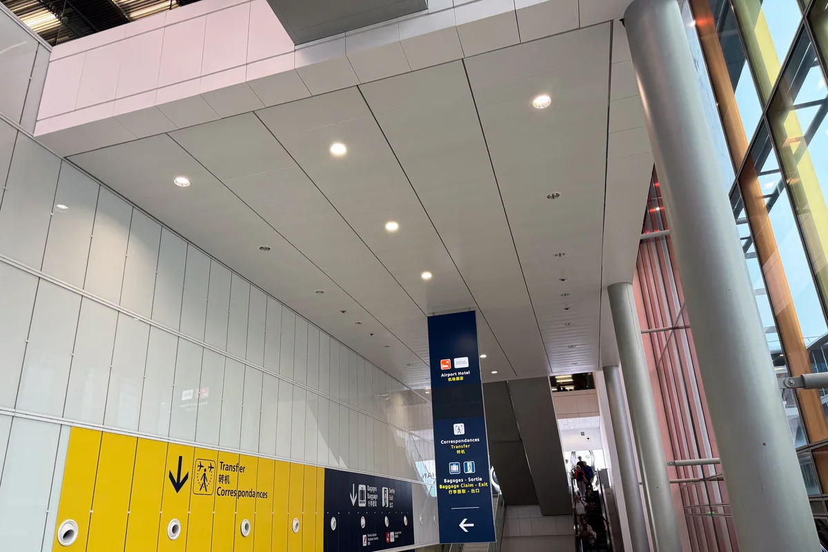
Airport wayfinding is adversarial reading. Passengers are tired, stressed, dragging luggage, and reading in a second or third language. Every millisecond of recognition delay compounds across thousands of decision points:
- Gate changes require instant comprehension from 30 metres
- Multilingual signs stack Latin, Cyrillic, and CJK scripts
- Low-contrast lighting conditions in tunnels and jetways
Frutiger solved these problems so thoroughly that his solution became the standard. The typeface remains in use at CDG today, exactly where it was designed to be.
Free Alternative: Hind
Hind in Regular weight shares Frutiger's open apertures and generous x-height -- the two features most critical for wayfinding legibility. Designed by the Indian Type Foundry, it was built for multi-script environments, making it particularly relevant for airport signage applications where Latin text coexists with Devanagari and other scripts.


