National Park Service Uses Frutiger
In 1977, the National Park Service hired Massimo Vignelli to solve a design problem: 400+ parks, each producing its own brochures, maps, and signage with no visual consistency. Vignelli's answer was the Unigrid system -- a modular layout grid paired with Frutiger as the sole typeface.
The choice of Frutiger was deliberate. Vignelli needed a face that worked on trail markers in Death Valley and interpretive panels in Alaskan wilderness alike. Frutiger's open letterforms and even stroke weight remained legible whether printed on a pocket-sized trail map or etched into a large wayfinding sign.
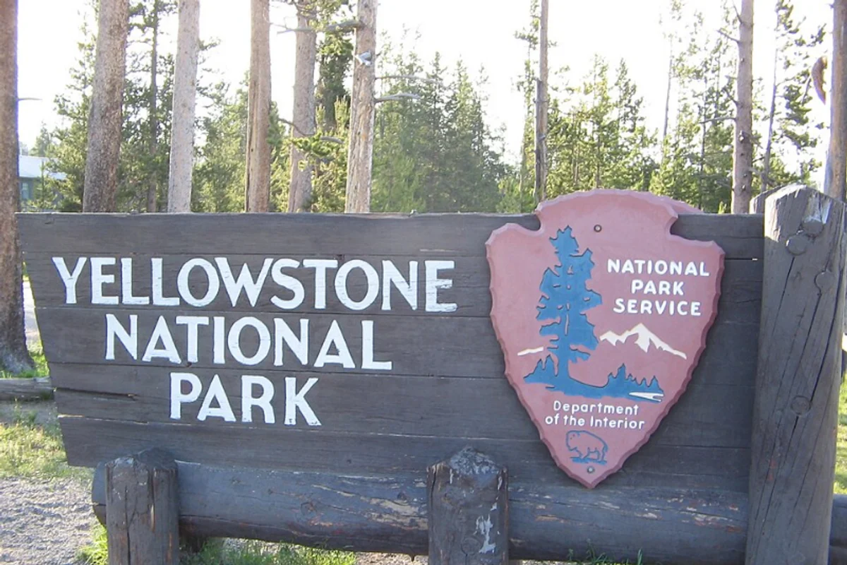
The Unigrid system is still in use today. Every NPS brochure a visitor picks up at a park entrance -- from Yellowstone to Acadia -- follows Vignelli's original grid and sets its text in Frutiger.
Why Frutiger Works for the NPS
Key Facts:
- Typeface: Frutiger (55 Roman and 65 Bold primarily)
- Designer: Adrian Frutiger, 1975
- System designer: Massimo Vignelli, 1977 (Unigrid program)
- Scope: 400+ national parks, monuments, and historic sites
Outdoor environments punish fragile typefaces. NPS materials face conditions that destroy legibility:
- UV exposure fades ink on trail signs over years
- Rain, condensation, and dust obscure letterforms on outdoor panels
- Visitors read maps in direct sunlight, deep shade, and twilight
Frutiger's consistent stroke width means no thin strokes disappear as signs weather. Its open counters resist filling with dirt and debris on carved or raised-letter signs.
Scale range is extreme. A single park may need Frutiger at 6pt on a geology diagram and at 200pt on a highway entrance sign. The typeface holds its proportions across this range without optical correction.
Vignelli's system required typographic neutrality. The Unigrid framework uses a black band header, a strict column grid, and restrained colour. Frutiger delivers information without competing with the landscape photography. It works because it does not call attention to itself.
Free Alternative: Hind
Hind in Medium weight delivers the same clean, upright proportions that make Frutiger effective on park signage. Its generous x-height and open counters maintain readability in the demanding outdoor conditions where NPS materials live, making it a practical substitute for interpretive panels and visitor-facing print.


