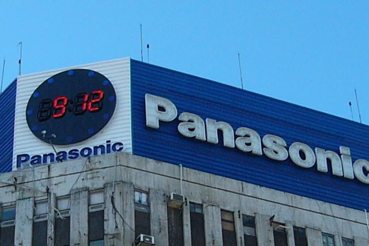
Panasonic Uses Helvetica
Panasonic's wordmark is Helvetica Black — the heaviest standard weight in the Helvetica family — set in the brand's proprietary blue. The letterforms are customized at the margins (adjusted spacing, minor curve refinements) but the DNA is unmistakable.
Nine uppercase letters, no icon, no symbol, no monogram. The word is the mark.
The current form dates to 1971, though "Panasonic" was initially just one of several Matsushita Electric brand names (alongside National, Quasar, and Technics). When the company unified under the Panasonic name globally in 2008, the Helvetica Black wordmark absorbed the weight of a $70 billion corporation.
Why Helvetica Black Works for Panasonic
The universal adapter
Consumer electronics brands face a translation problem that fashion and food brands do not. A television sold in Tokyo needs the same brand recognition as one sold in Berlin or São Paulo.
Helvetica Black solves this by being culturally weightless:
- Belongs to no country, no era, no aesthetic movement
- Connects everywhere because it commits nowhere
- The typographic equivalent of a universal adapter
Density for the shelf
The Black weight — heavier than Bold, denser than Extra Bold — serves a specific retail function. Electronics products sit on brightly lit shelves surrounded by spec sheets, price tags, and competitor products. The wordmark needs to punch through visual clutter at a distance.
Helvetica Black has the density to do this without appearing aggressive. It is heavy the way a well-built machine is heavy: solidly, not oppressively.
Swiss precision meets Japanese precision
There is an interesting tension between the typeface's Swiss origin and Panasonic's Japanese identity. Swiss design and Japanese design share an obsession with precision, reduction, and functional beauty. Helvetica Black on a Panasonic product feels coherent because both traditions value the same things — objects that work perfectly and communicate nothing beyond their function.
Free Alternative: Inter
Inter in ExtraBold (800) or Black (900) weight approximates the density of Panasonic's Helvetica Black. Its variable font axis lets you fine-tune between 800 and 900 for the exact optical weight your substrate requires. Source Sans Pro Bold is an alternative if you want slightly more humanist warmth than Helvetica's strict neutrality.