Vietnam Veterans Memorial Uses Optima
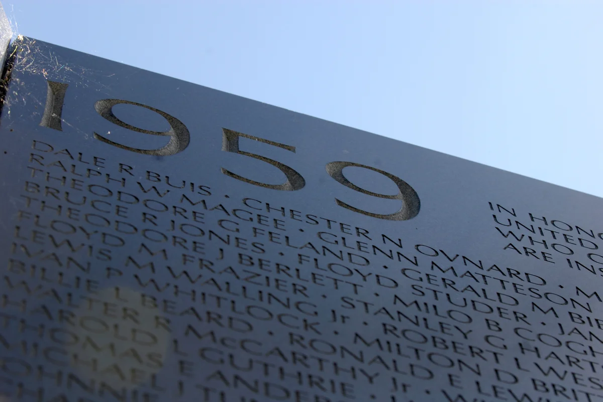
On the black granite panels of the Vietnam Veterans Memorial in Washington, D.C., 58,318 names are carved in Optima. Each name is a person. The typeface had to honor that.
Maya Lin was 21 years old when her design was selected in 1981. The memorial's power comes from its restraint — two walls of polished black granite sinking into the earth, carrying nothing but names, arranged chronologically by date of casualty. The typography needed to match that restraint.
Optima was chosen for the inscriptions by the memorial's design team. It was the right call. The names are legible from a distance and intimate up close, which matters when visitors press paper against the stone to trace a name with pencil.
Why Optima Worked for the Vietnam Veterans Memorial
Key Facts:
- Typeface: Optima (Medium weight)
- Designer: Hermann Zapf, 1958
- Application: 58,318 names carved into 144 panels of black granite
- Dedicated: November 13, 1982
The memorial demanded a typeface that could do something extraordinarily difficult: represent individual human beings as carved letters in stone, at scale, without reducing them to abstractions.
Optima met every requirement:
- Humanist stroke variation gave each name warmth that a geometric sans-serif would have denied it
- No serifs to trap shadow and reduce legibility in the memorial's reflective black granite
- Clean, open letterforms readable both at arm's length and from the walkway
- Dignified without being cold — critical for a wall that visitors touch, weep against, and leave flowers before
Hermann Zapf based Optima on Renaissance inscriptional lettering — the same tradition used on gravestones and monuments for centuries. On the Vietnam wall, that lineage carries a weight no design brief could have specified.
Free Alternative: URW Gothic
For memorial design, civic signage, or any project requiring Optima's humanist gravity, URW Gothic offers the same flared stroke terminals and open proportions.
Set in Medium weight with careful letterspacing, it preserves the dignified legibility that makes Optima the standard for inscriptional work. URW Gothic's warmth and clarity make it suitable for projects where typography must serve remembrance.


