Free Alternatives to Ambroise

About Ambroise
- Foundry
- Typofonderie
- Classification
- serif
- Style
- didone
Ambroise is a contemporary Didone serif designed by Jean Francois Porchez and published by Typofonderie. The typeface draws from late-period Didot designs of the 1830s, reinterpreting the high-contrast French typographic tradition for modern use with refined proportions and comprehensive stylistic features.
History and Design
Jean Francois Porchez created Ambroise by studying late Didot specimens from the 1830s, a period when the Didone style had evolved beyond the austere rationalism of earlier Didot and Bodoni designs into something more decorative and expressive. Ambroise captures this mature Didone sensibility, with subtle transitional curves in the serif junctions that soften the stark contrast of pure Didone construction.
The result is a typeface that reads as unmistakably high-contrast and classical, yet avoids the brittle fragility that can make pure Didone designs difficult to use at text sizes. Porchez's characteristic attention to proportion and spacing produces a Didone that is both visually dramatic and functionally reliable.
Technical Characteristics
- High stroke contrast: Dramatic thick-thin variation characteristic of Didone design
- Transitional serifs: Subtle bracketing in serif connections that adds warmth
- French proportions: Refined width relationships rooted in French typographic tradition
- Multiple optical sizes: Variants tuned for text, headline, and display applications
- Extensive family: Comprehensive weight and style range for professional typography
Use Cases
Ambroise excels in contexts requiring refined elegance:
- Fashion editorial: High-contrast drama suited to luxury magazine typography
- Brand identity: Sophisticated serif character for premium and luxury brands
- Book covers and display: Striking headline presence with classical authority
- Cultural publications: Art, architecture, and design publications seeking French refinement
- Invitations and stationery: Formal elegance for premium printed materials
Is Ambroise on Google Fonts?
No, Ambroise is a premium font from Typofonderie and is not available on Google Fonts.
The closest Google Fonts alternative is Playfair Display with 72% similarity. Get it free on Google Fonts ↗
Free Alternatives (3)


High-contrast serif with similar Didone elegance suited to editorial display
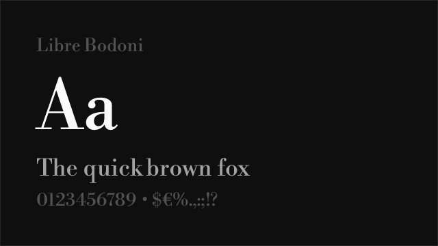
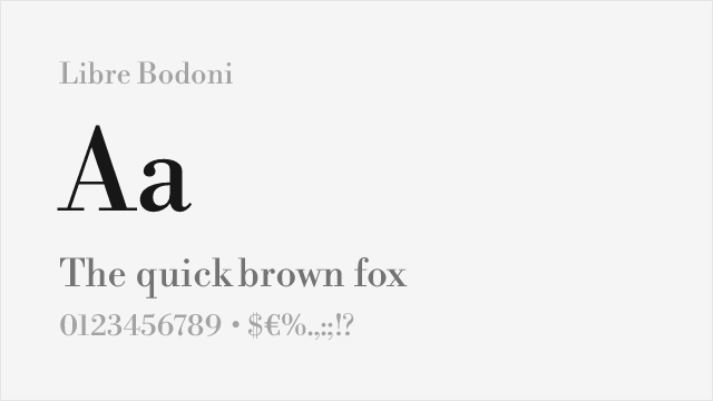
Open-source Bodoni revival sharing the Didone high-contrast structure

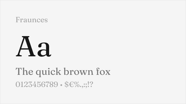
Variable serif with comparable stylistic range and editorial personality
See where Ambroise is used in the wild and swap to free alternatives live.
Install FontSwap →Performance Guide
Production performance metrics for each alternative.
How to Use Playfair Display
Copy these code snippets to quickly add Playfair Display to your project.
CSS code for Playfair Display
@import url('https://fonts.googleapis.com/css2?family=Playfair+Display:wght@100..900&display=swap');HTML code for Playfair Display
<link rel="preconnect" href="https://fonts.googleapis.com">
<link rel="preconnect" href="https://fonts.gstatic.com" crossorigin>
<link href="https://fonts.googleapis.com/css2?family=Playfair+Display:wght@100..900&display=swap" rel="stylesheet">
Tailwind code for Playfair Display
// tailwind.config.js
module.exports = {
  theme: {
    extend: {
      fontFamily: {
        'playfair-display': ['"Playfair Display"', 'sans-serif'],
      },
    },
  },
}

// Usage in HTML:
// <p class="font-playfair-display">Your text here</p>
Next.js code for Playfair Display
// Using next/font (Next.js 13+)
import { Playfair_Display } from 'next/font/google';

const playfair_display = Playfair_Display({
  subsets: ['latin'],
  weight: ['100', '200', '300', '400', '500', '600', '700', '800', '900'],
});

export default function Component() {
  return (
    <p className={playfair_display.className}>
      Your text here
    </p>
  );
}

// Or using inline styles with Google Fonts link:
// <p style={{ fontFamily: '"Playfair Display"' }}>Your text</p>
Expo and React Native code for Playfair Display
// Install: npx expo install @expo-google-fonts/playfair-display expo-font
import { useFonts, Playfair_Display_400Regular } from '@expo-google-fonts/playfair-display';

export default function App() {
  const [fontsLoaded] = useFonts({
    Playfair_Display_400Regular,
  });

  if (!fontsLoaded) return null;

  return (
    <Text style={{ fontFamily: 'Playfair_Display_400Regular' }}>
      Your text here
    </Text>
  );
}
Recommended Font Pairings
These free fonts pair well with Playfair Display Ambroise for headlines, body text, or accent use.
Browse Alternatives by Context
Find Ambroise alternatives filtered by specific use case, style, or language support.
By Use Case
By Style
By Script
Frequently Asked Questions
What is the best free alternative to Ambroise?
Playfair Display is the best free alternative to Ambroise with a FontAlternatives similarity score of 72%. It shares similar proportions and characteristics while being available under the OFL-1.1 license for both personal and commercial use at no cost.
Is there a free version of Ambroise?
There is no official free version of Ambroise. However, Playfair Display is available under the OFL-1.1 open-source license and achieves a FontAlternatives similarity score of 72%. It includes variable weights and supports latin, latin-extended.
What Google Font looks like Ambroise?
The Google Fonts most similar to Ambroise are Playfair Display, Libre Bodoni, Fraunces. Among these alternatives, Playfair Display offers the closest match with a FontAlternatives similarity score of 72% and includes variable weights for flexible typography options.
Can I use Playfair Display commercially?
Yes, Playfair Display can be used commercially. It is licensed under OFL-1.1, which allows free use in websites, applications, print materials, and commercial projects without purchasing a license or paying royalties.
Is Playfair Display similar enough to Ambroise?
Playfair Display achieves a FontAlternatives similarity score of 72% compared to Ambroise. While not identical, it offers comparable letterforms, proportions, and visual style. Most designers find it works excellently as a substitute in web and print projects.
What are the main differences between Ambroise and its free alternatives?
Free alternatives to Ambroise may differ in subtle details like letter spacing, curve refinements, and available weights. Premium fonts typically include more OpenType features, extended language support, and optimized screen rendering. However, for most projects, these differences are negligible.
Where can I download free alternatives to Ambroise?
Download Playfair Display directly from Google Fonts. Click the "Get Font" button on any alternative listed above to visit the official download page. Google Fonts also provides convenient embed codes for seamless web integration.