 Install FontSwap
Free Alternatives to Aptos Supporting Cyrillic
Need a free alternative to Aptos with Cyrillic script support? These 4 options include Cyrillic characters and share visual similarities with Aptos. Each is licensed for free personal and commercial use.
Top Picks
Comparison Table
| Font | Relevance ⓘ
How well this alternative fits the specific context (use-case or trait) of this page. Score 0–100 based on matching keywords, industries, and font characteristics. Alternatives scoring 25+ are highlighted.
| Similarity ⓘ
How visually similar this free font is to the premium original. Score 0–100 based on x-height, width, stroke contrast, use-case overlap, and language coverage.
Learn more → | Weights | Variable | License | Source |
|---|---|---|---|---|---|---|
| Inter | 0 | 86% | Variable | Yes | OFL-1.1 | Google Fonts ↗ |
| Arimo | 0 | 74% | Variable | Yes | OFL-1.1 | Google Fonts ↗ |
| Source Sans 3 | 0 | 70% | Variable | Yes | OFL-1.1 | Google Fonts ↗ |
| Manrope | 0 | 66% | Variable | Yes | OFL-1.1 | Google Fonts ↗ |
All Alternatives (4)
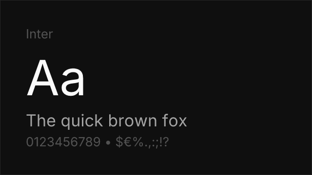
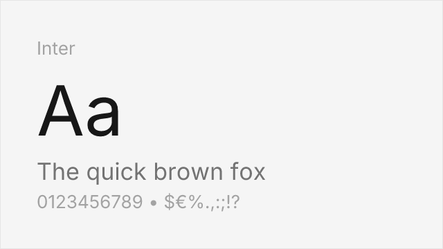
[Google Fonts] · OFL-1.1 · Variable
Screen-first neo-grotesque with the same large x-height and open apertures.
Why it matches: Inter and Aptos were solving the same problem a decade apart: how to make a neutral grotesque that stays legible at interface sizes. Both land on a large x-height, open apertures and generous spacing, and both disambiguate characters that older grotesques let collide. Inter goes further on weight range — nine weights against Aptos's six — and its variable axis is more widely supported outside the Microsoft ecosystem. The main visible difference is warmth: Aptos keeps small humanist gestures that Inter files off in favour of consistency.
uidocumentssaasweb
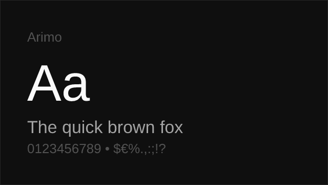
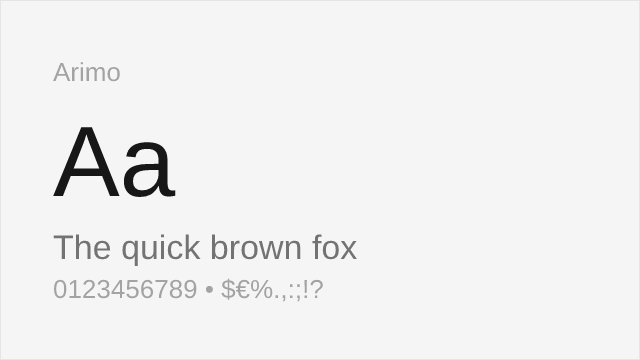
[Google Fonts] · OFL-1.1 · Variable
Also drawn by Steve Matteson; shares his neo-grotesque construction logic.
Why it matches: Arimo and Aptos come from the same hand. Steve Matteson drew both, and the underlying construction logic — how the curves meet the stems, how the shoulders spring — carries across, which is why Arimo sits closer to Aptos than its brief would suggest. What it lacks is the warmth: Arimo was constrained by Arial's metrics and could not take the small liberties Aptos does with the `R` and `g`. Its weight range also stops at 700, so there is no Light. Choose it when you want Matteson's rhythm and OFL licensing without needing Aptos's personality.
documentscorporatewebui
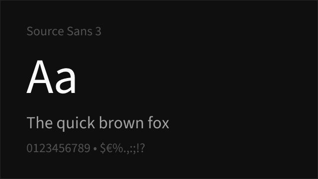

[Google Fonts] · OFL-1.1 · Variable
Adobe's open-source UI sans, humanist where Aptos is grotesque-with-warmth.
Why it matches: Source Sans 3 approaches the same middle ground from the humanist side rather than the grotesque side. Its stroke endings carry more of a written origin and its `a` and `g` are more openly calligraphic, so the page reads warmer than Aptos while remaining thoroughly neutral. It is a good match when the documents in question are meant to be read at length — reports, papers, long memos — rather than skimmed.
documentsacademicpublishingui
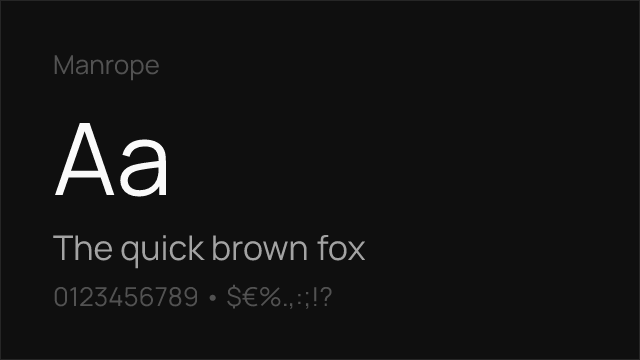
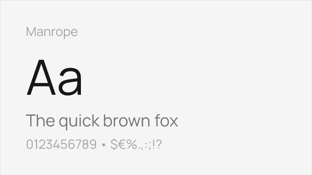
[Google Fonts] · OFL-1.1 · Variable
Semi-geometric sans with tight, modern spacing.
Why it matches: Manrope is the choice when you liked Aptos's contemporary feel but are building an interface rather than a document. It runs tighter and more geometric, with a distinctly modern rhythm that suits product UI and marketing sites better than it suits a memo. The trade-off is that it has less of the quiet neutrality that makes Aptos disappear into a Word document — Manrope is noticed, which is sometimes what you want.
uisaaswebbranding