Free Alternatives to Aptos with Web Optimized Style

7 alternatives | sans serif | Best match: Inter (86%)

Aptos is known for its web optimized aesthetic. If you're looking for a free sans serif font with a similar web optimized feel, these 7 alternatives offer comparable characteristics. All are available under open-source licenses for unrestricted commercial use.

Top Picks

Comparison Table

Font Relevance Similarity Weights Variable License Source
Inter 17 86% Variable Yes OFL-1.1 Google Fonts ↗
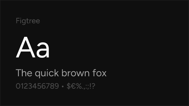
Figtree 16 82% Variable Yes OFL-1.1 Google Fonts ↗
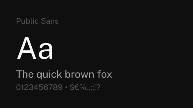
Public Sans 16 78% Variable Yes OFL-1.1 Google Fonts ↗
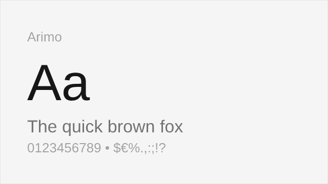
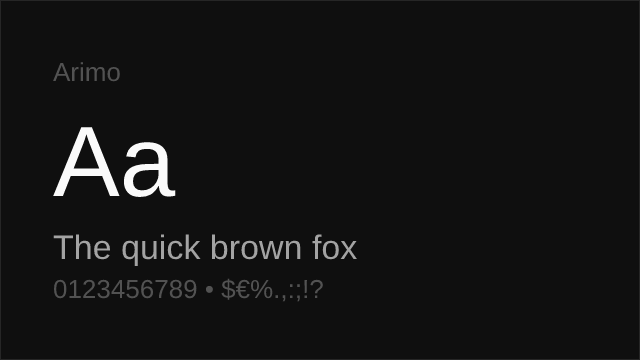
Arimo 15 74% Variable Yes OFL-1.1 Google Fonts ↗
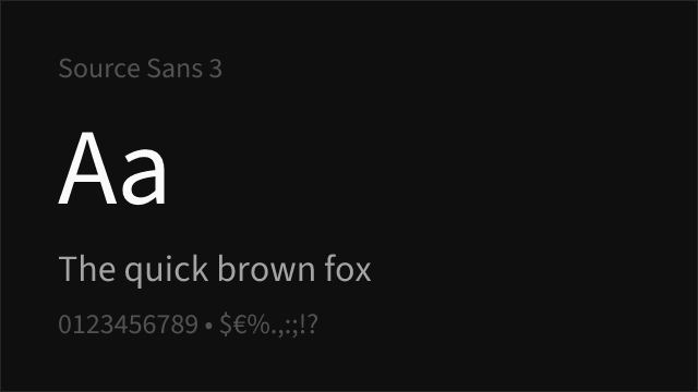
Source Sans 3 14 70% Variable Yes OFL-1.1 Google Fonts ↗
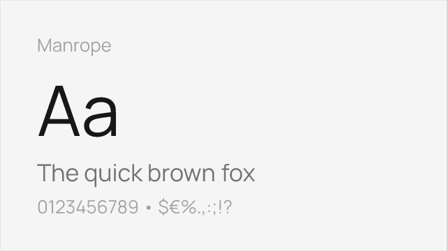
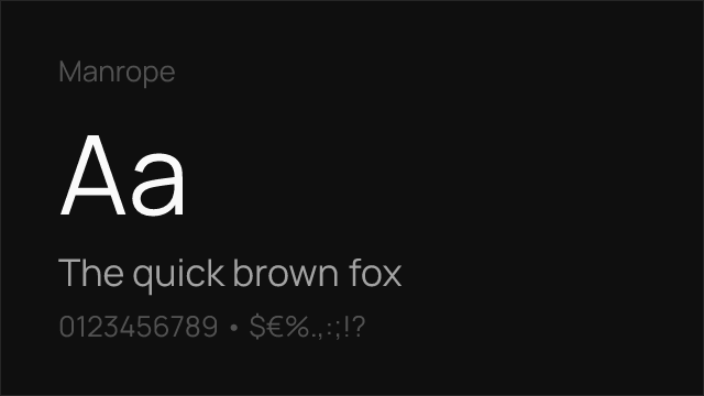
Manrope 13 66% Variable Yes OFL-1.1 Google Fonts ↗
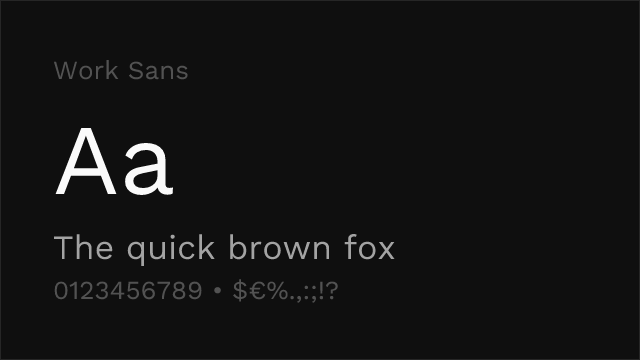
Work Sans 12 62% Variable Yes OFL-1.1 Google Fonts ↗

All Alternatives (7)

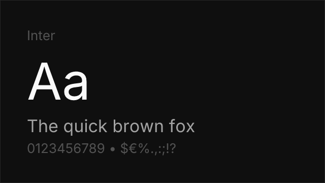
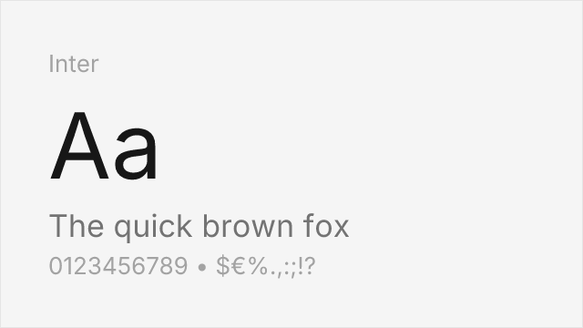
#1 Inter 86%
[Google Fonts] · OFL-1.1 · Variable

Screen-first neo-grotesque with the same large x-height and open apertures.
Why it matches: Inter and Aptos were solving the same problem a decade apart: how to make a neutral grotesque that stays legible at interface sizes. Both land on a large x-height, open apertures and generous spacing, and both disambiguate characters that older grotesques let collide. Inter goes further on weight range — nine weights against Aptos's six — and its variable axis is more widely supported outside the Microsoft ecosystem. The main visible difference is warmth: Aptos keeps small humanist gestures that Inter files off in favour of consistency.
uidocumentssaasweb
Get Font ↗
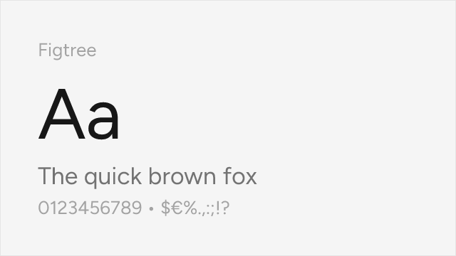
#2 Figtree 82%
[Google Fonts] · OFL-1.1 · Variable

Geometric-leaning sans with rounded, friendly detailing close to Aptos's humanist touches.
Why it matches: Figtree picks up the specific thing that separates Aptos from a plain grotesque: the small softenings. Its terminals resolve gently, the dots are round rather than square, and the overall texture is approachable without tipping into informality. Set a paragraph of each and the rhythm is strikingly similar at body sizes. Figtree runs slightly more geometric in the round letters, so headlines read a little more constructed than Aptos's, which is often an improvement in presentation decks.
presentationsuibrandingweb
Get Font ↗
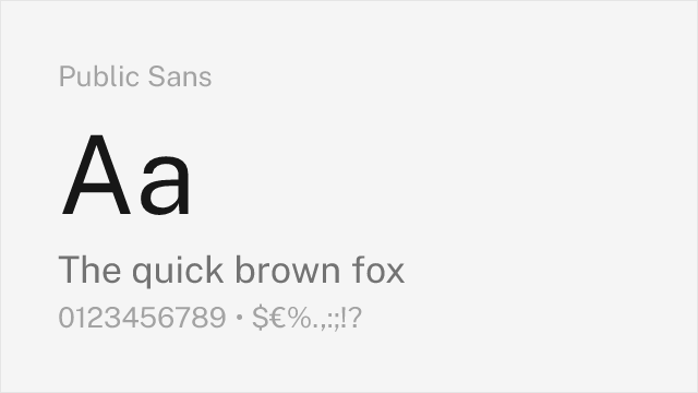
#3 Public Sans 78%
[Google Fonts] · OFL-1.1 · Variable

Accessibility-first grotesque from the US Web Design System.
Why it matches: Aptos made a point of separating the lowercase `l` from the capital `I` — Matteson gave the `l` a tail specifically to break that ambiguity. Public Sans was drawn with the same concern from a different direction, as part of a design system built for public services where misreading a character has consequences. If Aptos appeals to you because it is clearer than Calibri was, Public Sans delivers the same clarity with a slightly more rigid, more institutional texture.
documentscorporateacademicweb
Get Font ↗
#4 Arimo 74%
[Google Fonts] · OFL-1.1 · Variable

Also drawn by Steve Matteson; shares his neo-grotesque construction logic.
Why it matches: Arimo and Aptos come from the same hand. Steve Matteson drew both, and the underlying construction logic — how the curves meet the stems, how the shoulders spring — carries across, which is why Arimo sits closer to Aptos than its brief would suggest. What it lacks is the warmth: Arimo was constrained by Arial's metrics and could not take the small liberties Aptos does with the `R` and `g`. Its weight range also stops at 700, so there is no Light. Choose it when you want Matteson's rhythm and OFL licensing without needing Aptos's personality.
documentscorporatewebui
Get Font ↗
#5 Source Sans 3 70%
[Google Fonts] · OFL-1.1 · Variable

Adobe's open-source UI sans, humanist where Aptos is grotesque-with-warmth.
Why it matches: Source Sans 3 approaches the same middle ground from the humanist side rather than the grotesque side. Its stroke endings carry more of a written origin and its `a` and `g` are more openly calligraphic, so the page reads warmer than Aptos while remaining thoroughly neutral. It is a good match when the documents in question are meant to be read at length — reports, papers, long memos — rather than skimmed.
documentsacademicpublishingui
Get Font ↗
#6 Manrope 66%
[Google Fonts] · OFL-1.1 · Variable

Semi-geometric sans with tight, modern spacing.
Why it matches: Manrope is the choice when you liked Aptos's contemporary feel but are building an interface rather than a document. It runs tighter and more geometric, with a distinctly modern rhythm that suits product UI and marketing sites better than it suits a memo. The trade-off is that it has less of the quiet neutrality that makes Aptos disappear into a Word document — Manrope is noticed, which is sometimes what you want.
uisaaswebbranding
Get Font ↗
#7 Work Sans 62%
[Google Fonts] · OFL-1.1 · Variable

Optimised for mid-size screen text with more character than a default needs.

Why it matches: Work Sans is the furthest from Aptos here and the most deliberate choice. It was drawn for the 14-48px range, which covers subheads and deck headlines, and it carries noticeably more personality — slightly irregular curves, a livelier rhythm. Use it when replacing Aptos is an opportunity rather than an obligation, and the document was never going to be improved by another neutral grotesque.
presentationsheadlineswebbranding
Get Font ↗

Related Pages