 Install FontSwap
Free Alternatives to Aptos with Neo-Grotesque Style
Aptos is known for its neo-grotesque aesthetic. If you're looking for a free sans serif font with a similar neo-grotesque feel, these 7 alternatives offer comparable characteristics. We've identified 7 that are especially well-suited for this context. All are available under open-source licenses for unrestricted commercial use.
Top Picks
Comparison Table
| Font | Relevance ⓘ
How well this alternative fits the specific context (use-case or trait) of this page. Score 0–100 based on matching keywords, industries, and font characteristics. Alternatives scoring 25+ are highlighted.
| Similarity ⓘ
How visually similar this free font is to the premium original. Score 0–100 based on x-height, width, stroke contrast, use-case overlap, and language coverage.
Learn more → | Weights | Variable | License | Source |
|---|---|---|---|---|---|---|
| Inter | 37 | 86% | Variable | Yes | OFL-1.1 | Google Fonts ↗ |
| Figtree | 36 | 82% | Variable | Yes | OFL-1.1 | Google Fonts ↗ |
| Public Sans | 36 | 78% | Variable | Yes | OFL-1.1 | Google Fonts ↗ |
| Arimo | 35 | 74% | Variable | Yes | OFL-1.1 | Google Fonts ↗ |
| Source Sans 3 | 34 | 70% | Variable | Yes | OFL-1.1 | Google Fonts ↗ |
| Manrope | 33 | 66% | Variable | Yes | OFL-1.1 | Google Fonts ↗ |
| Work Sans | 32 | 62% | Variable | Yes | OFL-1.1 | Google Fonts ↗ |
All Alternatives (7)
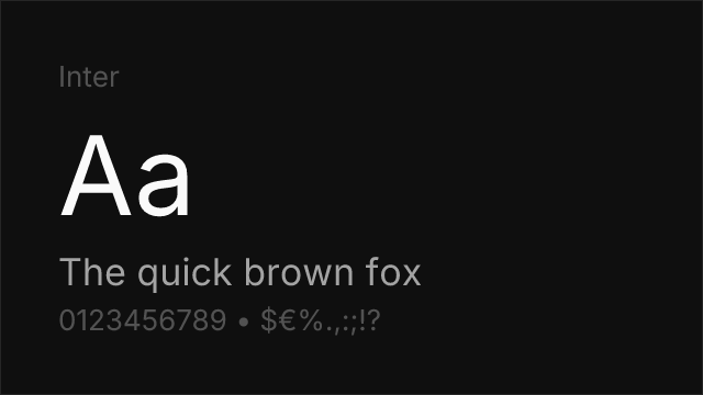
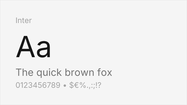
Screen-first neo-grotesque with the same large x-height and open apertures.
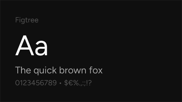
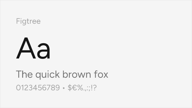
Geometric-leaning sans with rounded, friendly detailing close to Aptos's humanist touches.
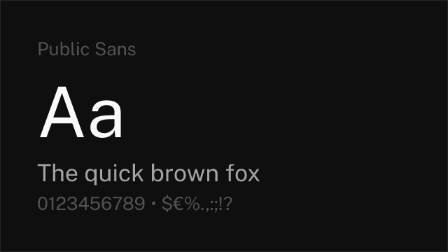
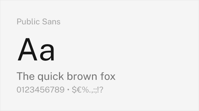
Accessibility-first grotesque from the US Web Design System.
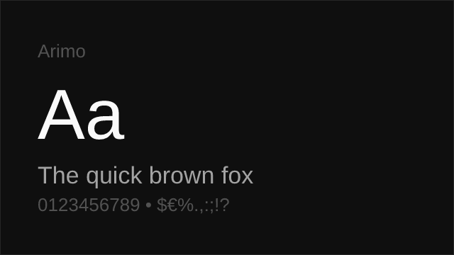
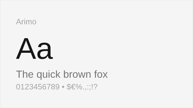
Also drawn by Steve Matteson; shares his neo-grotesque construction logic.
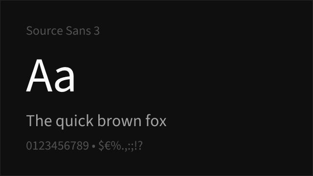

Adobe's open-source UI sans, humanist where Aptos is grotesque-with-warmth.
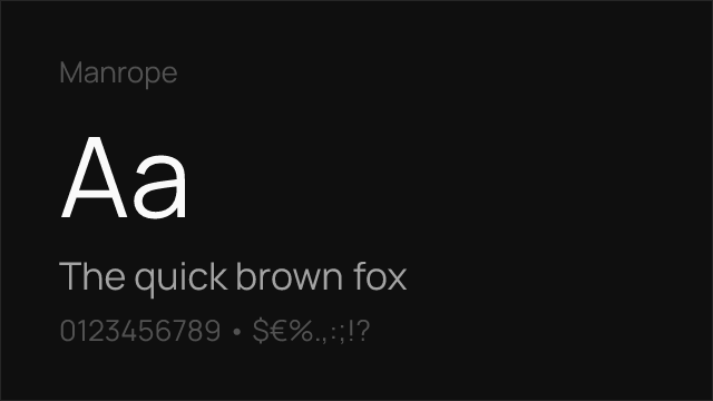
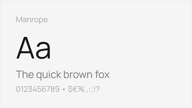
Semi-geometric sans with tight, modern spacing.
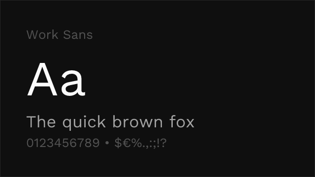

Optimised for mid-size screen text with more character than a default needs.