Free Alternatives to Cabinet Grotesk

About Cabinet Grotesk
- Foundry
- Indian Type Foundry
- Classification
- sans-serif
- Variable
- Yes
- Style
- neo-grotesque
Brands Using Cabinet Grotesk
Hero headlines and brand identity across landing pages and packaging
Portfolio website headlines and case study typography
Marketing pages and product landing page headlines
Widely used in social media templates and brand kits
Cabinet Grotesk is a display-oriented grotesque sans-serif typeface designed by the Indian Type Foundry, one of the most prolific type design studios in South Asia. Released as part of ITF's expanding catalog of contemporary display faces, Cabinet Grotesk caught fire in the startup and direct-to-consumer branding world during the early 2020s, becoming one of the defining typefaces of the Figma-native design generation. Its bold, confident letterforms and contemporary grotesque character make it a go-to choice for hero sections, brand identities, and social media graphics — the typographic contexts where first impressions matter most. Available as a variable font with a weight axis from Thin to Black, Cabinet Grotesk offers the flexibility that modern design workflows demand.
Cabinet Grotesk requires a paid license from Indian Type Foundry. Licensing is available through the ITF website and various type distribution platforms, with pricing that varies by usage type and platform. If your project cannot accommodate the licensing cost, this page covers the best open-source alternatives and the criteria for evaluating them.
Why Cabinet Grotesk Matters
Cabinet Grotesk represents a specific moment in type design history: the democratization of display typography through foundries like Indian Type Foundry and Pangram Pangram. Before this wave, distinctive display grotesques were primarily the province of established European and American foundries whose pricing put them out of reach for small studios, freelance designers, and early-stage startups. ITF and its peers changed the economics, making high-quality display type accessible to a broader design community.
This accessibility, combined with the rise of Figma as the dominant design tool, created perfect conditions for Cabinet Grotesk's adoption. Designers discovered it through type specimen sites, Figma community files, and social media showcases. Its bold weights became ubiquitous in startup hero sections — those full-screen landing page headlines where a typeface has roughly two seconds to communicate a brand's personality. Cabinet Grotesk excels in this context because it feels contemporary and confident without being eccentric or hard to read.
The typeface's popularity reflects a broader trend in startup branding: the move away from the friendly, rounded geometric sans-serifs that dominated the 2010s (Circular, Proxima Nova, Avenir) toward bolder, more expressive grotesques that signal energy and ambition. Cabinet Grotesk, along with fonts like Clash Grotesk and General Sans, defined this new aesthetic — clean enough for professional credibility, bold enough to stand out in a crowded digital landscape.
Indian Type Foundry's contribution to this shift deserves recognition. Founded by Satya Rajpurohit, ITF has built a catalog that spans both the Latin and Indic script worlds, making professional type design more globally representative. Cabinet Grotesk's success demonstrates that high-quality contemporary type design is a global enterprise, not limited to the traditional centers of New York, London, and Zurich.
The typeface has accumulated real search demand — its 199 Google Search Console impressions for font alternative queries confirm that designers actively seek substitutes, whether for budget reasons, variable font requirements, or the desire to avoid the ubiquity that popular free-tier and affordable typefaces inevitably develop.
Design Characteristics
Cabinet Grotesk's design reveals a display-first philosophy that prioritizes impact and contemporary character:
- High contrast between weights: The family spans from Thin to Black with dramatic weight variation, making the bold and extra-bold weights feel particularly impactful while thin weights provide elegant display contrast
- Wide, confident proportions: Letterforms are proportionally wider than traditional neo-grotesques, creating a generous, open feel that fills space authoritatively in hero sections and display contexts
- Contemporary grotesque skeleton: The underlying structure avoids both the rigid uniformity of Helvetica-era grotesques and the mathematical precision of geometric sans-serifs, landing in a contemporary space that feels designed for the 2020s
- Open apertures with modern terminals: The
c,e,s, andafeature generous openings with clean, horizontal terminals that contribute to legibility while maintaining a modern aesthetic - Subtle ink traps at intersections: Where strokes meet, slight traps prevent thickening that would be visible at larger display sizes — a detail that confirms the display-first design intent
- Variable font with weight axis: The full weight range is available as a single variable font file, enabling smooth animation and precise weight tuning in modern web and app contexts
- Even typographic color in medium weights: While optimized for display, the Regular and Medium weights produce reasonably even text color for supporting body copy
Where Cabinet Grotesk Excels
Cabinet Grotesk is at its most effective in display and branding contexts:
- Hero sections and landing pages: Bold and extra-bold weights create attention-grabbing headlines that communicate confidence and modernity
- Startup and DTC brand identities: The contemporary grotesque character aligns perfectly with the visual language of 2020s startup branding
- Social media graphics: Bold weights maintain impact at the compressed sizes and quick-scan contexts of Instagram, LinkedIn, and Twitter posts
- Packaging and product design: The clean, modern character translates well to physical packaging for DTC and consumer brands
- Portfolio and agency websites: Design studios use Cabinet Grotesk to signal contemporary aesthetic sensibility
- Event and conference materials: Posters, banners, and digital event branding benefit from the typeface's display-optimized proportions
Where Cabinet Grotesk Struggles
Cabinet Grotesk's display orientation creates specific limitations:
- Extended body text: While readable at body sizes, Cabinet Grotesk lacks the refinement and optimization that dedicated text typefaces bring to long-form reading experiences
- Data-dense interfaces: Product dashboards, form-heavy applications, and information-dense UIs need tighter, more efficient typefaces optimized for small-size legibility
- Conservative corporate contexts: Cabinet Grotesk's contemporary, startup-coded character can feel too casual or trendy for traditional corporate, legal, or financial communications
- Projects needing broad language support: Latin and Latin Extended coverage only — no Cyrillic, Greek, or Indic script support despite the foundry's Indic expertise
- Longevity-sensitive brand investments: Cabinet Grotesk's strong association with 2020s startup aesthetics means it may date more quickly than more neutral alternatives
- Small-size screen rendering: At body text sizes on lower-resolution screens, the display-optimized proportions can feel loose and less refined than screen-first alternatives
- Monospaced companion needs: No matching monospace variant, requiring careful selection of a compatible mono face for code and data contexts
How to Choose a Free Substitute
When evaluating Cabinet Grotesk replacements, focus on these criteria:
Display impact at bold weights: Cabinet Grotesk's primary use case is bold headlines. Set your alternative at 48-72px in Bold or Extra-Bold and evaluate whether it carries comparable visual authority and contemporary character. Space Grotesk and Barlow deliver strong display impact; more restrained alternatives like Work Sans require heavier weights to achieve similar presence.
Contemporary grotesque character: Cabinet Grotesk signals "2020s design." If your alternative reads as too traditional (like Libre Franklin) or too geometric (like Montserrat), it will shift the visual tone. Look for typefaces with a contemporary grotesque skeleton — Space Grotesk and DM Sans maintain this sensibility most effectively.
Weight range for visual hierarchy: Cabinet Grotesk's variable font spans Thin to Black, enabling dramatic weight contrasts within a single family. Your alternative should offer at least Regular through Extra-Bold to support the headline-to-body hierarchies typical in startup marketing.
Proportion compatibility: Cabinet Grotesk's wider proportions are part of its display character. Alternatives with condensed proportions (Barlow, Libre Franklin) will fit more text per line but lose the generous, confident feel. Test at your target headline width to verify visual compatibility.
Variable font support: Cabinet Grotesk ships as a variable font, enabling smooth weight animations and precise tuning. If your design workflow relies on variable font features, prioritize alternatives like Space Grotesk, DM Sans, and Jost that offer comparable flexibility.
Premium Font Neighbors
If Cabinet Grotesk's display-forward grotesque approach resonates, explore these premium alternatives:
Cluster A: Contemporary display grotesques
- Clash Grotesk (Indian Type Foundry) — ITF's own companion with a more aggressive, angular character
- Right Grotesk (Pangram Pangram) — wide, expressive grotesque with strong display personality
- General Sans (Indian Type Foundry) — more versatile companion that handles both display and text roles
- Neue Montreal (Pangram Pangram) — slightly softer contemporary grotesque with strong startup adoption
Cluster B: Editorial grotesques with display strength
- Beatrice (Sharp Type) — refined grotesque with editorial sophistication and display impact
- Fraktion (Pangram Pangram) — industrial-flavored grotesque with bold display weights
- Obviously (OH no Type) — wide, expressive grotesque designed for maximal display impact
FAQ
Is Cabinet Grotesk free?
No. Cabinet Grotesk is a premium typeface from Indian Type Foundry. Desktop, web, and app licenses are available through the ITF website and various type distribution platforms. Some platforms offer limited free trials or personal-use tiers. The best free alternative is Space Grotesk at 84% similarity.
What is the best free alternative to Cabinet Grotesk?
Space Grotesk is the closest free alternative at 84% similarity. Both share a contemporary grotesque character designed for display impact, with confident proportions and modern construction. Space Grotesk's variable font support and distinctive personality make it a strong substitute for headline and branding contexts.
Is Cabinet Grotesk a variable font?
Yes. Cabinet Grotesk is available as a variable font with a weight axis spanning from Thin to Black. This enables smooth weight animations, precise weight tuning, and reduced file sizes compared to loading multiple static font files. Several of its free alternatives — including Space Grotesk, DM Sans, and Barlow — also offer variable font support.
Who designed Cabinet Grotesk?
Cabinet Grotesk was designed by the Indian Type Foundry (ITF), founded by Satya Rajpurohit. ITF has become one of the most prolific contemporary type design studios, producing a wide catalog of Latin and Indic typefaces that serve the global design community. Cabinet Grotesk is among their most popular Latin display faces.
Does Cabinet Grotesk support Cyrillic?
No. Cabinet Grotesk supports Latin and Latin Extended scripts only. For projects requiring Cyrillic with a similar contemporary grotesque aesthetic, Space Grotesk, DM Sans, and Barlow offer Cyrillic coverage alongside their Latin character sets.
Is Cabinet Grotesk good for body text?
Cabinet Grotesk can handle body text adequately, but it was designed primarily for display use. The proportions, spacing, and details are optimized for larger sizes where the bold personality and contemporary character make the strongest impression. For extended reading at body sizes, pair it with a text-optimized typeface like Inter, DM Sans, or Work Sans.
What is the difference between Cabinet Grotesk and Clash Grotesk?
Both are display grotesques from Indian Type Foundry, but they have different personalities. Cabinet Grotesk is cleaner and more versatile, with a contemporary grotesque character that works across startup and corporate contexts. Clash Grotesk is more angular and aggressive, with sharper terminals and more distinctive letterforms that make stronger visual statements but limit its versatility.
Why is Cabinet Grotesk so popular with startups?
Cabinet Grotesk hits a sweet spot for startup branding: it looks contemporary and confident at the large display sizes typical of landing page heroes, it works across social media, packaging, and digital advertising, and it signals design awareness without requiring a significant licensing investment. Its bold weights communicate ambition and energy — qualities startups want to project to customers and investors.
How do I pair Cabinet Grotesk with other fonts?
Cabinet Grotesk works best as a headline and display face paired with a more neutral text typeface. Inter, Source Sans 3, or Work Sans handle body text roles well alongside Cabinet Grotesk headlines. For editorial contrast, pair it with a serif like Source Serif Pro or Lora. Avoid pairing with other display-focused grotesques, which creates visual competition rather than hierarchy.
Will Cabinet Grotesk date my design?
Cabinet Grotesk carries strong associations with 2020s startup and DTC branding aesthetics. Like any trend-aligned typeface, it may eventually feel specific to its era. For projects needing maximum longevity, more neutral alternatives like DM Sans or Work Sans provide comparable modern character with less temporal specificity. For projects where contemporary energy matters more than timelessness, Cabinet Grotesk remains an effective choice.
Is Cabinet Grotesk on Google Fonts?
No, Cabinet Grotesk is a premium font from Indian Type Foundry and is not available on Google Fonts.
The closest Google Fonts alternative is Space Grotesk with 84% similarity. Get it free on Google Fonts ↗
Free Alternatives (8)


Closest match for Cabinet Grotesk's display-oriented grotesque character with contemporary edge


Clean modern grotesque with strong weight range and screen-optimized proportions

Refined geometric with contemporary character and strong display performance


Contemporary grotesque with strong proportions and industrial character


Versatile sans with good display weights and balanced proportions


American gothic with editorial authority and strong headline weights


Geometric display face with refined character and extensive weight range

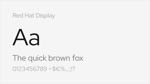
Display-oriented sans with distinctive ink traps
See where Cabinet Grotesk is used in the wild and swap to free alternatives live.
Install FontSwap →Replacement Summary
Source: FontAlternatives.com
Premium font: Cabinet Grotesk
Best free alternative: Space Grotesk
FontAlternatives similarity score: 84%
Replacement difficulty: Medium
Best for: startup hero sections, tech brand headlines, creative portfolio sites, event and conference materials
Notable users: Various DTC startups, Design agency portfolios, Indie SaaS products
Not recommended when: Brand consistency with Various DTC startups requires exact letterforms
What is the best free alternative to Cabinet Grotesk?
Space Grotesk is the best free alternative to Cabinet Grotesk with a FontAlternatives similarity score of 84%.
Space Grotesk shares similar proportions, stroke characteristics, and intended use with Cabinet Grotesk. It is available under the OFL-1.1 license, which permits both personal and commercial use at no cost.
This alternative works particularly well for: startup hero sections, tech brand headlines, creative portfolio sites, event and conference materials.
Can I safely replace Cabinet Grotesk with Space Grotesk?
Yes, with some considerations. Space Grotesk achieves a FontAlternatives similarity score of 84%, indicating good structural compatibility for most use cases.
Licensing: Space Grotesk is licensed under OFL-1.1, which allows commercial use without licensing fees or royalties.
Weight coverage: Most weights have close or exact matches available.
When should I NOT replace Cabinet Grotesk?
While Space Grotesk is a strong alternative, there are situations where replacing Cabinet Grotesk may not be appropriate:
- Optical precision requirements: Space Grotesk has measurable structural differences from Cabinet Grotesk that may be visible in precise design work.
- Brand consistency: Cabinet Grotesk is commonly seen in Startup landing pages and hero sections contexts where exact letterforms may be required.
- Strict compliance: Verify that OFL-1.1 terms meet your specific legal and compliance requirements.
Weight-Matching Guide
Map Cabinet Grotesk weights to their closest free alternatives for accurate font substitution.
Space Grotesk
| Cabinet Grotesk | Space Grotesk | Match |
|---|---|---|
| Light (300) | Light (300) | close |
| Regular (400) | Regular (400) | close |
| Medium (500) | Medium (500) | close |
| Bold (700) | Bold (700) | close |
DM Sans
| Cabinet Grotesk | DM Sans | Match |
|---|---|---|
| Light (300) | Light (300) | close |
| Regular (400) | Regular (400) | close |
| Bold (700) | Bold (700) | close |
| ExtraBold (800) | ExtraBold (800) | close |
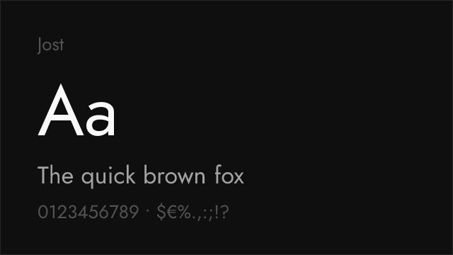
Jost
| Cabinet Grotesk | Jost | Match |
|---|---|---|
| Light (300) | Light (300) | close |
| Regular (400) | Regular (400) | close |
| Medium (500) | Medium (500) | close |
| Bold (700) | Bold (700) | close |
Barlow
| Cabinet Grotesk | Barlow | Match |
|---|---|---|
| Light (300) | Light (300) | close |
| Regular (400) | Regular (400) | close |
| Medium (500) | Medium (500) | close |
| Bold (700) | Bold (700) | close |
Work Sans
| Cabinet Grotesk | Work Sans | Match |
|---|---|---|
| Light (300) | Light (300) | close |
| Regular (400) | Regular (400) | close |
| Medium (500) | Medium (500) | close |
| Bold (700) | Bold (700) | close |
Libre Franklin
| Cabinet Grotesk | Libre Franklin | Match |
|---|---|---|
| Light (300) | Light (300) | close |
| Regular (400) | Regular (400) | close |
| Bold (700) | Bold (700) | close |
| Black (900) | Black (900) | close |
Raleway
| Cabinet Grotesk | Raleway | Match |
|---|---|---|
| Thin (100) | Thin (100) | close |
| Regular (400) | Regular (400) | close |
| Bold (700) | Bold (700) | close |
| Black (900) | Black (900) | close |
Performance Guide
Production performance metrics for each alternative.
How to Use Space Grotesk
Copy these code snippets to quickly add Space Grotesk to your project.
CSS code for Space Grotesk
@import url('https://fonts.googleapis.com/css2?family=Space+Grotesk:wght@100..900&display=swap');HTML code for Space Grotesk
<link rel="preconnect" href="https://fonts.googleapis.com">
<link rel="preconnect" href="https://fonts.gstatic.com" crossorigin>
<link href="https://fonts.googleapis.com/css2?family=Space+Grotesk:wght@100..900&display=swap" rel="stylesheet">
Tailwind code for Space Grotesk
// tailwind.config.js
module.exports = {
  theme: {
    extend: {
      fontFamily: {
        'space-grotesk': ['"Space Grotesk"', 'sans-serif'],
      },
    },
  },
}

// Usage in HTML:
// <p class="font-space-grotesk">Your text here</p>
Next.js code for Space Grotesk
// Using next/font (Next.js 13+)
import { Space_Grotesk } from 'next/font/google';

const space_grotesk = Space_Grotesk({
  subsets: ['latin'],
  weight: ['100', '200', '300', '400', '500', '600', '700', '800', '900'],
});

export default function Component() {
  return (
    <p className={space_grotesk.className}>
      Your text here
    </p>
  );
}

// Or using inline styles with Google Fonts link:
// <p style={{ fontFamily: '"Space Grotesk"' }}>Your text</p>
Expo and React Native code for Space Grotesk
// Install: npx expo install @expo-google-fonts/space-grotesk expo-font
import { useFonts, Space_Grotesk_400Regular } from '@expo-google-fonts/space-grotesk';

export default function App() {
  const [fontsLoaded] = useFonts({
    Space_Grotesk_400Regular,
  });

  if (!fontsLoaded) return null;

  return (
    <Text style={{ fontFamily: 'Space_Grotesk_400Regular' }}>
      Your text here
    </Text>
  );
}
Recommended Font Pairings
These free fonts pair well with Space Grotesk Cabinet Grotesk for headlines, body text, or accent use.
Source Serif Pro's steady transitional serifs provide authoritative body text contrast to Cabinet Grotesk's bold display headlines, creating a classic editorial hierarchy with contemporary energy for marketing pages and editorial features
Inter's neutral, screen-optimized character handles UI text and body copy alongside Cabinet Grotesk's expressive headlines, a practical pairing for product landing pages where display impact meets interface functionality
Lora's contemporary serifs with brushstroke influence create a warm, textural contrast against Cabinet Grotesk's clean grotesque forms, a pairing that works well for lifestyle brands and editorial content
Browse Alternatives by Context
Find Cabinet Grotesk alternatives filtered by specific use case, style, or language support.
By Script
Frequently Asked Questions
What is the best free alternative to Cabinet Grotesk?
Space Grotesk is the best free alternative to Cabinet Grotesk with a FontAlternatives similarity score of 84%. It shares similar proportions and characteristics while being available under the OFL-1.1 license for both personal and commercial use at no cost.
Is there a free version of Cabinet Grotesk?
There is no official free version of Cabinet Grotesk. However, Space Grotesk is available under the OFL-1.1 open-source license and achieves a FontAlternatives similarity score of 84%. It includes variable weights and supports latin, latin-extended.
What Google Font looks like Cabinet Grotesk?
The Google Fonts most similar to Cabinet Grotesk are Space Grotesk, DM Sans, Jost. Among these alternatives, Space Grotesk offers the closest match with a FontAlternatives similarity score of 84% and includes variable weights for flexible typography options.
Can I use Space Grotesk commercially?
Yes, Space Grotesk can be used commercially. It is licensed under OFL-1.1, which allows free use in websites, applications, print materials, and commercial projects without purchasing a license or paying royalties.
Is Space Grotesk similar enough to Cabinet Grotesk?
Space Grotesk achieves a FontAlternatives similarity score of 84% compared to Cabinet Grotesk. While not identical, it offers comparable letterforms, proportions, and visual style. Most designers find it works excellently as a substitute in web and print projects.
What are the main differences between Cabinet Grotesk and its free alternatives?
Free alternatives to Cabinet Grotesk may differ in subtle details like letter spacing, curve refinements, and available weights. Premium fonts typically include more OpenType features, extended language support, and optimized screen rendering. However, for most projects, these differences are negligible.
Where can I download free alternatives to Cabinet Grotesk?
Download Space Grotesk directly from Google Fonts. Click the "Get Font" button on any alternative listed above to visit the official download page. Google Fonts also provides convenient embed codes for seamless web integration.