Free Alternatives to Graphik Supporting Cyrillic
Need a free alternative to Graphik with Cyrillic script support? These 3 options include Cyrillic characters and share visual similarities with Graphik. Each is licensed for free personal and commercial use.
Top Picks
Comparison Table
| Font | Relevance ⓘ
How well this alternative fits the specific context (use-case or trait) of this page. Score 0–100 based on matching keywords, industries, and font characteristics. Alternatives scoring 25+ are highlighted.
| Similarity ⓘ
How visually similar this free font is to the premium original. Score 0–100 based on x-height, width, stroke contrast, use-case overlap, and language coverage.
Learn more → | Weights | Variable | License | Source |
|---|---|---|---|---|---|---|
| Inter | 0 | 88% | Variable | Yes | OFL-1.1 | Google Fonts ↗ |
| IBM Plex Sans | 0 | 82% | 7 | No | OFL-1.1 | Google Fonts ↗ |
| Source Sans 3 | 0 | 78% | Variable | Yes | OFL-1.1 | Google Fonts ↗ |
All Alternatives (3)


[Google Fonts] · OFL-1.1 · Variable
Closest overall match with excellent screen rendering and comprehensive variable font support
Why it matches: Christian Schwartz described Graphik as "emphatically vanilla" — a sans-serif whose entire purpose is to not be noticed. Inter occupies the same philosophical territory in the open-source world: a typeface designed to disappear into whatever content it carries. The structural overlap is strongest in body text, where both produce the exceptionally even typographic color that editorial art directors prize. The difference emerges in character: Graphik draws from mid-century European grotesques (Neuzeit, Folio, Recta), giving it a subtly warmer, more analog texture that serves print editorial and magazine layouts particularly well. Inter, born on screens for screens, is more optically precise but slightly more clinical — its counters are a fraction more open, its spacing a touch more generous. In editorial contexts where Graphik's warmth matters (fashion magazines, cultural publications like Bon Appetit or Wallpaper*), the substitution is visible to trained eyes. In product interfaces and corporate design systems, the two are functionally interchangeable.
design system foundationscontent-heavy web applicationscorporate brand typographycross-platform product interfaces

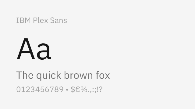
[Google Fonts] · OFL-1.1 · 7 weights
Rational corporate grotesque with similar professional neutrality and grid-based construction
Why it matches: IBM Plex Sans shares Graphik's commitment to rational, professional typography that serves large organizations. Both typefaces feature a disciplined grid-based construction, near-monolinear strokes, and the kind of restrained personality that works across corporate communications, product interfaces, and editorial content. IBM Plex's slightly more geometric detailing — particularly in the `o`, `a`, and `g` — gives it a marginally more technical character than Graphik's softer grotesque forms. The extensive language support (including Cyrillic, Greek, Arabic, and Devanagari) exceeds Graphik's coverage.
enterprise brand systemscorporate communicationsdata visualization typographymultilingual product interfaces


[Google Fonts] · OFL-1.1 · Variable
Adobe's professional sans with strong hinting and extensive language coverage
Why it matches: Source Sans 3 matches Graphik's professional utility through a slightly more humanist construction. Both typefaces are designed to be reliable workhorse fonts for professional contexts — the kind of sans-serif you choose when the typography should support content rather than compete with it. Source Sans 3's subtle humanist touches (slightly curved stroke terminals, marginally more organic proportions) add warmth at body sizes. Adobe's rigorous hinting and quality assurance make it exceptionally reliable across browsers and operating systems.
enterprise applicationsgovernment and institutional sitesdocumentation systemsmultilingual web platforms