Free Alternatives to Ogg with Editorial Style

8 alternatives | 7 highly relevant | serif | Best match: EB Garamond (72%)

Ogg is known for its editorial aesthetic. If you're looking for a free serif font with a similar editorial feel, these 8 alternatives offer comparable characteristics. We've identified 7 that are especially well-suited for this context. All are available under open-source licenses for unrestricted commercial use.

Top Picks

Comparison Table

Font Relevance Similarity Weights Variable License Source
EB Garamond 59 72% Variable Yes OFL-1.1 Google Fonts ↗
Alegreya 59 68% Variable Yes OFL-1.1 Google Fonts ↗
Playfair Display 51 80% Variable Yes OFL-1.1 Google Fonts ↗
Libre Caslon Display 49 70% 1 No OFL-1.1 Google Fonts ↗
Cormorant Garamond 45 77% 5 No OFL-1.1 Google Fonts ↗
Libre Bodoni 35 75% Variable Yes OFL-1.1 Google Fonts ↗
Bodoni Moda 35 74% Variable Yes OFL-1.1 Google Fonts ↗
Fraunces 15 73% Variable Yes OFL-1.1 Google Fonts ↗

Most Relevant (7)

#1 EB Garamond 72% Relevant
[Google Fonts] · OFL-1.1 · Variable

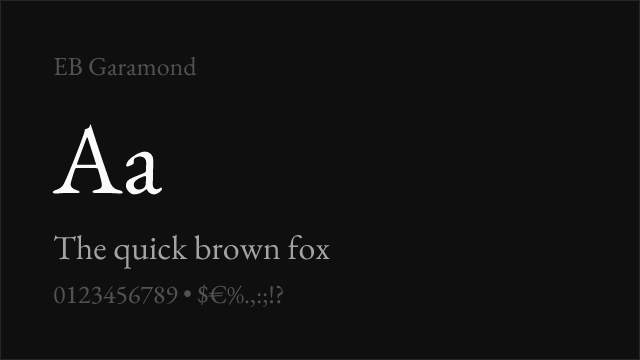
Scholarly humanist serif with refined display capability and extensive language coverage

Why it matches: EB Garamond provides elegant display typography with refined contrast and historically grounded proportions that serve fashion and editorial headline contexts effectively. While its personality is more scholarly and humanist than Ogg's contemporary luxury character, both typefaces share an intellectual elegance and refined attention to detail that signals design awareness. At display sizes, EB Garamond's Renaissance forms create a compelling visual presence that can substitute for Ogg's luxury authority in cultural and editorial contexts. The extensive language coverage including Greek and Cyrillic significantly exceeds Ogg's Latin-only support.
scholarly and literary display typemultilingual editorial headlinescultural institution publicationsluxury contexts with classical tone
Get Font ↗
#2 Alegreya 68% Relevant
[Google Fonts] · OFL-1.1 · Variable

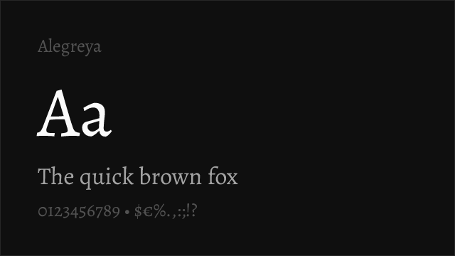
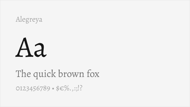
Calligraphic serif with expressive display character and literary presence

Why it matches: Alegreya provides display serif typography with calligraphic expressiveness and a warm, literary personality that shares some of Ogg's emphasis on elegant, handcrafted character. Both typefaces carry a sense of craftsmanship and artistic intention at display sizes, though Alegreya's calligraphic heritage gives it a more rustic, literary personality compared to Ogg's polished luxury refinement. The comprehensive weight range and true italic forms offer practical versatility, and the Small Caps variant adds typographic sophistication for editorial layouts. The calligraphic warmth provides a different but compelling alternative to Ogg's precision.
literary and cultural displayeditorial features with warmthbook and publishing headlinesartisanal and craft branding
Get Font ↗
#3 Playfair Display 80% Relevant
[Google Fonts] · OFL-1.1 · Variable

Closest high-contrast display match with editorial and fashion versatility

Why it matches: Playfair Display captures Ogg's high-contrast display orientation with dramatic thick-thin transitions and refined serif construction suited for fashion and editorial headlines. Both typefaces command visual attention at large sizes through bold stroke contrast and elegant letterforms. Playfair Display's transitional structure shares Ogg's ability to convey luxury and editorial sophistication, though it lacks the specific calligraphic elegance and distinctive serif treatments that make Ogg instantly recognizable. The variable font support with a continuous weight axis from 400 to 900 provides significantly more flexibility than Ogg's fixed weight range.
fashion and luxury display typeeditorial feature headlinesmagazine cover lineshigh-impact web headers
Get Font ↗
#4 Libre Caslon Display 70% Relevant
[Google Fonts] · OFL-1.1 · 1 weights

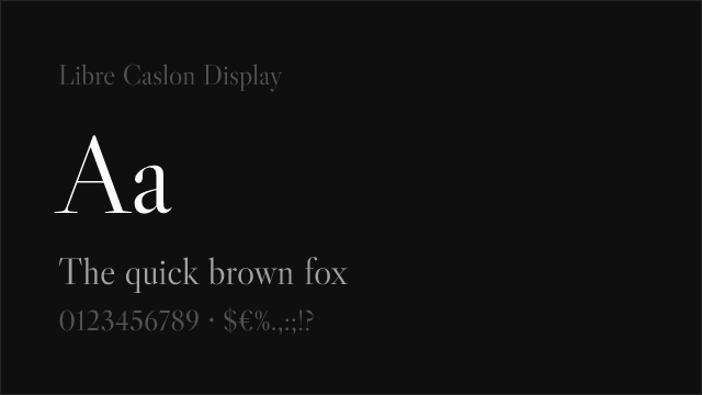
Elegant display Caslon with warm contrast and refined editorial presence

Why it matches: Libre Caslon Display shares Ogg's orientation toward elegant display serif typography with refined contrast designed for headline impact. The Caslon heritage gives it a warm, approachable personality that echoes Ogg's non-austere approach to luxury — both typefaces convey sophistication without coldness. At display sizes, Libre Caslon Display's detailing and contrast create editorial presence, though it lacks the distinctive calligraphic flourishes and high-fashion positioning that make Ogg a luxury standard. The single-weight limitation is the primary practical constraint.
editorial feature headlineswarm luxury display typecultural event typographybook title pages and covers
Get Font ↗
#5 Cormorant Garamond 77% Relevant
[Google Fonts] · OFL-1.1 · 5 weights

High-contrast display Garamond with elegant proportions and luxury character

Why it matches: Cormorant Garamond shares Ogg's orientation toward elegant, high-contrast display typography with letterforms that convey luxury and refinement at large sizes. Both typefaces feature dramatic thick-thin transitions and refined detailing that create visual impact in fashion and editorial contexts. Cormorant's Garamond heritage gives it a classical elegance that parallels Ogg's sophisticated personality, and its extremely high contrast makes it one of the few free serifs that can approach Ogg's visual drama at display sizes. The lighter weights in particular share Ogg's delicate, almost jewel-like quality.
luxury brand display typefashion editorial headlineselegant event typographycultural publication mastheads
Get Font ↗
#6 Libre Bodoni 75% Relevant
[Google Fonts] · OFL-1.1 · Variable

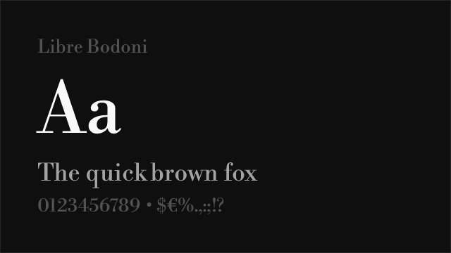
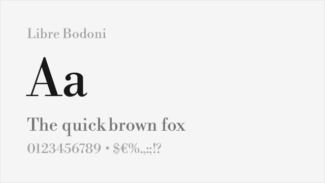
High-contrast Bodoni revival with commanding display presence and formal authority

Why it matches: Libre Bodoni shares Ogg's high-contrast display character with dramatic thick-thin transitions and strong vertical stress that creates commanding presence at headline sizes. Both typefaces operate primarily in display contexts where their contrast ratios generate maximum visual impact and convey luxury. Libre Bodoni's Didone construction is more formally rigid than Ogg's calligraphic fluidity, but in fashion and luxury contexts where high-contrast serif display type is the requirement, Libre Bodoni delivers comparable elegance. The vertical stress and hairline strokes share Ogg's ability to convey precision and refinement.
high-contrast luxury displayfashion magazine headlinesformal brand mastheadspremium packaging typography
Get Font ↗
#7 Bodoni Moda 74% Relevant
[Google Fonts] · OFL-1.1 · Variable

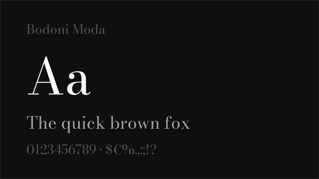
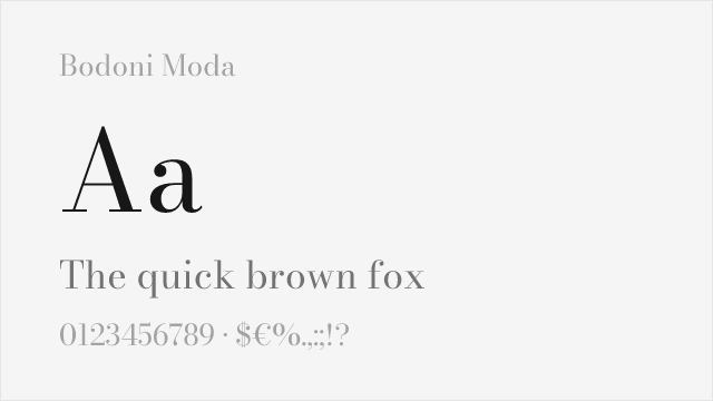
Google Fonts Bodoni revival with optical sizing and variable weight

Get Font ↗

Other Alternatives (1)

#8 Fraunces 73%
[Google Fonts] · OFL-1.1 · Variable

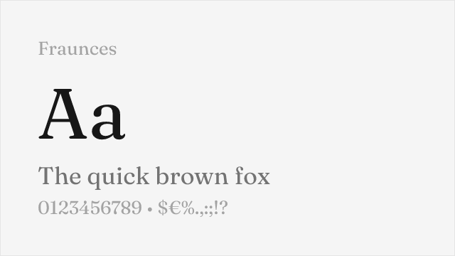
Expressive display serif with soft contrast and distinctive personality

Why it matches: Fraunces shares Ogg's expressive, personality-driven approach to display serif typography with a warm character that feels deliberately designed rather than historically derivative. Both typefaces thrive in contexts where the typography needs to make a statement — luxury branding, editorial features, cultural content. Fraunces's variable WONK axis adds optical adjustment capabilities that Ogg lacks, and its overall warmth and expressiveness offer a different but equally compelling take on display serif luxury. Where Ogg is refined and calligraphic, Fraunces is organic and playful — both reject the coldness of traditional Didone display faces.
expressive luxury brandingeditorial display with personalitylifestyle and wellness typographycultural and arts publications
Get Font ↗

Related Pages