Free Alternatives to Ogg

About Ogg
- Foundry
- Sharp Type
- Classification
- serif
- Style
- display
Brands Using Ogg
Luxury fashion brand identity and campaign typography
Lifestyle editorial display headlines and feature openers
Premium beauty brand editorial content and product storytelling
Display headlines, cover lines, and feature typography in fashion and luxury media
Ogg is a luxury display serif typeface designed by Lucas Sharp and released by Sharp Type. Ranked as the number one trending serif on Typewolf for multiple years, Ogg has become one of the most recognized and sought-after display serifs in contemporary design. The typeface features high contrast, elegant calligraphic details, and distinctive serif treatments that position it as a standard for fashion, luxury, and editorial display typography. Ogg ships as a display-focused family with carefully refined weights optimized for headline and large-scale use.
Ogg requires a paid license from Sharp Type. Licensing follows Sharp Type's per-project model with desktop, web, and app tiers. There is no free trial or gratis tier. If your budget cannot accommodate Sharp Type's licensing structure, this page covers the best open-source alternatives — though Ogg's distinctive luxury character makes it one of the hardest display serifs to replicate with free fonts.
Why Ogg Matters
Ogg matters because it redefined what a contemporary luxury serif could be. In a landscape where display serifs were either historical revivals (Bodoni, Didot) or experimental deconstructions, Ogg charted a third path — a display serif that felt simultaneously modern and timeless, that conveyed luxury without austerity, and that worked as naturally on an Instagram grid as it did on a printed magazine cover.
Lucas Sharp designed Ogg by drawing on the tradition of elegant, high-contrast serif typography while introducing distinctively contemporary letterforms. The result is a typeface that does not read as a revival of any particular historical model — it reads as a contemporary original that happens to possess the authority and refinement of classical luxury typography. This quality of being "rootless elegance" is precisely what made Ogg so successful in fashion and luxury branding, where references to specific historical periods can feel dated, but generic modernity feels cheap.
The fashion industry's adoption of Ogg was not coincidental. When luxury brands and fashion magazines need display typography, they need faces that convey exclusivity, taste, and cultural currency. Ogg delivers all three. Its appearance across fashion campaigns, luxury retail, beauty brand identities, and high-end hospitality is a testament to its ability to signal premium positioning without relying on the well-worn Bodoni and Didot templates that dominated luxury typography for decades.
Ogg's Typewolf dominance reflects a broader cultural phenomenon: the typeface became aspirational for an entire generation of designers. When young designers create mood boards, portfolio projects, or personal brand identities, Ogg frequently appears as the reference for "luxury serif done right." This aspirational status means that finding effective free alternatives is a common and practical need — many projects that want Ogg's aesthetic cannot justify the licensing cost.
What makes Ogg especially difficult to replace is the specificity of its elegance. The calligraphic details, the distinctive serif treatments, the way contrast is modulated through the letterforms — these are not generic luxury serif qualities but specific design decisions that give Ogg its recognizable identity. Free alternatives can approximate the high-contrast luxury serif category, but the particular flavor of Ogg remains elusive.
Design Characteristics
Ogg's design reflects Sharp's ability to create distinctive, contemporary letterforms within the luxury serif tradition:
- High contrast with calligraphic modulation: The dramatic thick-thin transitions follow a calligraphic logic rather than geometric precision, creating organic elegance that distinguishes Ogg from mechanical Didone display faces
- Distinctive serif treatments: Ogg's serifs are refined and carefully shaped — neither the hairline horizontals of Didot nor the bracketed forms of transitional serifs, but something unique that contributes to its recognizable identity
- Elegant, flowing curves: The bowls, counters, and curves flow with a calligraphic grace that suggests handwritten origins refined to typographic precision, creating a sense of movement and life at display sizes
- Strong vertical stress with organic transitions: The vertical emphasis creates the commanding presence expected of luxury display type, while the organic stress transitions add warmth and humanity
- Generous, open proportions: The letterforms are spacious and open, creating a sense of luxury through generous use of space — tight, cramped setting contradicts Ogg's design intent
- Refined uppercase with commanding presence: The capital letters are designed for impact, with distinctive proportions and detailing that make Ogg a compelling choice for all-caps luxury settings
- Display-only optimization: Every detail is calibrated for large-size use — hairline strokes, delicate serifs, and refined curves that demand display-scale rendering to be fully appreciated
The family ships in a focused weight range with matching italics, each weight carefully tuned for its intended role in luxury display hierarchy.
Where Ogg Excels
Ogg is at its best in luxury, fashion, and culturally elevated display contexts:
- Fashion brand identity: Ogg's distinctive luxury character makes it a natural choice for fashion labels, luxury retail, and haute couture campaign typography where the type itself communicates brand positioning
- Editorial magazine headlines: Fashion and lifestyle publications use Ogg for feature article display, cover lines, and section openers where the typography needs to match the visual quality of the photography
- Luxury product packaging: Premium cosmetics, fragrance, wine, and spirits brands deploy Ogg to convey quality and exclusivity on packaging and label design
- High-end hospitality branding: Boutique hotels, fine dining restaurants, and luxury travel brands use Ogg to signal premium positioning and refined taste
- Art gallery and exhibition materials: Museums, galleries, and cultural institutions use Ogg for exhibition titles, catalogs, and promotional materials where cultural sophistication is essential
- Wedding and luxury event typography: The elegant, calligraphic quality makes Ogg popular for high-end stationery, invitations, and event branding
Where Ogg Struggles
Ogg's luxury positioning comes with clear trade-offs that limit its usefulness in broader contexts:
- Body text at any size: Ogg's high contrast and display-optimized details make it unsuitable for body copy — thin strokes disappear at text sizes, and the reading rhythm is not designed for sustained paragraphs
- Low-resolution screens: The delicate hairlines and refined details that make Ogg beautiful at display sizes degrade on low-DPI screens, causing inconsistent rendering and loss of character
- Utilitarian or corporate contexts: Banks, technology companies, and institutional brands need serif typography that conveys reliability and accessibility, not Ogg's fashion-forward luxury
- Projects requiring extensive language support: Ogg covers Latin scripts only, limiting use in multilingual luxury markets that include Cyrillic, Greek, or Asian script requirements
- Budget-conscious web projects: The licensing cost relative to use case is hard to justify when the typeface only functions at display sizes, meaning you also need a separate text face
- Small-scale digital contexts: Social media profiles, app icons, and small-format digital contexts cannot render Ogg's refined details effectively
- Democratic or accessible brand positioning: Ogg's luxury associations actively work against brands that want to convey accessibility, affordability, or everyman positioning
How to Choose a Free Substitute
When evaluating Ogg replacements, accept upfront that Ogg's specific calligraphic elegance and distinctive serif treatments cannot be fully replicated. Instead, prioritize these criteria:
- Display-scale luxury presence: Ogg's primary job is conveying luxury at headline sizes. Set your alternative at 48-72px and evaluate whether it communicates premium positioning, refined taste, and visual sophistication
- Contrast quality and character: Ogg's high contrast is calligraphic and organic, not mechanical. Test how your alternative modulates thick-thin transitions — Cormorant Garamond's contrast is scholarly, Libre Bodoni's is formal, Playfair Display's is transitional. None matches Ogg exactly, but each brings legitimate display drama
- Elegance without austerity: Ogg conveys luxury warmly. Evaluate whether your alternative feels inviting or cold — Bodoni-style alternatives can read as austere where Ogg reads as elegant. Fraunces offers warmth but shifts the register from luxury to expressive
- Fashion and luxury credibility: Will your alternative be taken seriously in luxury branding and fashion editorial contexts? The typeface must signal taste and cultural awareness, not generic decorativeness
- Pairing compatibility: Ogg pairs with minimal sans-serifs that cede the stage to its display presence. Verify that your serif alternative creates the same luxury tension with your chosen sans-serif companion
Premium Font Neighbors
If Ogg's approach resonates but you want to explore adjacent options:
Cluster A: Contemporary luxury display serifs (Ogg's direct competitors)
- Portrait (Commercial Type) — shares Ogg's high-contrast luxury positioning with a slightly more restrained, less calligraphic personality; widely used in luxury fashion
- Heldane (Klim Type Foundry) — contemporary serif with calligraphic warmth; offers both Text and Display variants for more versatile use than display-only Ogg
- Regal (Sharp Type) — another Sharp Type luxury serif; occupies adjacent territory with a different design approach
Cluster B: Fashion and editorial display serifs
- Canela (Commercial Type) — bridges serif and sans-serif with soft organic forms; adjacent luxury positioning with a warmer, less dramatic personality
- Cirka (Sharp Type) — contemporary serif from the same foundry with a more geometric, less calligraphic approach to luxury display
- GT Super (Grilli Type) — retro-inflected display serif with warm, rounded character; serves the same editorial contexts with a different visual flavor
- Noe Display (Schick Toikka) — high-contrast editorial display serif with fashion credibility; more classical than Ogg but similarly positioned
- Domaine (Klim Type Foundry) — editorial display serif with historical grounding; less explicitly luxury than Ogg but design-forward
FAQ
Is Ogg free?
No. Ogg is a premium typeface from Sharp Type with per-project licensing. Desktop, web, and app licenses are priced separately based on usage. There is no free tier or trial version. For open-source alternatives, Playfair Display (80% similarity) is the closest match for luxury display contexts.
What is the best free alternative to Ogg?
Playfair Display is the closest free alternative at 80% similarity. Both share high-contrast serif construction designed for display impact. Playfair Display's transitional structure lacks Ogg's specific calligraphic elegance and distinctive serif treatments, but it delivers comparable headline drama with variable font support and Cyrillic coverage. Cormorant Garamond (77%) is the next best option if classical elegance matters more than structural similarity.
What makes Ogg's design unique?
Ogg's distinguishing qualities are its calligraphic modulation of high contrast and its distinctive serif treatments. Unlike classical Didone faces where contrast is mechanically precise, Ogg's thick-thin transitions follow organic, calligraphic logic. The serifs are neither hairline horizontals nor bracketed transitions but uniquely shaped forms that contribute to Ogg's recognizable identity. This combination creates a luxury display serif that feels contemporary and original rather than historically referential.
Why is Ogg so popular?
Ogg ranked as the number one trending serif on Typewolf for multiple consecutive years, establishing it as an aspirational standard for luxury display typography. Its popularity stems from solving a real design problem: how to convey luxury through serif typography without resorting to Bodoni, Didot, or other well-worn historical templates. Fashion brands, editorial publications, and luxury businesses adopted Ogg because it feels both timeless and distinctly contemporary.
Does Ogg support Cyrillic?
No. Ogg supports Latin and Latin Extended scripts only. For luxury and fashion projects requiring Cyrillic, Playfair Display or Cormorant Garamond are recommended alternatives that offer comparable display elegance with Cyrillic support.
Can I use Ogg for body text?
No. Ogg is exclusively a display typeface. The high contrast causes hairline strokes to disappear at text sizes, and the letterform details are calibrated for large-scale rendering. For body text alongside Ogg, pair it with a dedicated text serif like Source Serif Pro, Lora, or Literata that shares its refined personality at readable sizes.
Who designed Ogg?
Lucas Sharp, the founder of Sharp Type based in New York. Sharp is known for creating distinctive, contemporary typefaces that balance originality with usability. Ogg reflects his approach of creating letterforms that feel like contemporary originals rather than historical revivals — a quality that resonated strongly with the fashion and luxury design communities.
What fonts pair well with Ogg?
Ogg pairs best with minimal, clean sans-serifs that provide functional contrast without competing with its luxury display presence. DM Sans, Space Grotesk, and Inter all work well as body text or interface companions. The key principle is restraint — the sans-serif should serve as a neutral backdrop that lets Ogg's distinctive display character be the visual centerpiece.
Why is Ogg rated as "hard" to replace?
Ogg's calligraphic contrast modulation and distinctive serif treatments are unique among display serifs. Free high-contrast serifs like Playfair Display and Cormorant Garamond can approximate the display impact, but Ogg's specific flavor of contemporary luxury elegance — neither classical revival nor experimental deconstruction — is not available in any open-source typeface. If the specific Ogg aesthetic is central to your design, there is no true free equivalent.
How does Ogg compare to Bodoni or Didot?
Ogg, Bodoni, and Didot all occupy the high-contrast luxury serif category, but their design philosophies are fundamentally different. Bodoni and Didot are products of late 18th-century rationalism — their contrast is geometric, their stress is perfectly vertical, and their personality is austere and formal. Ogg is a 21st-century design with calligraphic warmth, organic contrast modulation, and distinctive serif shapes that create luxury through elegance rather than precision. Ogg feels warmer and more contemporary; Bodoni and Didot feel more classical and formal.
Is Ogg on Google Fonts?
No, Ogg is a premium font from Sharp Type and is not available on Google Fonts.
The closest Google Fonts alternative is Playfair Display with 80% similarity. Get it free on Google Fonts ↗
Free Alternatives (8)


Closest high-contrast display match with editorial and fashion versatility


High-contrast display Garamond with elegant proportions and luxury character
High-contrast Bodoni revival with commanding display presence and formal authority
Google Fonts Bodoni revival with optical sizing and variable weight

Expressive display serif with soft contrast and distinctive personality

Scholarly humanist serif with refined display capability and extensive language coverage

Elegant display Caslon with warm contrast and refined editorial presence
Calligraphic serif with expressive display character and literary presence
See where Ogg is used in the wild and swap to free alternatives live.
Install FontSwap →Replacement Summary
Source: FontAlternatives.com
Premium font: Ogg
Best free alternative: Playfair Display
FontAlternatives similarity score: 80%
Replacement difficulty: Medium
Best for: fashion and luxury display type, editorial feature headlines, magazine cover lines, high-impact web headers
Notable users: The Row, Kinfolk, Aesop
Not recommended when: Brand consistency with The Row requires exact letterforms
What is the best free alternative to Ogg?
Playfair Display is the best free alternative to Ogg with a FontAlternatives similarity score of 80%.
Playfair Display shares similar proportions, stroke characteristics, and intended use with Ogg. It is available under the OFL-1.1 license, which permits both personal and commercial use at no cost.
This alternative works particularly well for: fashion and luxury display type, editorial feature headlines, magazine cover lines, high-impact web headers.
Can I safely replace Ogg with Playfair Display?
Yes, with some considerations. Playfair Display achieves a FontAlternatives similarity score of 80%, indicating good structural compatibility for most use cases.
Licensing: Playfair Display is licensed under OFL-1.1, which allows commercial use without licensing fees or royalties.
Weight coverage: Most weights have close or exact matches available.
When should I NOT replace Ogg?
While Playfair Display is a strong alternative, there are situations where replacing Ogg may not be appropriate:
- Optical precision requirements: Playfair Display has measurable structural differences from Ogg that may be visible in precise design work.
- Brand consistency: Ogg is commonly seen in Fashion brand identity and campaign materials contexts where exact letterforms may be required.
- Strict compliance: Verify that OFL-1.1 terms meet your specific legal and compliance requirements.
Weight-Matching Guide
Map Ogg weights to their closest free alternatives for accurate font substitution.
Playfair Display
| Ogg | Playfair Display | Match |
|---|---|---|
| Regular (400) | Regular (400) | exact |
| Medium (500) | Medium (500) | exact |
| Bold (700) | Bold (700) | exact |
| Black (900) | Black (900) | close |
Cormorant Garamond
| Ogg | Cormorant Garamond | Match |
|---|---|---|
| Light (300) | Light (300) | close |
| Regular (400) | Regular (400) | exact |
| Semibold (600) | Semibold (600) | close |
| Bold (700) | Bold (700) | exact |
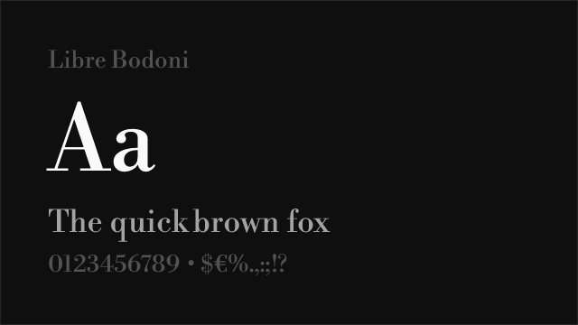
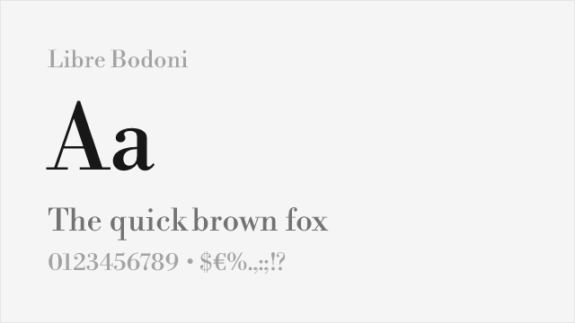
Libre Bodoni
| Ogg | Libre Bodoni | Match |
|---|---|---|
| Regular (400) | Regular (400) | exact |
| Medium (500) | Medium (500) | exact |
| Bold (700) | Bold (700) | exact |
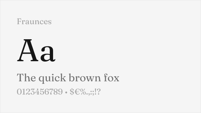
Fraunces
| Ogg | Fraunces | Match |
|---|---|---|
| Light (300) | Light (300) | close |
| Regular (400) | Regular (400) | exact |
| Bold (700) | Bold (700) | exact |
| Black (900) | Black (900) | close |
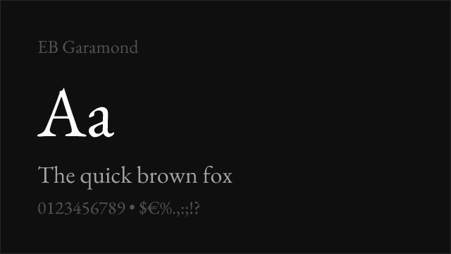
EB Garamond
| Ogg | EB Garamond | Match |
|---|---|---|
| Regular (400) | Regular (400) | exact |
| Medium (500) | Medium (500) | exact |
| Semibold (600) | Semibold (600) | close |
| Bold (700) | Bold (700) | exact |
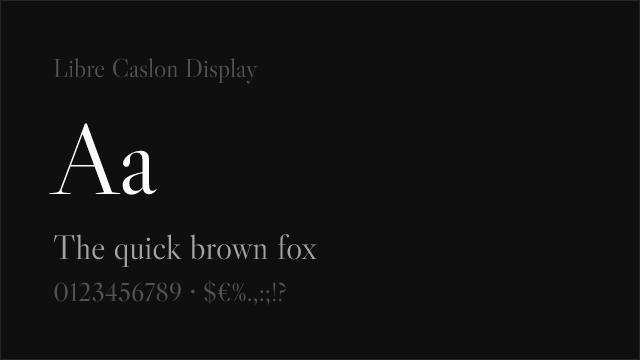
Libre Caslon Display
| Ogg | Libre Caslon Display | Match |
|---|---|---|
| Regular (400) | Regular (400) | exact |
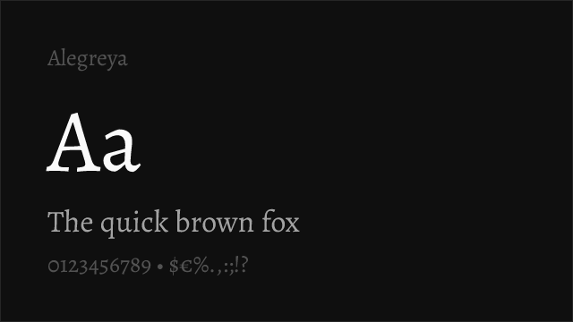
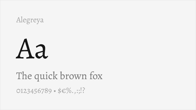
Alegreya
| Ogg | Alegreya | Match |
|---|---|---|
| Regular (400) | Regular (400) | exact |
| Medium (500) | Medium (500) | exact |
| Bold (700) | Bold (700) | exact |
| ExtraBold (800) | ExtraBold (800) | exact |
Performance Guide
Production performance metrics for each alternative.
How to Use Playfair Display
Copy these code snippets to quickly add Playfair Display to your project.
CSS code for Playfair Display
@import url('https://fonts.googleapis.com/css2?family=Playfair+Display:wght@100..900&display=swap');HTML code for Playfair Display
<link rel="preconnect" href="https://fonts.googleapis.com">
<link rel="preconnect" href="https://fonts.gstatic.com" crossorigin>
<link href="https://fonts.googleapis.com/css2?family=Playfair+Display:wght@100..900&display=swap" rel="stylesheet">
Tailwind code for Playfair Display
// tailwind.config.js
module.exports = {
  theme: {
    extend: {
      fontFamily: {
        'playfair-display': ['"Playfair Display"', 'sans-serif'],
      },
    },
  },
}

// Usage in HTML:
// <p class="font-playfair-display">Your text here</p>
Next.js code for Playfair Display
// Using next/font (Next.js 13+)
import { Playfair_Display } from 'next/font/google';

const playfair_display = Playfair_Display({
  subsets: ['latin'],
  weight: ['100', '200', '300', '400', '500', '600', '700', '800', '900'],
});

export default function Component() {
  return (
    <p className={playfair_display.className}>
      Your text here
    </p>
  );
}

// Or using inline styles with Google Fonts link:
// <p style={{ fontFamily: '"Playfair Display"' }}>Your text</p>
Expo and React Native code for Playfair Display
// Install: npx expo install @expo-google-fonts/playfair-display expo-font
import { useFonts, Playfair_Display_400Regular } from '@expo-google-fonts/playfair-display';

export default function App() {
  const [fontsLoaded] = useFonts({
    Playfair_Display_400Regular,
  });

  if (!fontsLoaded) return null;

  return (
    <Text style={{ fontFamily: 'Playfair_Display_400Regular' }}>
      Your text here
    </Text>
  );
}
Recommended Font Pairings
These free fonts pair well with Playfair Display Ogg for headlines, body text, or accent use.
DM Sans's clean geometric construction provides minimal contrast against Ogg's dramatic display forms — the understated sans-serif body text lets Ogg's luxury headlines command full visual attention in fashion and editorial layouts
Space Grotesk's contemporary geometric character creates compelling tension with Ogg's elegant serif forms, producing pairings that feel modern and design-forward for luxury brand and editorial contexts
Inter's neutral, screen-optimized precision provides the functional infrastructure that lets Ogg's expressive display character dominate — the contrast between functional sans-serif navigation and dramatic serif headlines creates clear visual hierarchy in luxury digital experiences
Browse Alternatives by Context
Find Ogg alternatives filtered by specific use case, style, or language support.
Frequently Asked Questions
What is the best free alternative to Ogg?
Playfair Display is the best free alternative to Ogg with a FontAlternatives similarity score of 80%. It shares similar proportions and characteristics while being available under the OFL-1.1 license for both personal and commercial use at no cost.
Is there a free version of Ogg?
There is no official free version of Ogg. However, Playfair Display is available under the OFL-1.1 open-source license and achieves a FontAlternatives similarity score of 80%. It includes variable weights and supports latin, latin-extended.
What Google Font looks like Ogg?
The Google Fonts most similar to Ogg are Playfair Display, Cormorant Garamond, Libre Bodoni. Among these alternatives, Playfair Display offers the closest match with a FontAlternatives similarity score of 80% and includes variable weights for flexible typography options.
Can I use Playfair Display commercially?
Yes, Playfair Display can be used commercially. It is licensed under OFL-1.1, which allows free use in websites, applications, print materials, and commercial projects without purchasing a license or paying royalties.
Is Playfair Display similar enough to Ogg?
Playfair Display achieves a FontAlternatives similarity score of 80% compared to Ogg. While not identical, it offers comparable letterforms, proportions, and visual style. Most designers find it works excellently as a substitute in web and print projects.
What are the main differences between Ogg and its free alternatives?
Free alternatives to Ogg may differ in subtle details like letter spacing, curve refinements, and available weights. Premium fonts typically include more OpenType features, extended language support, and optimized screen rendering. However, for most projects, these differences are negligible.
Where can I download free alternatives to Ogg?
Download Playfair Display directly from Google Fonts. Click the "Get Font" button on any alternative listed above to visit the official download page. Google Fonts also provides convenient embed codes for seamless web integration.