 Install FontSwap
Free Alternatives to Publico Supporting Greek
Need a free alternative to Publico with Greek script support? These 3 options include Greek characters and share visual similarities with Publico. Each is licensed for free personal and commercial use.
Top Picks
Comparison Table
| Font | Relevance ⓘ
How well this alternative fits the specific context (use-case or trait) of this page. Score 0–100 based on matching keywords, industries, and font characteristics. Alternatives scoring 25+ are highlighted.
| Similarity ⓘ
How visually similar this free font is to the premium original. Score 0–100 based on x-height, width, stroke contrast, use-case overlap, and language coverage.
Learn more → | Weights | Variable | License | Source |
|---|---|---|---|---|---|---|
| Source Serif Pro | 0 | 85% | Variable | Yes | OFL-1.1 | Google Fonts ↗ |
| Literata | 0 | 78% | Variable | Yes | OFL-1.1 | Google Fonts ↗ |
| EB Garamond | 0 | 72% | Variable | Yes | OFL-1.1 | Google Fonts ↗ |
All Alternatives (3)
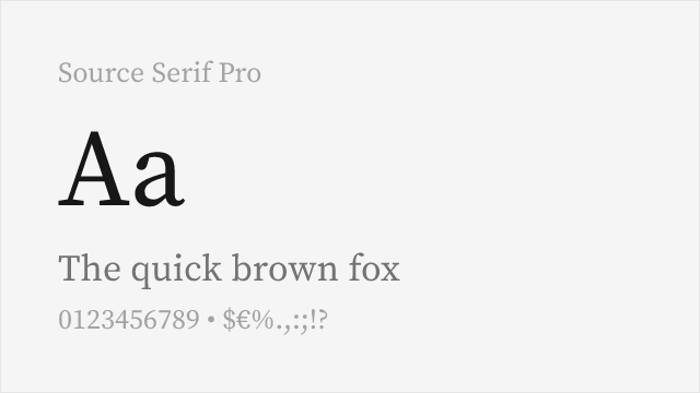
[Google Fonts] · OFL-1.1 · Variable
Closest structural match with similar transitional proportions and excellent screen rendering
Why it matches: Source Serif Pro mirrors Publico's sturdy transitional skeleton with moderate contrast and bracketed serifs that anchor text on screen. Both typefaces share a rational, newspaper-ready construction with generous x-heights designed for comfortable body text reading. Source Serif Pro's Adobe engineering ensures reliable rendering across browsers and devices, matching the kind of cross-platform consistency that Publico delivers in professional newsroom environments. The weight distribution is comparable, and the optical sizing axis gives Source Serif Pro an edge for headlines.
news websites and digital publicationslong-form journalism platformseditorial magazine layoutsmultilingual publishing projects
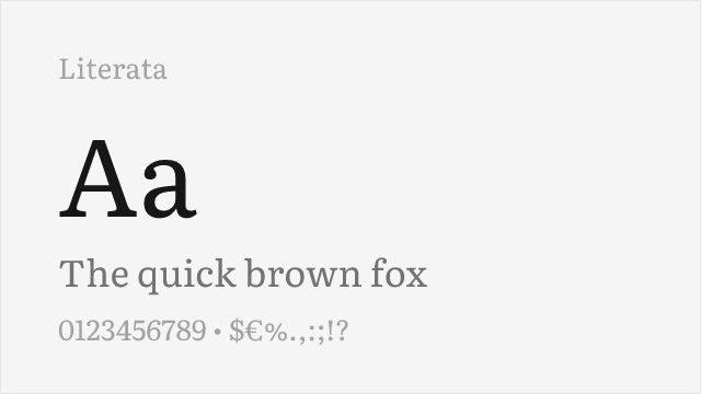
[Google Fonts] · OFL-1.1 · Variable
Google's reading-optimized serif with optical sizing and contemporary feel
Why it matches: Literata was commissioned by Google specifically for sustained reading on screens, which directly parallels Publico's primary use case in digital news. Both typefaces prioritize readability through open apertures, moderate contrast, and careful spacing at text sizes. Literata's optical sizing axis automatically adjusts stroke weight and spacing for different sizes, replicating the kind of size-specific optimization that Publico achieves through its Text and Banner optical variants. The contemporary yet restrained personality matches Publico's editorial authority.
e-reader and digital reading platformslong-form web articlesacademic and scholarly publicationsresponsive editorial design
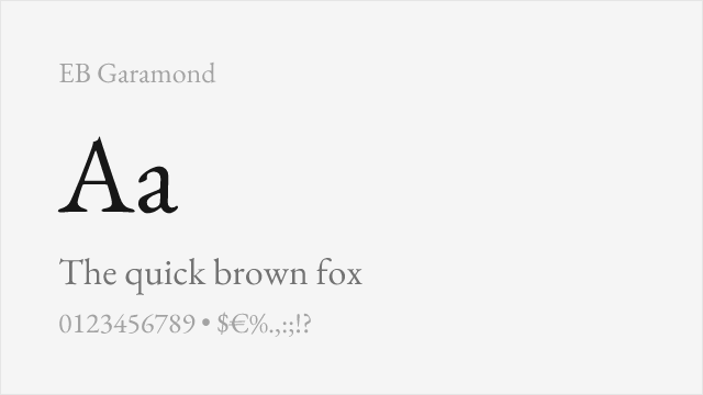
[Google Fonts] · OFL-1.1 · Variable
Scholarly old-style serif with exceptional language coverage
Why it matches: EB Garamond approaches editorial typography from a different era than Publico — Renaissance humanism versus modern rationalism — but both typefaces excel at sustained body text reading. The scholarly precision of EB Garamond's letterforms, based on original 16th-century specimens, gives it an intellectual authority that can substitute for Publico's editorial gravitas in academic and literary contexts. The extensive language support covering Latin, Cyrillic, Greek, and Vietnamese exceeds Publico's coverage significantly.
academic and scholarly publishingmultilingual editorial projectsliterary and cultural contentarchival and historical publications