Free Alternatives to Publico

About Publico
- Foundry
- Commercial Type
- Classification
- serif
- Style
- editorial
Brands Using Publico
The Lisbon daily newspaper the typeface was completed for and named after (2007 redesign by Mark Porter & Simon Esterson)
Editorial typography for the athlete-driven publication
Body and editorial type for the visual-essay / data-journalism publication
Brand and editorial typography
 See Publico live on these sites with FontSwap →
Publico is a transitional serif typeface designed by Christian Schwartz and Paul Barnes for Commercial Type. It grew out of the pair's work on The Guardian's landmark redesign, but it was completed for and named after the Portuguese newspaper Público (Lisbon), whose 2007 redesign by Mark Porter and Simon Esterson gave the family its first real home. That heritage shaped its purpose: a serif built to handle the demands of daily news production — from tight body text columns to commanding front-page headlines. The family spans three optical sizes: Publico Text (small sizes), Publico Headline (mid sizes and subheads), and Publico Banner (display), each carefully tuned for its intended scale.
Publico requires a paid license from Commercial Type. Pricing follows a per-project model with separate desktop, web, and app licenses. There is no free tier or trial version. If your budget cannot support Commercial Type's licensing structure, this page covers the best open-source alternatives and what matters when evaluating them.
Why Publico Matters
Publico's significance in editorial typography cannot be separated from its origin story — and that story is often told wrong. The typeface shares its DNA with The Guardian's 2005 redesign, the sprawling project on which Schwartz and Barnes drew Guardian Egyptian for the masthead and headlines. Publico began life as a byproduct of that work, an experimental serif that never became the Guardian's text face. It was finished later, and separately, for the Lisbon daily Público, whose 2007 redesign by Mark Porter and Simon Esterson is where the family first went to press and where it took its name. The Guardian, for the record, sets its own text in Guardian Egyptian, not in Publico.
That newsroom lineage is what makes Publico distinctive among contemporary serifs. Where many editorial typefaces prioritize aesthetic refinement, Publico prioritizes survival: it performs under the mechanical stress of high-speed printing, remains legible in cramped mobile layouts, and maintains authority at the small sizes demanded by serious journalism. It was drawn in the crucible of daily production, and it shows in every letter — a face designed to anchor long-form journalism in narrow columns with high ink coverage and variable paper quality, exactly the conditions Público threw at it from day one.
The typeface occupies a specific position in the serif landscape: more modern and robust than traditional book serifs like Garamond, more refined than slab serifs like Guardian Egyptian, and more authoritative than the softer contemporary serifs favored by lifestyle publications. For editorial teams, choosing Publico signals a commitment to serious content.
There is history under that positioning. The sturdy, high-contrast newspaper serif descends from the Scotch Romans of the early nineteenth century, workhorse text faces drawn to survive letterpress and, later, the speed and ink coverage of rotary printing. Schwartz and Barnes did not revive one specific historical face so much as absorb that lineage and rebuild it for contemporary production, keeping the familiar, traditional feel while giving the family the internal consistency a modern editorial system needs. It is a face with one foot in the archive and one on the phone screen.
Design Characteristics
Publico is a text-first serif, and almost every choice in its drawing serves reading. The contrast between thick and thin strokes is real but held in check, the serifs are bracketed rather than hairline or slab, and the proportions stay wide enough to keep letters distinct without wasting column space. Set a full paragraph and the cleverness of any single letter dissolves into an even, steady texture.
That evenness is the whole job of a newspaper serif. The instincts behind it show up in the specifics:
- Sturdy bracketed serifs: The serif terminals are substantial enough to anchor letterforms on low-resolution screens and newsprint, without the heaviness of a slab serif — providing grip without visual weight
- Generous x-height: Lowercase letters occupy a large proportion of the body height, ensuring readability in the small sizes (9-11pt) typical of newspaper body text and cramped mobile layouts
- Moderate stroke contrast: The difference between thick and thin strokes is controlled — sufficient to give the typeface editorial character without the fragility of high-contrast designs that break down on screen
- Open counters and apertures: Letters like
a,c,e,smaintain generous openings that prevent letterforms from filling in at small sizes or in low-resolution rendering - Robust construction: Stroke junctions and transitions are reinforced to withstand the degradation of offset printing, PDF compression, and aggressive anti-aliasing on screens
- Three optical sizes: Publico Text is tuned for body copy with wider spacing and sturdier details; Publico Headline handles subheads and mid-size settings; Publico Banner features the highest contrast and tightest fitting for display headline use
- Cyrillic coverage: Full Cyrillic support extends Publico's reach to Russian, Ukrainian, and other Slavic-language publications
The single most consequential idea in the family is optical sizing. Publico Text is drawn for small sizes: it opens the spacing, strengthens the thin strokes, and sturdies the serifs so letters hold together at roughly 9 to 14 points on paper or screen. Publico Headline sits in the middle, cut for subheads and the mid-size settings where a page turns from reading to scanning. Publico Banner is the display end of the range, drawn for headlines and large settings, where the contrast can climb, the fitting can tighten, and the fine details finally have room to show. A single-drawing serif is always compromising in one direction or the other, too fragile in the headline or too coarse in the body; giving each size range its own drawing — three of them, from Text through Headline to Banner — is how Publico stays sharp across the whole span. Several of the free alternatives below chase the same effect with an optical-sizing axis in place of named cuts.
The family ships in seven weights (Light, Roman, Medium, Bold, Extrabold, Black, and Ultra — there is no Thin, and the top weight is Ultra rather than Black) with matching italics across the Text, Headline, and Banner cuts, providing comprehensive hierarchy for editorial design systems.
Where Publico Excels
Publico is at its best in editorial and publishing contexts:
- News websites and digital journalism: The robust construction and generous x-height ensure readability across the wide range of devices and screen qualities that news audiences use
- Magazine feature articles: Publico Banner provides commanding headline presence while Publico Text handles body copy with authority and comfort
- Long-form investigative journalism: The even typographic color and carefully tuned spacing reduce reader fatigue in 3,000+ word articles
- Academic journals and reports: The serious, authoritative personality suits scholarly content without feeling stiff or archaic
- Corporate annual reports: Publico communicates institutional credibility while remaining more approachable than traditional financial serifs
The common thread is sustained reading at working sizes. Publico is built for the moment a reader commits to a thousand words or more and the type has to stay comfortable the whole way down the column, with no fatigue and no muddy passages where the eye slows down. Newsrooms and magazines are the obvious home for that. But the same qualities serve anyone who publishes long, serious documents: research institutes, policy groups, financial and annual reporting, and the brand journalism that wants to borrow the authority of the editorial page.
Where Publico Struggles
No typeface is universal. Publico underperforms in certain contexts:
- Playful or casual brands: Publico's newsroom authority reads as overly serious for lifestyle, food, or entertainment brands that need warmth and approachability
- Display at very large sizes: While Publico Banner handles headlines well, at poster or billboard scale the moderate contrast can appear flat compared to high-contrast display serifs
- Tech product interfaces: Publico's editorial personality feels misplaced in SaaS dashboards and app UI, where sans-serif typefaces dominate for good reason
- Projects requiring full CJK support: Publico covers Latin, Cyrillic, and Greek, but not Arabic or East Asian scripts — multilingual projects beyond those scripts need a fallback strategy
Two of these deserve more than a bullet. The first is display. Because Publico Text is engineered to be quiet and even, it can read as plain when it is set large without the Banner cut doing the work; the moderate contrast that protects legibility at 10 points looks reserved at 200, beside a true high-contrast display serif built to dazzle. If a project is mostly posters, covers, and oversized headlines, a dedicated display face will usually beat Publico Text pushed past its comfort zone.
The second is cost, and it is not trivial. Commercial Type licenses Publico per project and splits desktop, web, and app rights, so a single property that ships in print, on the web, and in an app can face three separate line items, with web pricing that scales by page views. For a well-funded newsroom that is a rounding error against the value of a coherent type system. For a small team or an early-stage product, it can be the deciding factor, which is the whole reason the free alternatives on this page exist.
It is also worth being honest about print versus screen. Publico was engineered to survive both, but its heritage is print, and its sharpest advantages, such as even color under heavy ink and resilience to paper and press variation, matter less on a calibrated display than on newsprint. Where most reading now happens, on screens, several of the free serifs below were drawn screen-first and give up very little to Publico in that setting.
How to Choose a Free Substitute
When evaluating Publico replacements, prioritize these criteria:
- Robustness at text sizes: Publico's defining trait is its reliability in body text. Test your alternative at 14-16px in a two-column editorial layout — does it maintain the same comfortable reading rhythm without strain?
- Serif weight and character: Publico's bracketed serifs are substantial but not heavy. Alternatives with hairline serifs (Garamond-style) will read as too delicate; slab serifs will feel too blunt
- Weight range and editorial hierarchy: News design requires at least Regular, Semibold, and Bold for article hierarchy (body, subheads, pullquotes). Check that your alternative covers these stations
- Screen rendering quality: Publico was engineered for both print and screen. Test your alternative on Windows (which renders differently from macOS), on Android, and in Chrome — the inconsistencies will reveal whether the hinting and outline quality hold up
- Typographic color: Set a full paragraph in your alternative and compare the overall gray value to a Publico paragraph at the same size. The evenness of color across a text block is what separates a good editorial serif from a decorative one
Those criteria point to different answers depending on the job. For a straight news or editorial site that needs the closest overall behavior, Source Serif Pro is the default: transitional bones, variable weights, optical sizing, and dependable rendering across platforms. When the work is screen-first and dense, Merriweather and Literata were both drawn for exactly that, with Literata adding an optical-sizing axis that echoes Publico's Text-and-Banner split. If the register shifts from newsroom to literary or cultural, Lora and Crimson Pro trade some of Publico's reportorial toughness for warmth, and EB Garamond goes further toward scholarly, old-style elegance. Libre Baskerville is the pragmatic pick when you only need a clean two-weight body serif and do not want to manage a large family.
A practical rule mirrors the one for any premium substitution: match by behavior, not by specimen. The serif that looks most like Publico frozen on a poster is not necessarily the one that reads most like Publico down a live column, and the running column is what your readers actually experience.
Premium Font Neighbors
If Publico's approach resonates but you want to explore adjacent options:
Cluster A: Newsroom serifs (Publico's direct competitors)
- Guardian Egyptian (Commercial Type) — Publico's sibling from The Guardian redesign; a slab serif with more visual weight and wider proportions
- Mercury (Hoefler&Co) — a Hoefler&Co newspaper serif used across editorial settings; sharper contrast and more refined details than Publico
- Tiempos (Klim Type Foundry) — similar newsroom DNA with a slightly softer, more contemporary personality
- Arnhem (OurType) — a Dutch editorial serif with strong text performance and distinctive character
Cluster B: Contemporary editorial serifs
- Lyon (Commercial Type) — Kai Bernau's refined editorial serif for literary and cultural publications
- Chronicle Display (Hoefler&Co) — higher contrast and more display-oriented than Publico; powerful at headline sizes
- Sanomat (Commercial Type) — editorial serif with more personality and quirkiness than Publico's disciplined forms
FAQ
Is Publico free?
No. Publico is a premium typeface from Commercial Type with per-project licensing. Desktop, web, and app licenses are priced separately. There is no free tier, trial version, or educational discount. For open-source alternatives, Source Serif Pro (85% similarity) is the closest match.
What is the best free alternative to Publico?
Source Serif Pro is the closest free alternative at 85% similarity. Both share transitional serif construction, moderate contrast, and a design philosophy centered on editorial readability. Source Serif Pro adds variable font support, optical sizing, and broader language coverage — making it a practical upgrade in some respects.
What is the difference between Publico Text, Publico Headline, and Publico Banner?
These are the family's three optical sizes, each drawn for a different scale. Publico Text is optimized for body copy at small sizes (9-14pt), with wider spacing, sturdier serifs, and lower contrast. Publico Headline is the mid-size cut, tuned for subheads and settings where the type is larger than body copy but not yet display. Publico Banner is the display companion for headlines and large-scale typography, with the highest contrast, tightest fitting, and most refined details. This multi-optical-size approach is common in professional editorial type systems, and Publico also ships condensed and monospaced variants alongside the three core cuts.
Was Publico designed for The Guardian?
Not quite — this is a common misconception. Publico originated in Christian Schwartz and Paul Barnes's work on The Guardian's 2005 redesign, but it was never the Guardian's text face. It was finished for and named after the Portuguese newspaper Público (Lisbon), whose 2007 redesign by Mark Porter and Simon Esterson gave the typeface its first published use. The Guardian sets its own text in Guardian Egyptian, the proprietary slab serif from that same project. Publico shares that newsroom design philosophy and lineage, but its name and its debut belong to Público.
Does Publico support Cyrillic?
Yes. Publico includes comprehensive Cyrillic character support, making it suitable for Russian, Ukrainian, Bulgarian, Serbian, and other Slavic-language editorial work. This is a significant advantage over many competing editorial serifs.
Can I use Publico on the web?
Yes, with a web font license from Commercial Type. Web licenses are priced by monthly page views. You receive WOFF2 files for self-hosting. Publico is not available through any font CDN or service like Google Fonts or Adobe Fonts.
What fonts pair well with Publico?
Publico pairs best with clean, disciplined sans-serifs that complement its editorial authority without competing for attention. Inter, Barlow, and Source Sans 3 all work well. The key is matching Publico's serious, professional tone — avoid playful or decorative sans-serifs that create tonal dissonance.
Who designed Publico?
Christian Schwartz and Paul Barnes, founders of Commercial Type. Schwartz is one of the most prolific and respected type designers working today, known for Guardian Egyptian, Graphik, and dozens of custom commissions for major publications and corporations. Barnes is a typographic historian whose research informs the foundry's historically grounded but contemporary approach.
Will a free alternative reflow my existing Publico layouts?
Probably. None of the alternatives here are metric-compatible clones of Publico, so swapping one in will change character widths, line breaks, and column depth. That is fine for a fresh design. But if you are replacing Publico in fixed templates, such as a print grid, an email, or a slide master, budget time to re-fit the type rather than expecting a drop-in match. Source Serif Pro and Literata, with their optical sizing and full weight ranges, leave the most room to re-tune hierarchy after the switch.
Is Publico on Google Fonts?
No, Publico is a premium font from Commercial Type and is not available on Google Fonts.
The closest Google Fonts alternative is Source Serif Pro with 85% similarity. Get it free on Google Fonts ↗
Free Alternatives (8)
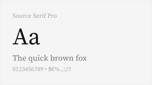
Closest structural match with similar transitional proportions and excellent screen rendering
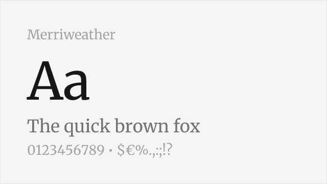
Robust screen-first editorial serif with comparable weight and presence
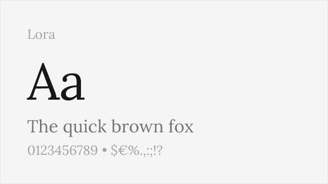
Calligraphy-rooted serif with elegant editorial presence
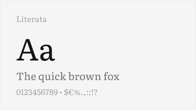
Google's reading-optimized serif with optical sizing and contemporary feel
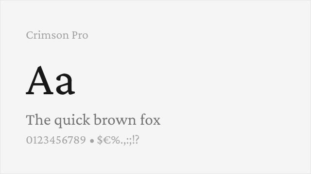
Refined old-style serif with classical elegance and full weight range
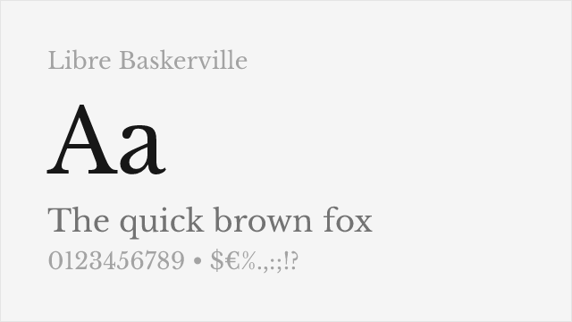
Web-optimized transitional serif with proven screen readability
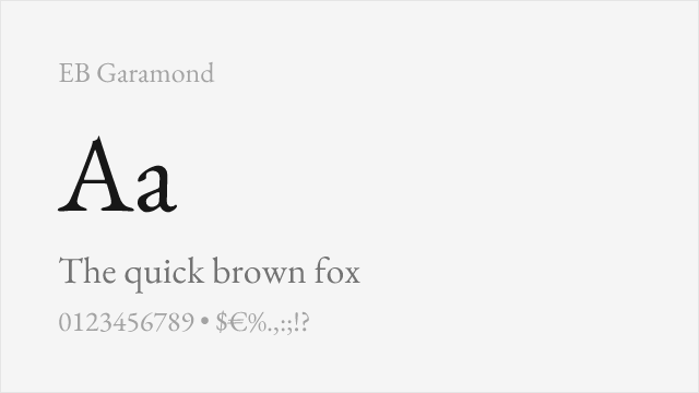
Scholarly old-style serif with exceptional language coverage
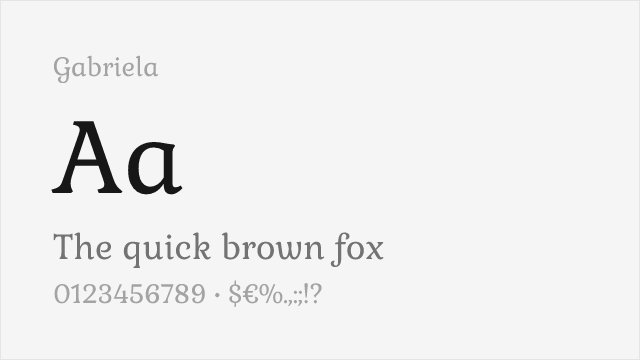
Compare the alternatives
See how Publico compares to its top alternatives — and how those alternatives compare to each other — side by side.
See where Publico is used in the wild and swap to free alternatives live.
Install FontSwap →Replacement Summary
Source: FontAlternatives.com
Premium font: Publico
Best free alternative: Source Serif Pro
FontAlternatives similarity score: 85%
Replacement difficulty: Low
Best for: news websites and digital publications, long-form journalism platforms, editorial magazine layouts, multilingual publishing projects
Notable users: Público, The Players' Tribune, The Pudding
Not recommended when: Brand consistency with Público requires exact letterforms
What is the best free alternative to Publico?
Source Serif Pro is the best free alternative to Publico with a FontAlternatives similarity score of 85%.
Source Serif Pro shares similar proportions, stroke characteristics, and intended use with Publico. It is available under the OFL-1.1 license, which permits both personal and commercial use at no cost.
This alternative works particularly well for: news websites and digital publications, long-form journalism platforms, editorial magazine layouts, multilingual publishing projects.
Can I safely replace Publico with Source Serif Pro?
Yes, Source Serif Pro is a high-confidence replacement for Publico. The FontAlternatives similarity score of 85% indicates strong structural compatibility.
Licensing: Source Serif Pro is licensed under OFL-1.1, which allows commercial use without licensing fees or royalties.
Weight coverage: Most weights have close or exact matches available.
When should I NOT replace Publico?
While Source Serif Pro is a strong alternative, there are situations where replacing Publico may not be appropriate:
- Strict compliance: Verify that OFL-1.1 terms meet your specific legal and compliance requirements.
Weight-Matching Guide
Map Publico weights to their closest free alternatives for accurate font substitution.
Source Serif Pro
| Publico | Source Serif Pro | Match |
|---|---|---|
| Light (300) | Light (300) | close |
| Roman (400) | Regular (400) | exact |
| Semibold (600) | Semibold (600) | exact |
| Bold (700) | Bold (700) | exact |
Merriweather
| Publico | Merriweather | Match |
|---|---|---|
| Light (300) | Light (300) | close |
| Roman (400) | Regular (400) | exact |
| Bold (700) | Bold (700) | exact |
| Black (800) | Black (900) | close |
Lora
| Publico | Lora | Match |
|---|---|---|
| Roman (400) | Regular (400) | exact |
| Medium (500) | Medium (500) | exact |
| Semibold (600) | Semi Bold (600) | exact |
| Bold (700) | Bold (700) | exact |
Literata
| Publico | Literata | Match |
|---|---|---|
| Light (300) | Light (300) | close |
| Roman (400) | Regular (400) | exact |
| Semibold (600) | Semibold (600) | exact |
| Bold (700) | Bold (700) | exact |
Crimson Pro
| Publico | Crimson Pro | Match |
|---|---|---|
| Light (300) | Light (300) | close |
| Roman (400) | Regular (400) | exact |
| Semibold (600) | Semibold (600) | exact |
| Bold (700) | Bold (700) | exact |
Libre Baskerville
| Publico | Libre Baskerville | Match |
|---|---|---|
| Roman (400) | Regular (400) | exact |
| Bold (700) | Bold (700) | exact |
EB Garamond
| Publico | EB Garamond | Match |
|---|---|---|
| Roman (400) | Regular (400) | exact |
| Medium (500) | Medium (500) | exact |
| Semibold (600) | Semibold (600) | close |
| Bold (700) | Bold (700) | exact |
Gabriela
| Publico | Gabriela | Match |
|---|---|---|
| Roman (400) | Regular (400) | exact |
Performance Guide
Production performance metrics for each alternative.
How to Use Source Serif Pro
Copy these code snippets to quickly add Source Serif Pro to your project.
CSS code for Source Serif Pro
@import url('https://fonts.googleapis.com/css2?family=Source+Serif+Pro:wght@100..900&display=swap');HTML code for Source Serif Pro
<link rel="preconnect" href="https://fonts.googleapis.com">
<link rel="preconnect" href="https://fonts.gstatic.com" crossorigin>
<link href="https://fonts.googleapis.com/css2?family=Source+Serif+Pro:wght@100..900&display=swap" rel="stylesheet">
Tailwind code for Source Serif Pro
// tailwind.config.js
module.exports = {
  theme: {
    extend: {
      fontFamily: {
        'source-serif-pro': ['"Source Serif Pro"', 'sans-serif'],
      },
    },
  },
}

// Usage in HTML:
// <p class="font-source-serif-pro">Your text here</p>
Next.js code for Source Serif Pro
// Using next/font (Next.js 13+)
import { Source_Serif_Pro } from 'next/font/google';

const source_serif_pro = Source_Serif_Pro({
  subsets: ['latin'],
  weight: ['100', '200', '300', '400', '500', '600', '700', '800', '900'],
});

export default function Component() {
  return (
    <p className={source_serif_pro.className}>
      Your text here
    </p>
  );
}

// Or using inline styles with Google Fonts link:
// <p style={{ fontFamily: '"Source Serif Pro"' }}>Your text</p>
Expo and React Native code for Source Serif Pro
// Install: npx expo install @expo-google-fonts/source-serif-pro expo-font
import { useFonts, Source_Serif_Pro_400Regular } from '@expo-google-fonts/source-serif-pro';

export default function App() {
  const [fontsLoaded] = useFonts({
    Source_Serif_Pro_400Regular,
  });

  if (!fontsLoaded) return null;

  return (
    <Text style={{ fontFamily: 'Source_Serif_Pro_400Regular' }}>
      Your text here
    </Text>
  );
}
Recommended Font Pairings
These free fonts pair well with Source Serif Pro Publico for headlines, body text, or accent use.
Inter's clean neo-grotesque construction provides crisp contrast against Publico's transitional serif warmth — both share disciplined, screen-first engineering that ensures visual harmony in editorial layouts
Barlow's slightly condensed grotesque proportions pair naturally with Publico's generous serif forms, creating efficient editorial hierarchies where navigation and body text need clear differentiation
Source Sans 3 and Publico's serif companion Source Serif Pro share Adobe's design DNA, making Source Sans 3 a natural sans-serif partner for any Source Serif Pro substitution of Publico in editorial systems
Browse Alternatives by Context
Find Publico alternatives filtered by specific use case, style, or language support.
Frequently Asked Questions
What is the best free alternative to Publico?
Source Serif Pro is the best free alternative to Publico with a FontAlternatives similarity score of 85%. It shares similar proportions and characteristics while being available under the OFL-1.1 license for both personal and commercial use at no cost.
Is there a free version of Publico?
There is no official free version of Publico. However, Source Serif Pro is available under the OFL-1.1 open-source license and achieves a FontAlternatives similarity score of 85%. It includes variable weights and supports latin, latin-extended.
What Google Font looks like Publico?
The Google Fonts most similar to Publico are Source Serif Pro, Merriweather, Lora. Among these alternatives, Source Serif Pro offers the closest match with a FontAlternatives similarity score of 85% and includes variable weights for flexible typography options.
Can I use Source Serif Pro commercially?
Yes, Source Serif Pro can be used commercially. It is licensed under OFL-1.1, which allows free use in websites, applications, print materials, and commercial projects without purchasing a license or paying royalties.
Is Source Serif Pro similar enough to Publico?
Source Serif Pro achieves a FontAlternatives similarity score of 85% compared to Publico. While not identical, it offers comparable letterforms, proportions, and visual style. Most designers find it works excellently as a substitute in web and print projects.
What are the main differences between Publico and its free alternatives?
Free alternatives to Publico may differ in subtle details like letter spacing, curve refinements, and available weights. Premium fonts typically include more OpenType features, extended language support, and optimized screen rendering. However, for most projects, these differences are negligible.
Where can I download free alternatives to Publico?
Download Source Serif Pro directly from Google Fonts. Click the "Get Font" button on any alternative listed above to visit the official download page. Google Fonts also provides convenient embed codes for seamless web integration.