Free Alternatives to Mercury

About Mercury
- Foundry
- Hoefler&Co
- Classification
- serif
- Style
- transitional
Brands Using Mercury
Originally designed for Esquire magazine; editorial body text and feature typography
Editorial body text and feature article typography
Feature article typography in print edition
News and magazine editorial typography across print and digital editions
Mercury is a transitional serif typeface designed by Jonathan Hoefler and Tobias Frere-Jones at Hoefler&Co, engineered from the ground up for the most demanding application in editorial typography: newspaper production. Where most editorial serifs are designed for the relatively forgiving conditions of magazine and book publishing, Mercury was built to survive the punishing combination of small sizes, narrow columns, cheap paper, and high-speed presses that define newspaper printing. The result is a typeface that performs with exceptional clarity and warmth across the full range of editorial contexts — from 8-point classified text to 72-point banner headlines.
Mercury requires a paid license from Hoefler&Co. Licensing is available through typography.com with separate desktop, web, and app tiers. There is no free trial or open-source version. If your budget cannot accommodate Hoefler&Co's pricing, this page covers the strongest open-source alternatives — though Mercury's specific combination of news-grade resilience and editorial refinement sets it apart from most free serifs.
Why Mercury Matters
Mercury represents one of the most significant achievements in modern serif design because it solved a problem that had defeated type designers for generations: how to create a serif that is simultaneously beautiful and indestructible. Newspaper typography demands typefaces that remain legible at 8 points on newsprint, in narrow columns with aggressive hyphenation, printed at high speed on presses that deposit ink unevenly. Most elegant serifs fail these conditions. Mercury does not.
Mercury was originally designed alongside Esquire magazine, and when Time Magazine and other major publications deploy it for editorial body text, these publications are relying on a typeface that has been tested against the harshest production conditions in print. The fact that Mercury also looks refined and sophisticated at those sizes is Hoefler&Co's particular achievement — the engineering is invisible, and what readers see is simply an elegant, warm, trustworthy serif.
Mercury's design draws from the 18th-century transitional tradition — the same rational, balanced approach that produced Baskerville and the typefaces of the Scottish Enlightenment. But where historical transitional serifs were designed for the relatively controlled conditions of book printing, Mercury applies transitional principles to the chaotic reality of newsroom production. The stroke contrast is moderate enough to survive ink spread. The counters are open enough to resist filling. The proportions are compact enough to fit narrow news columns without appearing cramped.
The family system amplifies this versatility. Mercury Text handles body copy with reading comfort as the primary goal. Mercury Display opens up at headline sizes with increased contrast and refined details. Mercury Grade provides alternate weights designed for different paper stocks — a level of production-aware engineering that reflects Hoefler&Co's commitment to solving real-world typographic problems rather than just drawing attractive letterforms.
Design Characteristics
Mercury's design reflects the intersection of editorial elegance and production engineering:
- Moderate, resilient contrast: The thick-thin transition is visible enough to give Mercury editorial sophistication but restrained enough to survive ink spread on newsprint, low-resolution screens, and poor printing conditions — a balance that distinguishes it from more fragile high-contrast editorial serifs
- Generous x-height with compact proportions: The lowercase letters are tall relative to the cap height, ensuring legibility at small sizes, while the overall letter widths are compact enough for narrow news columns — Mercury fits more characters per line than wider editorial serifs without feeling cramped
- Open counters and apertures: The internal spaces of letters like
a,e,c, andsare kept generously open to prevent ink filling at small sizes, a critical feature inherited from Mercury's newspaper-first design brief - Sturdy, functional serifs: The serifs are substantial enough to guide horizontal reading rhythm without being decorative — they serve a structural purpose in connecting letterforms into the smooth word shapes that sustain fast, comfortable reading
- Warm transitional personality: Despite its engineering rigor, Mercury maintains a warmth and approachability that distinguishes it from the cold precision of purely rational transitional faces — a quality that makes it as suitable for magazine feature stories as for news text
- Carefully tuned spacing: The letter-spacing and word-spacing are optimized for the dense, continuous text columns of editorial production, creating even typographic color without the rivers of white space that plague many text serifs
- Comprehensive optical sizing: Mercury Text, Mercury Display, and Mercury Grade variants provide size-specific and condition-specific tuning that goes beyond what most typeface families offer
Where Mercury Excels
Mercury is at its best in contexts that demand editorial reliability with refined aesthetics:
- Newspaper and news publication typography: Mercury's original design brief — it handles the full range of newspaper typographic demands from classified text to feature headlines
- Magazine editorial body copy: The warm, readable personality makes Mercury ideal for long-form magazine content where readers spend extended time with the text
- Digital news platforms: The generous proportions and open counters translate well to screen rendering, maintaining Mercury's print-bred readability in digital contexts
- Corporate and institutional publishing: Annual reports, white papers, and premium corporate communications benefit from Mercury's balance of authority and approachability
- Premium web editorial content: The transitional construction and careful spacing produce comfortable reading rhythm in web articles and digital long-form content
- Multi-platform publishing systems: Mercury's optical size variants allow a single typographic voice to perform correctly across print, web, and app environments
Where Mercury Struggles
Mercury's news-bred engineering is not always an advantage:
- Display-forward brand identities: Mercury's text-first personality lacks the drama and visual impact that brands need for logo treatments, posters, and large-format signage — it is fundamentally a reading face, not a display face
- Casual or playful contexts: The professional authority that makes Mercury effective in news and editorial reads as overly serious for brands targeting young, casual, or entertainment-focused audiences
- Projects requiring extensive script support: Mercury covers Latin scripts only — multilingual projects requiring Cyrillic, Greek, Arabic, or CJK need a complementary typeface
- Ultra-minimal or contemporary design contexts: Mercury's transitional warmth can feel traditional in design environments that favor the clean geometry of contemporary sans-serifs or the sharpness of modern wedge serifs like GT Sectra
- Budget-constrained teams: The per-project licensing across desktop, web, and app tiers adds up for organizations with complex publishing workflows
- Variable font workflows: Mercury ships as static files only, requiring manual weight selection where variable font alternatives offer responsive, continuous adjustment
How to Choose a Free Substitute
When evaluating Mercury replacements, focus on these criteria:
- Text-size reading comfort: Mercury's primary strength is sustained reading comfort at small sizes. Test your alternative in a realistic editorial layout — a three-column news page or a long-form web article at 16px — with 1,000+ words. The reading rhythm should feel natural and effortless after several paragraphs
- Moderate contrast that survives screen rendering: Mercury's contrast is carefully calibrated for both print and screen. Avoid free serifs with high contrast (they become fragile on screen) or near-monoline construction (they lose editorial character). Source Serif Pro and Lora hit the sweet spot
- Compact proportions for editorial density: News and editorial layouts need typefaces that fit dense text without appearing cramped. Set your alternative in a two-column layout at 14px and verify that line lengths remain comfortable
- Weight range for editorial hierarchy: Mercury's family system supports everything from light deck text to bold headline emphasis. Your alternative needs at least Regular, Medium, and Bold to handle basic editorial hierarchy; the nine-weight alternatives like Crimson Pro offer the most flexibility
- Cross-platform rendering reliability: Mercury is engineered for consistent performance. Test your alternative on Windows (where hinting matters most), macOS, iOS, and Android. Source Serif Pro and Merriweather have the strongest track records here
Premium Font Neighbors
If Mercury's editorial approach resonates but you want to explore adjacent options:
Cluster A: News-bred editorial serifs
- Guardian Egyptian (Commercial Type) — the serif designed for The Guardian's 2005 redesign; shares Mercury's news-production engineering with a slab-serif personality
- Publico (Commercial Type) — another newspaper-born serif; robust editorial text performance with a slightly warmer character than Mercury
- Mencken (Font Bureau) — Scotch Roman designed for The Baltimore Sun; similar newsroom DNA with higher contrast
Cluster B: Refined editorial text serifs for premium publishing
- Lyon (Commercial Type) — literary editorial serif designed by Kai Bernau; warmer and more humanist than Mercury
- Tiempos (Klim Type Foundry) — Kris Sowersby's editorial serif with news-grade text performance and a more contemporary personality
- Miller (Carter & Cone / Font Bureau) — Matthew Carter's Scotch Roman text serif; shares Mercury's editorial versatility with a different structural approach
- Freight Text (GarageFonts) — versatile text serif widely used in magazine and book design; similar editorial positioning
- Sentinel (Hoefler&Co) — Mercury's slab-serif cousin in the Hoefler ecosystem; shares the production engineering with a different visual character
FAQ
Is Mercury free?
No. Mercury is a premium typeface from Hoefler&Co, available through typography.com. Desktop, web, and app licenses are priced separately. There is no free trial or open-source version. For open-source alternatives, Source Serif Pro (83% similarity) is the closest functional match.
What is the best free alternative to Mercury?
Source Serif Pro is the closest free alternative at 83% similarity. Both share transitional serif construction and strong editorial text performance across print and screen. Source Serif Pro adds variable font support with optical sizing, broader language coverage, and Adobe-quality cross-platform rendering. However, Mercury's specific warmth and news-bred personality remain distinctive.
What makes Mercury different from other editorial serifs?
Mercury was designed specifically for newspaper production — the most demanding environment in editorial typography. While most editorial serifs are designed for the relatively forgiving conditions of magazines and books, Mercury was engineered to remain legible at 8 points on newsprint in narrow columns. This news-first approach produces a typeface that is both elegant and indestructible, performing with equal authority in premium magazine layouts and daily news production.
Can I use Mercury on the web?
Yes, with a web font license from Hoefler&Co. Web licenses are priced by monthly page views and include self-hosted font files. Mercury is also available through typography.com's cloud delivery. It is not available on Google Fonts or Adobe Fonts.
What is the difference between Mercury Text and Mercury Display?
Mercury Text is optimized for body copy at small sizes, with sturdier strokes, wider spacing, and more open counters that maintain legibility under demanding conditions. Mercury Display increases the contrast and refines the details for headline sizes where the typeface can afford to be more elegant. Mercury Grade adds alternate weights calibrated for different paper stocks and printing conditions.
Does Mercury support Cyrillic?
No. Mercury supports Latin and Latin Extended scripts only. For editorial projects requiring Cyrillic, Source Serif Pro or Merriweather are recommended alternatives that combine editorial text quality with Cyrillic support.
Who designed Mercury?
Jonathan Hoefler and Tobias Frere-Jones at Hoefler&Co (during the Hoefler & Frere-Jones partnership era). The typeface reflects their combined expertise in editorial type design — Hoefler's classical refinement and Frere-Jones's production-aware engineering.
Why is Mercury rated as "medium" difficulty to replace?
Mercury's transitional serif construction is well-served by open-source alternatives like Source Serif Pro and Lora, which match its editorial text performance and reading comfort. The specific combination of news-grade engineering and refined warmth is harder to replicate — no free serif has Mercury's particular production resilience. But for most editorial web and publishing contexts, the functional overlap with free alternatives is substantial enough to make substitution practical.
How does Mercury compare to Times New Roman?
Both are transitional serifs designed for newspaper production, but Mercury represents a modern approach to the problem. Times New Roman (1932) was designed for metal type and narrow columns in The Times of London. Mercury (2000s) was designed for contemporary printing and digital rendering. Mercury has more open counters, more refined proportions, and a warmer personality. Where Times New Roman has become a "default" that communicates "no typographic thought," Mercury signals deliberate editorial design.
What publications use Mercury?
Mercury was originally designed for Esquire magazine and has been used by Time Magazine, GQ, and numerous other American editorial publications. Its adoption by these titles reflects the typeface's ability to handle both the production demands of news publishing and the aesthetic expectations of premium editorial design.
Is Mercury on Google Fonts?
No, Mercury is a premium font from Hoefler&Co and is not available on Google Fonts.
The closest Google Fonts alternative is Source Serif Pro with 83% similarity. Get it free on Google Fonts ↗
Free Alternatives (7)

Closest functional match with excellent screen rendering and broad weight range

Contemporary editorial serif with calligraphic warmth matching Mercury's approachable tone

Google-commissioned reading serif with optical sizing and exceptional screen performance


Refined old-style serif with nine-weight range for complex editorial systems


Screen-optimized editorial serif with proven reliability and Cyrillic support

Web-optimized transitional serif with classical editorial pedigree
Versatile text serif with generous proportions and strong body text performance
See where Mercury is used in the wild and swap to free alternatives live.
Install FontSwap →Replacement Summary
Source: FontAlternatives.com
Premium font: Mercury
Best free alternative: Source Serif Pro
FontAlternatives similarity score: 83%
Replacement difficulty: Medium
Best for: long-form editorial body text, news and publishing websites, enterprise editorial systems, cross-platform publishing projects
Notable users: Esquire, Time Magazine, GQ
Not recommended when: Brand consistency with Esquire requires exact letterforms
What is the best free alternative to Mercury?
Source Serif Pro is the best free alternative to Mercury with a FontAlternatives similarity score of 83%.
Source Serif Pro shares similar proportions, stroke characteristics, and intended use with Mercury. It is available under the OFL-1.1 license, which permits both personal and commercial use at no cost.
This alternative works particularly well for: long-form editorial body text, news and publishing websites, enterprise editorial systems, cross-platform publishing projects.
Can I safely replace Mercury with Source Serif Pro?
Yes, with some considerations. Source Serif Pro achieves a FontAlternatives similarity score of 83%, indicating good structural compatibility for most use cases.
Licensing: Source Serif Pro is licensed under OFL-1.1, which allows commercial use without licensing fees or royalties.
Weight coverage: Most weights have close or exact matches available.
When should I NOT replace Mercury?
While Source Serif Pro is a strong alternative, there are situations where replacing Mercury may not be appropriate:
- Optical precision requirements: Source Serif Pro has measurable structural differences from Mercury that may be visible in precise design work.
- Brand consistency: Mercury is commonly seen in Newspaper section headers and feature headlines contexts where exact letterforms may be required.
- Strict compliance: Verify that OFL-1.1 terms meet your specific legal and compliance requirements.
Weight-Matching Guide
Map Mercury weights to their closest free alternatives for accurate font substitution.
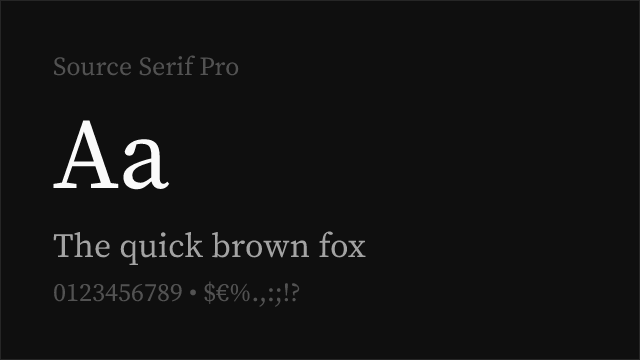
Source Serif Pro
| Mercury | Source Serif Pro | Match |
|---|---|---|
| Light (300) | Light (300) | close |
| Regular (400) | Regular (400) | exact |
| Semi Bold (600) | Semibold (600) | exact |
| Bold (700) | Bold (700) | exact |
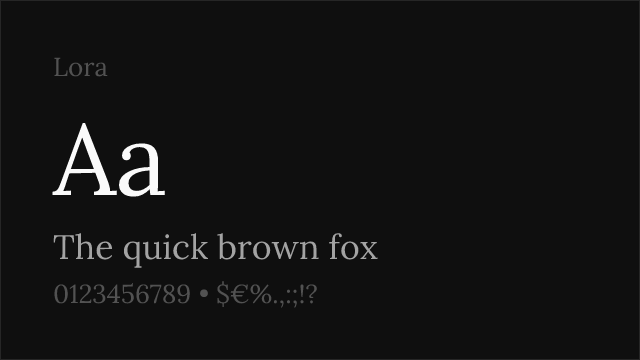
Lora
| Mercury | Lora | Match |
|---|---|---|
| Regular (400) | Regular (400) | exact |
| Medium (500) | Medium (500) | exact |
| Semi Bold (600) | Semi Bold (600) | exact |
| Bold (700) | Bold (700) | exact |
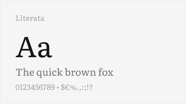
Literata
| Mercury | Literata | Match |
|---|---|---|
| Light (300) | Light (300) | close |
| Regular (400) | Regular (400) | exact |
| Semi Bold (600) | Semibold (600) | exact |
| Bold (700) | Bold (700) | exact |
Crimson Pro
| Mercury | Crimson Pro | Match |
|---|---|---|
| Light (300) | Light (300) | close |
| Regular (400) | Regular (400) | exact |
| Semi Bold (600) | Semibold (600) | exact |
| Bold (700) | Bold (700) | exact |
Merriweather
| Mercury | Merriweather | Match |
|---|---|---|
| Light (300) | Light (300) | exact |
| Regular (400) | Regular (400) | exact |
| Bold (700) | Bold (700) | exact |
| Black (900) | Black (900) | close |
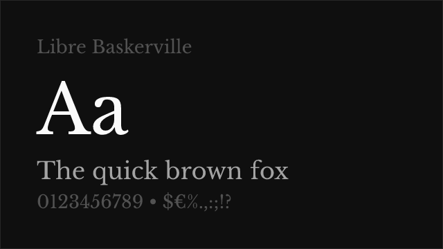
Libre Baskerville
| Mercury | Libre Baskerville | Match |
|---|---|---|
| Regular (400) | Regular (400) | exact |
| Bold (700) | Bold (700) | exact |
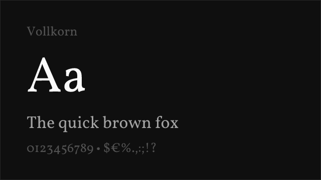
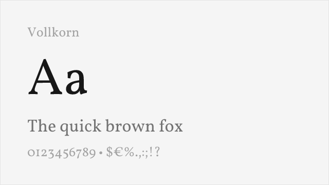
Vollkorn
| Mercury | Vollkorn | Match |
|---|---|---|
| Regular (400) | Regular (400) | exact |
| Semi Bold (600) | Semibold (600) | close |
| Bold (700) | Bold (700) | exact |
| Black (900) | Black (900) | close |
Performance Guide
Production performance metrics for each alternative.
How to Use Source Serif Pro
Copy these code snippets to quickly add Source Serif Pro to your project.
CSS code for Source Serif Pro
@import url('https://fonts.googleapis.com/css2?family=Source+Serif+Pro:wght@100..900&display=swap');HTML code for Source Serif Pro
<link rel="preconnect" href="https://fonts.googleapis.com">
<link rel="preconnect" href="https://fonts.gstatic.com" crossorigin>
<link href="https://fonts.googleapis.com/css2?family=Source+Serif+Pro:wght@100..900&display=swap" rel="stylesheet">
Tailwind code for Source Serif Pro
// tailwind.config.js
module.exports = {
  theme: {
    extend: {
      fontFamily: {
        'source-serif-pro': ['"Source Serif Pro"', 'sans-serif'],
      },
    },
  },
}

// Usage in HTML:
// <p class="font-source-serif-pro">Your text here</p>
Next.js code for Source Serif Pro
// Using next/font (Next.js 13+)
import { Source_Serif_Pro } from 'next/font/google';

const source_serif_pro = Source_Serif_Pro({
  subsets: ['latin'],
  weight: ['100', '200', '300', '400', '500', '600', '700', '800', '900'],
});

export default function Component() {
  return (
    <p className={source_serif_pro.className}>
      Your text here
    </p>
  );
}

// Or using inline styles with Google Fonts link:
// <p style={{ fontFamily: '"Source Serif Pro"' }}>Your text</p>
Expo and React Native code for Source Serif Pro
// Install: npx expo install @expo-google-fonts/source-serif-pro expo-font
import { useFonts, Source_Serif_Pro_400Regular } from '@expo-google-fonts/source-serif-pro';

export default function App() {
  const [fontsLoaded] = useFonts({
    Source_Serif_Pro_400Regular,
  });

  if (!fontsLoaded) return null;

  return (
    <Text style={{ fontFamily: 'Source_Serif_Pro_400Regular' }}>
      Your text here
    </Text>
  );
}
Recommended Font Pairings
These free fonts pair well with Source Serif Pro Mercury for headlines, body text, or accent use.
Inter's rational neo-grotesque proportions create clean typographic hierarchy alongside Mercury's warm editorial serifs — a pairing that mirrors the classic news-design formula of sans-serif navigation and serif editorial content
Source Sans 3 shares Mercury's Adobe-quality engineering ethos, creating a functionally matched serif-sans pair for editorial platforms where both typefaces need to perform reliably across rendering environments
DM Sans's geometric clarity provides a contemporary counterpoint to Mercury's transitional warmth, a pairing that suits modern editorial platforms blending news authority with clean digital aesthetics
Browse Alternatives by Context
Find Mercury alternatives filtered by specific use case, style, or language support.
By Style
By Script
Frequently Asked Questions
What is the best free alternative to Mercury?
Source Serif Pro is the best free alternative to Mercury with a FontAlternatives similarity score of 83%. It shares similar proportions and characteristics while being available under the OFL-1.1 license for both personal and commercial use at no cost.
Is there a free version of Mercury?
There is no official free version of Mercury. However, Source Serif Pro is available under the OFL-1.1 open-source license and achieves a FontAlternatives similarity score of 83%. It includes variable weights and supports latin, latin-extended.
What Google Font looks like Mercury?
The Google Fonts most similar to Mercury are Source Serif Pro, Lora, Literata. Among these alternatives, Source Serif Pro offers the closest match with a FontAlternatives similarity score of 83% and includes variable weights for flexible typography options.
Can I use Source Serif Pro commercially?
Yes, Source Serif Pro can be used commercially. It is licensed under OFL-1.1, which allows free use in websites, applications, print materials, and commercial projects without purchasing a license or paying royalties.
Is Source Serif Pro similar enough to Mercury?
Source Serif Pro achieves a FontAlternatives similarity score of 83% compared to Mercury. While not identical, it offers comparable letterforms, proportions, and visual style. Most designers find it works excellently as a substitute in web and print projects.
What are the main differences between Mercury and its free alternatives?
Free alternatives to Mercury may differ in subtle details like letter spacing, curve refinements, and available weights. Premium fonts typically include more OpenType features, extended language support, and optimized screen rendering. However, for most projects, these differences are negligible.
Where can I download free alternatives to Mercury?
Download Source Serif Pro directly from Google Fonts. Click the "Get Font" button on any alternative listed above to visit the official download page. Google Fonts also provides convenient embed codes for seamless web integration.