Free Alternatives to Söhne for Corporate

8 alternatives | 8 highly relevant | sans serif | Best match: Public Sans (72%)

Looking for a free sans serif font for corporate projects? Söhne by Klim Type Foundry is a popular choice, but its licensing cost can be prohibitive. We've curated 8 free alternatives that work well in corporate contexts. We've identified 8 that are especially well-suited for this context. Each alternative is scored by visual similarity and contextual relevance, and ships under an open-source license for both personal and commercial use.

Top Picks

Comparison Table

Font Relevance Similarity Weights Variable License Source
Public Sans 72 72% Variable Yes OFL-1.1 Google Fonts ↗
Source Sans 3 71 74% Variable Yes OFL-1.1 Google Fonts ↗
Plus Jakarta Sans 64 76% Variable Yes OFL-1.1 Google Fonts ↗
Inter 50 90% Variable Yes OFL-1.1 Google Fonts ↗
Geist 45 85% Variable Yes OFL-1.1 Google Fonts ↗
Work Sans 44 82% Variable Yes OFL-1.1 Google Fonts ↗
Satoshi 36 78% Variable Yes ITF Free Font License fontshare ↗
DM Sans 28 78% Variable Yes OFL-1.1 Google Fonts ↗

All Alternatives (8)

#1 Public Sans 72%
[Google Fonts] · OFL-1.1 · Variable

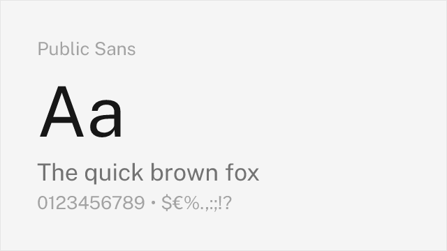
Government-grade neutrality with accessibility-first design

Why it matches: Public Sans shares Söhne's goal of invisible, functional typography. Both were designed to let content take priority over typeface personality. Public Sans is slightly more austere and wider-set than Söhne, optimized for the accessibility requirements of government digital services.
accessible web applicationsinstitutional portalsform-heavy enterprise toolscompliance-focused interfaces
Get Font ↗
#2 Source Sans 3 74%
[Google Fonts] · OFL-1.1 · Variable

Adobe's workhorse sans with broad language support and strong hinting

Why it matches: Source Sans 3 matches Söhne's commitment to screen legibility through generous apertures and careful hinting. While Söhne is more distinctly neo-grotesque, Source Sans 3 adds subtle humanist touches that improve readability in long-form content. Its extensive language support and Adobe's optimization make it reliable across diverse rendering environments.
enterprise applicationsgovernment and institutional sitesdocumentation systemsmultilingual interfaces
Get Font ↗
[Google Fonts] · OFL-1.1 · Variable

Contemporary geometric with slightly warmer character

Why it matches: Plus Jakarta Sans shares Söhne's contemporary positioning as a typeface designed for modern digital products. Both feature clean, open letterforms with moderate contrast. Jakarta is more geometric and warmer than Söhne, making it a good substitute when the project needs approachability alongside technical credibility.
fintech and banking appshealthcare tech interfacesB2B SaaS dashboardslanding pages
Get Font ↗
#4 Inter 90%
[Google Fonts] · OFL-1.1 · Variable

Closest overall match with exceptional screen rendering and variable font support

Why it matches: Inter mirrors Söhne's tall x-height, open apertures, and disciplined neo-grotesque skeleton. Both typefaces were built for digital interfaces first, sharing similarly tight but readable letter-spacing at UI sizes. Inter's optical sizing axis automatically adjusts details for different sizes, compensating for Söhne's manual optical grading between Söhne and Söhne Breit. The lowercase a, e, and s shapes are structurally very close.
product UI and dashboardsSaaS marketing sitesdeveloper documentationdesign system foundations
Get Font ↗
#5 Geist 85%
[Google Fonts] · OFL-1.1 · Variable

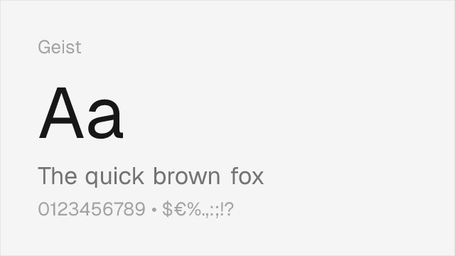
Vercel's own typeface with very similar tech-focused aesthetic

Why it matches: Geist was designed by Vercel in collaboration with Basement Studio specifically for developer-facing interfaces, the same context where Söhne thrives. Both share tight, rational letterforms with a focus on code-adjacent readability. Geist's slightly wider proportions give it marginally better legibility at very small sizes, while Söhne maintains tighter overall typographic color.
developer tools and CLIstech startup brandingdocumentation sitesdark-mode interfaces
Get Font ↗
#6 Work Sans 82%
[Google Fonts] · OFL-1.1 · Variable

Mature editorial sans with comparable weight distribution

Why it matches: Work Sans shares Söhne's preference for functional clarity over decorative personality. Both typefaces feature a moderate x-height and restrained letter-spacing suitable for dense UI layouts. Work Sans leans slightly more humanist in its stroke terminals, which adds warmth at body sizes where Söhne can feel austere.
editorial layoutscontent-heavy web appsresponsive marketing sitescross-platform design systems
Get Font ↗
#7 Satoshi 78%
[fontshare] · ITF Free Font License · Variable

Popular neo-grotesque from Fontshare with clean character

Get Font ↗
#8 DM Sans 78%
[Google Fonts] · OFL-1.1 · Variable

Geometric-leaning grotesque with clean, modern proportions

Why it matches: DM Sans blends geometric construction with grotesque openness in a way that approximates Söhne's balanced personality. Both avoid the extreme geometry of Futura or the raw grotesque feel of Helvetica, landing in a middle ground that reads as modern without being trendy. DM Sans is slightly rounder in its bowls and counters.
startup product interfacesmobile app typographypresentation deckslightweight branding
Get Font ↗

Related Pages