Free Alternatives to TT Norms Pro Supporting Cyrillic
Need a free alternative to TT Norms Pro with Cyrillic script support? These 4 options include Cyrillic characters and share visual similarities with TT Norms Pro. Each is licensed for free personal and commercial use.
Top Picks
Comparison Table
| Font | Relevance ⓘ
How well this alternative fits the specific context (use-case or trait) of this page. Score 0–100 based on matching keywords, industries, and font characteristics. Alternatives scoring 25+ are highlighted.
| Similarity ⓘ
How visually similar this free font is to the premium original. Score 0–100 based on x-height, width, stroke contrast, use-case overlap, and language coverage.
Learn more → | Weights | Variable | License | Source |
|---|---|---|---|---|---|---|
| Inter | 0 | 82% | Variable | Yes | OFL-1.1 | Google Fonts ↗ |
| Nunito Sans | 0 | 76% | Variable | Yes | OFL-1.1 | Google Fonts ↗ |
| Jost | 0 | 74% | Variable | Yes | OFL-1.1 | Google Fonts ↗ |
| Source Sans 3 | 0 | 72% | Variable | Yes | OFL-1.1 | Google Fonts ↗ |
All Alternatives (4)

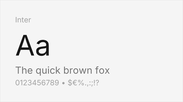
[Google Fonts] · OFL-1.1 · Variable
Superior screen optimization and variable font support compensate for slight stylistic differences
Why it matches: Inter approximates TT Norms Pro's functional clarity through a slightly different route — where TT Norms Pro is geometric-first, Inter blends neo-grotesque structure with UI-specific optimizations. Both share tall x-heights, clean apertures, and a professional tone suitable for product interfaces. Inter's optical sizing axis handles size transitions more gracefully than TT Norms Pro's static instances, and its broader language coverage (including Cyrillic, Greek, and Vietnamese) actually exceeds TT Norms Pro's script range.
SaaS product dashboardsdeveloper documentationdesign system foundationsenterprise web applications

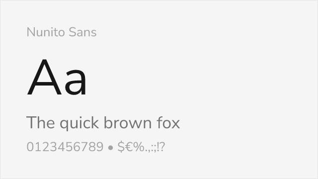
[Google Fonts] · OFL-1.1 · Variable
Balanced geometric sans with strong Cyrillic support matching TT Norms Pro's multilingual reach
Why it matches: Nunito Sans shares TT Norms Pro's balanced approach to geometric design — neither as strictly circular as Futura nor as neutral as Helvetica. Both typefaces feature open apertures, generous counters, and a friendly-yet-professional personality. Critically, Nunito Sans includes full Cyrillic support, matching one of TT Norms Pro's key differentiators. The main difference is that Nunito Sans has slightly softer, more humanist stroke endings compared to TT Norms Pro's sharper terminals.
multilingual SaaS platformsEastern European market interfacescorporate documentationaccessible web applications
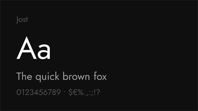

[Google Fonts] · OFL-1.1 · Variable
Futura-inspired geometric with elegant proportions and Cyrillic coverage
Why it matches: Jost approaches TT Norms Pro's geometric territory from a more classical direction — its proportions echo 1920s Bauhaus geometry rather than contemporary tech aesthetics. Both share perfectly circular `o` shapes, consistent stroke weights, and a clean, modern read. Jost is slightly more elongated in its vertical proportions and carries more historical gravitas, making it feel more editorial where TT Norms Pro feels more technological. Both include Cyrillic support.
fashion and luxury brandingeditorial headlinescultural institution materialsdisplay typography


[Google Fonts] · OFL-1.1 · Variable
Adobe's workhorse sans with broad language support and proven enterprise reliability
Why it matches: Source Sans 3 matches TT Norms Pro's commitment to functional clarity and screen legibility, though it arrives there from a humanist-grotesque rather than geometric starting point. Both excel in dense UI layouts and handle weight hierarchies cleanly. Source Sans 3 adds subtle humanist touches that improve long-form readability, and its broader language support and Adobe's extensive hinting make it more reliable across diverse rendering environments.
enterprise application UIsgovernment and institutional sitesdocumentation systemsmultilingual interfaces