Free Alternatives to TT Norms Pro

About TT Norms Pro
- Foundry
- TypeType
- Classification
- sans-serif
- Style
- geometric
Brands Using TT Norms Pro
Digital banking interfaces and corporate communications across Eastern Europe
Ride-hailing and delivery app interface typography
CRM product interface and marketing materials
Project management platform UI and brand collateral
Corporate identity and digital presence for Eastern European IT services
TT Norms Pro is a geometric sans-serif typeface designed by Ivan Gladkikh and released by TypeType in 2017, with the "Pro" update following in 2019. Built on a rigorously geometric foundation with perfectly circular bowls and consistent stroke weights, TT Norms Pro has become one of the most widely adopted premium geometric sans-serifs in Eastern Europe and increasingly across global tech markets. Its combination of clean geometry, extensive weight range, and strong Cyrillic support fills a specific niche that few competitors address as completely.
TT Norms Pro requires a paid license from TypeType. Desktop licenses are available per-workstation, with separate web, app, and server licenses. TypeType offers a trial version, but production use requires a commercial license. If your budget does not accommodate TypeType's licensing structure, this page covers the best open-source alternatives and how to evaluate them for your specific needs.
Why TT Norms Pro Matters
TT Norms Pro's rise tracks closely with the growth of the Eastern European tech ecosystem. When companies like Bolt, Pipedrive, and Wrike needed typefaces that felt globally contemporary while handling Cyrillic script natively, TT Norms Pro became the default recommendation. Unlike many Western-designed geometric sans-serifs where Cyrillic is an afterthought — bolted on by different designers with varying degrees of care — TT Norms Pro's Cyrillic was integral to the original design process. The letterforms in both scripts share identical construction principles, weight distribution, and spacing logic.
Beyond its Cyrillic advantage, TT Norms Pro occupies the same design territory as Circular and Proxima Nova — the "friendly geometric" space that has dominated startup and SaaS branding since the mid-2010s. What distinguishes TT Norms Pro is its precision. Where Circular softens its geometry with subtle humanist curves and Proxima Nova adds warmth through slightly tapered strokes, TT Norms Pro maintains sharper terminals and tighter letter-spacing. The result reads as more engineered, more controlled — qualities that appeal to banking, fintech, and enterprise software brands.
The Pro update added extended OpenType features, refined kerning across all scripts, and additional weights, bringing the family to 20 styles (10 weights with italics). TypeType priced it competitively against foundries like Lineto and Klim, which helped drive adoption among budget-conscious startups that still wanted premium typography.
Design Characteristics
TT Norms Pro's design choices reflect a commitment to geometric purity tempered by pragmatic screen optimization:
- Perfectly circular bowls: Letters like
o,d,b,p,qare built on true circles, giving the typeface its characteristic geometric precision and visual consistency across text blocks - Monoline stroke weight: Minimal variation between thick and thin strokes creates even typographic color, reducing visual noise in dense interface layouts and data tables
- Sharp, clean terminals: Stroke endings are cut cleanly rather than rounded or tapered, contributing to TT Norms Pro's engineered, controlled personality — a deliberate contrast to the softer terminals of competitors like Circular
- Tall x-height: The lowercase letters occupy a large proportion of the body height, maximizing legibility at the 12-16px range where most UI text lives
- Open apertures: The
c,e,s, andamaintain generous counter openings that prevent letterform collapse at small sizes on screen, particularly important for mobile interfaces - Consistent vertical metrics: Cap height, x-height, and descender proportions are carefully calibrated to maintain even line spacing across mixed-case text, which is critical for UI component alignment
- Native Cyrillic construction: Cyrillic letterforms follow the same geometric grid as the Latin set, with proper optical adjustments for characters like
Д,Ж, andФrather than mechanical translations
The family ships in 10 weights (Thin through Black) with matching italics. A companion family, TT Norms Pro Serif, provides a harmonized serif option for editorial contexts.
Where TT Norms Pro Excels
TT Norms Pro performs best in contexts that reward geometric precision and clean construction:
- SaaS product interfaces: The even typographic color and tight spacing handle dense information displays — dashboards, settings panels, data tables — without creating visual clutter
- Mobile app UIs: The tall x-height and open apertures ensure readability on small screens where every pixel of legibility matters
- Corporate branding systems: Its neutral-yet-modern personality works across business cards, slide decks, email templates, and web properties without feeling either boring or trendy
- Banking and fintech products: The precise, engineered quality conveys trustworthiness and technical competence — both essential for financial services
- Multilingual Eastern European projects: Native Cyrillic support means brands operating across Western and Eastern European markets can maintain typographic consistency
Where TT Norms Pro Struggles
TT Norms Pro has clear limitations in certain design contexts:
- Long-form editorial content: The monoline stroke weight and tight letter-spacing cause reader fatigue in extended prose. After a few paragraphs, the geometric consistency that works in UI becomes monotonous in articles
- Warm or playful brands: TT Norms Pro reads as precise and controlled, which can feel clinical for brands targeting families, children, or lifestyle audiences
- Display and poster design: At very large sizes (72pt+), the geometric construction can appear sterile — the perfectly circular bowls and uniform strokes lack the expressive details that make display typefaces interesting
- CJK or Arabic projects: TT Norms Pro covers Latin and Cyrillic but does not extend to East Asian or Arabic scripts, requiring a fallback strategy for truly global products
How to Choose a Free Substitute
When evaluating TT Norms Pro replacements, prioritize these criteria:
- Geometric consistency: TT Norms Pro's defining feature is its circular-geometry construction. Test your alternative's
o,d,b, andp— do the bowls feel circular and consistent, or oval and varied? The more geometric, the closer the match - Weight distribution: TT Norms Pro's 10-weight range provides granular control for UI hierarchy. Your alternative needs at minimum Regular, Medium, SemiBold, and Bold to replicate common patterns
- Cyrillic support: If your project serves Eastern European markets, this is non-negotiable. Many geometric sans-serifs lack Cyrillic, or include a poorly harmonized version. Test Cyrillic text at body sizes before committing
- Monoline character: TT Norms Pro has very low stroke contrast. Alternatives with visible thick-thin variation will read differently even if the overall proportions are similar
- Letter-spacing at UI sizes: TT Norms Pro is relatively tightly spaced for a geometric sans. Test your alternative at 14px in a button, input field, and table cell — if it feels looser or more open, the UI density will shift
Premium Font Neighbors
If TT Norms Pro's approach resonates but you want to explore adjacent premium options:
Cluster A: Friendly geometrics (TT Norms Pro's direct competitors)
- Circular (Lineto) — the original "startup geometric" that launched the trend; softer and more humanist than TT Norms Pro
- Proxima Nova (Mark Simonson Studio) — warmer, slightly wider proportions with subtle stroke tapering; the older generation's default
- Gilroy (Radomir Tinkov) — very similar geometric construction at a lower price point; less refined kerning and spacing
Cluster B: Contemporary geometric alternatives
- GT Walsheim (Grilli Type) — friendlier and more rounded than TT Norms Pro; named after Swiss modernist traditions
- Campton (Rene Bieder) — geometric with slightly more personality in its terminals; popular with European agencies
- Avenir (Adrian Frutiger / Linotype) — the classic humanist-geometric hybrid; more organic than TT Norms Pro
- Core Sans (S-Core) — affordable geometric with extensive width options; similar market positioning
FAQ
Is TT Norms Pro free?
No. TT Norms Pro is a premium typeface from TypeType with per-format licensing. Desktop licenses start around $30 per style, with web licenses priced by monthly page views. TypeType offers a trial version for design exploration, but any production use requires a commercial license.
What is the best free alternative to TT Norms Pro?
Poppins is the closest free alternative at 85% similarity. Both share circular geometric construction, consistent stroke weights, and a clean modern aesthetic. Poppins adds Devanagari support but lacks TT Norms Pro's native Cyrillic quality. For projects requiring Cyrillic, Inter (82% similarity) provides better script coverage.
Why is TT Norms Pro popular in Eastern Europe?
TypeType is based in Saint Petersburg, and TT Norms Pro was designed with Cyrillic as a first-class citizen rather than an afterthought. The Cyrillic letterforms share identical construction principles with the Latin set, which is rare among Western-designed geometric sans-serifs. This, combined with competitive pricing compared to foundries like Klim and Grilli Type, made it the default choice for the region's growing tech sector.
Can I use TT Norms Pro on the web?
Yes, with a web font license from TypeType. Web licenses are priced by monthly page views and include WOFF2 files for self-hosting. TT Norms Pro is not available through Google Fonts, Adobe Fonts, or any free font service.
What is the difference between TT Norms and TT Norms Pro?
TT Norms was the original 2017 release. TT Norms Pro (2019) is the expanded version with refined kerning, additional OpenType features (stylistic alternates, extended ligatures, tabular figures), improved hinting, and broader language support. The Pro version effectively replaces the original — TypeType recommends it for all new projects.
Does TT Norms Pro support Cyrillic?
Yes. Cyrillic support is one of TT Norms Pro's strongest differentiators. The Cyrillic letterforms were designed alongside the Latin set using the same geometric grid, resulting in harmonized typography across both scripts. This is particularly important for brands operating in markets like Russia, Ukraine, Bulgaria, and Serbia.
Is TT Norms Pro a variable font?
No. TT Norms Pro ships as static font files in 10 weights with matching italics (20 styles total). For web projects where variable font support would improve performance, most free alternatives — including Inter, DM Sans, and Plus Jakarta Sans — offer variable font versions, which is a practical advantage over TT Norms Pro.
Who designed TT Norms Pro?
Ivan Gladkikh, lead type designer at TypeType foundry. TypeType is one of the most prolific Russian type foundries, known for comprehensive font families with strong Cyrillic support. Their catalog includes TT Commons, TT Firs, TT Hoves, and dozens of other production-ready families used across enterprise and consumer applications.
Is TT Norms Pro on Google Fonts?
No, TT Norms Pro is a premium font from TypeType and is not available on Google Fonts.
The closest Google Fonts alternative is Poppins with 85% similarity. Get it free on Google Fonts ↗
Free Alternatives (7)


Closest geometric match with similarly clean, circular letterforms and comprehensive weight coverage


Superior screen optimization and variable font support compensate for slight stylistic differences


Low-contrast geometric with a slightly warmer personality and excellent variable font support

Contemporary geometric with ink traps and modern details that echo TT Norms Pro's precision


Balanced geometric sans with strong Cyrillic support matching TT Norms Pro's multilingual reach

Futura-inspired geometric with elegant proportions and Cyrillic coverage


Adobe's workhorse sans with broad language support and proven enterprise reliability
See where TT Norms Pro is used in the wild and swap to free alternatives live.
Install FontSwap →Replacement Summary
Source: FontAlternatives.com
Premium font: TT Norms Pro
Best free alternative: Poppins
FontAlternatives similarity score: 85%
Replacement difficulty: Low
Best for: startup branding and marketing sites, mobile app interfaces, presentation decks, consumer-facing product UIs
Notable users: Raiffeisen Bank International, Bolt, Pipedrive
Not recommended when: Brand consistency with Raiffeisen Bank International requires exact letterforms
What is the best free alternative to TT Norms Pro?
Poppins is the best free alternative to TT Norms Pro with a FontAlternatives similarity score of 85%.
Poppins shares similar proportions, stroke characteristics, and intended use with TT Norms Pro. It is available under the OFL-1.1 license, which permits both personal and commercial use at no cost.
This alternative works particularly well for: startup branding and marketing sites, mobile app interfaces, presentation decks, consumer-facing product UIs.
Can I safely replace TT Norms Pro with Poppins?
Yes, Poppins is a high-confidence replacement for TT Norms Pro. The FontAlternatives similarity score of 85% indicates strong structural compatibility.
Licensing: Poppins is licensed under OFL-1.1, which allows commercial use without licensing fees or royalties.
Weight coverage: All 5 weights have exact matches available.
When should I NOT replace TT Norms Pro?
While Poppins is a strong alternative, there are situations where replacing TT Norms Pro may not be appropriate:
- Extended language support: Poppins has limited cyrillic support compared to TT Norms Pro.
- Brand consistency: TT Norms Pro is commonly seen in Eastern European tech companies contexts where exact letterforms may be required.
- Strict compliance: Verify that OFL-1.1 terms meet your specific legal and compliance requirements.
Weight-Matching Guide
Map TT Norms Pro weights to their closest free alternatives for accurate font substitution.
Poppins
| TT Norms Pro | Poppins | Match |
|---|---|---|
| Thin (100) | Thin (100) | exact |
| Light (300) | Light (300) | exact |
| Regular (400) | Regular (400) | exact |
| Medium (500) | Medium (500) | exact |
| Bold (700) | Bold (700) | exact |
Inter
| TT Norms Pro | Inter | Match |
|---|---|---|
| Light (300) | Light (300) | exact |
| Regular (400) | Regular (400) | exact |
| Medium (500) | Medium (500) | exact |
| Bold (700) | Bold (700) | exact |
DM Sans
| TT Norms Pro | DM Sans | Match |
|---|---|---|
| Light (300) | Light (300) | close |
| Regular (400) | Regular (400) | close |
| Medium (500) | Medium (500) | close |
| Bold (700) | Bold (700) | close |
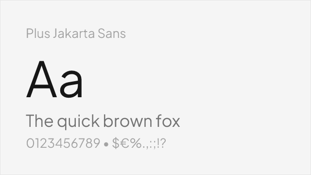
Plus Jakarta Sans
| TT Norms Pro | Plus Jakarta Sans | Match |
|---|---|---|
| Light (300) | Light (300) | close |
| Regular (400) | Regular (400) | close |
| Medium (500) | Medium (500) | close |
| Bold (700) | Bold (700) | close |
Nunito Sans
| TT Norms Pro | Nunito Sans | Match |
|---|---|---|
| ExtraLight (200) | ExtraLight (200) | exact |
| Regular (400) | Regular (400) | exact |
| SemiBold (600) | SemiBold (600) | exact |
| Bold (700) | Bold (700) | exact |
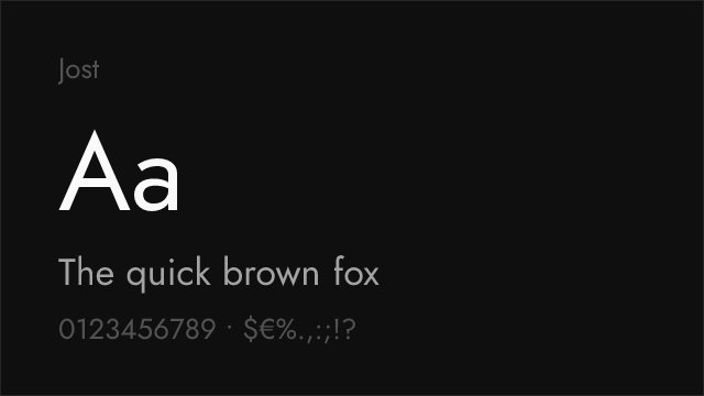
Jost
| TT Norms Pro | Jost | Match |
|---|---|---|
| Thin (100) | Thin (100) | exact |
| Light (300) | Light (300) | close |
| Regular (400) | Regular (400) | close |
| Bold (700) | Bold (700) | close |
Source Sans 3
| TT Norms Pro | Source Sans 3 | Match |
|---|---|---|
| Light (300) | Light (300) | close |
| Regular (400) | Regular (400) | close |
| Medium (500) | Medium (500) | substitute |
| Bold (700) | Bold (700) | close |
Performance Guide
Production performance metrics for each alternative.
How to Use Poppins
Copy these code snippets to quickly add Poppins to your project.
CSS code for Poppins
@import url('https://fonts.googleapis.com/css2?family=Poppins:wght@100;200;300;400;500;600;700;800;900&display=swap');HTML code for Poppins
<link rel="preconnect" href="https://fonts.googleapis.com">
<link rel="preconnect" href="https://fonts.gstatic.com" crossorigin>
<link href="https://fonts.googleapis.com/css2?family=Poppins:wght@100;200;300;400;500;600;700;800;900&display=swap" rel="stylesheet">
Tailwind code for Poppins
// tailwind.config.js
module.exports = {
  theme: {
    extend: {
      fontFamily: {
        'poppins': ['Poppins', 'sans-serif'],
      },
    },
  },
}

// Usage in HTML:
// <p class="font-poppins">Your text here</p>
Next.js code for Poppins
// Using next/font (Next.js 13+)
import { Poppins } from 'next/font/google';

const poppins = Poppins({
  subsets: ['latin'],
  weight: ['100', '200', '300', '400', '500', '600', '700', '800', '900'],
});

export default function Component() {
  return (
    <p className={poppins.className}>
      Your text here
    </p>
  );
}

// Or using inline styles with Google Fonts link:
// <p style={{ fontFamily: "'Poppins'" }}>Your text</p>
Expo and React Native code for Poppins
// Install: npx expo install @expo-google-fonts/poppins expo-font
import { useFonts, Poppins_400Regular } from '@expo-google-fonts/poppins';

export default function App() {
  const [fontsLoaded] = useFonts({
    Poppins_400Regular,
  });

  if (!fontsLoaded) return null;

  return (
    <Text style={{ fontFamily: 'Poppins_400Regular' }}>
      Your text here
    </Text>
  );
}
Recommended Font Pairings
These free fonts pair well with Poppins TT Norms Pro for headlines, body text, or accent use.
Merriweather's sturdy, screen-optimized serifs create strong contrast against TT Norms Pro's clean geometric headlines — both typefaces were designed for digital readability, making them a technically harmonious pairing for content-heavy interfaces
Lora's contemporary brush-influenced serifs soften TT Norms Pro's precise geometry in editorial layouts, providing reading comfort in long-form content while maintaining a modern, professional tone
Crimson Pro's elegant, classical serifs provide typographic depth that balances TT Norms Pro's geometric simplicity, creating sophisticated editorial hierarchies for magazines, reports, and content platforms
Browse Alternatives by Context
Find TT Norms Pro alternatives filtered by specific use case, style, or language support.
By Script
Frequently Asked Questions
What is the best free alternative to TT Norms Pro?
Poppins is the best free alternative to TT Norms Pro with a FontAlternatives similarity score of 85%. It shares similar proportions and characteristics while being available under the OFL-1.1 license for both personal and commercial use at no cost.
Is there a free version of TT Norms Pro?
There is no official free version of TT Norms Pro. However, Poppins is available under the OFL-1.1 open-source license and achieves a FontAlternatives similarity score of 85%. It includes 9 weights and supports latin, latin-extended.
What Google Font looks like TT Norms Pro?
The Google Fonts most similar to TT Norms Pro are Poppins, Inter, DM Sans. Among these alternatives, Poppins offers the closest match with a FontAlternatives similarity score of 85% and includes 9 weights for design flexibility.
Can I use Poppins commercially?
Yes, Poppins can be used commercially. It is licensed under OFL-1.1, which allows free use in websites, applications, print materials, and commercial projects without purchasing a license or paying royalties.
Is Poppins similar enough to TT Norms Pro?
Poppins achieves a FontAlternatives similarity score of 85% compared to TT Norms Pro. While not identical, it offers comparable letterforms, proportions, and visual style. Most designers find it works excellently as a substitute in web and print projects.
What are the main differences between TT Norms Pro and its free alternatives?
Free alternatives to TT Norms Pro may differ in subtle details like letter spacing, curve refinements, and available weights. Premium fonts typically include more OpenType features, extended language support, and optimized screen rendering. However, for most projects, these differences are negligible.
Where can I download free alternatives to TT Norms Pro?
Download Poppins directly from Google Fonts. Click the "Get Font" button on any alternative listed above to visit the official download page. Google Fonts also provides convenient embed codes for seamless web integration.