Free Alternatives to GT Walsheim

About GT Walsheim
- Foundry
- Grilli Type
- Classification
- sans-serif
- Style
- geometric
Brands Using GT Walsheim
Primary typeface across the HEY email client and Basecamp project management product
Brand identity, marketing site, and product interface typography
Product interface and customer messaging platform typography
Early brand identity and marketing materials before custom type
Retail branding, packaging, and e-commerce experience
GT Walsheim is a geometric sans-serif typeface designed by Noël Leu and released by Grilli Type in 2010. Named after Swiss type designer and teacher Otto Walsheim, it reinterprets the geometric sans-serif tradition through a distinctly warm, humanist lens — circular letterforms softened by rounded terminals and generous proportions that communicate friendliness without sacrificing typographic rigor. GT Walsheim has become one of the most recognizable typefaces in the design-conscious tech and creative industries.
GT Walsheim requires a paid license from Grilli Type. Pricing follows a per-format model with separate desktop, web, and app licenses. Grilli Type offers test fonts for design exploration, but any production use requires a commercial license. If your project cannot accommodate Grilli Type's licensing, this page covers the best free alternatives and how to choose between them.
Why GT Walsheim Matters
GT Walsheim emerged at a pivotal moment in digital typography. When it launched in 2010, the dominant web fonts were either cold corporate grotesques (Helvetica, Arial) or decorative display faces with limited weight ranges. GT Walsheim offered something different — a typeface that felt simultaneously professional and human, structured and warm. Design-forward companies immediately recognized its value.
Basecamp adopted GT Walsheim for its HEY email client, using its friendly geometry to signal that email could feel personal again. WeTransfer built its entire brand around the typeface's approachable warmth, from marketing pages to the file transfer interface itself. Intercom used it to make customer communication software feel less like enterprise tooling and more like conversation. These companies chose GT Walsheim because it solved a specific branding problem: how to appear trustworthy and competent while also being likeable.
The typeface's Swiss heritage is not merely biographical. Noël Leu's design follows the Grilli Type philosophy of reinterpreting modernist traditions rather than simply reviving them. GT Walsheim takes the geometric purity of faces like Futura and the warmth of faces like Gill Sans, finding a middle ground that reads as contemporary rather than historically referential. The rounded terminals are its signature — they appear at the ends of strokes in letters like a, c, e, f, s, and t, creating a softness that pervades the entire text block without any individual letter looking obviously "rounded."
Design Characteristics
GT Walsheim's design balances geometric precision with deliberate warmth through carefully calibrated details:
- Rounded terminals: The defining feature — stroke endings on letters like
c,e,f,s, andtare softly rounded rather than cut flat, creating the typeface's signature warm, approachable personality without appearing childish or informal - Circular bowls: Letters like
o,d,b,p, andqare built on near-perfect circles, giving the typeface its geometric foundation and visual consistency across text blocks - Low stroke contrast: Minimal variation between thick and thin strokes creates even typographic color, ensuring GT Walsheim looks composed and balanced whether used for a single headline or a full paragraph
- Generous x-height: Lowercase letters are proportionally large relative to cap height, improving legibility at the small to medium sizes where most UI and branding text is read
- Open counters: Interior spaces in letters like
a,e, andgare spacious, preventing the letterforms from appearing closed or cramped at small sizes on screen - Humanist proportions within geometric frames: While the overall skeleton is geometric, subtle width variations between letters (the
mis proportionally wider, theinarrower) create a natural reading rhythm that pure geometrics lack - Distinctive lowercase g: A single-story
gthat reinforces the font's clean, modern character and avoids the complexity of double-story forms
The family ships in six weights (Thin through Bold) with matching italics. GT Walsheim Pro adds additional OpenType features, and display cuts are optimized for large-size use.
Where GT Walsheim Excels
GT Walsheim is at its best in contexts that reward warmth combined with professionalism:
- Consumer-facing tech products: The friendly geometry makes software feel approachable — chat apps, email clients, project tools, and creative platforms all benefit from GT Walsheim's personality
- Brand identity systems: Its distinctive rounded character provides instant brand recognition while remaining versatile enough for business cards, signage, presentations, and web properties
- Packaging and retail: The warm, inviting quality works exceptionally well for food and beverage brands, lifestyle products, and retail environments where approachability drives purchasing decisions
- Museum and gallery communications: Cultural institutions value GT Walsheim's balance of contemporary sophistication and accessibility — it signals "we care about design" without excluding non-designer audiences
- Editorial design: Magazines, newsletters, and content platforms benefit from GT Walsheim's ability to create clear hierarchy while maintaining a warm editorial voice
Where GT Walsheim Struggles
GT Walsheim's strengths become limitations in certain contexts:
- Data-dense enterprise UIs: The rounded terminals and generous spacing consume more horizontal space than tighter grotesques, making GT Walsheim less efficient for dashboards, data tables, and dense interface layouts
- Serious or institutional tone: Financial services, legal firms, and government agencies often need typography that communicates authority and gravitas — GT Walsheim's friendliness can undermine that message
- Long-form body text at small sizes: The geometric construction and low contrast create monotonous texture in extended prose. After several paragraphs at 14-16px, the roundedness that works beautifully in UI becomes tiring in continuous reading
- Multilingual projects: GT Walsheim supports Latin and Latin Extended scripts only. Projects requiring Cyrillic, Greek, Arabic, or CJK scripts need a fallback strategy — and finding a fallback that matches GT Walsheim's distinctive personality is difficult
- Very thin weights at body sizes: The Thin weight is designed for display use. At body sizes, it can appear fragile and difficult to read, particularly on lower-resolution screens
How to Choose a Free Substitute
When evaluating GT Walsheim replacements, prioritize these criteria:
- Rounded terminals: This is GT Walsheim's most recognizable feature. If your substitute has flat or angled terminals, the personality shift will be immediately noticeable. Nunito and Quicksand both offer rounded terminals; Poppins and DM Sans do not
- Geometric warmth vs. geometric precision: GT Walsheim feels warm because it softens geometry with humanist touches. Pure geometric fonts (Futura, Jost) feel colder. Pure humanist fonts (Source Sans) feel different. You need something in between
- Weight range: GT Walsheim ships in six weights. For branding work, you need at minimum Regular, Medium, and Bold. For UI work, add Light and SemiBold. Check that your alternative covers your hierarchy needs
- Horizontal proportions: GT Walsheim is moderately wide. Alternatives that are significantly narrower (like Barlow) or wider (like Quicksand) will change the density and rhythm of text blocks noticeably
- Display vs. text optimization: GT Walsheim works across sizes because Grilli Type optimized it for both contexts. Some free alternatives are designed primarily for display or primarily for text — test at both 14px and 48px
Premium Font Neighbors
If GT Walsheim's approach resonates but you want to explore adjacent premium options:
Cluster A: Warm geometrics (GT Walsheim's direct competitors)
- Circular (Lineto) — the other dominant "friendly geometric" of the 2010s; less overtly rounded than GT Walsheim, more subtle in its warmth
- Brown (Aurèle Sack / Lineto) — shares GT Walsheim's rounded character with a slightly more condensed, serious personality
- Proxima Nova (Mark Simonson Studio) — the previous generation's default warm geometric; wider and less distinctively rounded
Cluster B: Contemporary friendly sans-serifs
- TT Norms (TypeType) — similar geometric territory with sharper terminals; stronger Cyrillic support
- Campton (Rene Bieder) — geometric with more pronounced personality in its terminals and details
- Maison Neue (Milieu Grotesque) — slightly cooler than GT Walsheim but similarly design-forward
- Neue Montreal (Pangram Pangram) — more expressive and less geometric; popular in creative branding
FAQ
Is GT Walsheim free?
No. GT Walsheim is a premium typeface from Grilli Type with per-format licensing. Desktop licenses start at around CHF 50 per style, with web and app licenses priced separately. Grilli Type provides test fonts for design mockups, but production use requires a commercial license. There is no free tier.
What is the best free alternative to GT Walsheim?
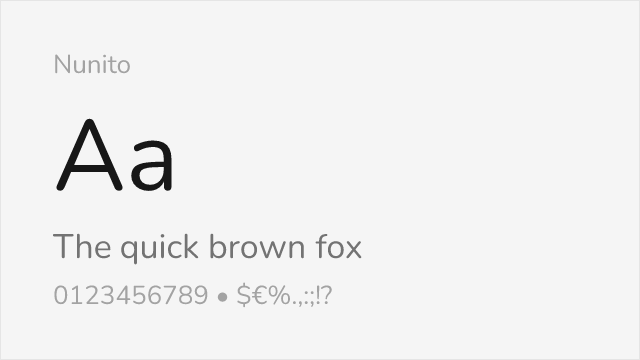
Nunito is the closest free alternative at 85% similarity. Both share rounded geometric construction and a warm, friendly personality. Nunito adds variable font support, Cyrillic coverage, and a broader weight range (200-900), making it a strong practical replacement. The main difference is that Nunito rounds all terminals uniformly, whereas GT Walsheim rounds selectively for rhythmic variety.
Why do design agencies love GT Walsheim?
GT Walsheim solves a specific branding problem that design agencies frequently encounter: their clients need to appear professional and trustworthy while also being approachable and human. Most grotesques accomplish the former but not the latter. GT Walsheim achieves both through its rounded geometric construction. The Grilli Type name also carries significant credibility in the design community, signaling typographic taste and attention to craft.
Can I use GT Walsheim on the web?
Yes, with a web font license from Grilli Type. Web licenses are priced by monthly page views and include WOFF2 files for self-hosting. GT Walsheim is not available through Google Fonts, Adobe Fonts, or any free font service.
What is the difference between GT Walsheim and GT Walsheim Pro?
GT Walsheim is the original release with a standard character set. GT Walsheim Pro adds extended OpenType features including stylistic alternates, small caps, tabular figures, and broader language support. For most projects, the Pro version is recommended, though the standard version is sufficient for basic Latin typography.
Does GT Walsheim support Cyrillic?
No. GT Walsheim supports Latin and Latin Extended scripts only. For projects requiring Cyrillic support, Nunito (85% similarity, includes Cyrillic) or Inter (76% similarity, includes Cyrillic and Greek) are the recommended free alternatives.
Who designed GT Walsheim?
Noël Leu designed GT Walsheim for Grilli Type, a Swiss type foundry based in Lucerne and Zurich. Grilli Type is known for high-quality typefaces that reinterpret modernist traditions, including GT America, GT Sectra, GT Flexa, and GT Pressura. The foundry has become one of the most respected independent type foundries in Europe.
What does the name mean?
GT Walsheim is named after Otto Walsheim, a lesser-known Swiss type designer and teacher who influenced the development of geometric sans-serif design in Switzerland during the mid-twentieth century. The "GT" prefix stands for Grilli Type, the foundry's standard naming convention.
Is GT Walsheim on Google Fonts?
No, GT Walsheim is a premium font from Grilli Type and is not available on Google Fonts.
The closest Google Fonts alternative is Nunito with 85% similarity. Get it free on Google Fonts ↗
Free Alternatives (7)

Closest match for GT Walsheim's signature rounded terminals and friendly geometric character


Widely available geometric with warmth that approaches GT Walsheim's approachable tone

Rounded geometric with a playful character that closely echoes GT Walsheim's softness


Clean geometric with more neutral tone than GT Walsheim but similarly polished construction


Superior screen optimization trades GT Walsheim's warmth for functional precision

Modern geometric with subtle warmth and ink traps that bridge the gap toward GT Walsheim's character


Editorial-ready sans with humanist warmth that parallels GT Walsheim's approachable tone
See where GT Walsheim is used in the wild and swap to free alternatives live.
Install FontSwap →Replacement Summary
Source: FontAlternatives.com
Premium font: GT Walsheim
Best free alternative: Nunito
FontAlternatives similarity score: 85%
Replacement difficulty: Low
Best for: friendly brand identities, consumer-facing web apps, educational platforms, health and wellness products
Notable users: Basecamp / HEY, WeTransfer, Intercom
Not recommended when: Brand consistency with Basecamp / HEY requires exact letterforms
What is the best free alternative to GT Walsheim?
Nunito is the best free alternative to GT Walsheim with a FontAlternatives similarity score of 85%.
Nunito shares similar proportions, stroke characteristics, and intended use with GT Walsheim. It is available under the OFL-1.1 license, which permits both personal and commercial use at no cost.
This alternative works particularly well for: friendly brand identities, consumer-facing web apps, educational platforms, health and wellness products.
Can I safely replace GT Walsheim with Nunito?
Yes, Nunito is a high-confidence replacement for GT Walsheim. The FontAlternatives similarity score of 85% indicates strong structural compatibility.
Licensing: Nunito is licensed under OFL-1.1, which allows commercial use without licensing fees or royalties.
Weight coverage: Most weights have close or exact matches available.
When should I NOT replace GT Walsheim?
While Nunito is a strong alternative, there are situations where replacing GT Walsheim may not be appropriate:
- Brand consistency: GT Walsheim is commonly seen in Design agency portfolios contexts where exact letterforms may be required.
- Strict compliance: Verify that OFL-1.1 terms meet your specific legal and compliance requirements.
Weight-Matching Guide
Map GT Walsheim weights to their closest free alternatives for accurate font substitution.
Nunito
| GT Walsheim | Nunito | Match |
|---|---|---|
| Thin (100) | ExtraLight (200) | close |
| Light (300) | Light (300) | exact |
| Regular (400) | Regular (400) | exact |
| Bold (700) | Bold (700) | exact |
Poppins
| GT Walsheim | Poppins | Match |
|---|---|---|
| Thin (100) | Thin (100) | close |
| Light (300) | Light (300) | exact |
| Regular (400) | Regular (400) | exact |
| Bold (700) | Bold (700) | exact |
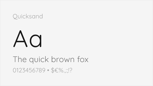
Quicksand
| GT Walsheim | Quicksand | Match |
|---|---|---|
| Light (300) | Light (300) | close |
| Regular (400) | Regular (400) | close |
| Medium (500) | Medium (500) | close |
| Bold (700) | Bold (700) | close |
DM Sans
| GT Walsheim | DM Sans | Match |
|---|---|---|
| Light (300) | Light (300) | close |
| Regular (400) | Regular (400) | close |
| Medium (500) | Medium (500) | close |
| Bold (700) | Bold (700) | close |
Inter
| GT Walsheim | Inter | Match |
|---|---|---|
| Light (300) | Light (300) | exact |
| Regular (400) | Regular (400) | exact |
| Medium (500) | Medium (500) | exact |
| Bold (700) | Bold (700) | exact |
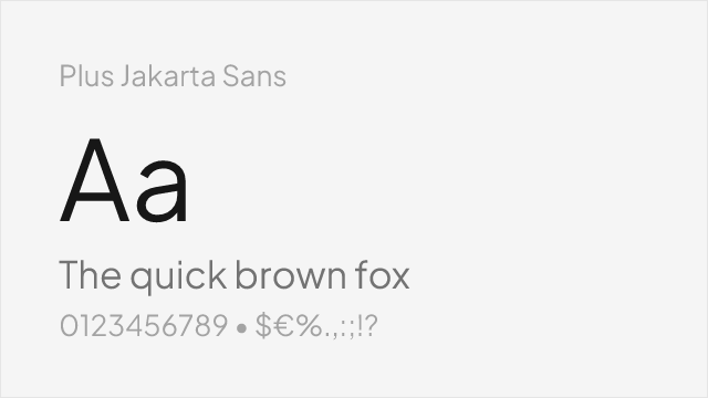
Plus Jakarta Sans
| GT Walsheim | Plus Jakarta Sans | Match |
|---|---|---|
| Light (300) | Light (300) | close |
| Regular (400) | Regular (400) | close |
| Medium (500) | Medium (500) | close |
| Bold (700) | Bold (700) | close |
Work Sans
| GT Walsheim | Work Sans | Match |
|---|---|---|
| Light (300) | Light (300) | exact |
| Regular (400) | Regular (400) | exact |
| Medium (500) | Medium (500) | exact |
| Bold (700) | Bold (700) | close |
Performance Guide
Production performance metrics for each alternative.
How to Use Nunito
Copy these code snippets to quickly add Nunito to your project.
CSS code for Nunito
@import url('https://fonts.googleapis.com/css2?family=Nunito:wght@100..900&display=swap');HTML code for Nunito
<link rel="preconnect" href="https://fonts.googleapis.com">
<link rel="preconnect" href="https://fonts.gstatic.com" crossorigin>
<link href="https://fonts.googleapis.com/css2?family=Nunito:wght@100..900&display=swap" rel="stylesheet">
Tailwind code for Nunito
// tailwind.config.js
module.exports = {
  theme: {
    extend: {
      fontFamily: {
        'nunito': ['Nunito', 'sans-serif'],
      },
    },
  },
}

// Usage in HTML:
// <p class="font-nunito">Your text here</p>
Next.js code for Nunito
// Using next/font (Next.js 13+)
import { Nunito } from 'next/font/google';

const nunito = Nunito({
  subsets: ['latin'],
  weight: ['100', '200', '300', '400', '500', '600', '700', '800', '900'],
});

export default function Component() {
  return (
    <p className={nunito.className}>
      Your text here
    </p>
  );
}

// Or using inline styles with Google Fonts link:
// <p style={{ fontFamily: "'Nunito'" }}>Your text</p>
Expo and React Native code for Nunito
// Install: npx expo install @expo-google-fonts/nunito expo-font
import { useFonts, Nunito_400Regular } from '@expo-google-fonts/nunito';

export default function App() {
  const [fontsLoaded] = useFonts({
    Nunito_400Regular,
  });

  if (!fontsLoaded) return null;

  return (
    <Text style={{ fontFamily: 'Nunito_400Regular' }}>
      Your text here
    </Text>
  );
}
Recommended Font Pairings
These free fonts pair well with Nunito GT Walsheim for headlines, body text, or accent use.
Literata's warm, contemporary serifs harmonize with GT Walsheim's friendly geometry — both typefaces share an approachable, modern sensibility that creates cohesive editorial layouts without sacrificing readability or personality
EB Garamond's classical elegance creates sophisticated contrast against GT Walsheim's geometric warmth, elevating editorial hierarchies for magazines, brand publications, and premium content experiences
Lora's brush-influenced serifs complement GT Walsheim's rounded terminals in editorial layouts — both typefaces share a humanist warmth that makes long-form content inviting and readable
Browse Alternatives by Context
Find GT Walsheim alternatives filtered by specific use case, style, or language support.
By Style
By Script
Frequently Asked Questions
What is the best free alternative to GT Walsheim?
Nunito is the best free alternative to GT Walsheim with a FontAlternatives similarity score of 85%. It shares similar proportions and characteristics while being available under the OFL-1.1 license for both personal and commercial use at no cost.
Is there a free version of GT Walsheim?
There is no official free version of GT Walsheim. However, Nunito is available under the OFL-1.1 open-source license and achieves a FontAlternatives similarity score of 85%. It includes variable weights and supports latin, latin-extended.
What Google Font looks like GT Walsheim?
The Google Fonts most similar to GT Walsheim are Nunito, Poppins, Quicksand. Among these alternatives, Nunito offers the closest match with a FontAlternatives similarity score of 85% and includes variable weights for flexible typography options.
Can I use Nunito commercially?
Yes, Nunito can be used commercially. It is licensed under OFL-1.1, which allows free use in websites, applications, print materials, and commercial projects without purchasing a license or paying royalties.
Is Nunito similar enough to GT Walsheim?
Nunito achieves a FontAlternatives similarity score of 85% compared to GT Walsheim. While not identical, it offers comparable letterforms, proportions, and visual style. Most designers find it works excellently as a substitute in web and print projects.
What are the main differences between GT Walsheim and its free alternatives?
Free alternatives to GT Walsheim may differ in subtle details like letter spacing, curve refinements, and available weights. Premium fonts typically include more OpenType features, extended language support, and optimized screen rendering. However, for most projects, these differences are negligible.
Where can I download free alternatives to GT Walsheim?
Download Nunito directly from Google Fonts. Click the "Get Font" button on any alternative listed above to visit the official download page. Google Fonts also provides convenient embed codes for seamless web integration.