Free Alternatives to Verdana

About Verdana
- Foundry
- Microsoft
- Classification
- sans-serif
- Style
- humanist
Brands Using Verdana
Switched from Futura to Verdana for global communications in 2009
Default system font for Windows and Office applications
Earlier web platform body text
Verdana is a humanist sans-serif typeface designed by Matthew Carter and hand-hinted by Thomas Rickner for Microsoft in 1996. Created specifically for screen display, Verdana became one of the most widely used web fonts of the early internet era and remains a standard system font on Windows and macOS. For a generation of web designers, Verdana was the default choice when legibility mattered.
History and Design
Microsoft commissioned Matthew Carter—one of the world's most accomplished type designers—to create a typeface optimized for the limitations of early computer screens. In the mid-1990s, most monitors displayed 72-96 pixels per inch, far below the resolution needed to render traditional typefaces clearly. Carter created Verdana with an unusually large x-height, wide letterforms, and open counters to maximize legibility at small sizes on low-resolution displays.
Thomas Rickner's meticulous hand-hinting ensured crisp rendering even at 9 and 10 pixel sizes. Unlike automated hinting, Rickner manually adjusted each glyph to align with pixel grids at multiple sizes—painstaking work that contributed to Verdana's exceptional screen clarity. The investment in hinting was unusual for its time and demonstrated Microsoft's commitment to improving web typography.
The name "Verdana" combines "verdant" (suggesting growth and freshness) with "Ana," a name significant to Carter. Released alongside Georgia (its serif companion designed by Carter at the same time), Verdana helped establish web typography standards that persisted for over a decade. Microsoft distributed both fonts freely as part of their Web Core Fonts initiative, ensuring widespread availability.
The design's wide proportions were deliberate—tighter typefaces collapsed into illegibility on low-resolution screens. Verdana's spacing prevented letters from running together even at small sizes. The generous counters in letters like 'a,' 'e,' and 'g' remained open when other fonts would fill in with blur.
Why Verdana Defined Web Typography
Before web fonts, designers relied on system fonts that users already had installed. Verdana's presence on both Windows and Mac systems, combined with its exceptional screen legibility, made it the de facto choice for body text on countless websites. Its wide spacing and large x-height remained readable even at sizes that would render other typefaces illegible.
IKEA famously adopted Verdana in 2009 for their catalog and signage, generating controversy among typography enthusiasts who considered it too plain for a design-focused brand. The decision highlighted Verdana's ubiquity—it had become synonymous with "web font" to the point where using it for print felt incongruous.
Though modern high-resolution displays have reduced the need for screen-specific optimization, Verdana's clarity and accessibility continue to make it valuable for applications where legibility is paramount. Accessibility-focused design often specifies Verdana for its reliable rendering across platforms and assistive technologies.
Use Cases
Verdana excels in:
- Web applications: Reliable cross-platform rendering
- User interfaces: Clear at all sizes on various devices
- Email: Safe choice with universal availability
- Documents: Consistent appearance across systems
Finding Free Alternatives
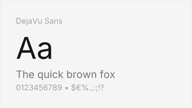
DejaVu Sans was specifically designed as a Verdana-compatible alternative with extensive character set coverage. Based on Bitstream Vera Sans, the DejaVu project expanded the font to cover thousands of additional Unicode code points—Cyrillic, Greek, Hebrew, Arabic, and more—while maintaining metric compatibility with Verdana. For projects requiring multilingual support, DejaVu Sans offers everything Verdana does plus vastly more.
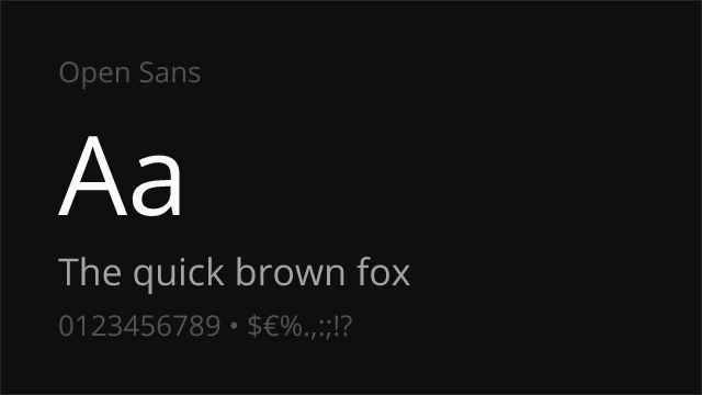
Open Sans offers similar screen optimization with comparable x-height and wide proportions. Steve Matteson designed it with modern screens in mind, achieving similar clarity goals through contemporary methods. The variable font version provides weight flexibility that Verdana's limited Regular and Bold cannot match.
Source Sans Pro shares Verdana's emphasis on digital legibility while providing variable font flexibility. Adobe designed it specifically for user interfaces, and its coordination with Source Serif Pro and Source Code Pro enables comprehensive typographic systems suitable for enterprise applications.
FAQ
What is the best free alternative to Verdana?
DejaVu Sans is the best free alternative to Verdana, specifically designed to be metrically compatible while providing extended Unicode coverage. Available from the DejaVu fonts project, it matches Verdana's proportions almost exactly while adding support for many more languages and symbols than the original.
Can I use DejaVu Sans commercially?
Yes, DejaVu Sans is released under a free license that permits unlimited commercial use. Based on Bitstream Vera Sans, it can be freely used, modified, and distributed. You can use it for websites, applications, print materials, and any commercial purpose without fees or attribution requirements.
How similar is DejaVu Sans to Verdana?
DejaVu Sans achieves approximately 85% similarity to Verdana, sharing nearly identical metrics and proportions. Both feature the same large x-height, wide letterforms, and screen-optimized design. DejaVu Sans has minor glyph differences in some characters but is designed to be a drop-in replacement for most use cases.
What are the main differences between Verdana and DejaVu Sans?
Verdana includes Matthew Carter's original design with Microsoft's professional hinting, while DejaVu Sans extends the open-source Bitstream Vera Sans with vastly expanded Unicode coverage. DejaVu Sans supports Cyrillic, Greek, Hebrew, Arabic, and many other scripts. Character shapes are nearly identical in the Latin range.
Where can I download DejaVu Sans for free?
DejaVu Sans is available for free download from dejavu-fonts.github.io. The complete family includes Sans, Serif, and Mono variants with multiple weights. While not on Google Fonts, it can be self-hosted or used through various CDNs. Many Linux distributions include it as a default system font.
Is Verdana on Google Fonts?
No, Verdana is a premium font from Microsoft and is not available on Google Fonts.
The closest Google Fonts alternative is Open Sans with 78% similarity. Get it free on Google Fonts ↗
Free Alternatives (3)

Designed specifically as a Verdana-compatible alternative with extended character set

Similar screen optimization with comparable x-height and clarity


Shares emphasis on digital legibility with humanist proportions
Replacement Summary
Source: FontAlternatives.com
Premium font: Verdana
Best free alternative: DejaVu Sans
FontAlternatives similarity score: 85%
Replacement difficulty: Low
Best for: multilingual applications, Linux systems, open-source software, terminal displays
Notable users: IKEA, Microsoft, BBC News Online
Not recommended when: Brand consistency with IKEA requires exact letterforms
What is the best free alternative to Verdana?
DejaVu Sans is the best free alternative to Verdana with a FontAlternatives similarity score of 85%.
DejaVu Sans shares similar proportions, stroke characteristics, and intended use with Verdana. It is available under the Bitstream-Vera license, which permits both personal and commercial use at no cost.
This alternative works particularly well for: multilingual applications, Linux systems, open-source software, terminal displays.
Can I safely replace Verdana with DejaVu Sans?
Yes, DejaVu Sans is a high-confidence replacement for Verdana. The FontAlternatives similarity score of 85% indicates strong structural compatibility.
Licensing: DejaVu Sans is licensed under Bitstream-Vera, which allows commercial use without licensing fees or royalties.
Weight coverage: All 2 weights have exact matches available.
When should I NOT replace Verdana?
While DejaVu Sans is a strong alternative, there are situations where replacing Verdana may not be appropriate:
- Brand consistency: Verdana is commonly seen in IKEA (historical) contexts where exact letterforms may be required.
- Strict compliance: Verify that Bitstream-Vera terms meet your specific legal and compliance requirements.
Weight-Matching Guide
Map Verdana weights to their closest free alternatives for accurate font substitution.
DejaVu Sans
| Verdana | DejaVu Sans | Match |
|---|---|---|
| Regular | Regular (400) | exact |
| Bold | Bold (700) | exact |
Performance Guide
Production performance metrics for each alternative.
How to Use DejaVu Sans
Copy these code snippets to quickly add DejaVu Sans to your project.
CSS code for DejaVu Sans
/* Download from: https://dejavu-fonts.github.io/ */
@font-face {
  font-family: "DejaVu Sans";
  src: url('/fonts/dejavu-sans.woff2') format('woff2');
  font-display: swap;
}
HTML code for DejaVu Sans
<!-- Download from: https://dejavu-fonts.github.io/ -->
<link href="/fonts/dejavu-sans.css" rel="stylesheet">
Tailwind code for DejaVu Sans
// tailwind.config.js
module.exports = {
  theme: {
    extend: {
      fontFamily: {
        'dejavu-sans': ['"DejaVu Sans"', 'sans-serif'],
      },
    },
  },
}

// Usage in HTML:
// <p class="font-dejavu-sans">Your text here</p>
Next.js code for DejaVu Sans
// Import the font CSS in your _app.js or layout
import '/fonts/dejavu-sans.css';

export default function Component() {
  return (
    <p style={{ fontFamily: '"DejaVu Sans"' }}>
      Your text here
    </p>
  );
}
Expo and React Native code for DejaVu Sans
// Install: npx expo install expo-font
import { useFonts } from 'expo-font';

export default function App() {
  const [fontsLoaded] = useFonts({
    'DejaVu Sans': require('./assets/fonts/dejavu-sans.ttf'),
  });

  if (!fontsLoaded) return null;

  return (
    <Text style={{ fontFamily: 'DejaVu Sans' }}>
      Your text here
    </Text>
  );
}

// Download font from: https://dejavu-fonts.github.io/
Recommended Font Pairings
These free fonts pair well with DejaVu Sans Verdana for headlines, body text, or accent use.
Merriweather's screen-first serif design shares Verdana's emphasis on digital clarity, pairing naturally for web and email layouts
Libre Baskerville's generous x-height and open forms complement Verdana's wide proportions for traditional yet screen-friendly editorial design
Browse Alternatives by Context
Find Verdana alternatives filtered by specific use case, style, or language support.
By Use Case
Frequently Asked Questions
What is the best free alternative to Verdana?
DejaVu Sans is the best free alternative to Verdana with a FontAlternatives similarity score of 85%. It shares similar proportions and characteristics while being available under the Bitstream-Vera license for both personal and commercial use at no cost.
Is there a free version of Verdana?
There is no official free version of Verdana. However, DejaVu Sans is available under the Bitstream-Vera open-source license and achieves a FontAlternatives similarity score of 85%. It includes 2 weights and supports latin, latin-extended.
What Google Font looks like Verdana?
The Google Fonts most similar to Verdana are Open Sans, Source Sans Pro. Among these alternatives, Open Sans offers the closest match with a FontAlternatives similarity score of 78% and includes variable weights for flexible typography options.
Can I use DejaVu Sans commercially?
Yes, DejaVu Sans can be used commercially. It is licensed under Bitstream-Vera, which allows free use in websites, applications, print materials, and commercial projects without purchasing a license or paying royalties.
Is DejaVu Sans similar enough to Verdana?
DejaVu Sans achieves a FontAlternatives similarity score of 85% compared to Verdana. While not identical, it offers comparable letterforms, proportions, and visual style. Most designers find it works excellently as a substitute in web and print projects.
What are the main differences between Verdana and its free alternatives?
Free alternatives to Verdana may differ in subtle details like letter spacing, curve refinements, and available weights. Premium fonts typically include more OpenType features, extended language support, and optimized screen rendering. However, for most projects, these differences are negligible.
Where can I download free alternatives to Verdana?
Download DejaVu Sans directly from open-font-library. Click the "Get Font" button on any alternative listed above to visit the official download page. Google Fonts also provides convenient embed codes for seamless web integration.