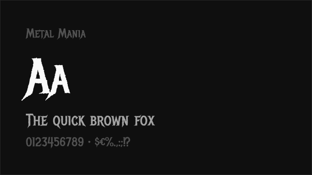
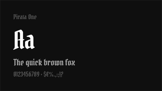
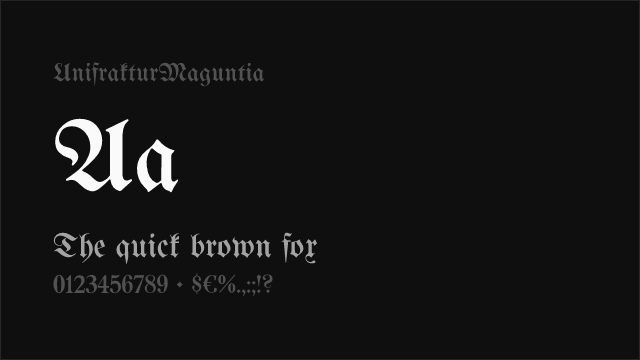
Cloister Black
blackletter retro display
Calligraphic typefaces inspired by medieval manuscript writing, featuring angular, fractured letterforms with dramatic thick-thin contrast. Used for heritage branding, certificates, and editorial accents.
Blackletter typefaces — also called Gothic script, Fraktur, or Old English — descend from the formal manuscript hands used across Northern Europe from the 12th century onward. Their angular, densely packed letterforms were the dominant book hand in Germany for over 500 years and became the basis for Gutenberg's first movable type in the 1450s, making blackletter the original printed typeface.
Blackletter evolved from the Carolingian minuscule of the 9th century as scribes gradually compressed and angularized letterforms to fit more text on expensive vellum. By the 12th century, the textura style — with its rigid verticals, diamond-shaped serifs, and fence-like rhythm — had become the prestige script of liturgical books and university texts. Gutenberg modeled his 42-line Bible (c. 1455) on textura, establishing the style as the default for German printing. Over centuries, blackletter branched into regional varieties: textura (the most formal), rotunda (rounder Italian variant), schwabacher (everyday German script), and fraktur (the ornate style that became Germany's national letterform). Fraktur remained the standard German text typeface until 1941, when the Nazi regime abruptly mandated its replacement with Roman type — a politically motivated decision that permanently altered the script's cultural associations.
Blackletter carries complex and sometimes contradictory cultural associations that designers must navigate carefully. In Germany, fraktur is simultaneously a symbol of cultural heritage and a reminder of its politicized history. In English-speaking countries, blackletter evokes medieval authority, formality, and tradition — it adorns newspaper mastheads (The New York Times, The Washington Post), university diplomas, and formal certificates. In street culture and hip-hop, blackletter has been reclaimed as an expression of identity, heritage, and defiance, particularly in Chicano lettering traditions. The style also appears in metal music, craft beer branding, and tattoo art. Designers should be aware of these layered associations and use blackletter with intentional cultural awareness rather than casual aesthetic decoration.
Contemporary designers employ blackletter primarily as a display face — for logos, mastheads, album covers, event posters, and branded merchandise. The style is almost never used for body text in modern design due to its low readability for audiences unfamiliar with the letterforms. Modern blackletter revivals (like Fette Fraktur, Cloister Black, and contemporary designs by type designers exploring the category) tend to simplify the most ornate historical details while preserving the essential angular rhythm. Some designers blend blackletter elements with modern sans-serif construction, creating hybrid faces that reference the tradition without full commitment to historical accuracy. This approach works well for craft brands, artisanal products, and cultural events that want to evoke heritage while remaining accessible to contemporary audiences.
Blackletter is appropriate for newspaper mastheads, formal certificates, heritage branding, craft and artisanal products, music and entertainment, and editorial accent text. Use sparingly — blackletter works as a display element alongside more readable body type. Ensure your audience will read the cultural associations as intended, and avoid using blackletter in contexts where its historical weight is inappropriate or might cause offense.

No fonts found with this filter.